

Display Template Browser
Template Display Browser
The Template Display Browser allows users to create reusable display templates that can be linked to specific devices. By associating a template with a device, all widgets in the template automatically use points from that device, making it easy to deploy the same dashboard across multiple devices.
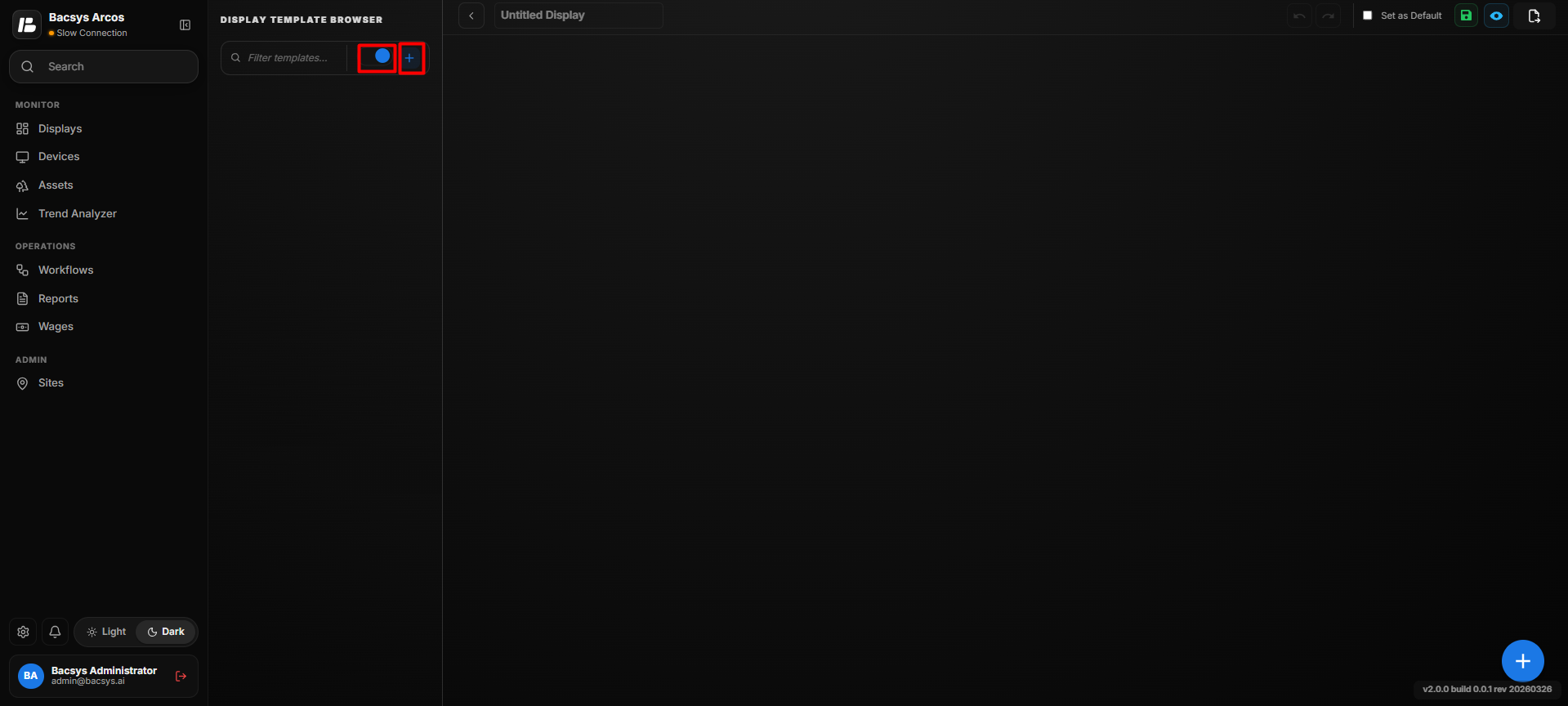
Template Display Browser
Accessing the Template Display Browser
- Open the Display module.
- Click the Toggle button to switch from Display Browser to Template Display Browser.
Creating a Template Display
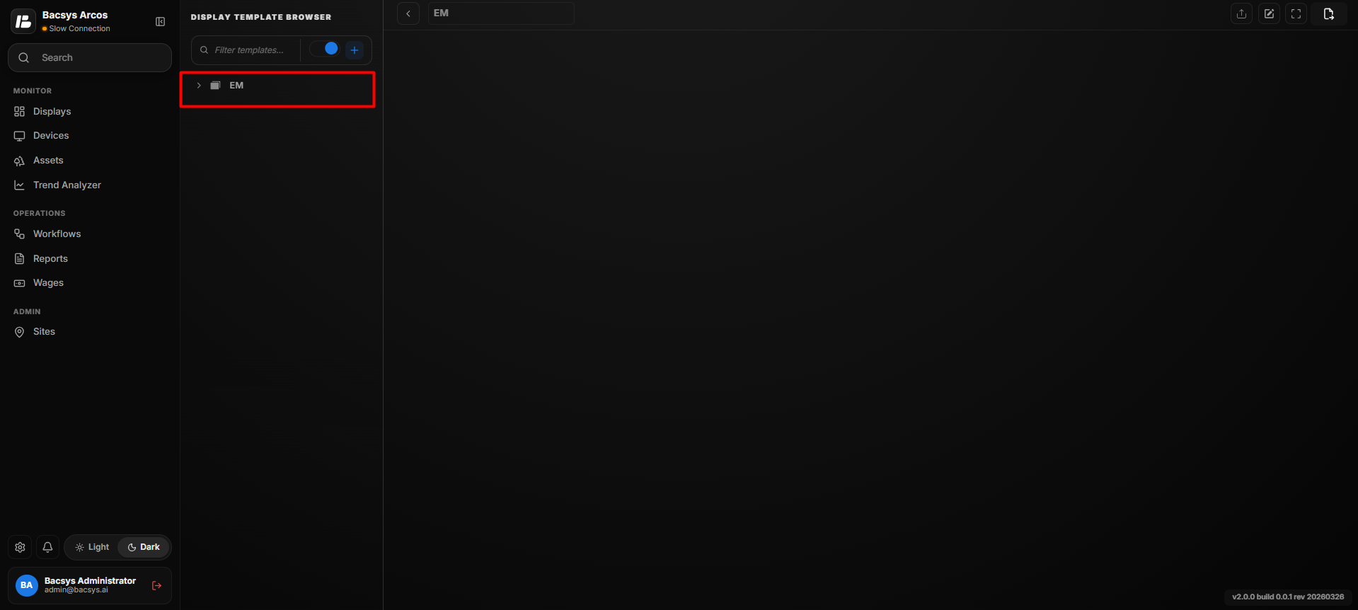
Create Template Display
Steps
- Click the + icon.
- Enter a name for the template display.
- Click Save.
The template display is created successfully and is ready for device mapping.
Adding Devices to a Template Display
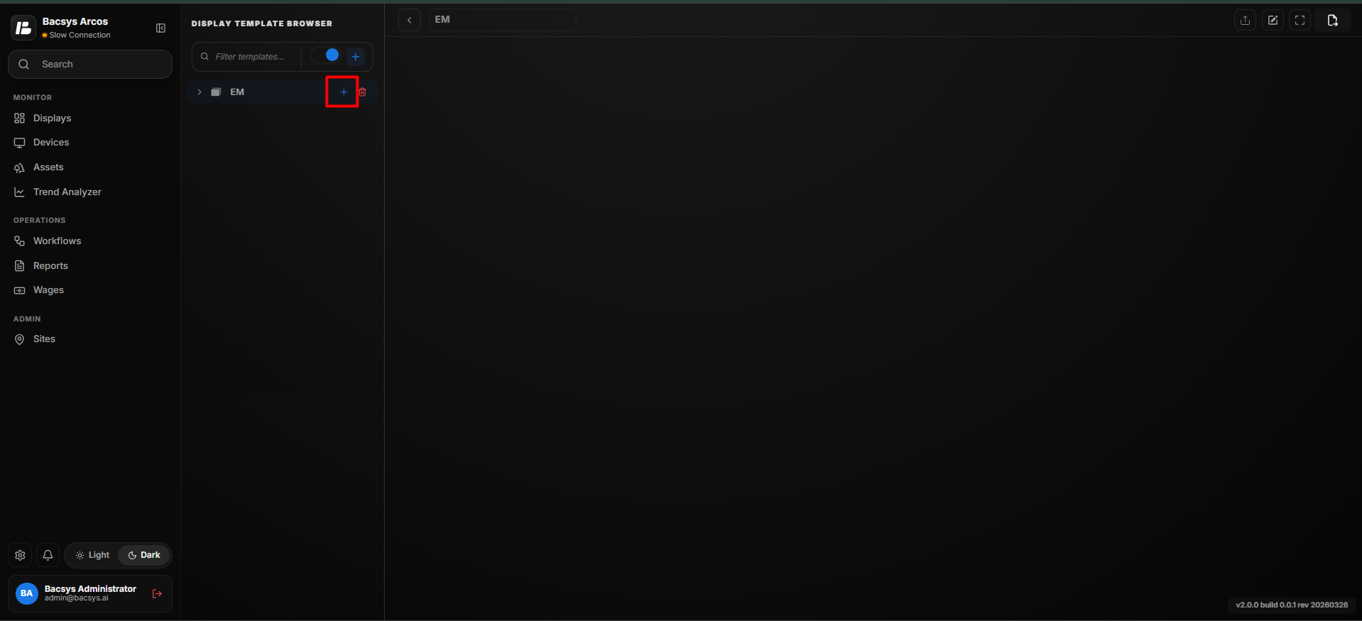
Add Device
After creating the template display, devices can be associated with it for point mapping.
Steps
- Select the newly created template display.
- Click the + icon in the Devices section.
- The Add Device dialog box appears.
- Use the Search box to locate a specific device.
- Select one or more devices by checking the corresponding checkboxes.
- To include all available devices, select Select All.
- Click Add Selected.
The selected devices are added to the template display.
Note
- Multiple devices can be selected simultaneously.
- The Search option helps locate devices quickly.
- Select All adds every available device.
Device Point Mapping
Device Point Mapping
Once a device is added, the template display becomes associated with that device.
When configuring widgets:
- Only the points belonging to the selected device are displayed.
- Global point search is supported.
- When a point is selected through global search, it is automatically mapped to the corresponding device.
- All widgets use the mapped device points.
Note
Device mapping allows the same template display to be reused across multiple devices without modifying the widget configuration.
Configuring Widgets
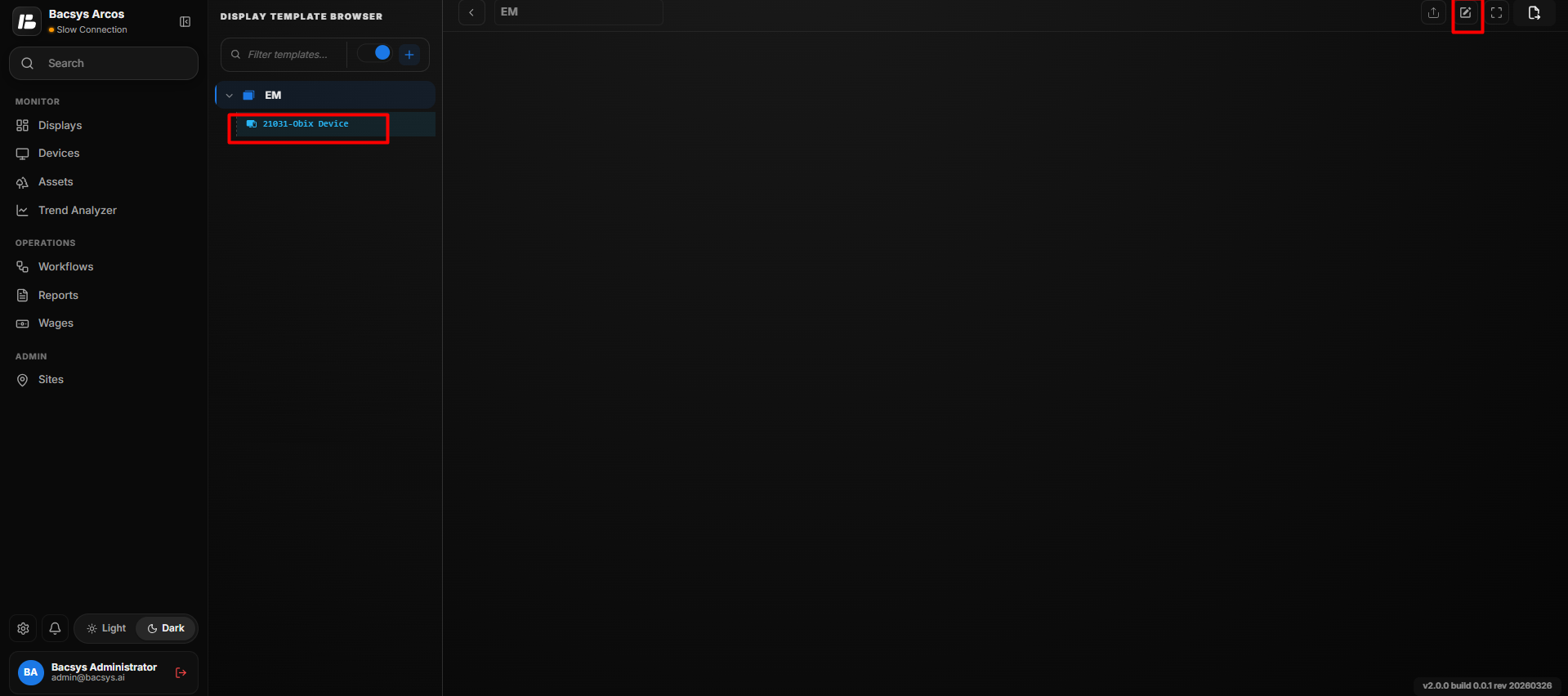
Template Display - Edit Mode
After mapping the device, widgets can be added to the template.
Steps
- Select the required device.
- Click Edit.
- Click the + icon to open the Widget Library.
- Select one of the available widget categories.
- Drag and drop the required widget onto the canvas.
- Configure the widget properties.
- Select the required point from the mapped device.
- Customize the widget appearance if required.
- Click Save.
Note
- All widgets automatically use the points from the mapped device.
- Widgets can be moved and resized on the canvas.
- When another device is assigned to the template, the widgets automatically use the corresponding points.
Widget Categories
The Widget Library is organized into five categories.
- Display Widgets
- Energy Widgets
- Analytics Widgets
- 3D Widgets
- Floor Widgets
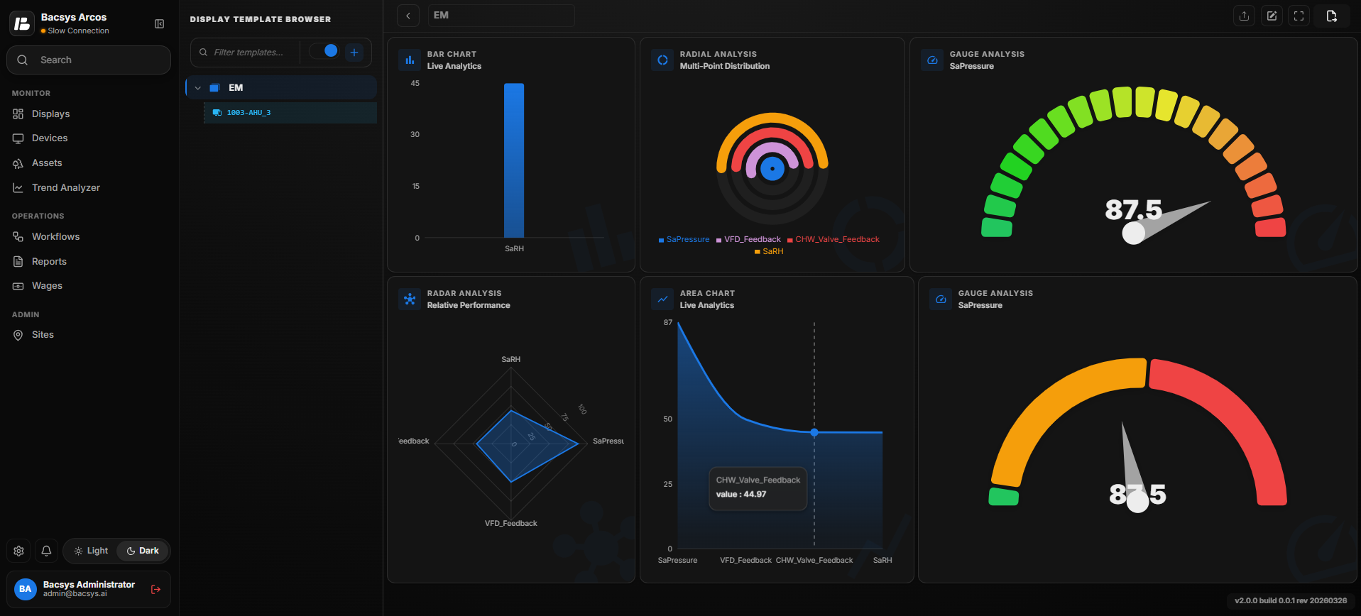
Display Widgets
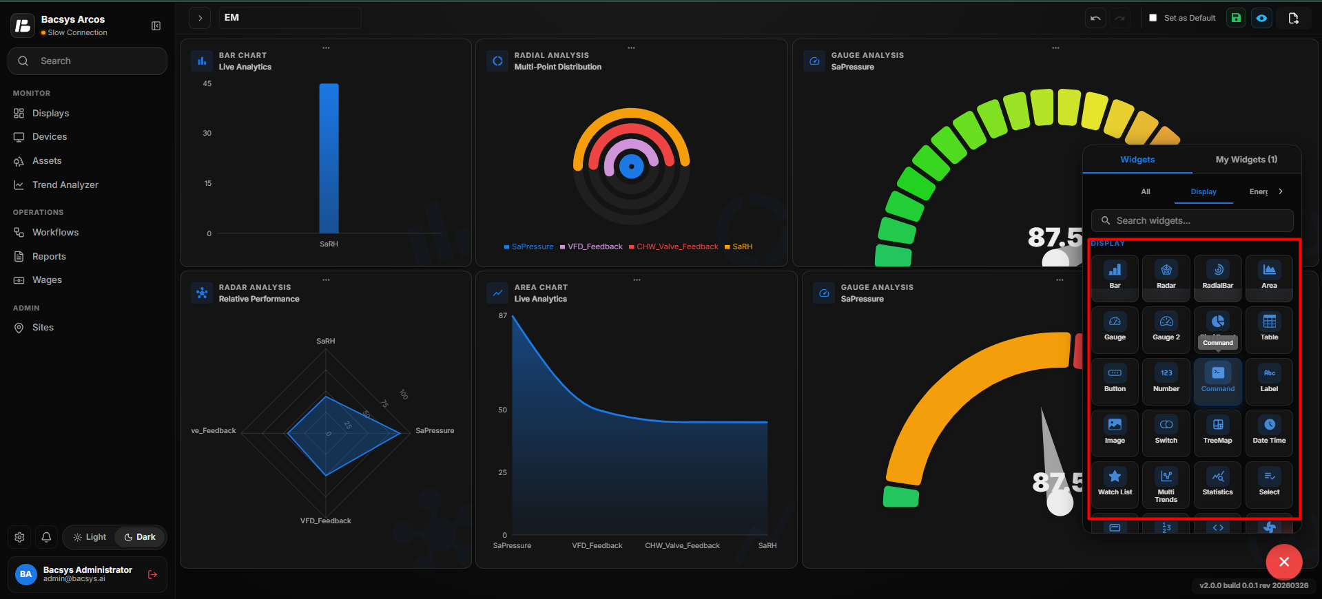
| Widget | Description |
|---|---|
| Bar Chart | Displays multiple data points as a bar chart for comparison. |
| Radar Chart | Displays multiple data points in a radar chart. |
| Radial Bar Chart | Displays values using circular bars. |
| Area Chart | Displays trend data as a shaded area graph. |
| Gauge Chart | Displays a single value using a gauge. |
| Gauge 2 Chart | Displays an alternative gauge visualization. |
| Pie / Donut Chart | Displays proportional data in pie or donut format. |
| Table | Displays selected point values in a table. |
| Button | Performs navigation or configured actions. |
| Number | Displays the current numeric value of a point. |
| Command | Sends commands to writable points. |
| Label | Displays static text. |
| Image | Displays uploaded images. |
| Switch | Provides ON/OFF control. |
| Tree Map | Displays hierarchical data. |
| Date Time | Displays the current date and time. |
| Watch List | Displays selected points in a monitoring list. |
| Multi Trends | Displays multiple trends on one graph. |
| Statistics | Displays Min, Max, Average, and Total values. |
| Select | Provides a drop-down selection. |
| Header | Displays section headings. |
| Value Widget | Displays formatted point values. |
| Web View | Embeds web content. |
| Fan Dashboard | Displays fan-related operating information. |
| Multi State | Displays multiple operating states using configurable colors. |
Display Widgets
There are 18 standard widgets available:
Display Widgets Configuration
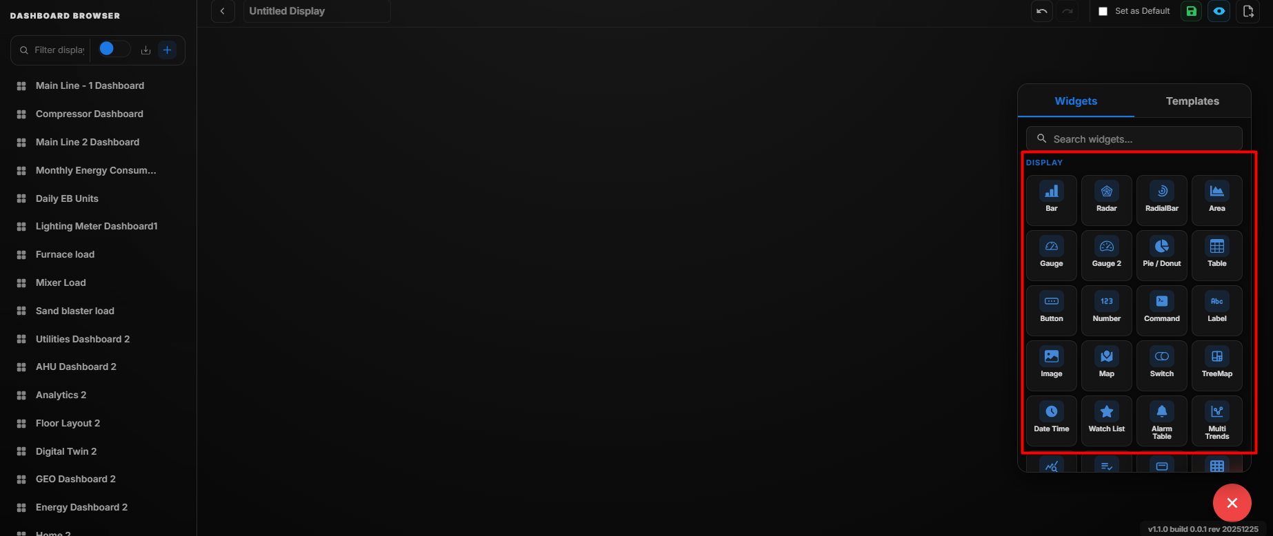 Display Widget
| Display Widget | Description | Fields |
|---|---|---|
| Bar | Displays a bar chart representing live or historical data for multiple points. | Title, Select Type, Select Points (max 5), Poll Frequency |
| Radar | Displays a radar chart comparing multiple data points in a circular layout. | Title, Select Points (max 10), Poll Frequency |
| Radial Bar Chart | Visualizes data in a circular bar format for multiple points. | Title, Select Points (max 10), Poll Frequency |
| Area Chart | Shows trends over time using shaded area under line graphs. | Title, Select Type, Select Points (max 5), Poll Frequency |
| Gauge Chart | Visualizes a single data point on a semi-circular gauge scale. | Title, Select Points (max 1), Poll Frequency |
| Pie Chart | Displays proportionate distribution of values using a pie chart. | Title, Select Points (max 5), Poll Frequency |
| Table | Shows tabular data for multiple points. | Title, Select Points, Poll Frequency, Hide Write Points Fields |
| Button | Navigational button used to switch between displays. | Button/Link Title, Select Display, Choose Button Color |
| Number | Displays a single numeric value with optional formatting. | Title, Select Points (max 1), Poll Frequency, Hide Decimal Value |
| Command | Provides an interface to trigger control commands on a selected point. | Select Points (max 1) |
| Label | Static text label used for annotations or section headings. | Label, Font Size |
| Image | Embeds an image within the dashboard. | Drag and Drop / Browse Image |
| Map | Visualizes device locations on an interactive map. | No configurable fields |
| Switch | Toggle interface used for ON/OFF control of a selected point. | Title, Select Points (max 1), Poll Frequency |
| Tree Map | Represents hierarchical data using nested rectangles. | Title, Select Points (max 20), Poll Frequency |
| Date Time | Displays the current date and time. | Font Size, Poll Frequency |
| Watch List | Shows a list of selected data points for quick monitoring. | Title, Poll Frequency |
| Alarm Table | Displays a table view of system alarms with filtering options. | Title, Select Site, Severity Filter, Status Filter, Poll Frequency |
| Multi Trends | Displays multiple trend lines for comparison over time. | Title, Select Points (max 10), Time Range, Poll Frequency |
| Statistics | Shows aggregated statistical values such as Min, Max, Average, and Total. | Title, Select Points, Aggregation Type, Time Range |
| Select Header | Displays a customizable section header for organizing dashboard content. | Header Title, Font Size, Alignment |
| Heatmap | Visualizes data intensity variations using color gradients. | Title, Select Points, Time Range, Poll Frequency |
| Timeline Chart | Displays events or data points along a time-based horizontal axis. | Title, Select Points, Time Range |
| Bubble Chart | Represents three-dimensional data using bubbles of varying size. | Title, Select Points (max 5), Poll Frequency |
| Reports Card | Displays summarized report information in a card layout. | Title, Select Report, Time Range |
| Value Widget | Displays a key value with optional threshold-based color indication. | Title, Select Points (max 1), Poll Frequency, Threshold Settings |
| IAQ Widget | Displays Indoor Air Quality metrics such as CO₂, temperature, and humidity. | Title, Select IAQ Points, Poll Frequency |
| Polar Chart | Displays data in polar coordinate format for angular comparison. | Title, Select Points (max 10), Poll Frequency |
| Scatter Chart | Displays data distribution using plotted points on X and Y axes. | Title, Select X-Axis Point, Select Y-Axis Point, Poll Frequency |
| Composed Chart | Combines multiple chart types (e.g., bar, line, area) into a single visualization. | Title, Select Points, Chart Type Mix, Poll Frequency |
Field Descriptions
Add and Configure the Bar Widget
The Bar Widget is used to display point values in a bar-style visualization. It allows users to monitor selected points directly from the display and configure how the values are presented.
-
Click the + icon.
-
Drag and drop the Bar Widget onto the display.
-
Select the Bar Widget to view the available widget actions:
- Zoom In
- Zoom Out
- Settings
- Remove Widget
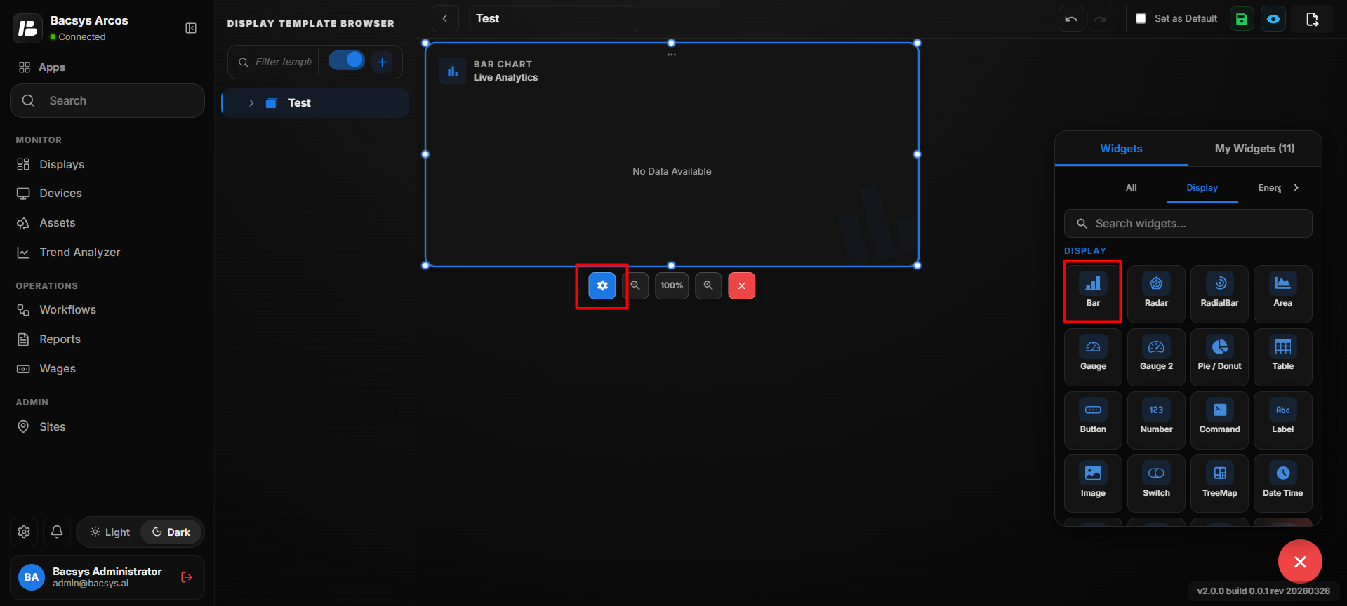
- Click Settings to open the Bar Widget configuration panel.
- Under Select Type, select Instantaneous.
- Configure the available options as described below.
Instantaneous Settings
| Option | Description |
|---|---|
| Title | Enter a title for the Bar Chart. The title is displayed at the top of the widget. |
| Select Type | Selects the type of data to be displayed in the Bar Chart. Select Instantaneous Value to display the current value of the mapped points. |
| Number of Rows | Defines the number of rows or points to be displayed in the Bar Chart. |
| Point to be Mapped for Row | Enter the exact point name to be mapped to the corresponding row. A separate point mapping field is provided for each configured row. |
| Show Background | Use the toggle to show or hide the widget background. |
| Hide Header | Use the toggle to show or hide the widget header. |
| Save | Saves the Bar Chart configuration. |
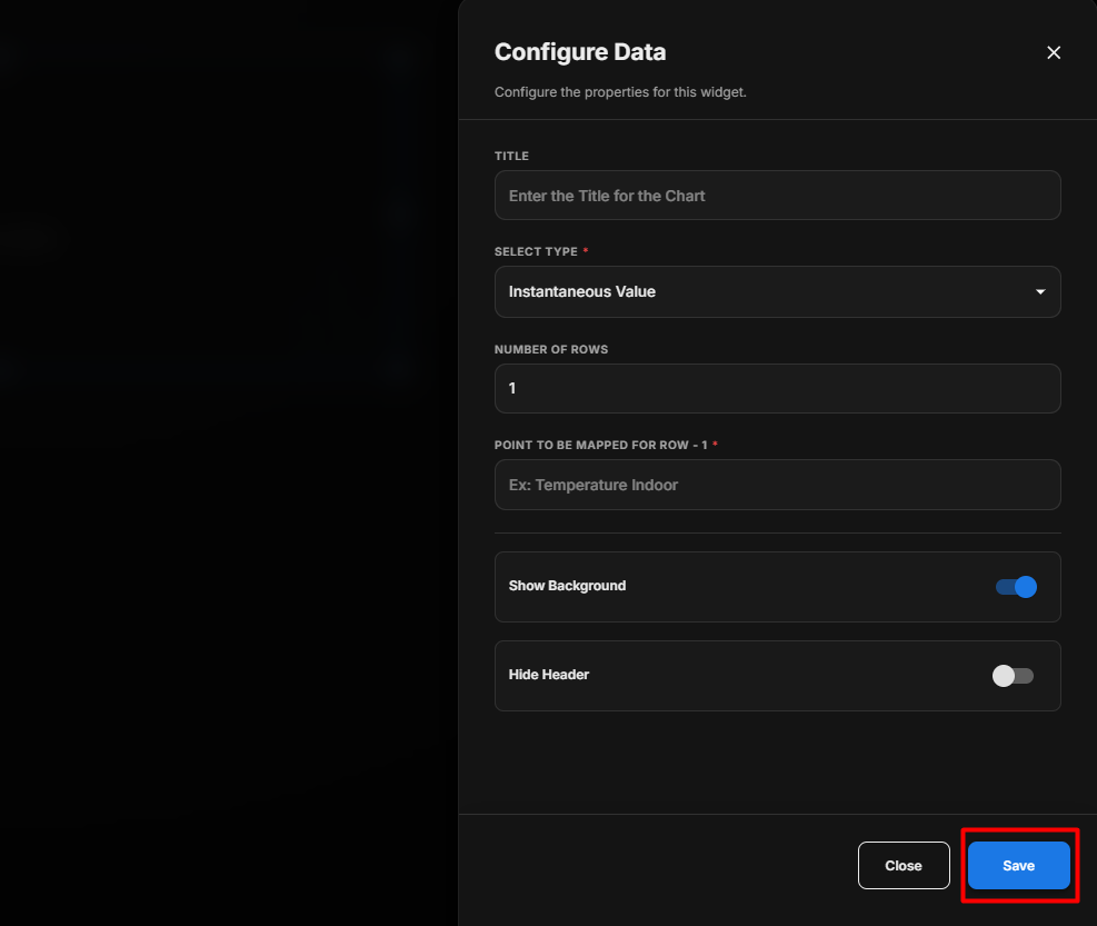
Save the Configuration
After configuring the required settings:
- Review the selected points and configuration options.
- Click Save.
- The Bar Widget is updated with the configured settings.
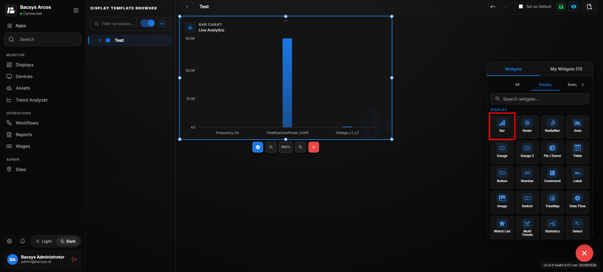
Configure Instantaneous Value
- Enter the required Title for the Bar Chart.
- Under Select Type, select Instantaneous Value.
- Enter the required Number of Rows.
- For each row, enter the exact point name under Point to be Mapped for Row.
- Enable or disable Show Background as required.
- Enable Hide Header if the widget header should not be displayed.
- Review the configured settings.
- Click Save.
- The Bar Chart displays the instantaneous values of the mapped points.
Configure the Bar Widget for Trends
The Trends view of the Bar Widget is used to visualize the historical values of selected points over a specific time period. Before configuring the widget, make sure that Trend is enabled for every point you want to display.
Configure the Trends View
- Select the Bar Widget.
- Click Settings to open the widget configuration panel.
- Under Select Type, select Trends.
- Make sure Trend is enabled for every point that you want to display in the Trends view.
- Configure the available options as described below.
Trends Settings
| Option | Description |
|---|---|
| Title | Enter a title for the Bar Chart. The title identifies the trend data displayed in the widget. |
| Select Type | Selects the type of data to be displayed. Select Trend Value to display historical point values over a selected time period. |
| Point to be Mapped | Enter the exact point name whose historical trend data should be displayed in the Bar Chart. |
| Select Date Ranges | Selects the time period for which the trend data should be displayed. |
| Last 1 Day | Displays the trend data for the previous 1 day. |
| Last 2 Days | Displays the trend data for the previous 2 days, if available. |
| Custom Date | Allows the user to select a specific start date and end date for the trend data. |
| Show Background | Use the toggle to show or hide the background of the Bar Chart. |
| Hide Header | Use the toggle to show or hide the widget header, including the title. |
| Save | Saves the configured Bar Chart settings. |
Select a Date Range
Under Select Date Range, choose one of the following options:
- 1 Day – Displays trend data for one day.
- 2 Days – Displays trend data for two days.
- Custom Date – Allows you to select a specific date range.
When Custom Date is selected:
- Select the Start Date.
- Select the End Date.
- Make sure the selected date range is valid.
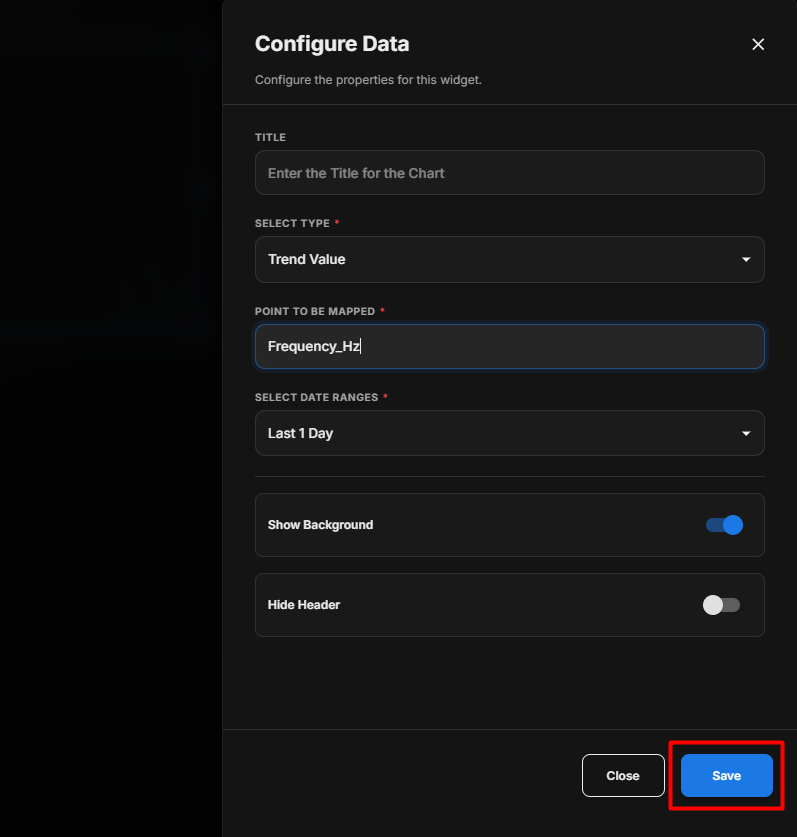
Save the Configuration
After configuring the Trends view:
- Verify that Trend is enabled for every required point.
- Make sure Value is enabled.
- Review the selected Date Range.
- If Custom Date is selected, verify the Start Date and End Date.
- Review the Show Background and Hide Header settings.
- Click Save.
- The Bar Widget displays the trend data for the selected points and configured date range.
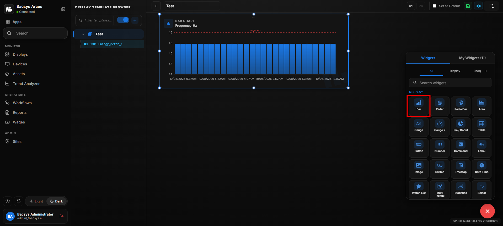
Configure Trend Value
- Enter the required Title for the Bar Chart.
- Under Select Type, select Trend Value.
- Enter the required point name under Point to be Mapped.
- Under Select Date Ranges, select the required time period.
- Select Last 1 Day to display the previous day's trend data.
- Select Last 2 Days to display the previous two days' trend data, if available.
- Select Custom Date when a specific date range is required and provide the Start Date and End Date.
- Enable or disable Show Background as required.
- Enable Hide Header if the widget header should not be displayed.
- Review the configuration.
- Click Save.
- The Bar Chart displays the historical trend values for the selected point and date range.
Add and Configure the Radar Widget
The Radar Widget is used to display selected point values in a radar-style visualization. It helps users compare multiple point values within a single widget.
Add the Radar Widget
- Click the + icon.
- Drag and drop the Radar Widget onto the display.
- Select the Radar Widget to view the available widget actions:
- Zoom In – Enlarges the widget.
- Zoom Out – Reduces the widget size.
- Settings – Opens the widget configuration options.
- Remove Widget – Removes the widget from the display.
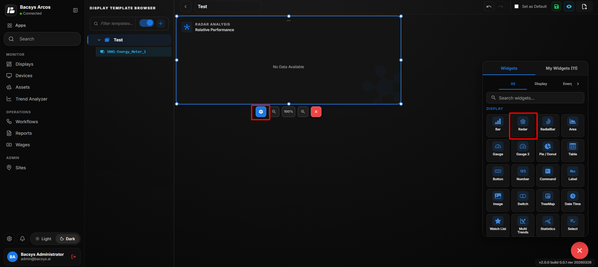
Configure the Radar Widget
- Click Settings to open the Radar Widget configuration panel.
- Configure the available options as described below.
Radar Widget Settings
| Option | Description |
|---|---|
| Title | Enter a title for the Radar Chart. The title identifies the information displayed in the widget. |
| Number of Rows | Defines the number of data points or values to be displayed in the Radar Chart. |
| Point to be Mapped for Row | Enter the exact point name to be mapped to the corresponding row. A separate point mapping field is displayed for each configured row. |
| Show Background | Use the toggle to show or hide the background of the Radar Chart. |
| Hide Header | Use the toggle to show or hide the widget header, including the title. |
| Save | Saves the configured Radar Chart settings. |
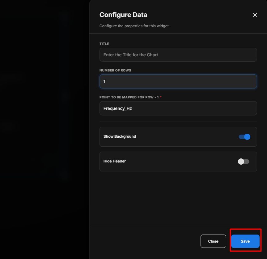
Save the Configuration
After configuring the Radar Widget:
- Enter the required Title and Subtitle.
- Select the required Points.
- Set the required Poll Frequency.
- Configure the Show Background and Hide Header toggle buttons as required.
- Review the configuration.
- Click Save.
- The Radar Widget is updated with the configured settings and selected point values.
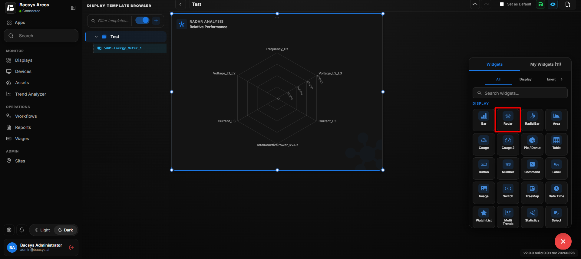
Configure Radar Chart
- Enter the required Title for the Radar Chart.
- Enter the required Number of Rows.
- For each row, enter the corresponding point name under Point to be Mapped for Row.
- Enable or disable Show Background as required.
- Enable Hide Header if the widget header should not be displayed.
- Review the configured settings.
- Click Save.
- The Radar Chart displays the values of the mapped points.
Add and Configure the Radial Bar Widget
The Radial Bar Widget is used to display selected point values in a radial bar visualization. It allows users to configure the displayed points, refresh frequency, and widget appearance.
Add the Radial Bar Widget
- Click the + icon.
- Drag and drop the Radial Bar Widget onto the display.
- Select the Radial Bar Widget to view the available widget actions:
- Zoom In
- Zoom Out
- Settings
- Remove Widget
- Click Settings to open the Configure Data panel.
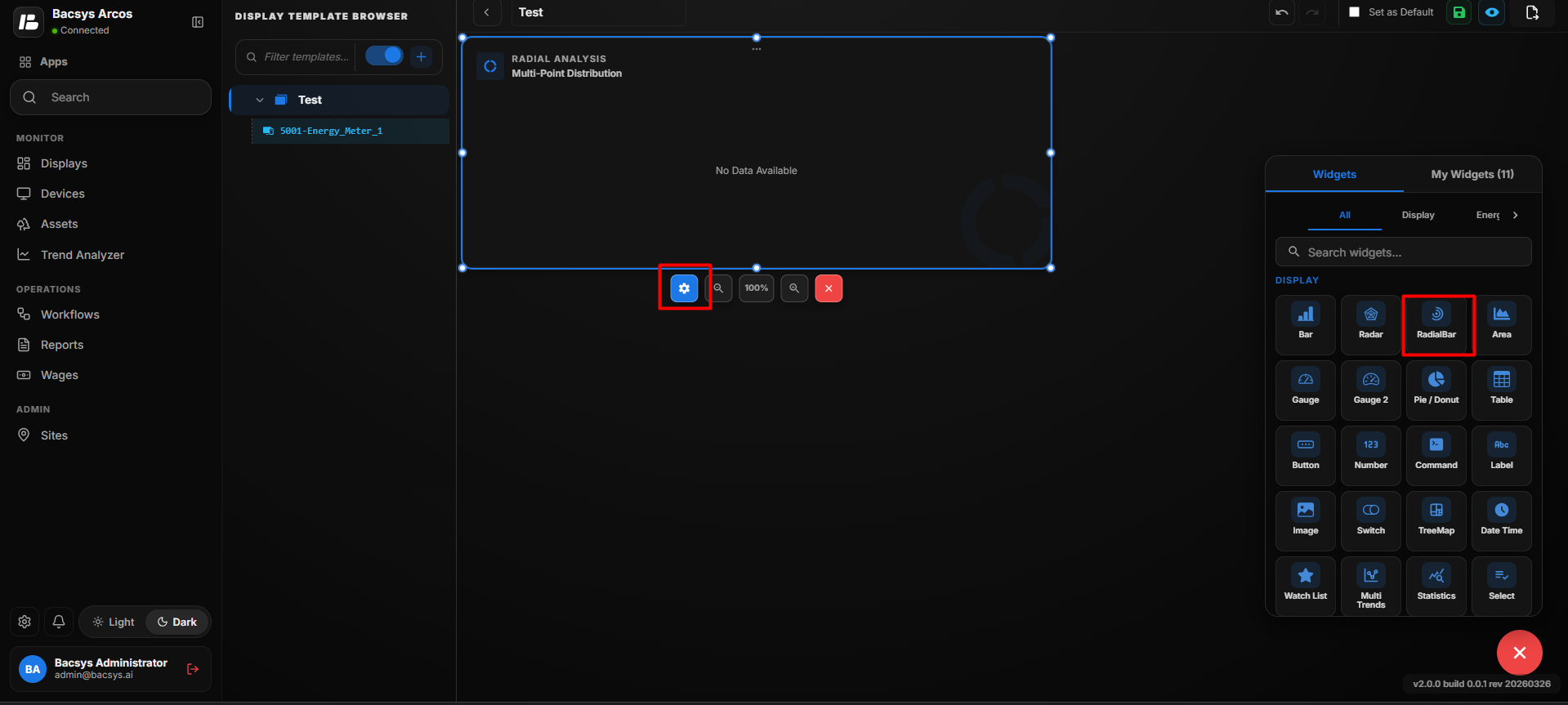
Radial Bar Widget Settings
| Option | Description |
|---|---|
| Title | Enter a title for the Radial Bar Chart. The title identifies the information displayed in the widget. |
| Number of Rows | Defines the number of data points or values to be displayed in the Radial Bar Chart. |
| Point to be Mapped for Row | Enter the exact point name to be mapped to the corresponding row. A separate point mapping field is displayed for each configured row. |
| Show Background | Use the toggle to show or hide the background of the Radial Bar Chart. |
| Hide Header | Use the toggle to show or hide the widget header, including the title. |
| Save | Saves the configured Radial Bar Chart settings. |
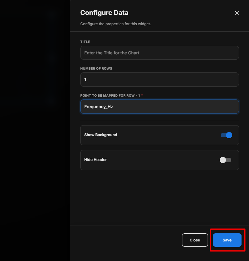
Save the Configuration
After clicking Save, the Radial Bar Widget is added to the display with the selected points and configured settings.
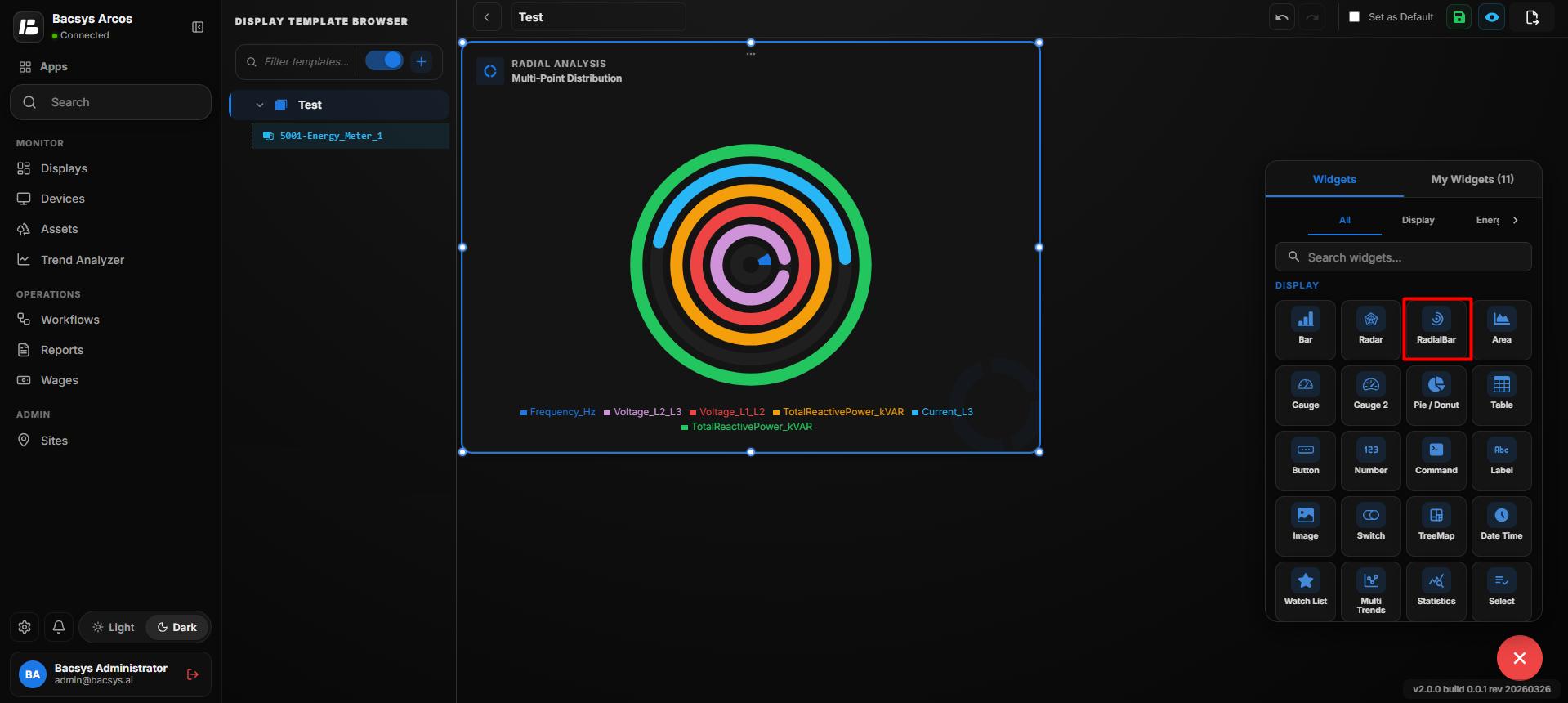
Configure Radial Bar Chart
- Enter the required Title for the Radial Bar Chart.
- Enter the required Number of Rows.
- For each row, enter the corresponding point name under Point to be Mapped for Row.
- Enable or disable Show Background as required.
- Enable Hide Header if the widget header should not be displayed.
- Review the configured settings.
- Click Save.
- The Radial Bar Chart displays the values of the mapped points.
Add and Configure the Area Chart Widget
The Area Chart Widget is used to display point values as an area chart. It helps users visualize point data and monitor changes over time or based on the selected data type.
Add the Area Chart Widget
- Click the + icon.
- Drag and drop the Area Chart Widget onto the display.
- Select the Area Chart Widget to view the available widget actions:
- Zoom In
- Zoom Out
- Settings
- Remove Widget
- Click Settings to open the Configure Data panel.
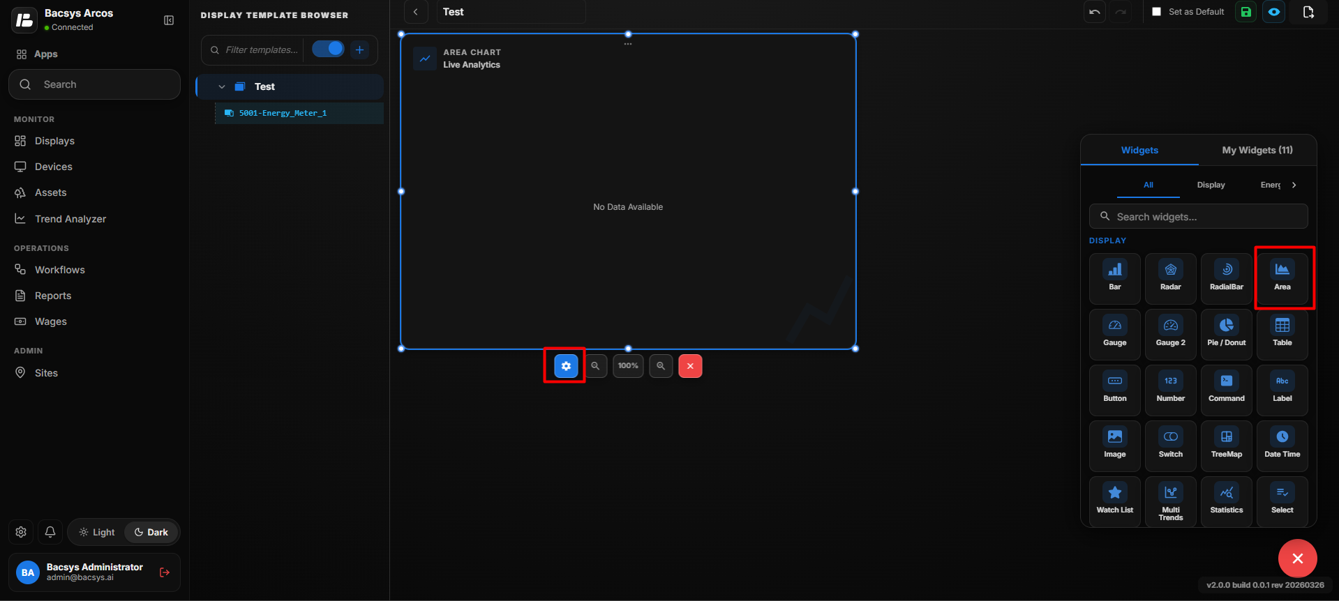
Area Chart Settings
| Option | Description |
|---|---|
| Title | Enter a title for the Area Chart. The title identifies the information displayed in the widget. |
| Select Type | Selects the type of data to be displayed in the Area Chart. Select Instantaneous Value to display the current values of the mapped points. |
| Number of Rows | Defines the number of data points or values to be displayed in the Area Chart. |
| Point to be Mapped for Row | Enter the exact point name to be mapped to the corresponding row. A separate point mapping field is displayed for each configured row. |
| Show Background | Use the toggle to show or hide the background of the Area Chart. |
| Hide Header | Use the toggle to show or hide the widget header, including the title. |
| Save | Saves the configured Area Chart settings. |
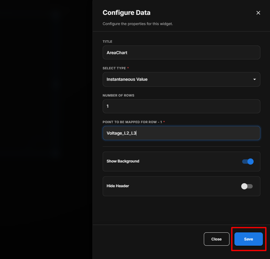
Save the Configuration
After clicking Save, the Area Chart Widget is updated on the display with the selected points and configured settings.
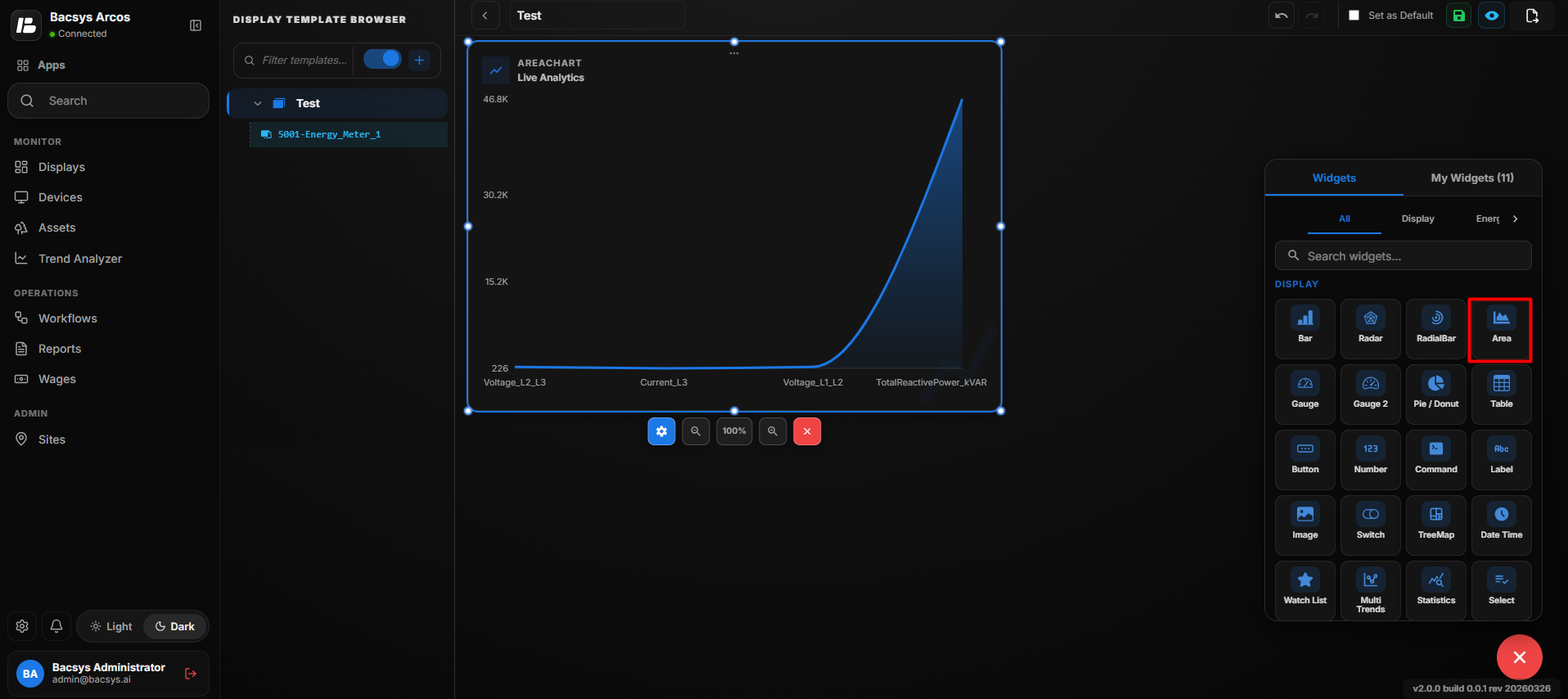
Configure Area Chart – Instantaneous Value
- Enter the required Title for the Area Chart.
- Under Select Type, select Instantaneous Value.
- Enter the required Number of Rows.
- For each row, enter the corresponding point name under Point to be Mapped for Row.
- Enable or disable Show Background as required.
- Enable Hide Header if the widget header should not be displayed.
- Review the configured settings.
- Click Save.
- The Area Chart displays the instantaneous values of the mapped points.
Add and Configure the Area Chart Widget for Trends
The Area Chart Widget – Trends is used to visualize historical trend data for selected points over a specific date range. It helps users analyze how point values change over time.
Add the Area Chart Widget
- Click the + icon.
- Drag and drop the Area Chart Widget onto the display.
- Select the Area Chart Widget to view the available widget actions:
- Zoom In
- Zoom Out
- Settings
- Remove Widget
- Click Settings to open the Configure Data panel.
- Under Select Type, select Trend Value.
Trends Settings
| Option | Description |
|---|---|
| Title | Enter a title for the Area Chart. The title identifies the trend information displayed in the chart. |
| Select Type | Select Trend Value to display historical trend data for the mapped point. |
| Point to be Mapped | Enter the exact point name whose historical trend data should be displayed in the Area Chart. |
| Select Date Ranges | Select the date range for which the trend data should be displayed. |
| Last 1 Day | Displays trend data for the previous 1 day. |
| Last 2 Days | Displays trend data for the previous 2 days, if available. |
| Custom Date | Allows the user to select a custom date range using a Start Date and End Date. |
| Start Date | Defines the beginning of the custom trend period. |
| End Date | Defines the end of the custom trend period. |
| Show Background | Use the toggle to show or hide the Area Chart background. |
| Hide Header | Use the toggle to show or hide the widget header, including the title. |
| Save | Saves the configured Area Chart settings. |
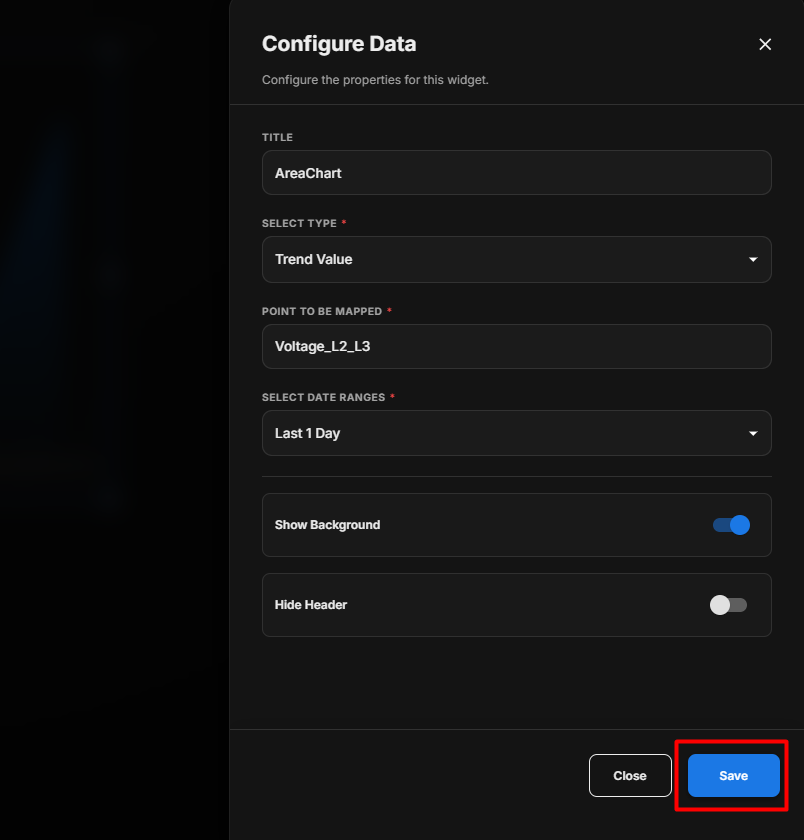
Save the Configuration
After clicking Save, the Area Chart Widget is updated on the display and shows the selected points' trend values for the configured date range.
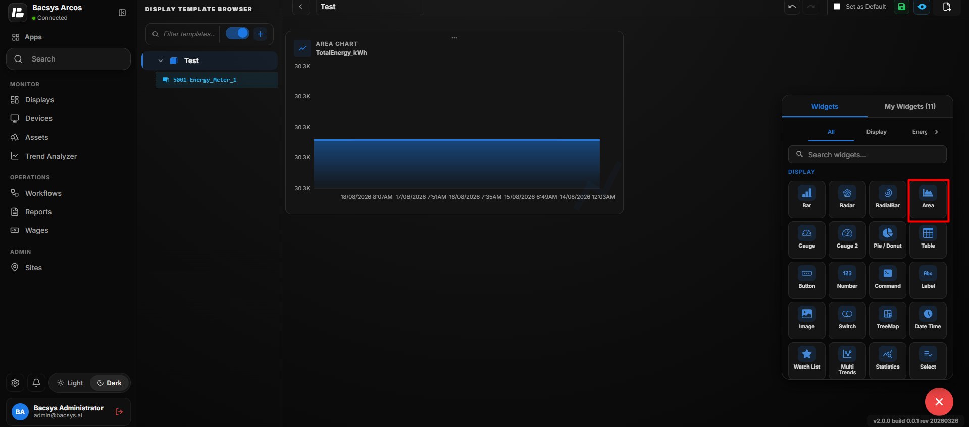
Configure Area Chart – Trend Value
- Enter the required Title.
- Under Select Type, select Trend Value.
- Enter the required point name under Point to be Mapped.
- Under Select Date Ranges, select the required date range.
- Select Last 1 Day or Last 2 Days to display the corresponding historical trend data.
- Select Custom Date to define a specific Start Date and End Date.
- Enable or disable Show Background as required.
- Enable Hide Header if the widget header should not be displayed.
- Review the configuration.
- Click Save.
- The Area Chart displays the historical trend data for the selected point and date range.
Add and Configure the Gauge Chart Widget
The Gauge Chart Widget is used to display the current value of a selected point in a gauge-style visualization. It provides a simple way to monitor a point value directly from the display.
Add the Gauge Chart Widget
- Click the + icon.
- Drag and drop the Gauge Chart Widget onto the display.
- Select the Gauge Chart Widget to view the available widget actions:
- Zoom In
- Zoom Out
- Settings
- Remove Widget
- Click Settings to open the Configure Data panel.
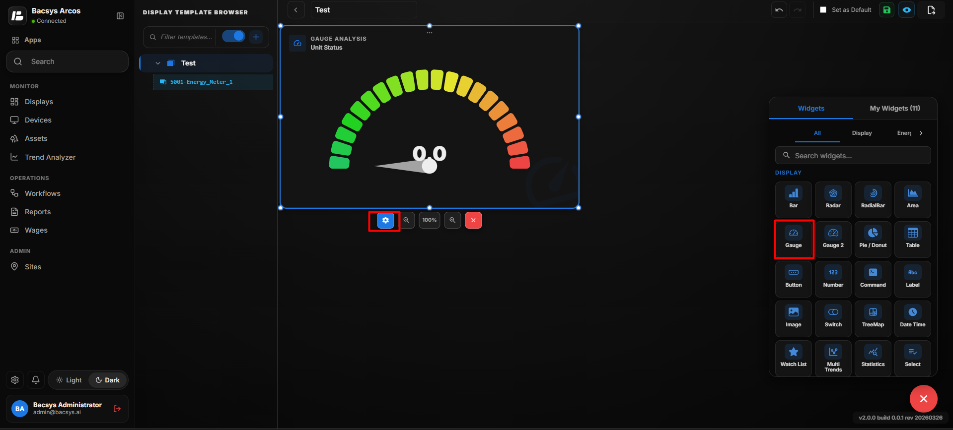
Gauge Chart Settings
| Option | Description |
|---|---|
| Title | Enter a title for the Gauge Chart. The title identifies the value displayed by the gauge. |
| Point to be Mapped | Enter the exact point name whose current value should be displayed in the Gauge Chart. |
| Poll Frequency (Seconds) | Specifies how frequently the Gauge Chart retrieves or refreshes the value of the mapped point. |
| Show Background | Use the toggle button to show or hide the widget background. |
| Hide Header | Use the toggle button to show or hide the widget header, including the title. |
| Close | Closes the configuration panel without saving the changes. |
| Save | Saves the configured Gauge Chart settings. |
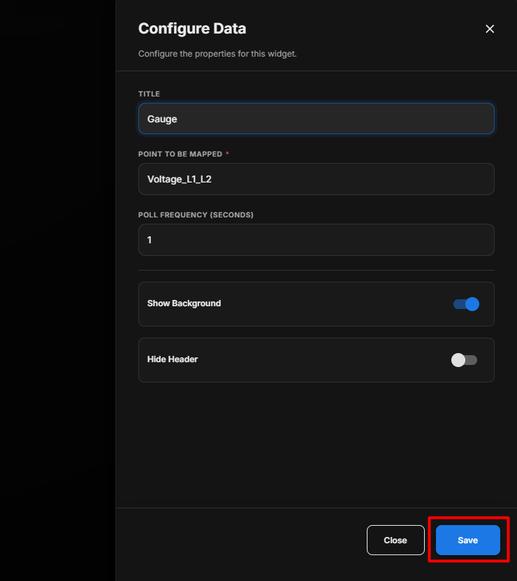
Save the Configuration
After clicking Save, the Gauge Chart Widget is updated on the display and displays the selected point value according to the configured settings.
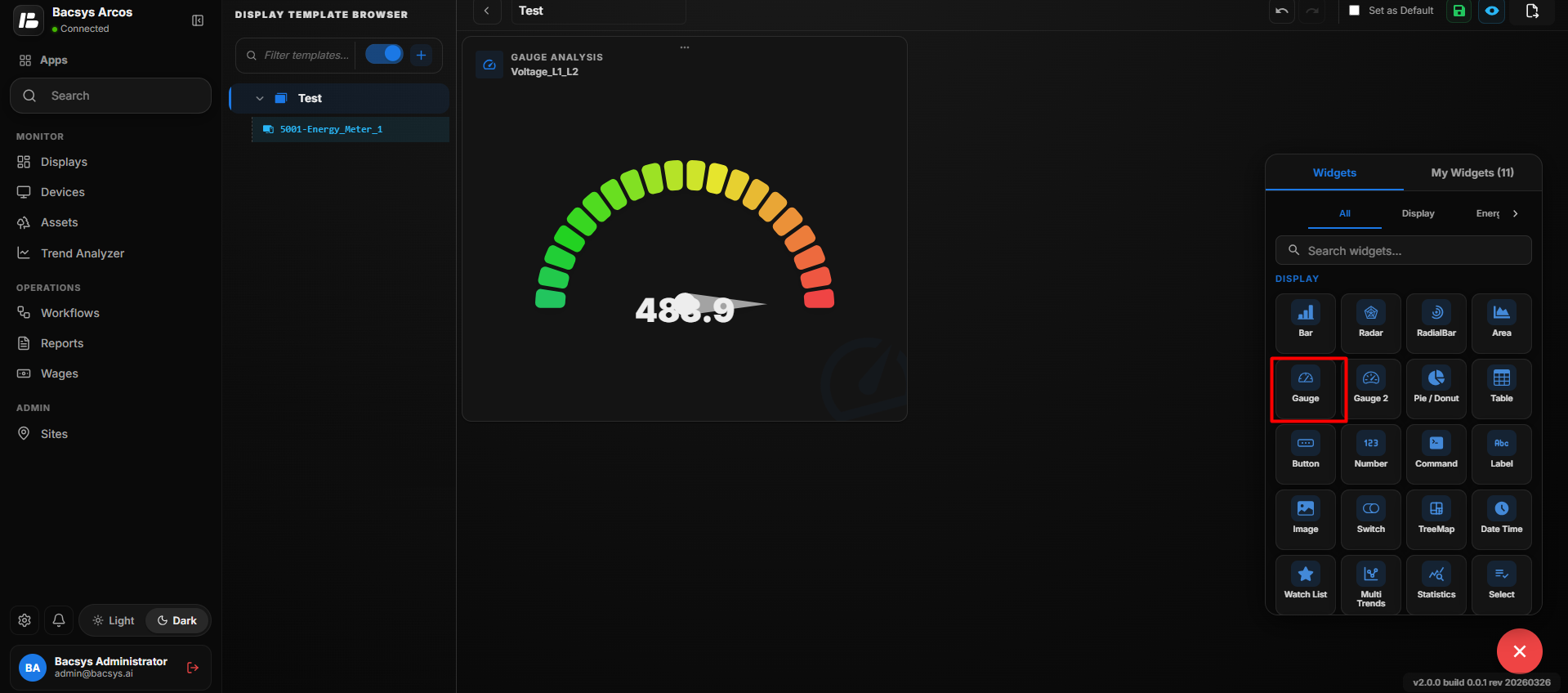
Configure Gauge Chart
- Enter the required Title.
- Enter the required point name under Point to be Mapped.
- Enter the required Poll Frequency (Seconds).
- Enable or disable Show Background as required.
- Enable Hide Header if the widget title should not be displayed.
- Click Save.
- The configured Gauge Chart displays the current value of the mapped point.
Add and Configure the Gauge 2 Widget
The Gauge 2 Widget is used to display the value of a selected point using a gauge visualization with configurable minimum, maximum, and critical value ranges. Users can also customize the colors associated with these value ranges.
Add the Gauge 2 Widget
- Click the + icon.
- Drag and drop the Gauge 2 Widget onto the display.
- Select the Gauge 2 Widget to view the available widget actions:
- Zoom In
- Zoom Out
- Settings
- Remove Widget
- Click Settings to open the Configure Data panel.
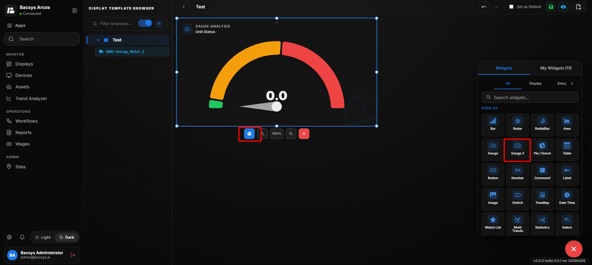
Gauge 2 Settings
| Option | Description |
|---|---|
| Title | Enter a title for the Gauge 2 Chart. The title identifies the value displayed by the gauge. |
| Point to be Mapped | Enter the exact point name whose value should be displayed in the Gauge 2 Chart. |
| Font Size | Specifies the font size used to display the value or information in the Gauge 2 Chart. |
| Poll Frequency (Seconds) | Specifies how frequently the Gauge 2 Chart retrieves or refreshes the value of the mapped point. |
| Min Value | Defines the minimum value of the Gauge 2 range. |
| Min Range Color | Selects the color used to represent the minimum value range of the gauge. |
| Max Value | Defines the maximum value of the Gauge 2 range. |
| Max Range Color | Selects the color used to represent the maximum value range of the gauge. |
| Critical Value | Defines the value at which the Gauge 2 Chart indicates a critical condition. |
| Critical Range Color | Selects the color used to represent the critical value range of the gauge. |
| Recent Colors | Provides quick access to recently selected colors for the gauge ranges. |
| Show Background | Use the toggle button to show or hide the widget background. |
| Hide Header | Use the toggle button to show or hide the widget header, including the title. |
| Close | Closes the configuration panel without saving the changes. |
| Save | Saves the configured Gauge 2 Chart settings. |
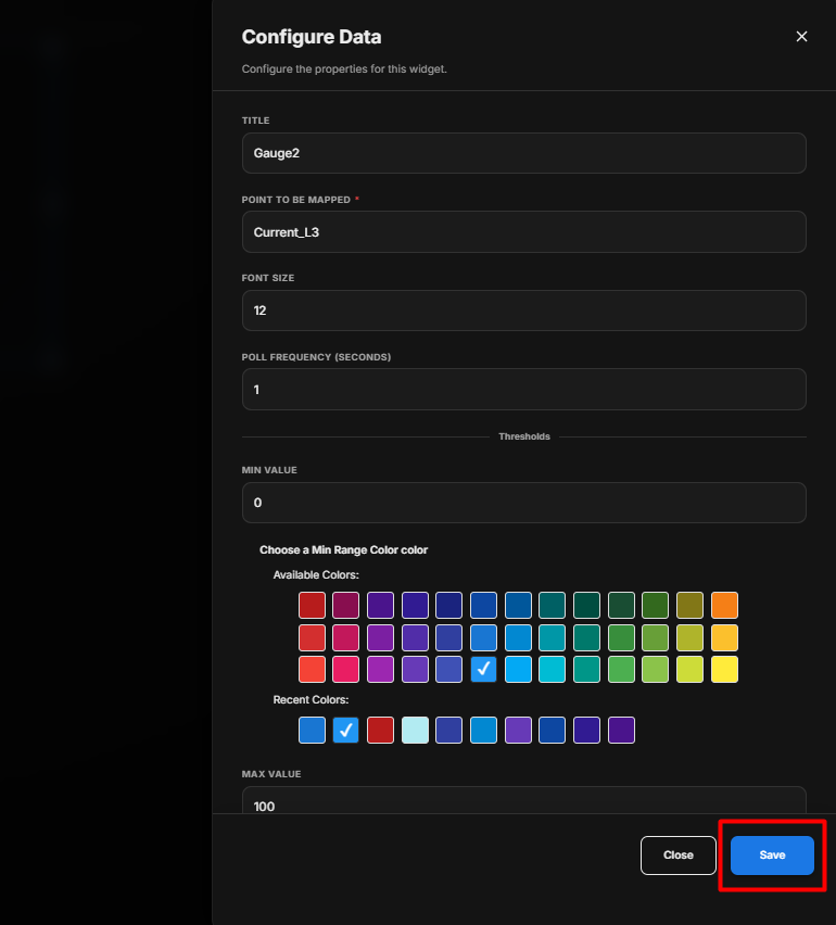
Save the Configuration
After clicking Save, the Gauge 2 Widget is updated on the display and displays the selected point value according to the configured settings.
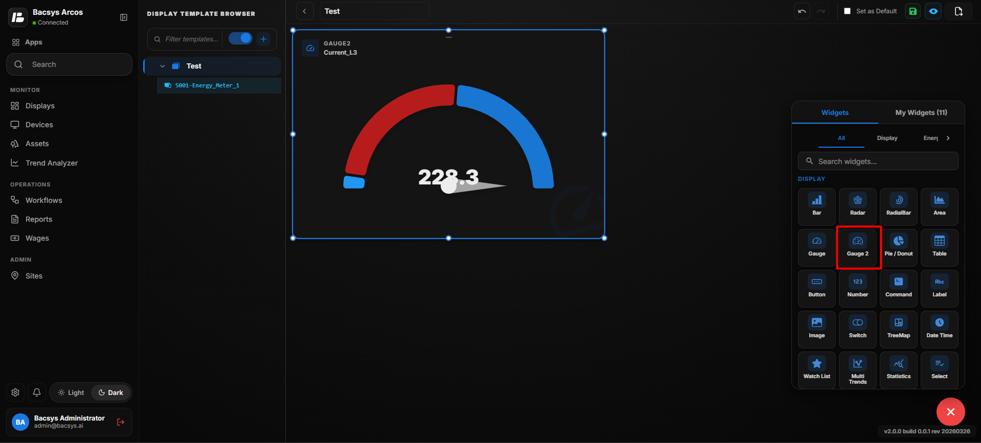
Configure the Gauge 2 Widget
- Enter the required Title.
- Enter an optional Subtitle.
- Under Select Point, click Browse Hierarchy.
- Navigate through Network → Device → Point.
- Select the required point.
- Set the required Poll Frequency (Seconds).
- Enter the required Min Value.
- Select a color for the Min Value.
- Enter the required Max Value.
- Select a color for the Max Value.
- Enter the required Critical Value.
- Select a color for the Critical Value.
- Configure the Show Background toggle according to your requirement.
- Configure the Hide Header toggle according to your requirement.
- Review all the configured settings.
- Click Save.
Add and Configure the Pie/Donut Chart Widget
The Pie/Donut Chart Widget is used to display selected point values as sections of a circular chart. It helps users compare the relative values of multiple points in a simple visual format. The widget can be configured as either a Pie Chart or a Donut Chart.
Add the Pie/Donut Chart Widget
- Click the + icon.
- Drag and drop the Pie/Donut Chart Widget onto the display.
- Select the widget to view the available widget actions:
- Zoom In
- Zoom Out
- Settings
- Remove Widget
- Click Settings to open the Configure Data panel.
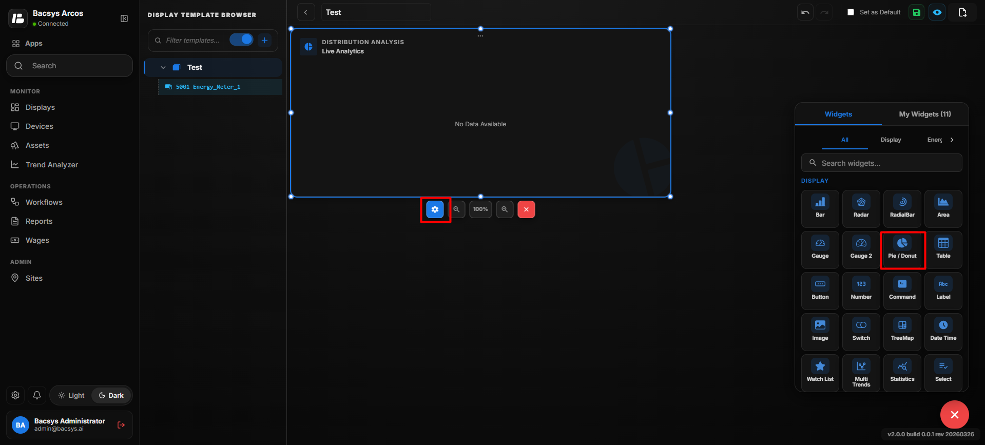
Pie/Donut Chart Settings
| Option | Description |
|---|---|
| Title | Enter a title for the Pie/Donut Chart. The title identifies the information displayed by the chart. |
| Number of Rows | Specifies the number of point values to be displayed in the Pie/Donut Chart. |
| Point to be Mapped for Row | Enter the point name to be mapped to each row. The values from the mapped points are used to generate the chart. |
| Poll Frequency (Seconds) | Specifies how frequently the widget retrieves or refreshes the values of the mapped points. |
| Represent as Donut Chart | Use the toggle button to display the visualization as a Donut Chart instead of a Pie Chart. |
| Show Background | Use the toggle button to show or hide the widget background. |
| Hide Header | Use the toggle button to show or hide the widget header, including the title. |
| Close | Closes the configuration panel without saving the changes. |
| Save | Saves the configured Pie/Donut Chart settings. |
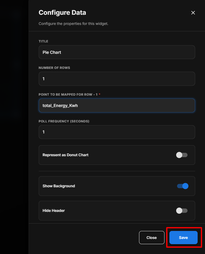
Save the Configuration
After clicking Save, the Pie/Donut Chart Widget is updated on the display and visualizes the values of the selected points as a pie chart or donut chart according to the configuration.
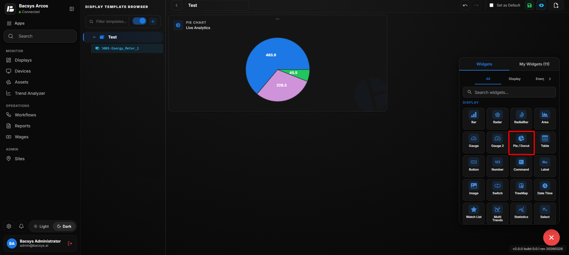
Configure Pie / Donut Chart
- Enter the required Title.
- Enter the required Number of Rows.
- Enter the point name under Point to be Mapped for Row.
- If multiple rows are configured, enter the corresponding point name for each row.
- Set the required Poll Frequency (Seconds).
- Enable Represent as Donut Chart to display the chart as a Donut Chart, or leave it disabled to display a Pie Chart.
- Enable or disable Show Background as required.
- Enable Hide Header if the widget title should not be displayed.
- Click Save.
- The configured Pie/Donut Chart displays the values of the mapped points.
Note: By default, the widget is displayed as a Pie Chart. Enable Represent as Donut Chart to display it as a Donut Chart.
Add and Configure the Table Widget
The Table Widget is used to display selected point information in a tabular format. It allows users to view point values in rows and columns and customize how the table is displayed.
Add the Table Widget
- Click the + icon.
- Drag and drop the Table Widget onto the display.
- Select the Table Widget to view the available widget actions:
- Zoom In
- Zoom Out
- Settings
- Remove Widget
- Click Settings to open the Configure Data panel.
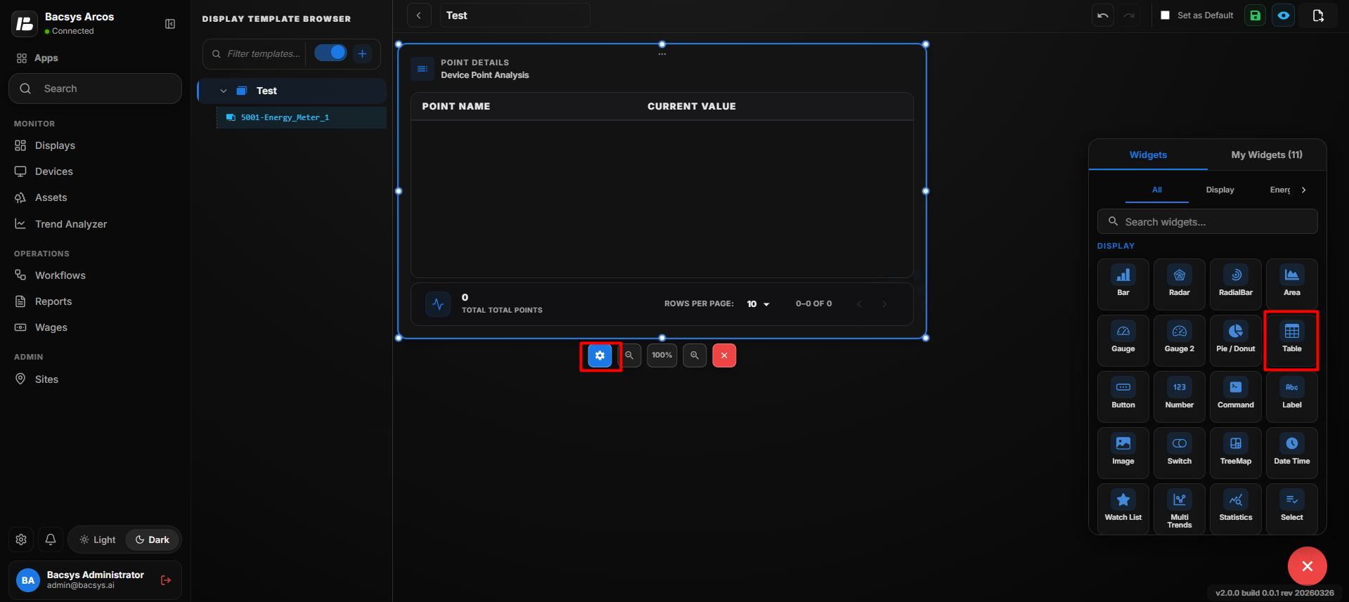
Table Widget Settings
| Option | Description |
|---|---|
| Title | Enter a title for the Table Widget. The title identifies the information displayed in the table. |
| Number of Rows | Specifies the number of rows to be displayed in the Table Widget. |
| Point to be Mapped for Row | Enter the point name to be mapped to each row. The value of the mapped point is displayed in the corresponding row. |
| Enable Write Points Field | Use the toggle button to enable or disable writing or modifying point values directly from the Table Widget. |
| Show Background | Use the toggle button to show or hide the widget background. |
| Hide Header | Use the toggle button to show or hide the widget header, including the title. |
| Close | Closes the configuration panel without saving the changes. |
| Save | Saves the configured Table Widget settings. |
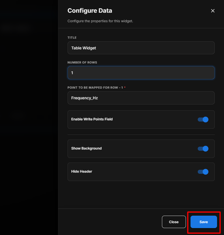
Save the Configuration
After clicking Save, the Table Widget is updated on the display and shows the selected point values according to the configured settings.
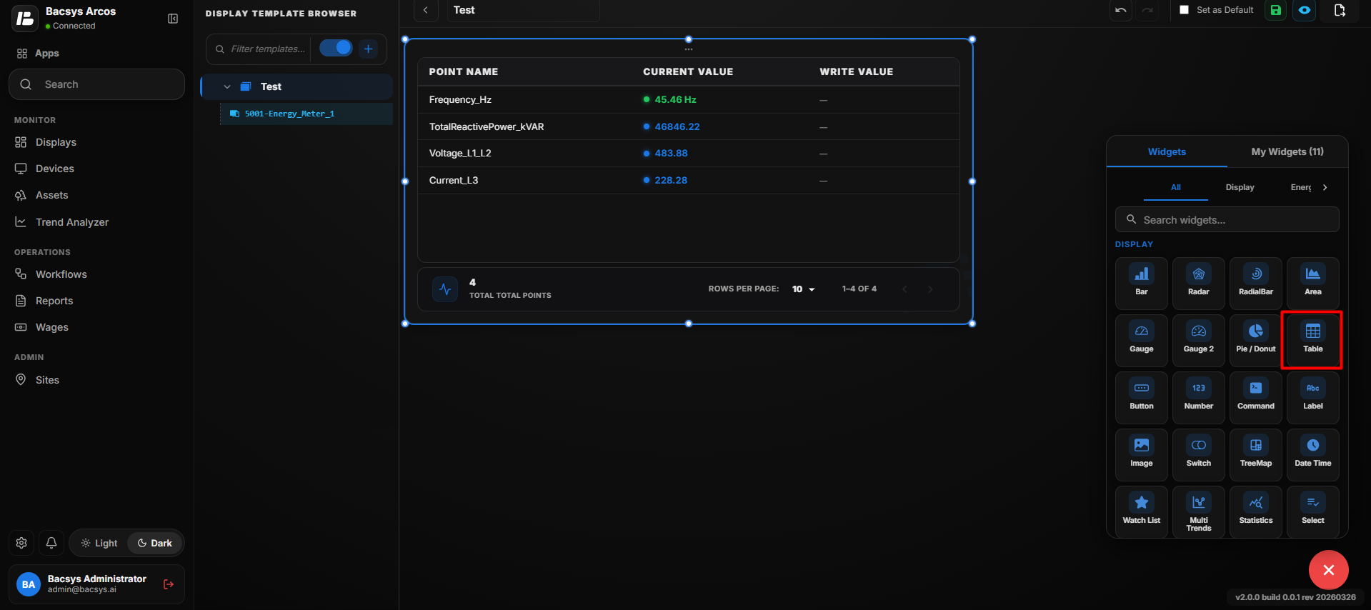
Configure the Table Widget
- Enter the required Title.
- Enter the required Number of Rows.
- Enter the point name under Point to be Mapped for Row.
- If multiple rows are configured, enter the corresponding point name for each row.
- Enable Enable Write Points Field if users need to modify point values from the table.
- Enable or disable Show Background as required.
- Enable Hide Header if the widget title should not be displayed.
- Click Save.
- The configured Table Widget displays the mapped point values in the table.
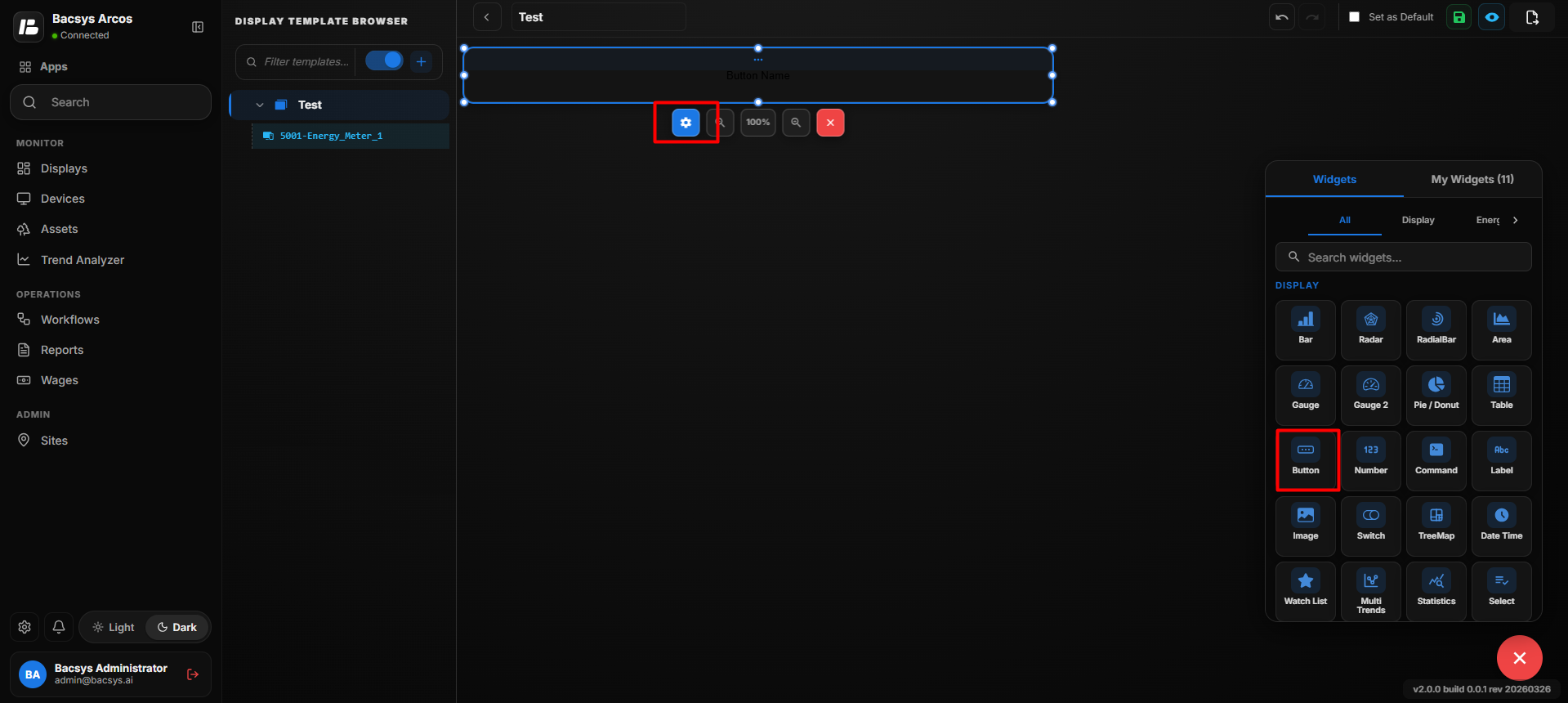
Add and Configure the Button Widget
The Button Widget is used to create an interactive button on the display. Users can configure the button text, font size, link, colors, associated display, and appearance settings. The button can also be configured to open a linked page in a new browser tab.
Add the Button Widget
- Click the + icon.
- Drag and drop the Button Widget onto the display.
- Select the Button Widget to view the available widget actions:
- Zoom In
- Zoom Out
- Settings
- Remove Widget
- Click Settings to open the Configure Data panel.
Button Widget Settings
| Option | Description |
|---|---|
| Button/Link Title | Enter the text that should be displayed on the Button Widget. |
| Font Size | Specifies the font size of the button title. |
| URL Link | Enter the URL that should be opened when the button is configured to use a URL link. |
| Display Selection | Select the display that should be opened when the button is configured for display navigation. Use the search field to find the required display. |
| Leading Icon | Upload or select an icon to be displayed before the button title. The icon can be added using Drag & Drop or Browse Icon. |
| Button Color | Select the color of the Button Widget from the available colors. |
| Recent Colors | Provides quick access to previously selected button colors. |
| Show Background | Use the toggle button to show or hide the widget background. |
| Hide Header | Use the toggle button to show or hide the widget header. |
| Close | Closes the configuration panel without saving the changes. |
| Save | Saves the configured Button Widget settings. |
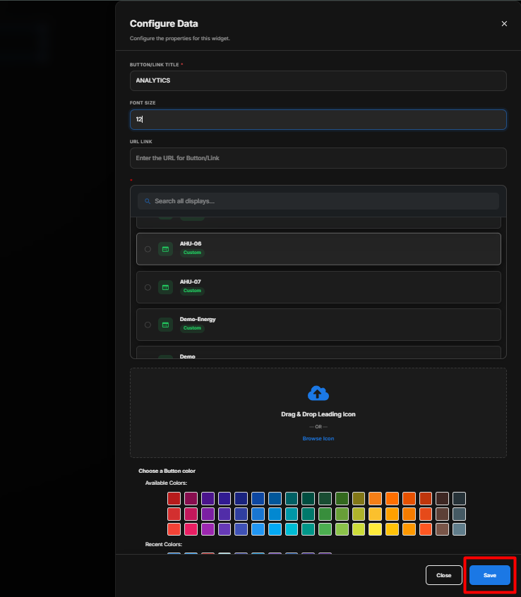
Save the Configuration
After clicking Save, the Button Widget is updated on the display with the configured text, colors, formatting, associated display or URL, and appearance settings.
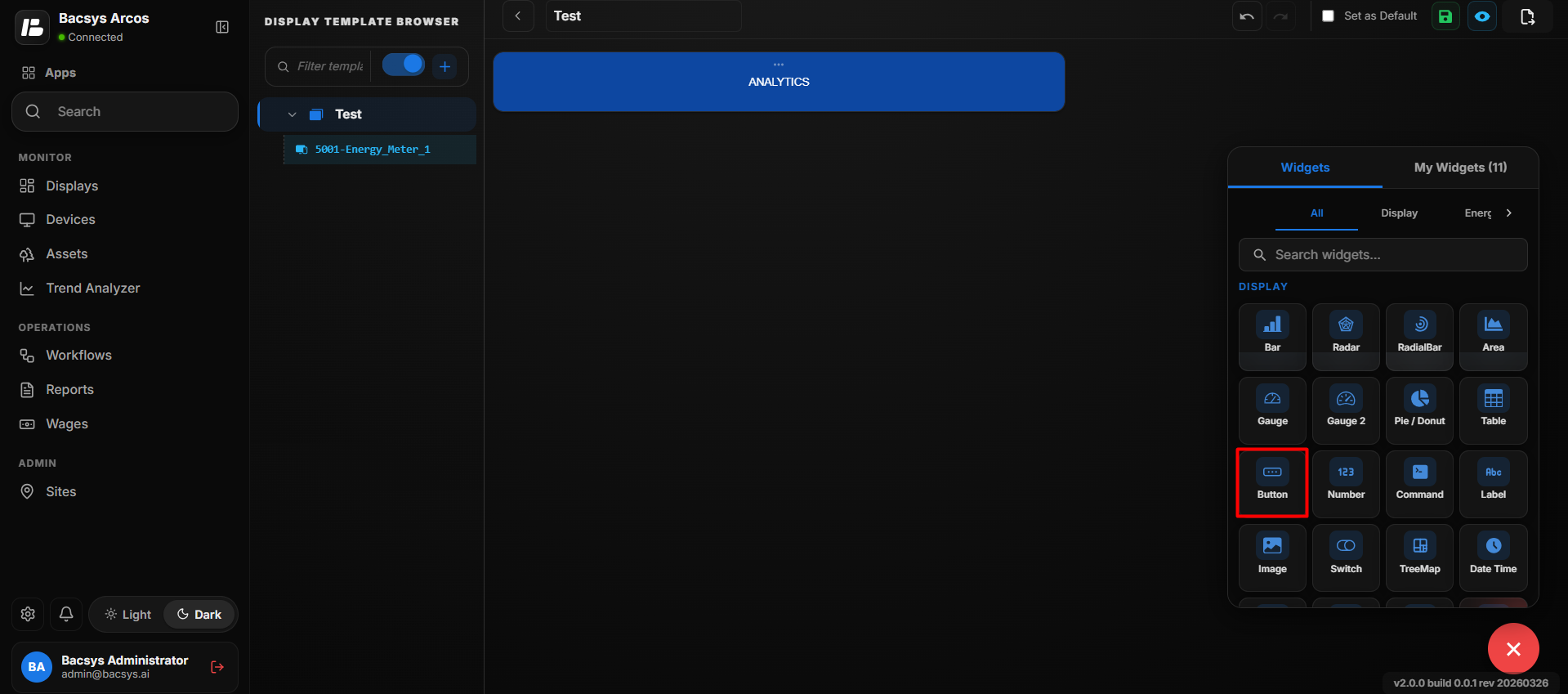
Configure Button Widget
- Enter the required Button/Link Title.
- Set the required Font Size.
- Enter the URL Link if the button should open an external URL.
- Select the required Display from the display list if the button should navigate to another display.
- Add a Leading Icon using Drag & Drop or Browse Icon, if required.
- Select the required Button Color.
- Enable or disable Show Background as required.
- Enable Hide Header if the widget header should not be displayed.
- Click Save.
- The configured Button Widget is displayed on the display and performs the configured navigation or link action when selected.
Button Navigation
When a display is selected under Select Display, clicking the configured button navigates directly to that display.
For example, if the Floor 1 display is selected for a button named Floor 1, clicking the button takes the user directly to the Floor 1 display.
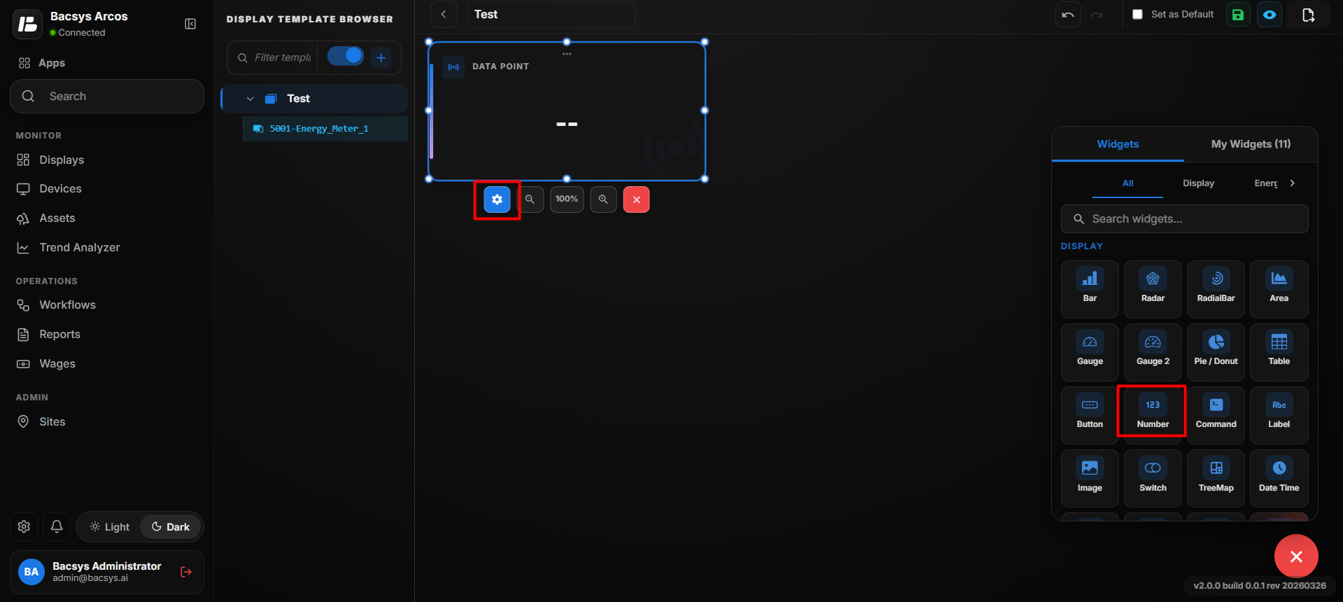
Add and Configure the Number Widget
The Number Widget is used to display the current value of a selected point as a number on the display. It provides a simple way to monitor a specific point value and can be configured to control how the value is displayed.
Add the Number Widget
- Click the + icon.
- Drag and drop the Number Widget onto the display.
- Select the Number Widget to view the available widget actions:
- Zoom In
- Zoom Out
- Settings
- Remove Widget
- Click Settings to open the Configure Data panel.
Number Widget Settings
| Option | Description |
|---|---|
| Title | Enter a title for the Number Widget. The title identifies the information displayed by the widget. |
| Point to be Mapped | Enter the exact point name whose current value should be displayed in the Number Widget. |
| Hide Decimal Value | Enable the toggle to hide the decimal portion of the displayed value. Disable it to display decimal values. |
| Font Size | Specifies the font size of the value displayed in the Number Widget. |
| Show Status | Enable the toggle to display the status of the mapped point along with its value. |
| Bold | Enable the toggle to display the point value in bold text. |
| Background Color | Select the background color of the Number Widget from the available colors. |
| Recent Colors | Provides quick access to previously selected background colors. |
| Font Color | Select the font color used to display the point value. |
| Recent Colors | Provides quick access to previously selected font colors. |
| Show Background | Use the toggle button to show or hide the widget background. |
| Hide Header | Use the toggle button to show or hide the widget header, including the title. |
| Close | Closes the configuration panel without saving the changes. |
| Save | Saves the configured Number Widget settings. |
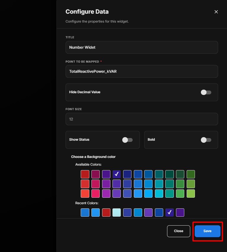
Save the Configuration
After clicking Save, the Number Widget is updated on the display and shows the selected point's current value according to the configured settings.
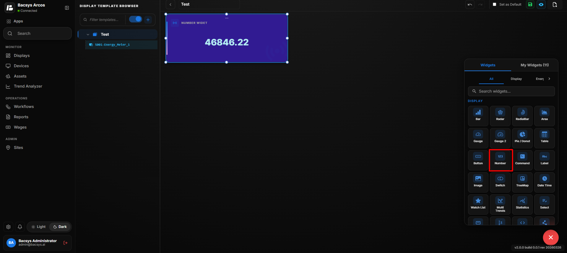
Configure the Number Widget
- Enter the required Title.
- Enter the required point name under Point to be Mapped.
- Enable Hide Decimal Value if decimal values should not be displayed.
- Set the required Font Size.
- Enable Show Status if the point status should be displayed.
- Enable Bold if the value should be displayed in bold text.
- Select the required Background Color.
- Select the required Font Color.
- Enable or disable Show Background as required.
- Enable Hide Header if the widget title should not be displayed.
- Click Save.
- The configured Number Widget displays the current value of the mapped point.
Add and Configure the Command Widget
The Command Widget is used to display a selected point and provide a command or control interface for that point. It allows users to select a point, customize the font size, and control how the widget is displayed.
Add the Command Widget
- Click the + icon.
- Drag and drop the Command Widget onto the display.
- Select the Command Widget to view the available widget actions:
- Zoom In
- Zoom Out
- Settings
- Remove Widget
- Click Settings to open the Configure Data panel.
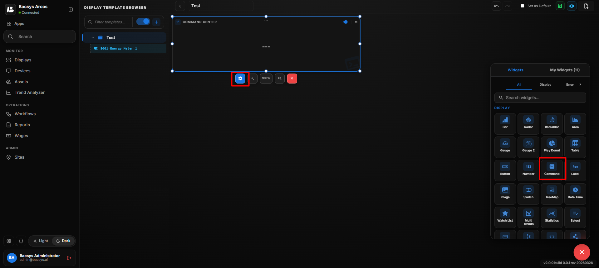
Command Widget Settings
| Option | Description |
|---|---|
| Title | Enter a title for the Command Widget. The title identifies the command or point displayed by the widget. |
| Point to be Mapped | Enter the exact point name that the Command Widget will use to send or execute the command. |
| Font Size | Specifies the font size used to display the command information in the widget. |
| Hide Auto Manual | Enable the toggle to hide the Auto/Manual control from the Command Widget. Disable it to display the Auto/Manual option. |
| Show Background | Use the toggle button to show or hide the widget background. |
| Hide Header | Use the toggle button to show or hide the widget header, including the title. |
| Close | Closes the configuration panel without saving the changes. |
| Save | Saves the configured Command Widget settings. |
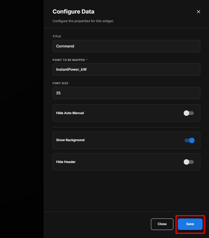
Save the Configuration
After clicking Save, the Command Widget is updated on the display with the selected point and configured display settings.
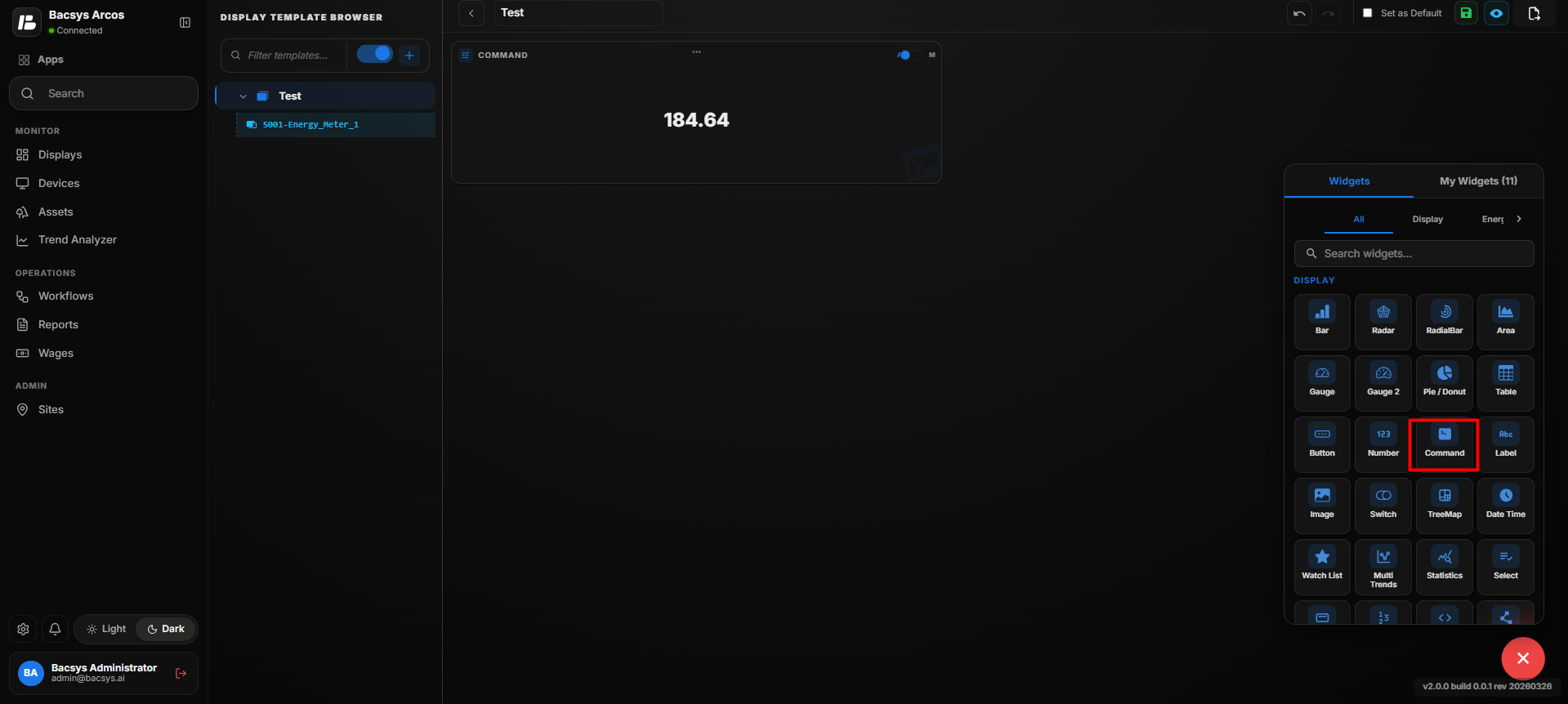
Configure the Command Widget
- Enter the required Title.
- Enter the required point name under Point to be Mapped.
- Set the required Font Size.
- Enable Hide Auto Manual if the Auto/Manual control should not be displayed.
- Enable or disable Show Background as required.
- Enable Hide Header if the widget title should not be displayed.
- Click Save.
- The configured Command Widget is displayed and can be used to operate the mapped point.
Add and Configure the Label Widget
The Label Widget is used to display text labels on the display. It allows users to customize the label text, font size, colors, and text formatting to match the display requirements.
Add the Label Widget
- Click the + icon.
- Drag and drop the Label Widget onto the display.
- Select the Label Widget to view the available widget actions:
- Zoom In
- Zoom Out
- Settings
- Remove Widget
- Click Settings to open the Configure Data panel.
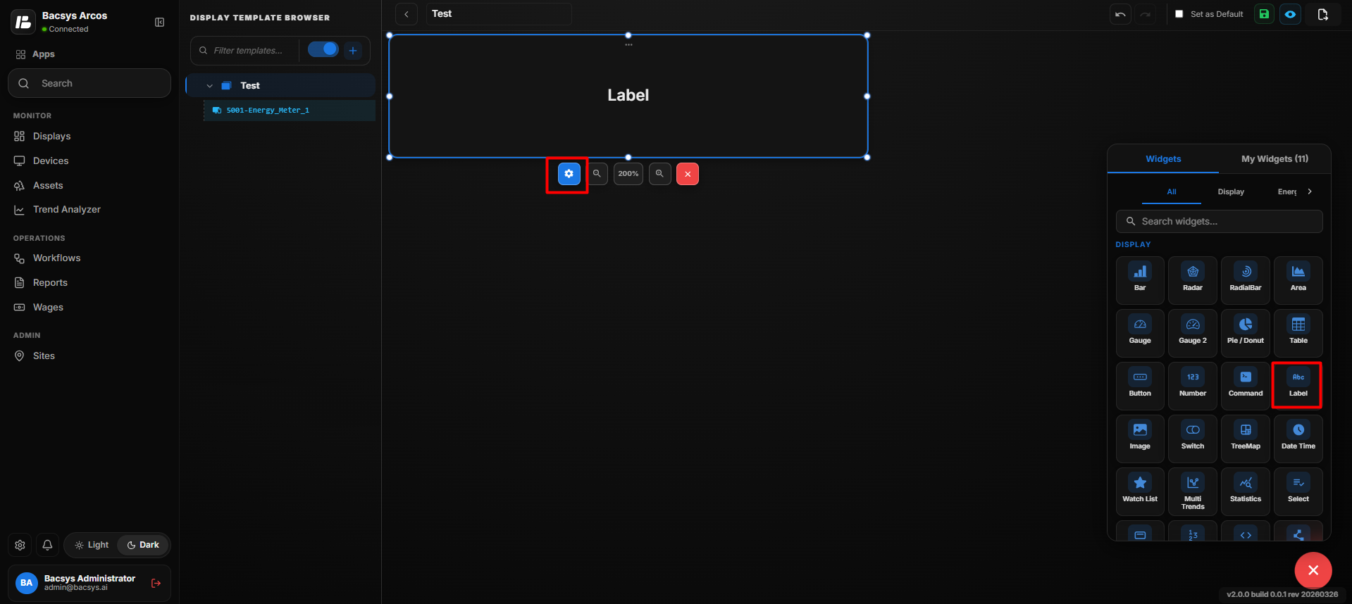
Label Widget Settings
| Option | Description |
|---|---|
| Label | Enter the text that should be displayed in the Label Widget. |
| Show Folder/Device Name | Enable the toggle to display the associated folder or device name along with the label. |
| Font Size | Specifies the font size of the label text. |
| Show Status | Enable the toggle to display the status information associated with the label. |
| Bold | Enable the toggle to display the label text in bold. |
| Background Color | Select the background color of the Label Widget from the available colors. |
| Recent Colors | Provides quick access to previously selected background colors. |
| Font Color | Select the color of the label text from the available colors. |
| Recent Colors | Provides quick access to previously selected font colors. |
| Show Background | Use the toggle button to show or hide the widget background. |
| Hide Header | Use the toggle button to show or hide the widget header. |
| Close | Closes the configuration panel without saving the changes. |
| Save | Saves the configured Label Widget settings. |
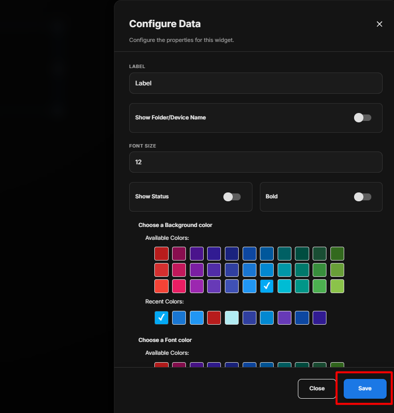
Save the Configuration
After clicking Save, the Label Widget is updated on the display with the selected point and configured display settings.
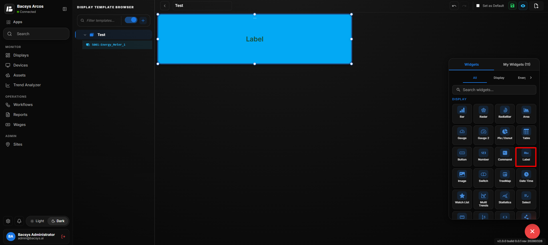
Configure the Label Widget
- Enter the required Label text.
- Enable Show Folder/Device Name if the associated folder or device name should be displayed.
- Set the required Font Size.
- Enable Show Status if the point or device status should be displayed.
- Enable Bold if the label text should appear in bold.
- Select the required Background Color.
- Select the required Font Color.
- Enable or disable Show Background as required.
- Enable Hide Header if the widget header should not be displayed.
- Click Save.
- The configured Label Widget is displayed on the display with the selected text, styling, and status information.
Add and Configure the Image Widget
The Image Widget is used to display an image on the display. Users can upload an image, adjust its appearance, associate it with another display page, and configure background and header settings.
Add the Image Widget
- Click the + icon.
- Drag and drop the Image Widget onto the display.
- Select the Image Widget to view the available widget actions:
- Zoom In
- Zoom Out
- Settings
- Remove Widget
- Click Settings to open the Configure Data panel.
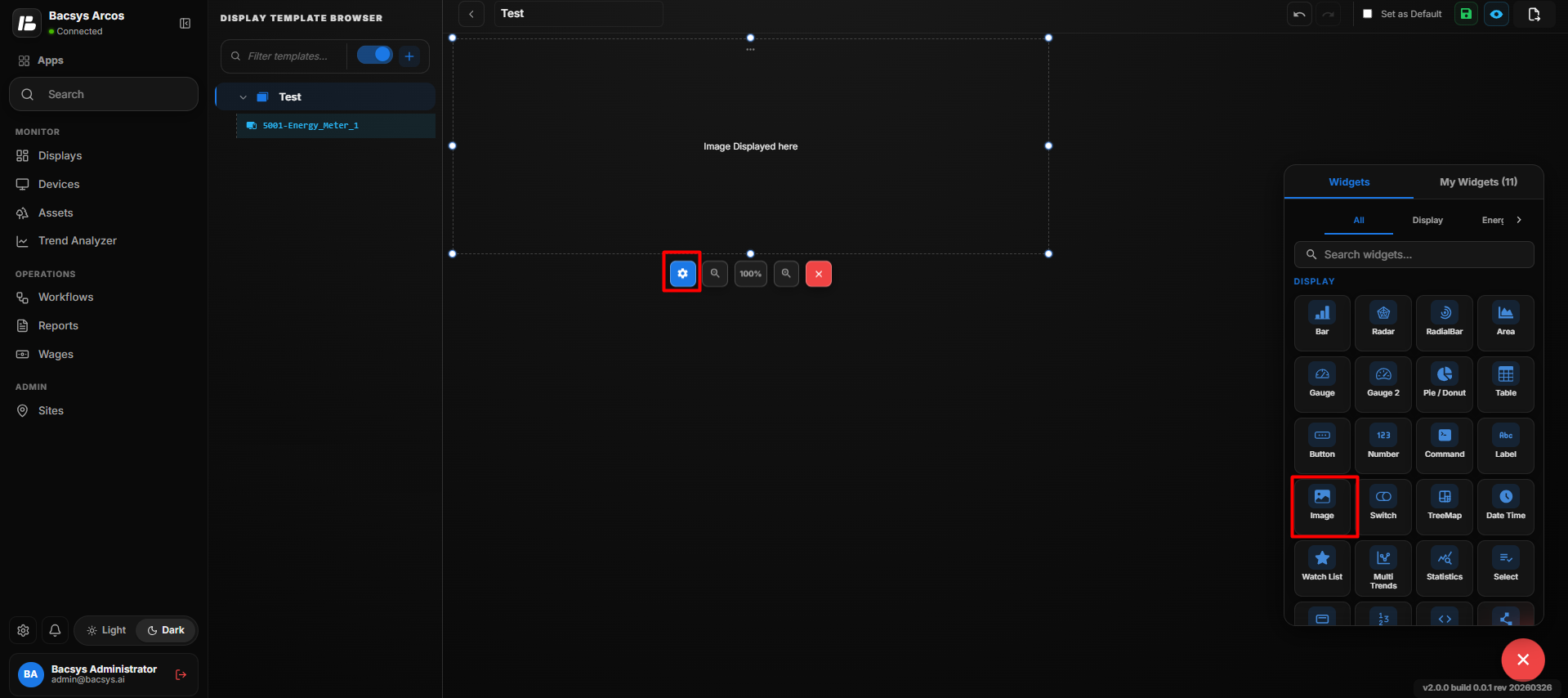
Image Widget Settings
| Option | Description |
|---|---|
| Is Floor Layout | Enable the toggle when the uploaded image is intended to be used as a floor layout. |
| Auto Color Adjust (Invert in Dark Mode) | Automatically adjusts the image appearance for the display theme. When enabled, the image is inverted in dark mode to improve visibility. |
| Upload Image | Upload an image using Drag & Drop Image or Browse Files. |
| Width (in px) | Defines the width of the displayed image in pixels. |
| Height (in px) | Defines the height of the displayed image in pixels. |
| Select Display Page | Select the display page associated with the image. Use the search field to find the required display and select it from the list. |
| Show Background | Use the toggle button to show or hide the widget background. |
| Hide Header | Use the toggle button to show or hide the widget header. |
| Close | Closes the configuration panel without saving the changes. |
| Save | Saves the configured Image Widget settings. |
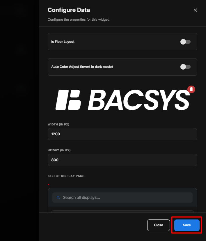
Save the Configuration
After clicking Save, the Image Widget is updated on the display with the selected image and configured display settings.
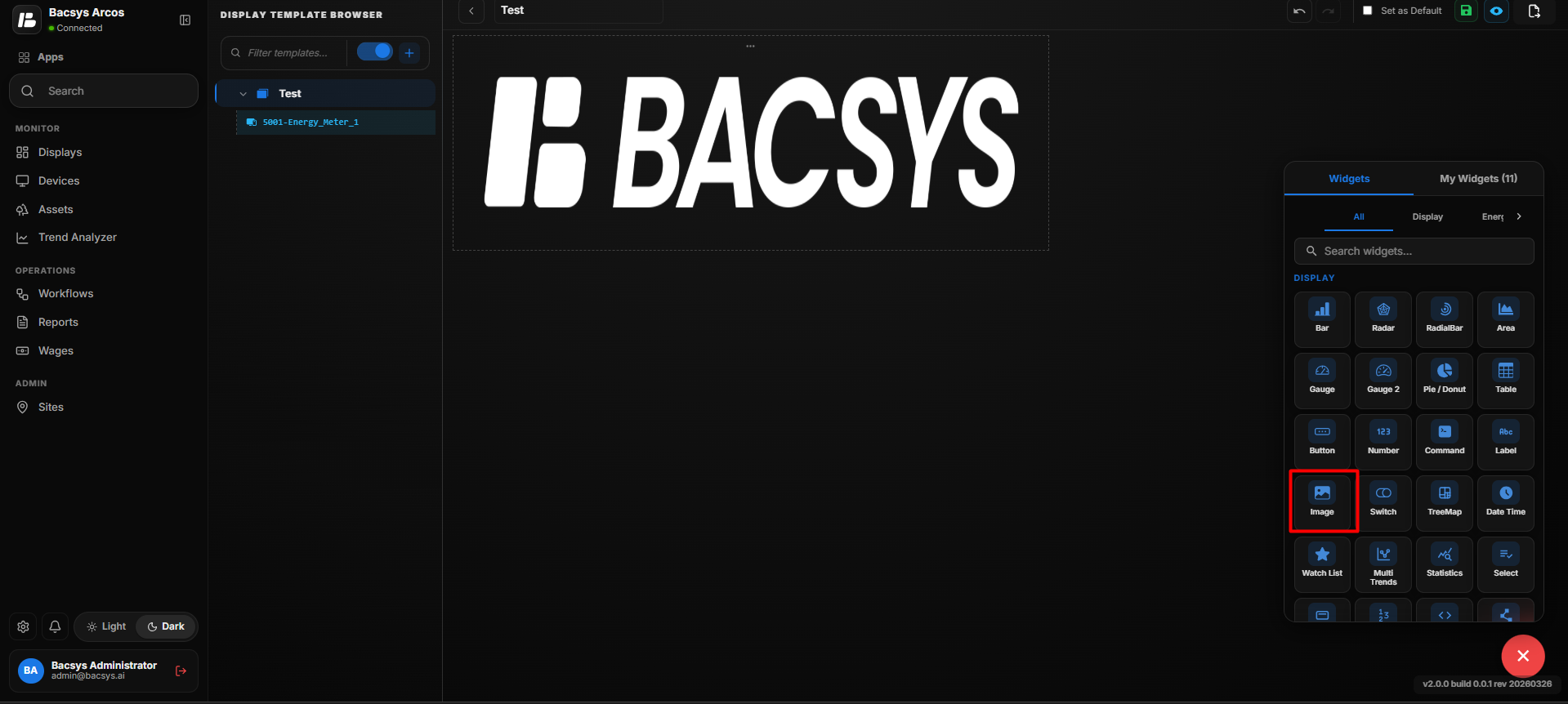
Configure the Image Widget
- Enable Is Floor Layout if the image will be used as a floor layout.
- Enable Auto Color Adjust if the image should automatically adjust for dark mode.
- Upload the required image using Drag & Drop Image or Browse Files.
- Enter the required Width and Height in pixels.
- Select the required Display Page from the available displays.
- Enable or disable Show Background as required.
- Enable Hide Header if the widget header should not be displayed.
- Click Save.
- The configured Image Widget is displayed with the selected image and settings.
Add and Configure the Switch Widget
The Switch Widget is used to display and control a point with a True/False or On/Off type of value. It allows users to select a point, configure the values displayed for the True and False states, and optionally enable write functionality to control the selected point.
Add the Switch Widget
- Click the + icon.
- Drag and drop the Switch Widget onto the display.
- Select the Switch Widget to view the available widget actions:
- Zoom In
- Zoom Out
- Settings
- Remove Widget
- Click Settings to open the Configure Data panel.
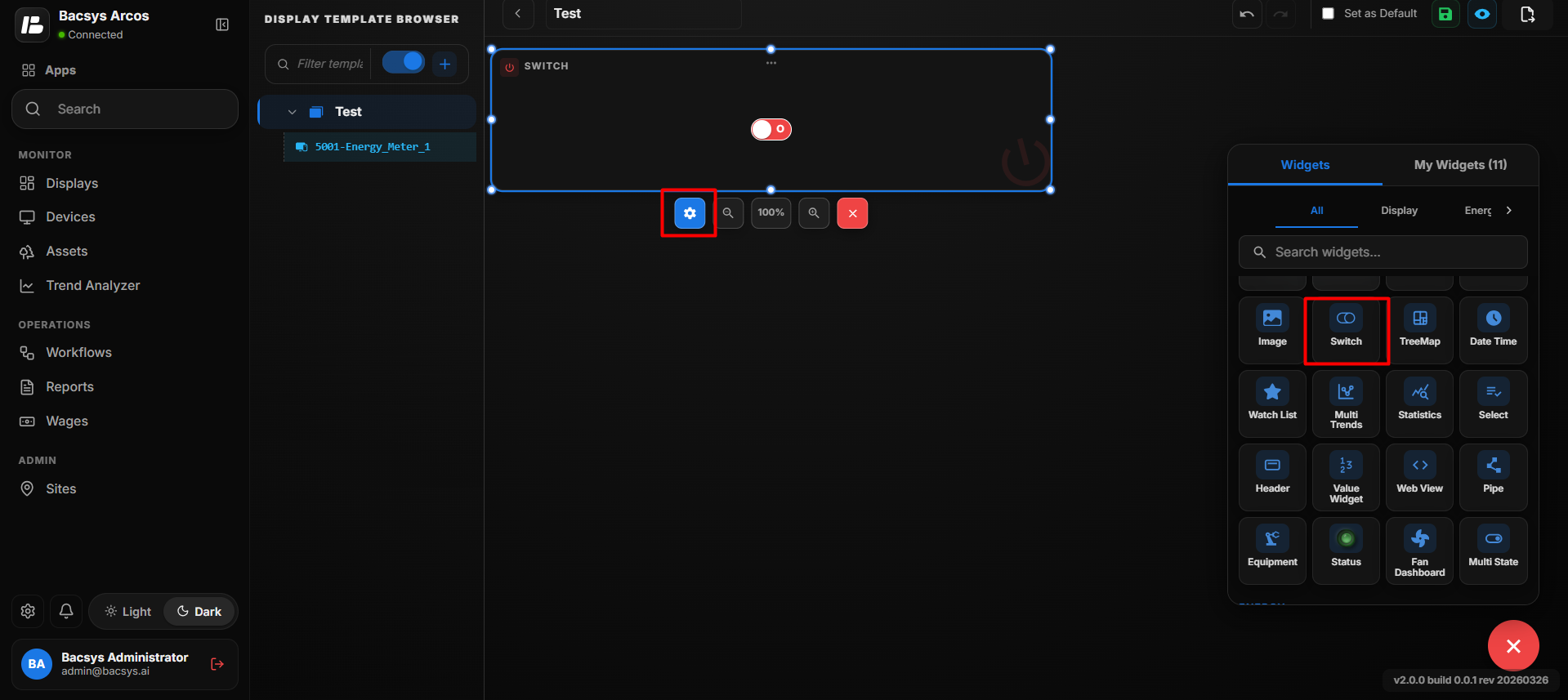
Switch Widget Settings
| Option | Description |
|---|---|
| Title | Enter a title for the Switch Widget. The title identifies the control displayed by the widget. |
| Point to be Mapped | Enter the exact point name that should be monitored or controlled by the Switch Widget. |
| True Value | Enter the value that represents the True/ON state of the mapped point. |
| False Value | Enter the value that represents the False/OFF state of the mapped point. |
| Enable Write | Enable the toggle to allow users to write or change the value of the mapped point using the Switch Widget. |
| Show Background | Use the toggle button to show or hide the widget background. |
| Hide Header | Use the toggle button to show or hide the widget header, including the title. |
| Close | Closes the configuration panel without saving the changes. |
| Save | Saves the configured Switch Widget settings. |
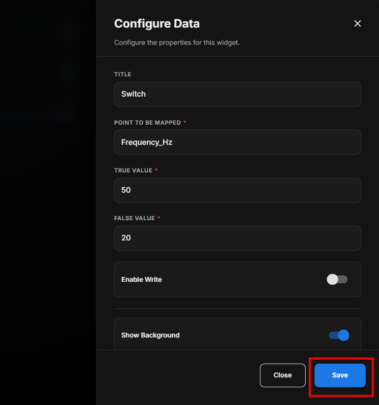
Configure the Switch Widget
- Enter the required Title.
- Enter the required point name under Point to be Mapped.
- Enter the value representing the True/ON state in True Value.
- Enter the value representing the False/OFF state in False Value.
- Enable Enable Write if users need to control the mapped point using the switch.
- Enable or disable Show Background as required.
- Enable Hide Header if the widget title should not be displayed.
- Click Save.
- The configured Switch Widget displays the current state of the mapped point and, when write is enabled, allows the user to switch between the configured True and False values.
True and False Values
The Switch Widget uses the configured values to represent the two states of the selected point.
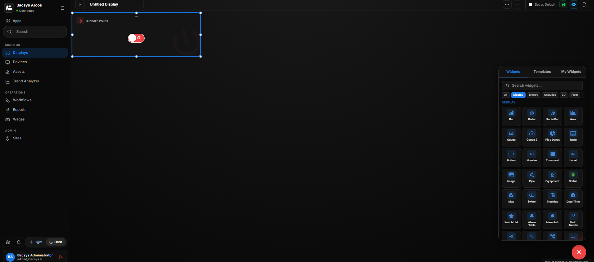
| State | Configuration |
|---|---|
| True / On | Uses the value configured under True Value. |
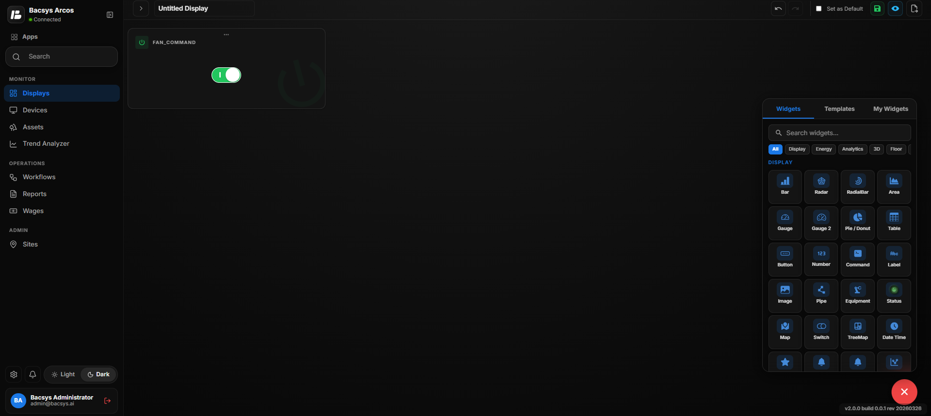
| False / Off | Uses the value configured under False Value. |
Enable Write
When Enable Write is enabled, the Switch Widget can be used to change the value of the selected point.
When Enable Write is disabled, the widget can be used to display the point value without allowing the user to write a new value.
Save the Configuration
After clicking Save, the Switch Widget is updated on the display with the selected point, configured True/False values, polling frequency, and write settings.
Add and Configure the Tree Map Widget
The Tree Map Widget is used to represent hierarchical data using nested rectangles. It allows users to select multiple points and view their data in a compact visual format.
Add the Tree Map Widget
- Click the + icon.
- Drag and drop the Tree Map Widget onto the display.
- Select the Tree Map Widget to view the available widget actions:
- Zoom In
- Zoom Out
- Settings
- Remove Widget
- Click Settings to open the Configure Data panel.
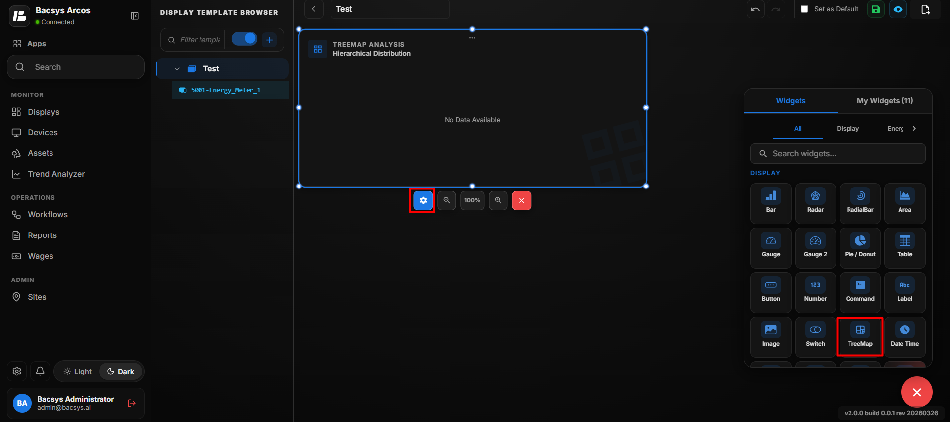
Tree Map Widget Settings
| Option | Description |
|---|---|
| Title | Enter a title for the Tree Map Widget. The title identifies the information displayed in the tree map. |
| Number of Rows | Specifies the number of point values to be displayed in the Tree Map Widget. |
| Point to be Mapped for Row | Enter the exact point name to be mapped to each row. The values of the mapped points are used to generate the tree map. |
| Show Background | Use the toggle button to show or hide the widget background. |
| Hide Header | Use the toggle button to show or hide the widget header, including the title. |
| Close | Closes the configuration panel without saving the changes. |
| Save | Saves the configured Tree Map Widget settings. |
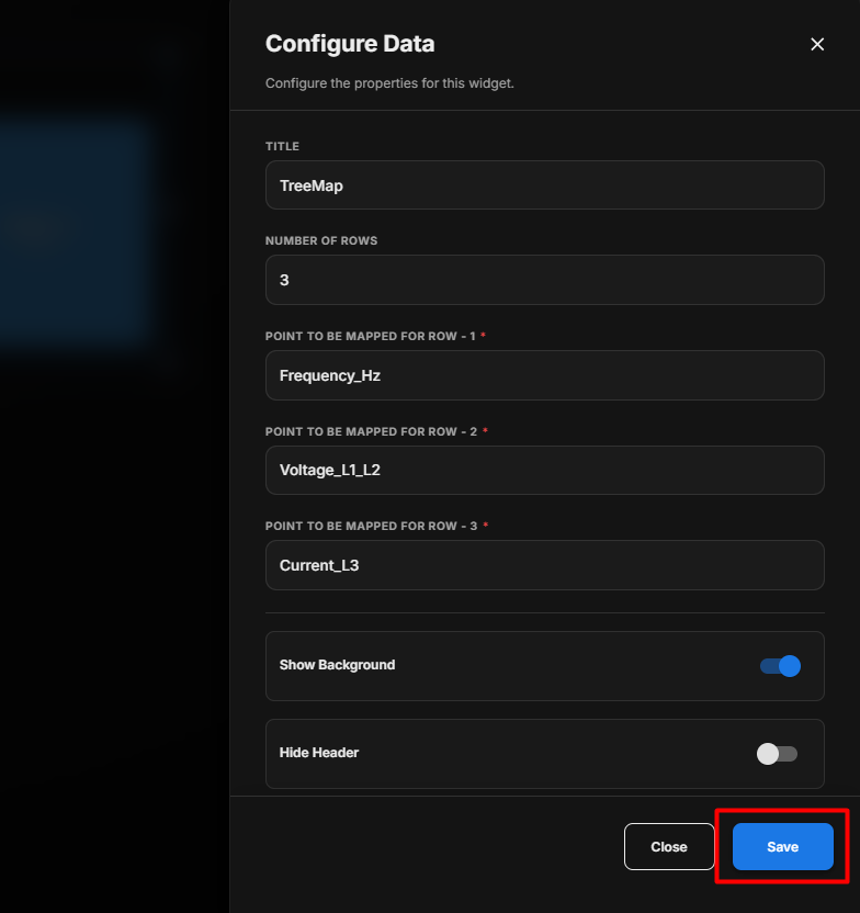
Save the Configuration
After clicking Save, the Tree Map Widget is updated on the display and represents the selected point data using nested rectangles.
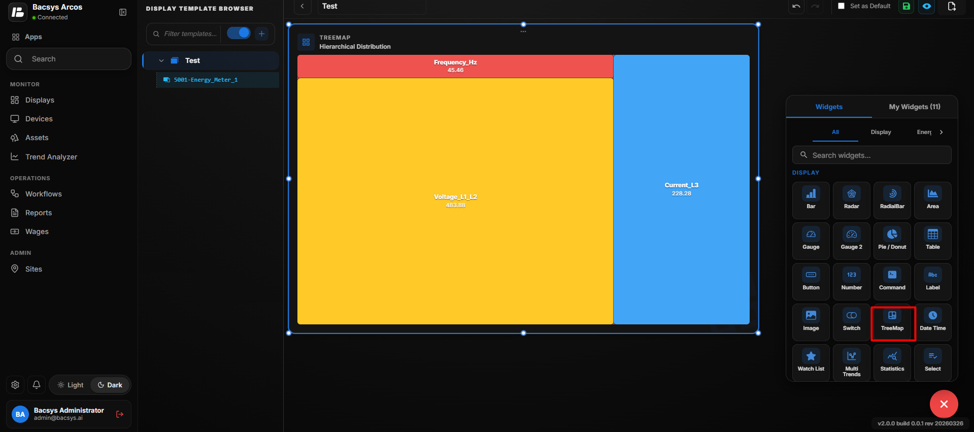
Configure the Tree Map Widget
- Enter the required Title.
- Enter the required Number of Rows.
- Enter the point name under Point to be Mapped for Row 1.
- Enter the corresponding point name for each additional row.
- Enable or disable Show Background as required.
- Enable Hide Header if the widget title should not be displayed.
- Click Save.
- The configured Tree Map Widget displays the mapped point values using different sized sections based on their values.
Note: The Tree Map Widget supports a maximum of 20 points.
Date Time Widget
The Date Time Widget displays the current date and time. When the widget is dragged and dropped onto the display, it automatically retrieves the date and time based on the system time of the device/browser where the display is running.
No additional configuration is required for the Date Time Widget.
Date Time Widget Behavior
| Feature | Description |
|---|---|
| Current Date | Displays the current date according to the system date. |
| Current Time | Displays the current time according to the system time. |
| System Time Zone | Uses the time zone configured on the system/browser running the display. |
| Automatic Update | The displayed time updates automatically without requiring manual refresh. |
| Configuration | No point mapping or additional configuration is required. |
How It Works
- Drag and drop the Date Time Widget onto the display.
- The widget is added to the display.
- The widget automatically reads the system date and time.
- The current date and time are displayed in the widget.
- The displayed time continues to update automatically according to the system clock.
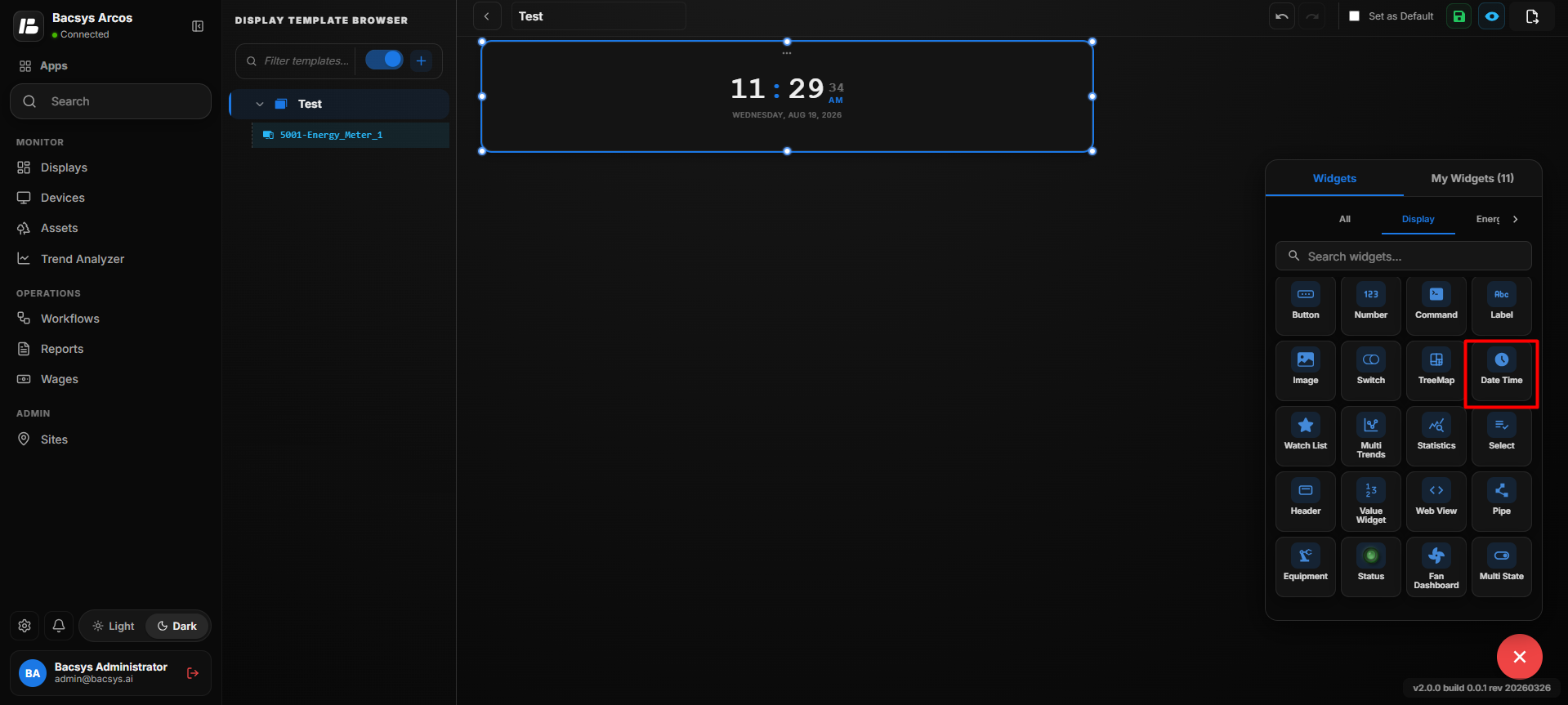
Note: The Date Time Widget does not retrieve data from a device point. It uses the date, time, and time zone available from the system/browser on which the display is running.
Add and Configure the Watch List Widget
The Watch List Widget displays a list of selected data points for quick monitoring. It allows users to view point information in one place and configure how frequently the data is refreshed.
Add the Watch List Widget
- Click the + icon.
- Drag and drop the Watch List Widget onto the display.
- Select the Watch List Widget to view the available widget actions:
- Zoom In
- Zoom Out
- Settings
- Remove Widget
- Click Settings to open the Configure Data panel.
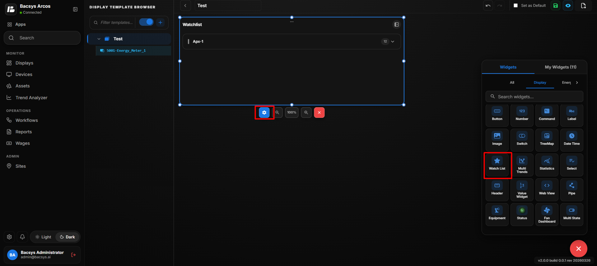
Configure the Watch List Widget
| Option | Description |
|---|---|
| Title | Enter a title for the Watch List Widget. The title is displayed at the top of the widget. |
| Point to Be Mapped | Enter or select the point that you want to monitor in the Watch List. The selected point's current value is displayed in the widget. |
| Show Background | Use the toggle button to show or hide the widget background. |
| Hide Header | Use the toggle button to show or hide the widget header, including the title. |
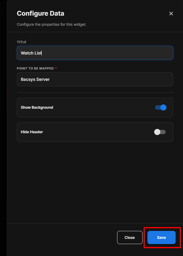
Save the Configuration
After clicking Save, the Watch List Widget is updated on the display with the configured title, polling frequency, background, and header settings.
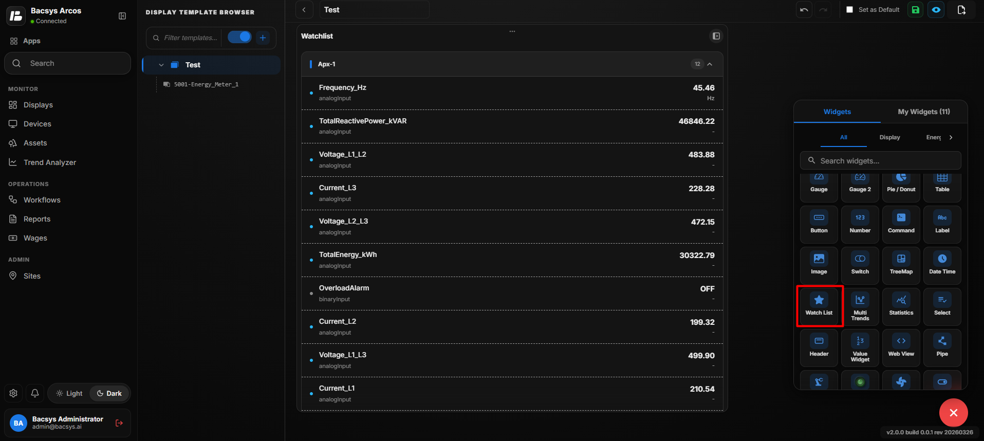
Configure the Watch List Widget
- Enter the required Title.
- Set the required Poll Frequency (Seconds).
- Configure Show Background according to your requirement.
- Configure Hide Header according to your requirement.
- Review the configured settings.
- Click Save.
Add and Configure the Multi Trends Widget
The Multi Trends Widget is used to display trend data for multiple points in a single widget. It allows users to select multiple points and view their trend information together.
Note: Only points that have trend data available can be selected for the Multi Trends Widget.
Add the Multi Trends Widget
- Click the + icon.
- Drag and drop the Multi Trends Widget onto the display.
- Select the Multi Trends Widget to view the available widget actions:
- Zoom In
- Zoom Out
- Settings
- Remove Widget
- Click Settings to open the Configure Data panel.
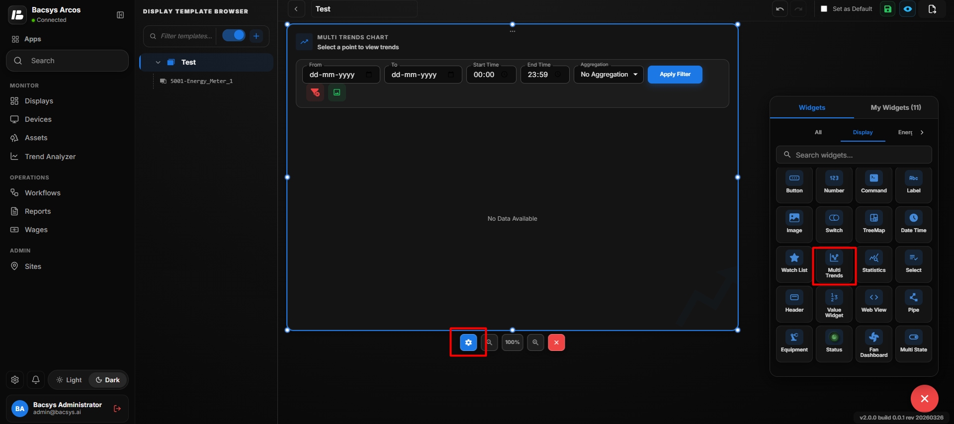
Multi Trends Widget Settings
| Option | Description |
|---|---|
| Title | Enter a title for the Multi Trends Widget. The title is displayed at the top of the widget. |
| Number of Points | Enter the number of points that you want to display in the Multi Trends Widget. |
| Point to Be Mapped for Point - 1 | Enter the point name to be displayed in the trend chart. |
| Point to Be Mapped for Additional Points | When the Number of Points is increased, additional fields are displayed to enter the required point names. |
| Poll Frequency (Seconds) | Specify how frequently the widget retrieves or refreshes the selected point data. |
| Show Points Browser | Enable this option to display the Points Browser, allowing users to browse and select available points. |
| Show Background | Use the toggle button to show or hide the widget background. |
| Hide Header | Use the toggle button to show or hide the widget header, including the title. |
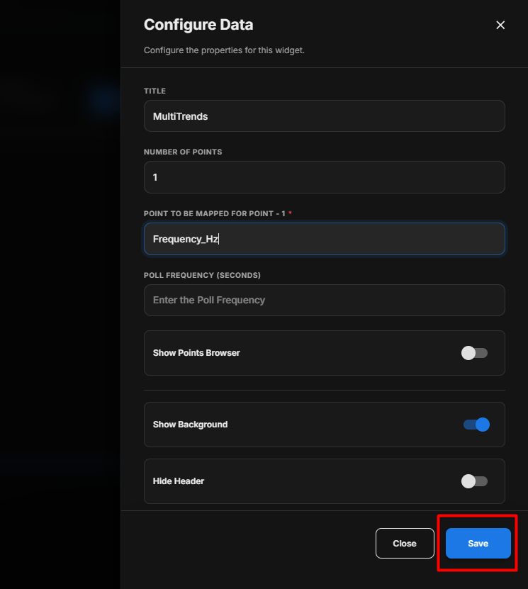
Select Points for Multi Trends
When selecting points for the Multi Trends Widget:
- Click Browse Hierarchy.
- Navigate through Network → Device → Point.
- Select the required points.
- Make sure that the selected points have trend data available.
- Points without available trend data should not be used for the Multi Trends Widget.
- Review the selected points before saving the configuration.
Configure the Multi Trends Widget
- Enter the required Title.
- Enter an optional Subtitle.
- Under Select Points, click Browse Hierarchy.
- Navigate through Network → Device → Point.
- Select the required trend-enabled points.
- Set the required Poll Frequency (Seconds).
- Enable Show Points Browser if the points browser should be visible.
- Configure Show Background according to your requirement.
- Configure Hide Header according to your requirement.
- Review all the configured settings.
- Click Save.
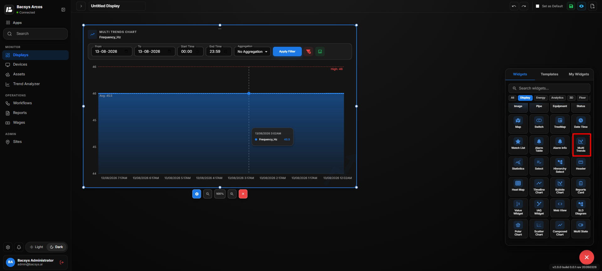
Trend Availability
The Multi Trends Widget requires trend data for the selected points.
| Point Condition | Multi Trends Behavior |
|---|---|
| Trend Available | The point can be selected and its trend data can be displayed. |
| Trend Not Available | The point does not have trend data available and should not be selected for trend visualization. |
Save the Configuration
After clicking Save, the Multi Trends Widget displays the trend data of the selected trend-enabled points together in the widget.
Add and Configure the Statistic Widget
The Statistic Widget is used to display statistical information for a selected point. It provides key values such as the Minimum (MIN), Maximum (MAX), Average (AVG), and Variation for the selected point over a specified date.
Add the Statistic Widget
- Click the + icon.
- Drag and drop the Statistic Widget onto the display.
- Select the Statistic Widget to view the available widget actions:
- Zoom In
- Zoom Out
- Settings
- Remove Widget
- Click Settings to open the Configure Data panel.
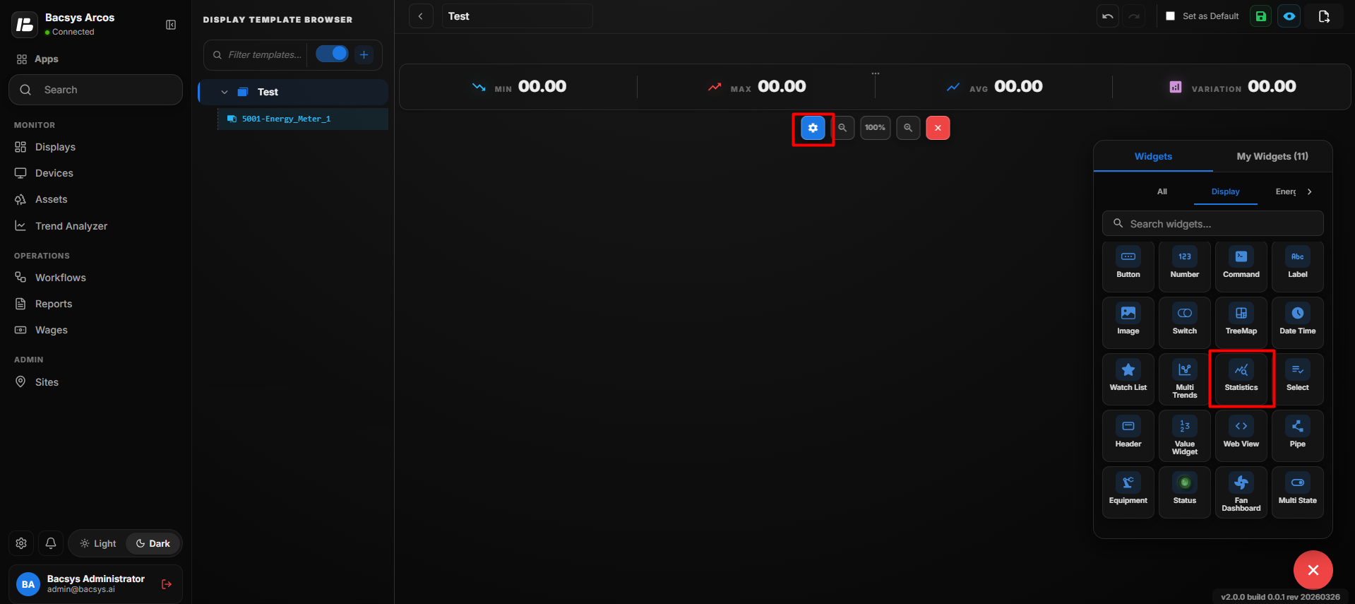
Statistic Widget Settings
| Option | Description |
|---|---|
| Title | Enter a title for the Statistic Widget. The title is displayed at the top of the widget. |
| Point to Be Mapped | Enter the point for which statistical information should be displayed. |
| Select Interval | Select the interval used to calculate and display the statistical values. The available option shown is Day Wise. |
| Date | Select the date for which the statistical values should be calculated. Enter the date in DD-MM-YYYY format or use the calendar picker. |
| Show Background | Use the toggle button to show or hide the widget background. |
| Hide Header | Use the toggle button to show or hide the widget header, including the title. |
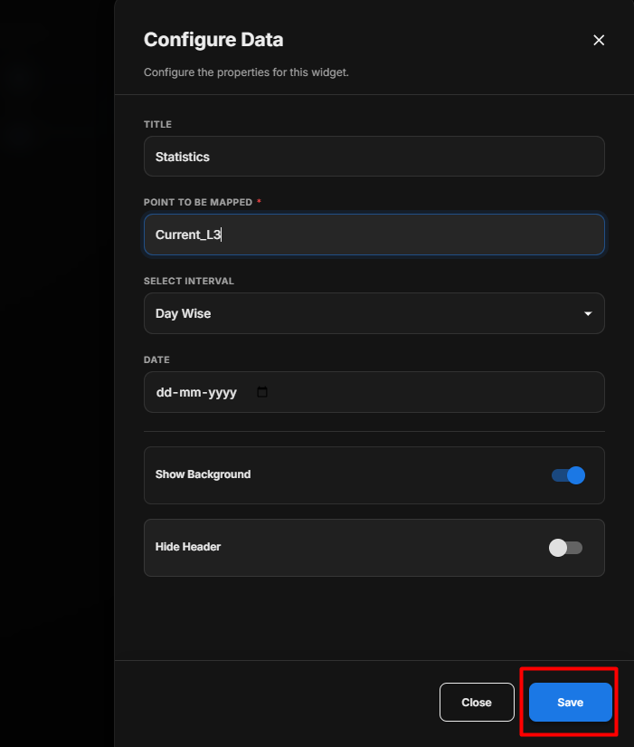
Configure the Statistic Widget
- Enter the required Title.
- Enter the required Point to Be Mapped.
- Select the required Interval from the Select Interval drop-down.
- Select the required Date using the date field or calendar picker.
- Configure Show Background according to your requirement.
- Configure Hide Header according to your requirement.
- Review the configured settings.
- Click Save.
Sample Configuration:
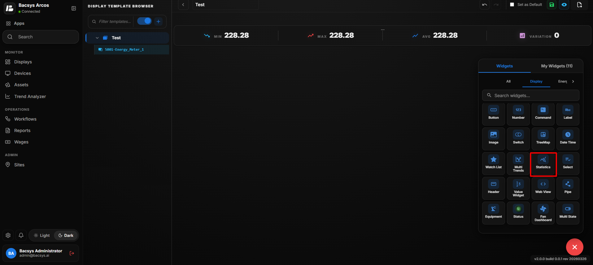
Save the Configuration
- Review all the configured settings.
- Click Save to save the widget configuration.
- The configured settings are applied to the widget.
- The widget updates to display the configured data and settings.
Add and Configure the Select Widget
The Select Widget is used to display and navigate between selected display pages within the widget. Users can select one or more existing display pages from the available display list.
Add the Select Widget
- Click the + icon to open the widget list.
- Locate the Select Widget.
- Drag and drop the Select Widget onto the display.
- Select the widget to view the available widget actions:
- Zoom In
- Zoom Out
- Settings
- Remove Widget
- Click Settings to open the Configure Data panel.
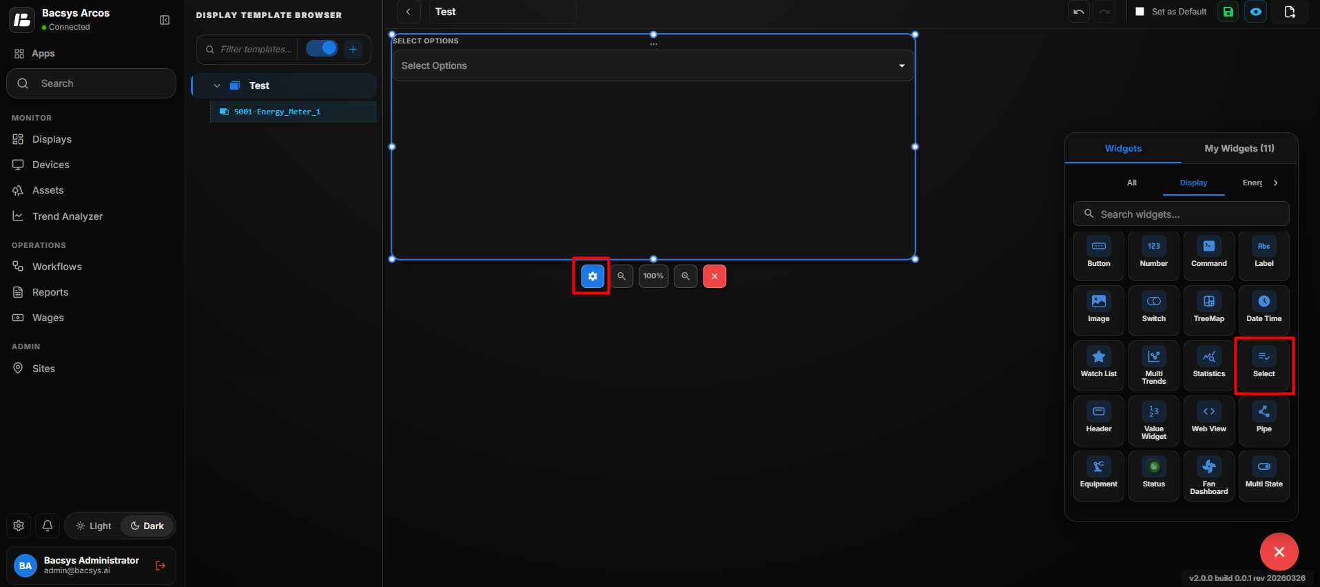
Select Widget Settings
| Option | Description |
|---|---|
| Title | Enter a title for the Select Widget. |
| Select Display Page | Select one or more display pages to be available in the widget. Use the search field to find the required display pages. |
| Show Background | Use the toggle button to show or hide the widget background. |
| Hide Header | Use the toggle button to show or hide the widget header, including the title. |
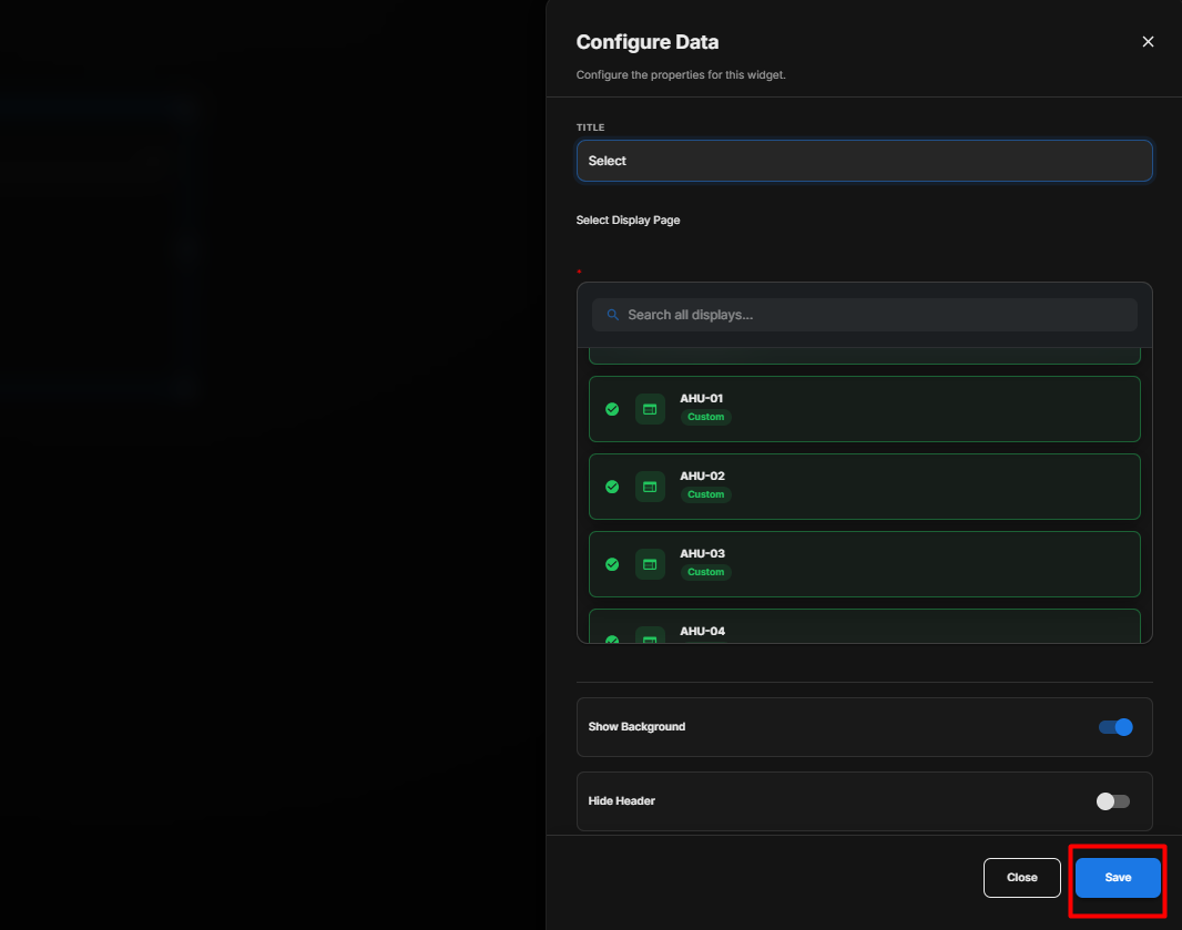
Select Display Pages
- Under Select Display Page, use the search field to find the required display.
- Select the required display from the available list.
- Select additional display pages if required.
- The selected display pages are added to the widget configuration.
- Review the selected displays before saving the configuration.
Save the Configuration
- Review all the configured settings.
- Verify that the required display pages are selected.
- Configure Show Background and Hide Header according to your requirement.
- Click Save.
- The configuration is applied to the Select Widget.
Display Behavior
After the configuration is saved, the Select Widget displays the selected display pages.
For example, if the following display pages are selected:
- AHU-01
- AHU-02
- AHU-03
- AHU-04
the selected display pages are available within the Select Widget.
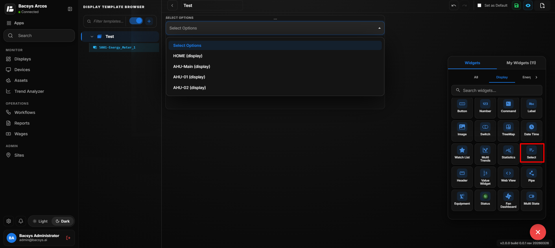
Configure the Select Widget
- Enter the required Title.
- Under Select Display Page, search for the required display page.
- Select one or more display pages from the available list.
- Configure Show Background according to your requirement.
- Configure Hide Header according to your requirement.
- Review the selected display pages.
- Click Save.
Note: The display pages available in the Select Widget depend on the display pages selected under Select Display Page.
Add and Configure the Header Widget
The Header Widget is used to display a header section on the display. When the Header Widget is dragged and dropped onto the display, it displays the configured display information along with the current date and time.
Add the Header Widget
- Click the + icon.
- Drag and drop the Header Widget onto the display.
- The Header Widget is added to the display and displays the header information along with the current date and time.
- Select the Header Widget to view the available widget actions:
- Zoom In
- Zoom Out
- Settings
- Remove Widget
- Click Settings to open the Configure Data panel.
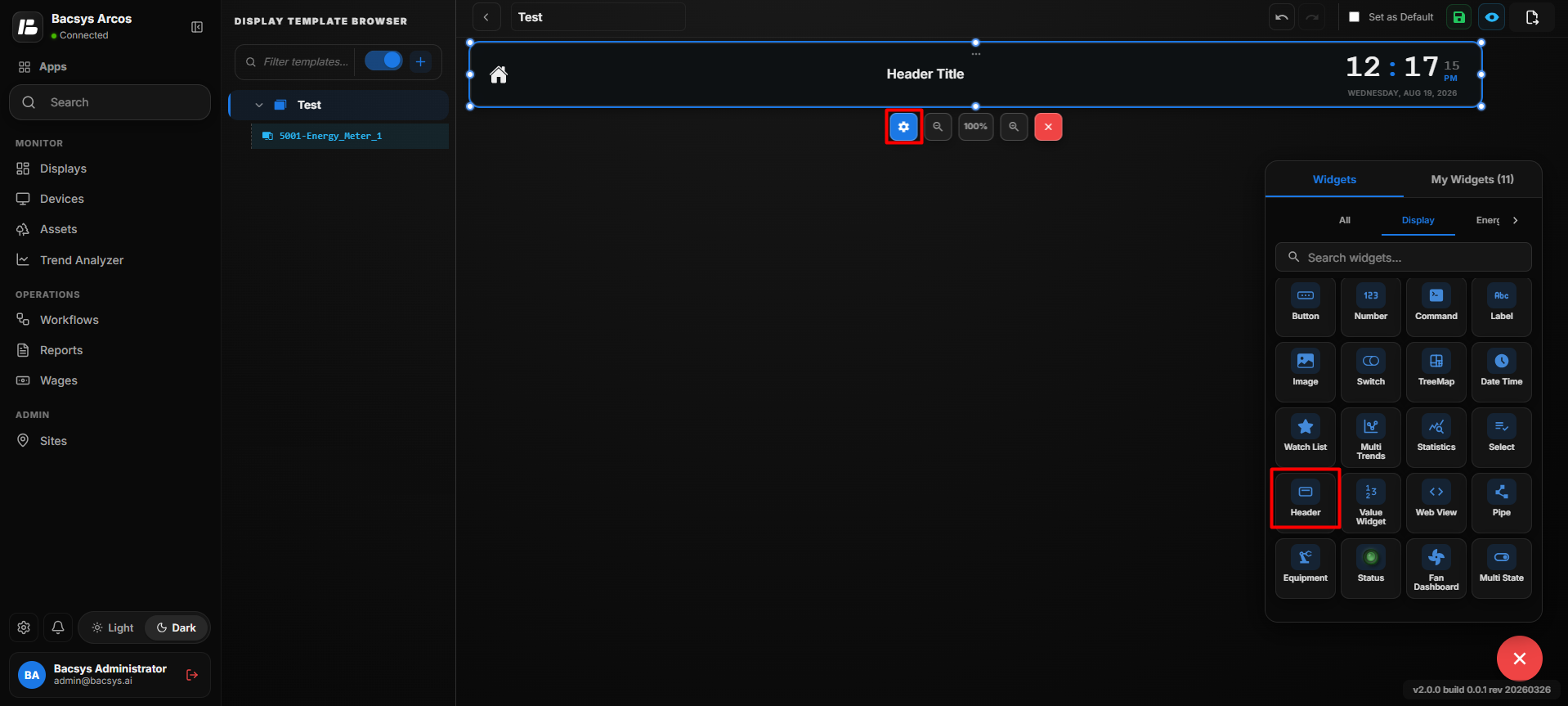
Header Widget Settings
| Option | Description |
|---|---|
| Title | Enter the title that should be displayed in the Header Widget. |
| Select Display Page | Select the display page that should be associated with the Header Widget. Use the search field to find and select the required display. |
| Button Color | Select the color used for the header navigation or display button from the available colors. |
| Image | Upload an image or logo to be displayed in the Header Widget. |
| Show Background | Use the toggle button to show or hide the widget background. |
| Hide Header | Use the toggle button to show or hide the widget header. |
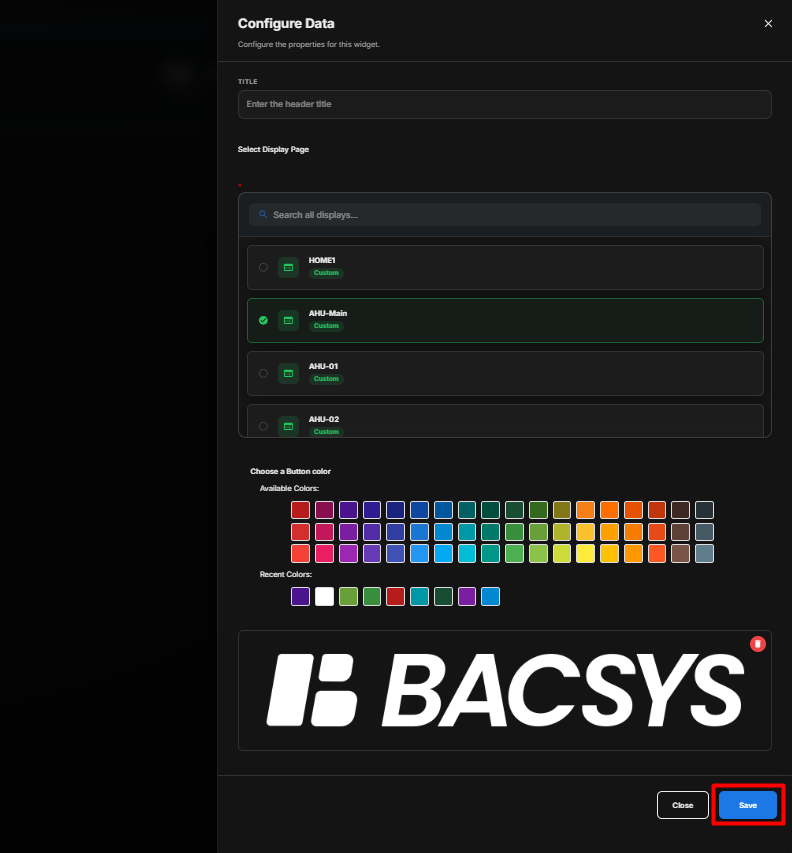
Configure the Header Widget
- Enter the required Title.
- Under Select Display Page, search for the required display.
- Select the required display page.
- Select the required Button Color.
- If required, upload an Image or logo.
- Configure Show Background according to your requirement.
- Configure Hide Header according to your requirement.
- Review all the configured settings.
- Click Save.
Add and Configure the Value Widget
The Value Widget is used to display the current value of a selected point in a clear and simple format. Users can customize the text appearance, background color, and other display options.
Add the Value Widget
- Click the + icon.
- Drag and drop the Value Widget onto the display.
- Select the Value Widget to view the available widget actions:
- Zoom In
- Zoom Out
- Settings
- Remove Widget
- Click Settings to open the Configure Data panel.
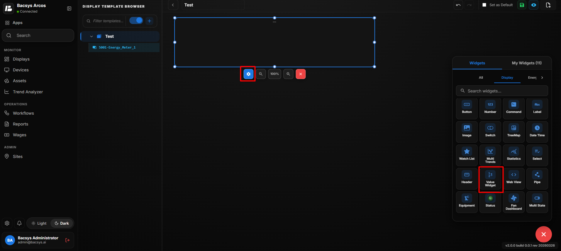
Value Widget Settings
| Option | Description |
|---|---|
| Point to Be Mapped | Enter the point whose current value should be displayed in the Value Widget. |
| Font Size | Enter the required font size for the displayed value. |
| Show Status | Enable the toggle to display the status of the mapped point along with its value. |
| Bold | Enable the toggle to display the point value in bold text. |
| Background Color | Select the background color for the Value Widget from the available colors. Recently used colors are also available for quick selection. |
| Font Color | Select the font color for the displayed point value from the available colors. Recently used colors are also available for quick selection. |
| Show Background | Use the toggle button to show or hide the widget background. |
| Hide Header | Use the toggle button to show or hide the widget header. |
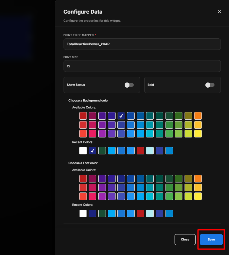
Save the Configuration
After clicking Save, the configured settings are applied to the Value Widget, and the mapped point value is displayed using the selected font size, colors, and display options.
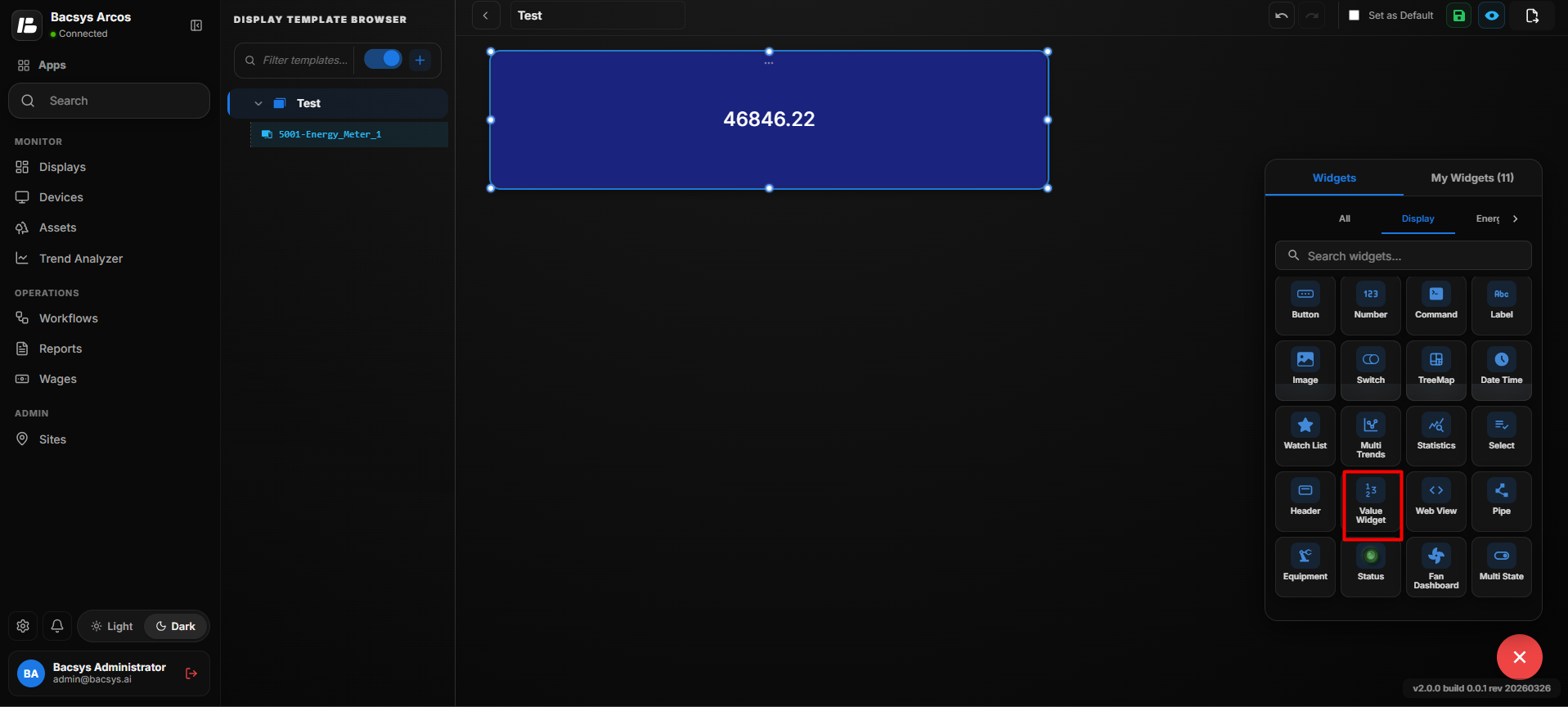
Configure the Value Widget
- Enter the required Point to Be Mapped.
- Enter the required Font Size.
- Enable Show Status if the point status should be displayed.
- Enable Bold if the value should be displayed in bold.
- Select the required Background Color.
- Select the required Font Color.
- Configure Show Background according to your requirement.
- Configure Hide Header according to your requirement.
- Review the configured settings.
- Click Save.
Add and Configure the Web View Widget
The Web View Widget allows users to create and display a custom widget using HTML, CSS, and JavaScript. Users can create their own widget layout, define data bindings, use predefined templates, and preview the widget before saving it.
Add the Web View Widget
- Click the + icon.
- Drag and drop the Web View Widget onto the display.
- Select the Web View Widget.
- Click Settings to open the Web View Widget Editor.
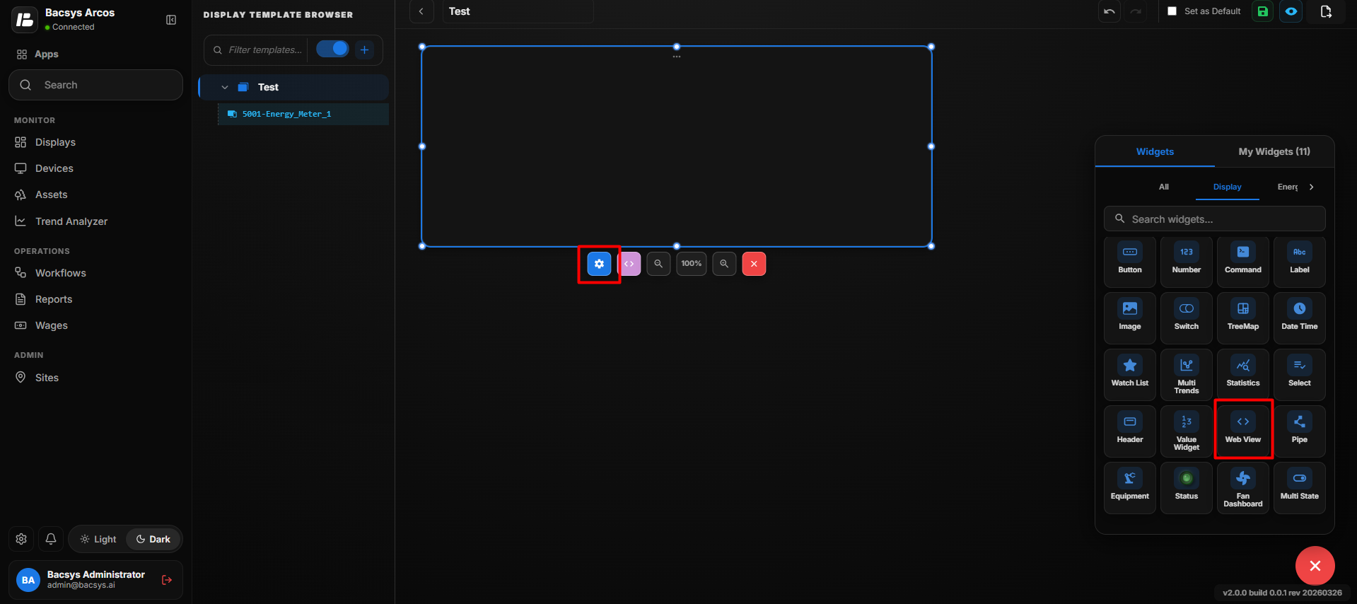
Web View Widget Editor
The Web View Widget Editor provides an editor where users can create and configure their own custom widget.
The editor contains the following sections:
- Bindings
- Docs
- Code Editor
- Preview
- Templates
Use Template
The Use Template option provides predefined widget templates that can be used as a starting point for creating a custom widget.
Available templates include:
- Blank
- Live Value Card
- Trend Table
- Bar Chart
- Line Chart
- Duty Cycle (Direct API)
- Consumption Compare (Direct API)
- Multi-Meter Comparison (Direct API)
- Radial Gauge
- KPI Card with Sparkline
- Consumption Heatmap Calendar
- Equipment Status Board
Select a template to automatically load the corresponding widget structure into the editor. The template can then be customized according to the requirement.
Create a Custom Widget
Users can also create a widget from scratch by selecting Blank.
The code editor provides an HTML structure where users can define:
- HTML for the widget structure
- CSS for styling and layout
- JavaScript for widget behavior and data handling
Users can modify the code to create their required widget design and functionality.
Bindings
The Bindings section allows users to define named data bindings that can be referenced from the widget's JavaScript code.
- Click Add Binding.
- Enter the required binding details.
- Define the binding name.
- Configure the required point or data source.
- Use the binding in the widget code to receive live point values.
Bindings allow the custom widget to display live data from configured points.
Generate Bindings
The Generate Bindings option can be used to create bindings for the custom widget.
After configuring the required bindings, they can be referenced from the JavaScript code to display live values in the widget.
Preview
The Preview section displays a preview of the custom widget layout.
Users can use the preview to verify:
- Widget layout
- Styling
- Data display
- Binding behavior
- Overall appearance
The preview can be used to check the widget before saving it.
Sample Data
The Sample Data option can be used to display sample values in the preview.
This allows users to verify how the widget will look when data is available.
Copy AI Spec
The Copy AI Spec option allows users to copy the widget specification so that it can be used as input for creating or modifying the widget with AI-assisted development.
Save as Widget
After creating and configuring the custom widget, click Save as Widget to save the custom Web View widget for reuse.
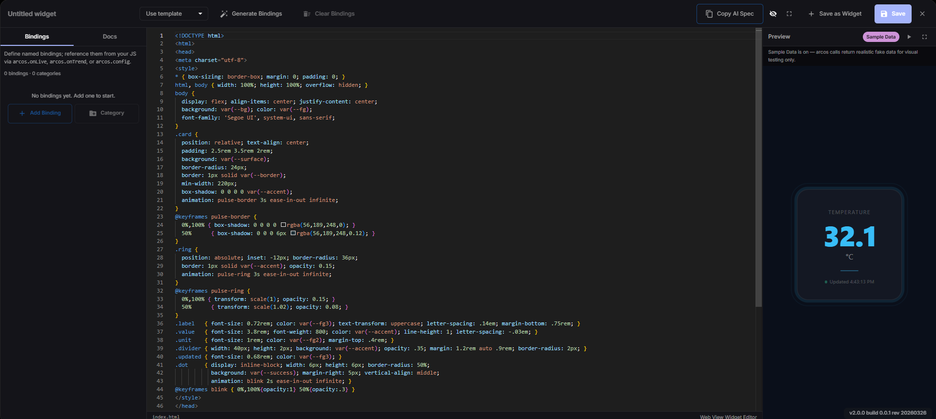
Save the Web View Widget
- Select a predefined Template or start with Blank.
- Modify the HTML, CSS, and JavaScript according to the requirement.
- Add the required Bindings.
- Configure the required data points.
- Use the bindings in the widget code.
- Check the widget in the Preview section.
- Verify the widget layout and data.
- Click Save as Widget if the widget needs to be saved as a reusable widget.
- Click Save to save the current configuration.
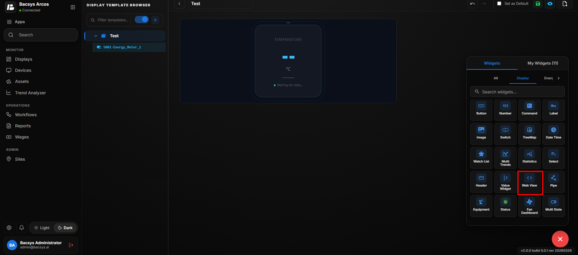
Web View Widget Use
The Web View Widget can be used when the standard prebuilt widgets do not provide the required design or functionality. It allows users to create a custom widget using web technologies and connect it to live BACsys point data through bindings.
Add and Configure the Pipe Widget
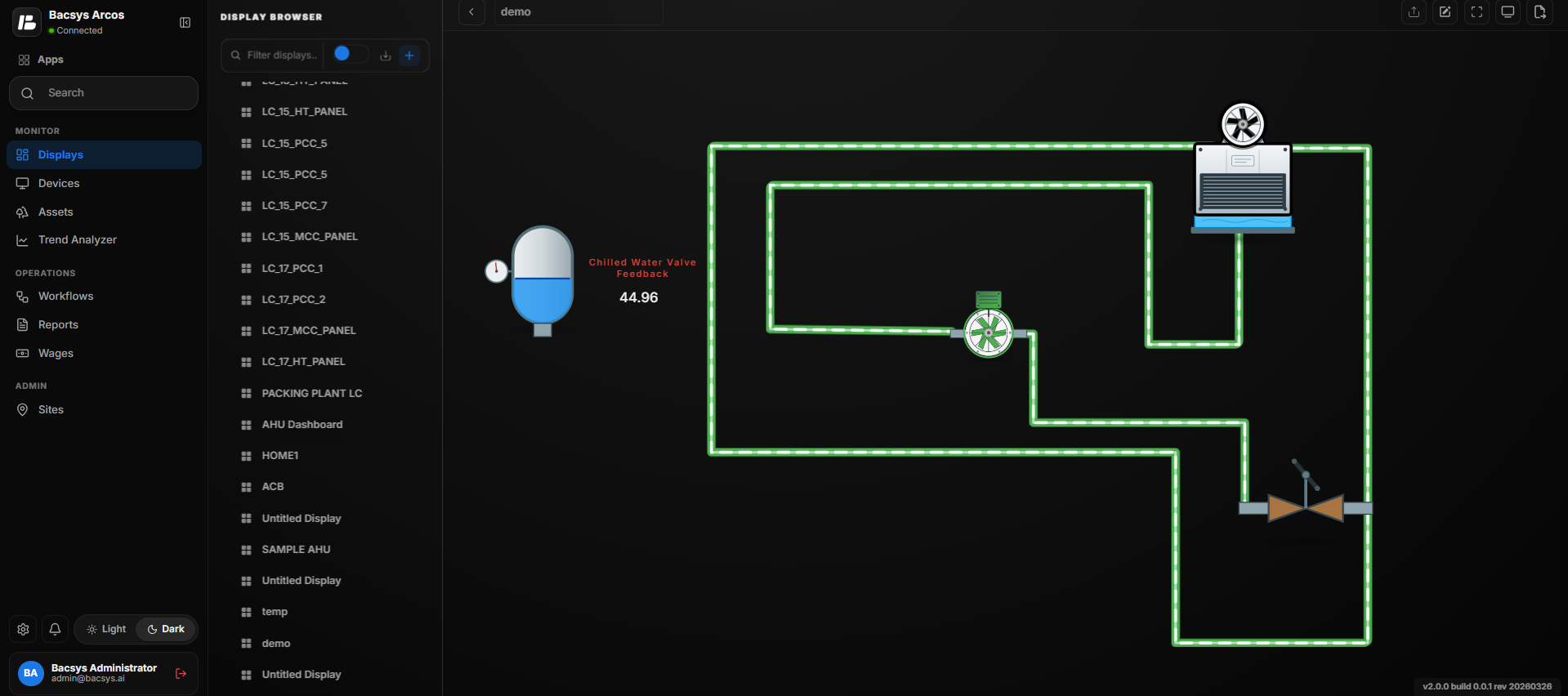
The Pipe Widget is used to draw a pipe path on the display. You can create a pipe by adding multiple points to define its route. After drawing the pipe, you can customize its color, width, flow animation, and appearance.
Draw the Pipe
-
Click the + icon.
-
Drag and drop the Pipe Widget onto the display.
-
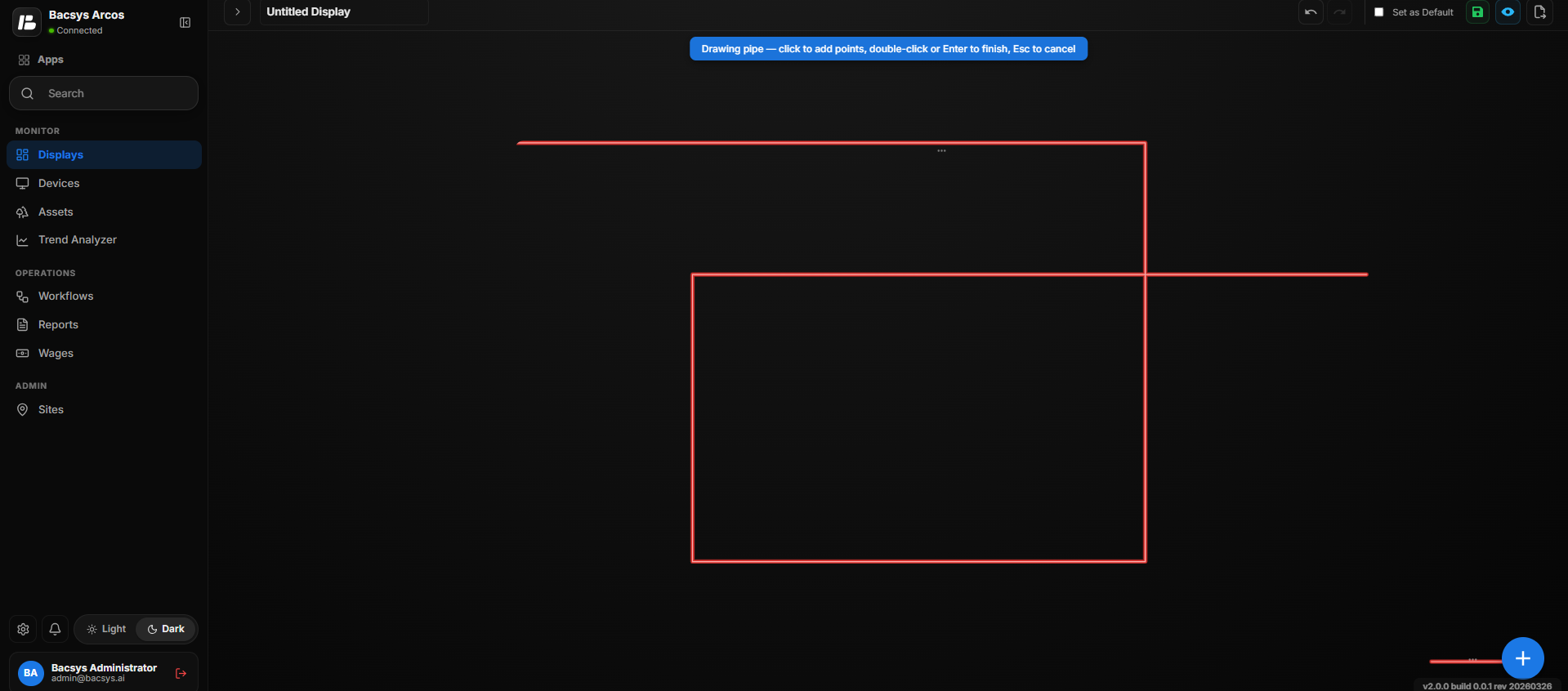
Start drawing the pipe by clicking on the display to add points.
-
Continue clicking at each location where you want the pipe to change direction.
-
While drawing the pipe, the message "Drawing pipe — click to add points, double-click or Enter to finish, Esc to cancel" is displayed.
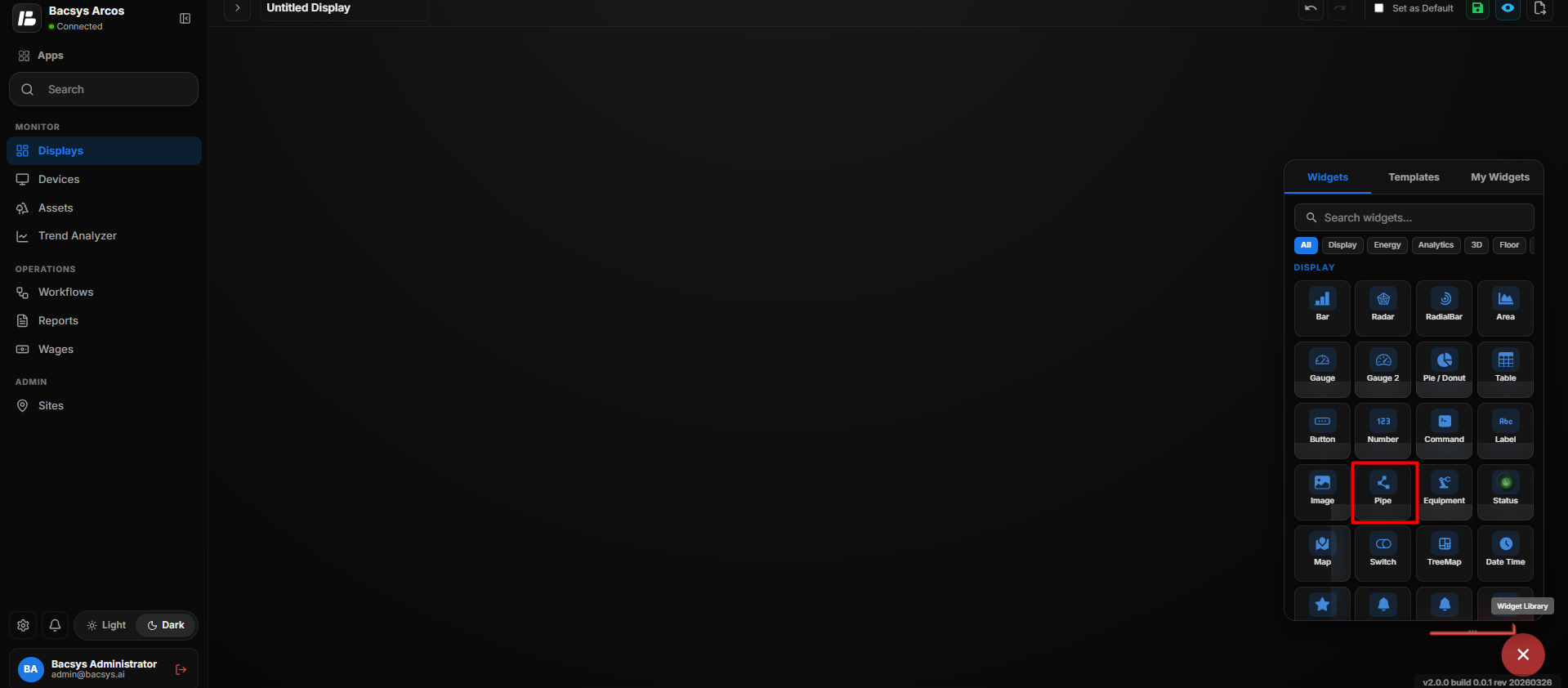
-
Continue adding points until the required pipe path is complete.
-
Press Enter to finish drawing the pipe.
Note: You can also double-click to finish drawing the pipe. Press Esc to cancel the current pipe drawing.
Select the Pipe
After completing the pipe:
-
Click the Pipe on the display.
-
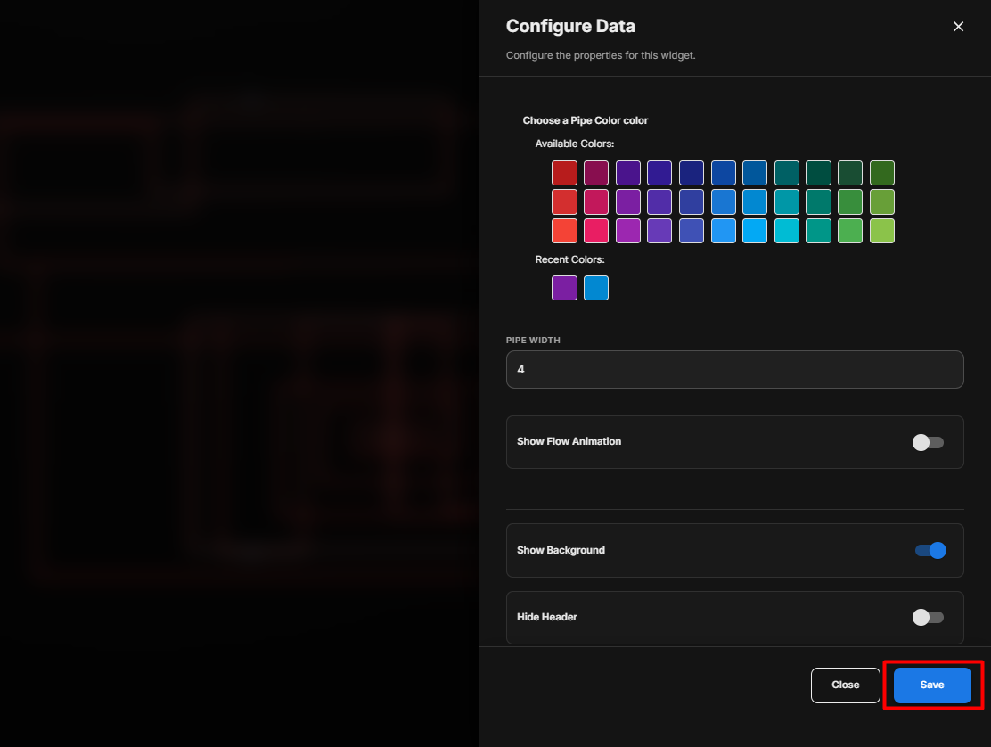
The Configure Data panel opens.
-
The pipe configuration settings are displayed.
Pipe Settings
| Option | Description |
|---|---|
| Choose a Pipe Color | Select the required color for the pipe from the available colors. |
| Pipe Width | Enter the required width of the pipe line. A higher value produces a thicker pipe. |
| Show Flow Animation | Enable the toggle to display an animated flow effect along the pipe. Disable it to display the pipe without flow animation. |
| Show Background | Use the toggle button to show or hide the widget background. |
| Hide Header | Use the toggle button to show or hide the widget header. |
Configure the Pipe
- Select the required Pipe Color.
- Enter the required Pipe Width.
- Enable Show Flow Animation if an animated flow effect is required.
- Configure Show Background according to your requirement.
- Configure Hide Header according to your requirement.
- Review all the configured settings.
- Click Save.
Complete Pipe Workflow
Click the + Icon
       ↓
Drag and Drop the Pipe Widget
       ↓
Start Drawing the Pipe
       ↓
Click to Add Points
       ↓
Add Points to Define the Pipe Path
       ↓
Press Enter / Double-Click to Finish
       ↓
Select the Drawn Pipe
       ↓
Configure Pipe Settings
       ↓
Select Pipe Color
       ↓
Set Pipe Width
       ↓
Enable/Disable Flow Animation
       ↓
Configure Background and Header
       ↓
Click Save
       ↓
Pipe Updated on the Display
Add and Configure the Equipment Widget
The Equipment Widget is used to visually represent equipment such as pumps, cooling towers, AHUs, fans, chillers, generators, boilers, valves, and other supported equipment. The widget can be connected to a Run Status Point so that the equipment status can be represented visually.
Add the Equipment Widget
- Click the + icon.
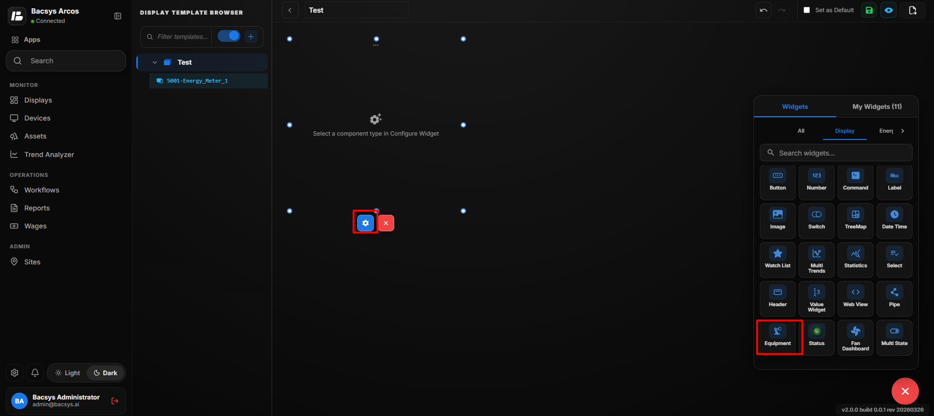
- Drag and drop the Equipment Widget onto the display.
- Select the Equipment Widget to view the available widget action:
- Settings
- Click Settings to open the Configure Data panel.
Equipment Widget Settings
| Option | Description |
|---|---|
| Title | Enter an optional label to be displayed above the equipment component. |
| Component Type | Select the type of equipment to display. Available component types include Pump, Cooling Tower, AHU, Fan, Chiller, Generator, Boiler, Valve, Heat Exchanger, Air Separator, and Expansion Tank. |
| Run Status Point — Point Name | Enter the point name that provides the running status of the equipment. |
| Running Color | Select the color used to represent the equipment when it is in the running state. |
| Stopped Color | Select the color used to represent the equipment when it is in the stopped state. |
| Animation Speed (Seconds per Rotation) | Specify the number of seconds required for one complete animation rotation. A lower value results in faster animation. |
| Reverse Direction | Enable the toggle to reverse the direction of the equipment animation. |
| Show Background | Use the toggle button to show or hide the widget background. |
| Hide Header | Use the toggle button to show or hide the widget header. |
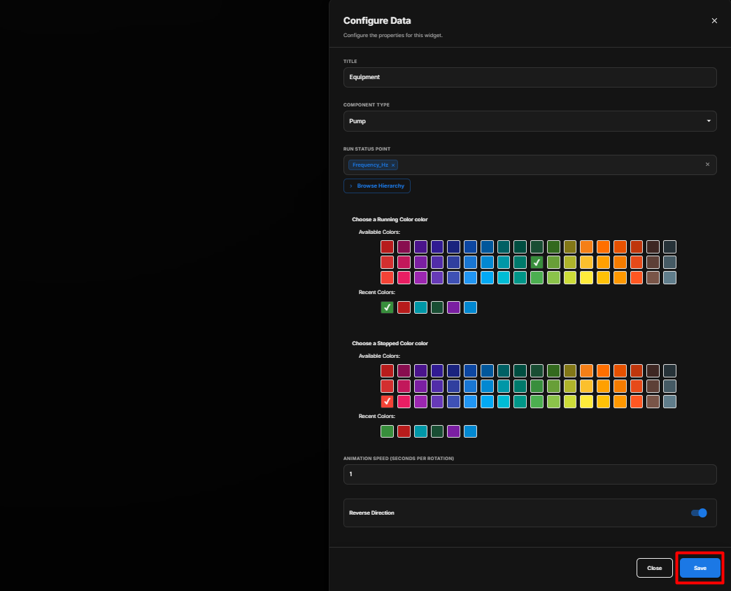
Select the Component Type
Under Component Type, select the equipment that you want to display.
Available component types include:
- Pump
- Cooling Tower
- AHU
- Fan
- Chiller
- Generator
- Boiler
- Valve
- Heat Exchanger
- Air Separator
- Expansion Tank
Configure the Run Status Point
The Run Status Point determines whether the equipment is running or stopped.
- Click Browse Hierarchy.
- Navigate through Network → Device → Point.
- Select the required Run Status Point.
- The selected point is used to determine the equipment's running status.
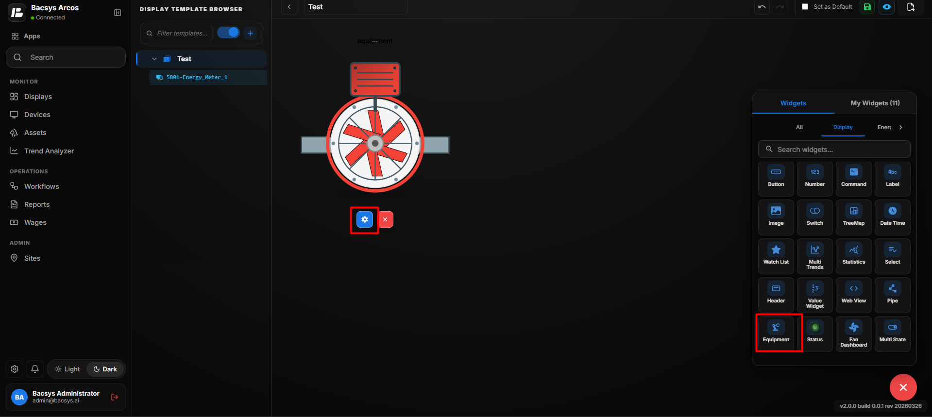
The equipment uses the configured colors to indicate its status:
- Running – The equipment is displayed using the selected Running Color.
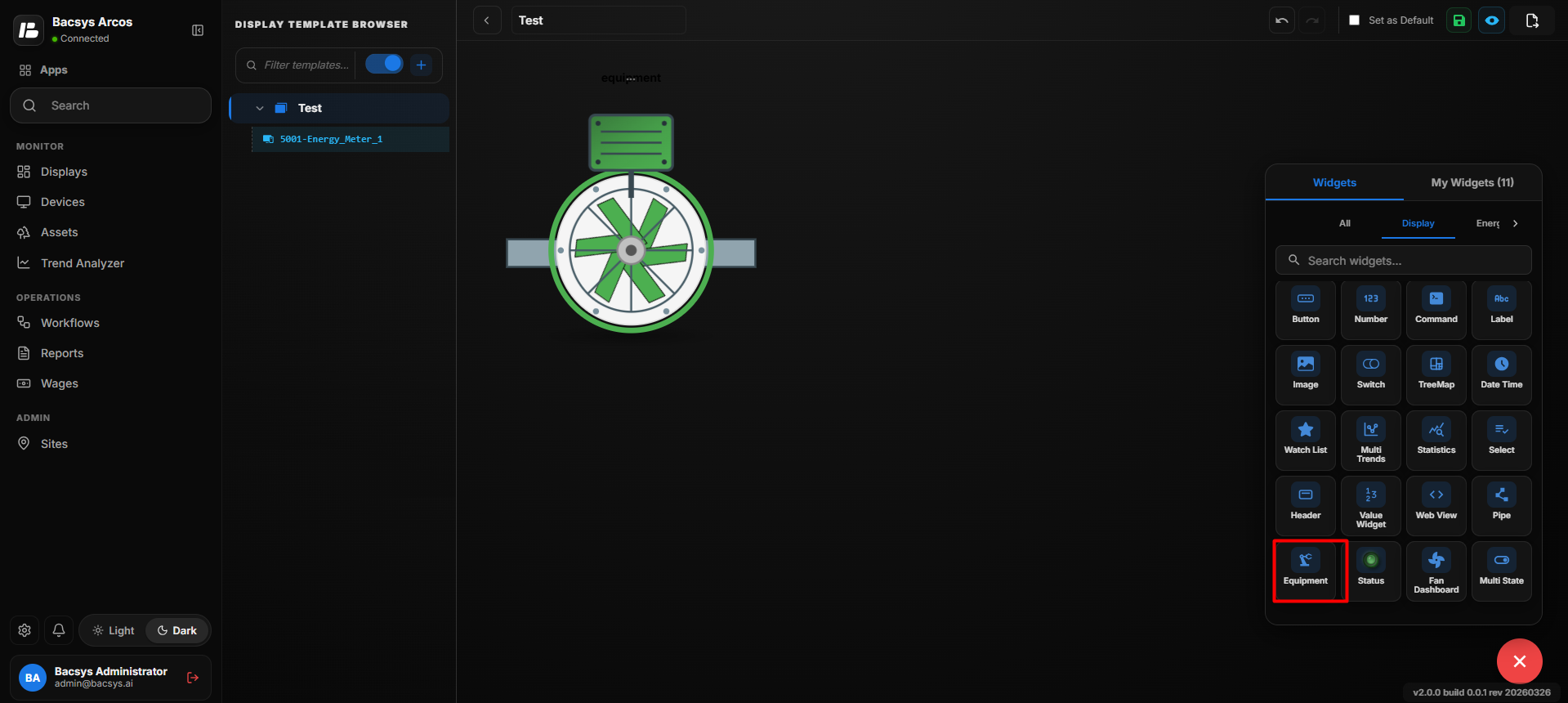
- Stopped – The equipment is displayed using the selected Stopped Color.
Configure the Equipment Widget
- Enter an optional Title.
- Under Component Type, select the required equipment.
- Under Run Status Point, click Browse Hierarchy.
- Navigate through Network → Device → Point.
- Select the required Run Status Point.
- Select the required Running Color.
- Select the required Stopped Color.
- Set the Animation Speed (Seconds per Rotation).
- Enable Reverse Direction if the equipment animation should rotate in the opposite direction.
- Configure Show Background according to your requirement.
- Configure Hide Header according to your requirement.
- Review all the configured settings.
- Click Save.
Equipment Status Behavior
| Equipment Status | Widget Behavior |
|---|---|
| Running | The equipment is displayed using the configured Running Color and the animation is shown according to the configured animation settings. |
| Stopped | The equipment is displayed using the configured Stopped Color. |
Save the Configuration
After clicking Save, the Equipment Widget is updated on the display with the selected equipment type, Run Status Point, status colors, animation settings, and appearance configuration.
Add and Configure the Status Widget
The Status Widget is used to visually represent the status or phase information of equipment or points.
The Status Widget provides the following layout types:
- Single Status – Displays the status of a single primary point.
- RYB Phase – Displays three-phase status information using separate points for R (Red), Y (Yellow), and B (Blue) phases.
Add the Status Widget
- Click the + icon.
- Drag and drop the Status Widget onto the display.
- Select the Status Widget to view the available widget actions:
- Zoom In – Enlarges the widget.
- Zoom Out – Reduces the widget size.
- Settings – Opens the widget configuration options.
- Click Settings to open the Configure Data panel.
- Under Layout Type, select the required layout:
- Single Status
- RYB Phase
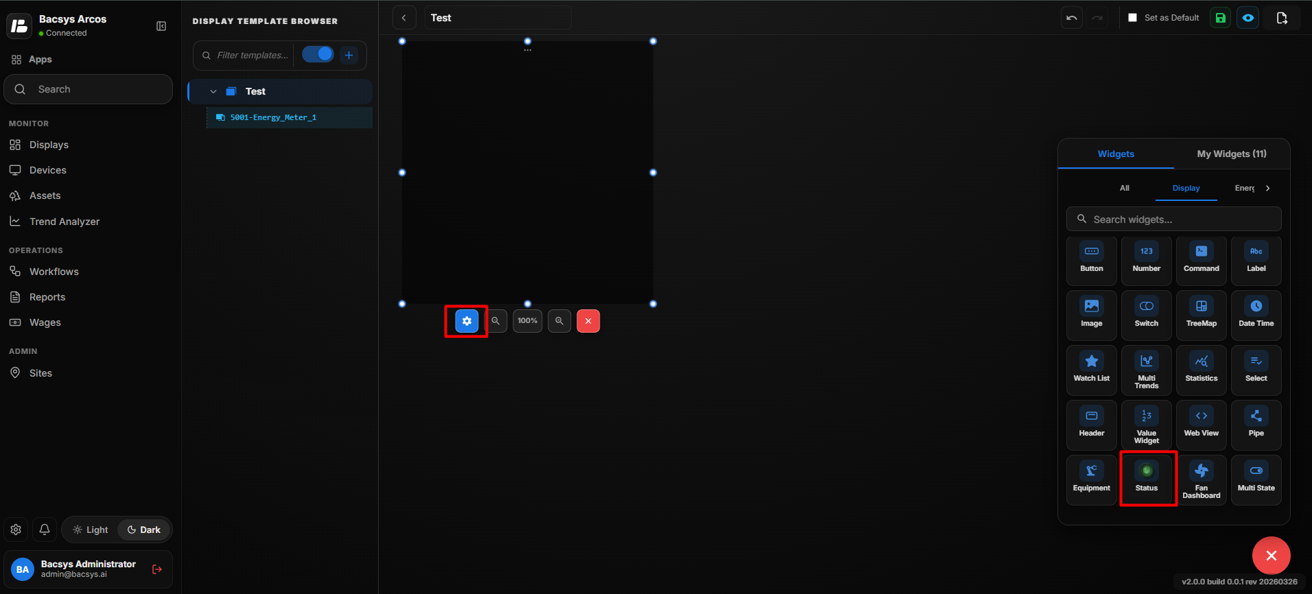
Single Status
The Single Status layout is used to represent the status of a single equipment or device based on a configured primary point.
The Single Status layout supports different Value Types, such as:
- Binary (On/Off)
- Multistate Input
Single Status Settings
| Option | Description |
|---|---|
| Title | Enter an optional label to be displayed above the Status Widget. |
| Layout Type | Select Single Status to display the status of a single point. |
| Value Type | Select the type of value used to determine the status. Available value types include Binary (On/Off) and Multistate Input. |
| Primary Point — Point Name | Enter the point name whose value is used to determine the status displayed by the widget. |
| Value 1 | Enter the first value used for the status configuration. |
| Value 2 | Enter the second value used for the status configuration. |
| Value 3 | Enter the third value used for the status configuration. |
| Display Page | Select the display page associated with the Status Widget. Use the search field to find and select the required display page. |
| Widget Color | Select the color used to represent the configured status or widget. |
| Transparent Background | Enable the toggle to make the widget background transparent. |
| Widget Scale | Specify the scale of the widget. A higher value increases the displayed size of the widget. |
| Show Background | Use the toggle button to show or hide the widget background. |
| Hide Header | Use the toggle button to show or hide the widget header, including the title. |
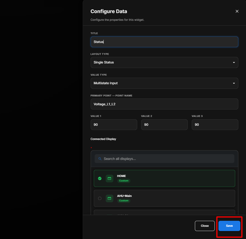
Configure the Single Status Widget
- Enter the required Title.
- Select Single Status from Layout Type.
- Select the required Value Type.
- Enter the required Primary Point — Point Name.
- Configure the settings according to the selected Value Type.
- Under the display list, search for and select the required Display Page.
- Select the required Widget Color.
- Enable Transparent Background if required.
- Enter the required Widget Scale.
- Configure Show Background according to your requirement.
- Configure Hide Header according to your requirement.
- Review all the configured settings.
- Click Save.
Value Type: Binary (On/Off)
Select Binary (On/Off) when the status point has two states: On and Off.
Configure Binary (On/Off)
- Under Value Type, select Binary (On/Off).
- Under On/Off Point — Point Name, click Browse Hierarchy.
- Navigate through Network → Device → Point.
- Select the required On/Off point.
- Under Trip Point — Point Name, click Browse Hierarchy.
- Select the required trip point.
- Under Connected Display, select the required display page.
- Select the required Widget Color.
- Configure Transparent Background, Show Labels, and Italic Labels as required.
- Set the required Widget Scale.
- Configure Show Background and Hide Header as required.
- Review the configuration.
- Click Save.
Binary (On/Off) Settings
| Option | Description |
|---|---|
| Title | Enter a title for the Single Status Widget. |
| Layout Type | Select Single Status to display a single equipment or device status. |
| Value Type | Select Binary (On/Off) when the status is represented by two states: On and Off. |
| On/Off Point — Point Name | Enter the point name whose value determines whether the status is On or Off. |
| Trip Point — Point Name | Enter the point name used to indicate a trip, fault, or abnormal condition. |
| Connected Display | Select the display page associated with the Status Widget. |
| Widget Color | Select the color used to represent the status widget. |
| Transparent Background | Enable the toggle to make the widget background transparent. |
| Show Labels | Enable the toggle to display status labels on the widget. |
| Italic Labels | Enable the toggle to display the status labels in italic text. |
| Widget Scale | Enter the required scale of the widget. |
| Show Background | Use the toggle button to show or hide the widget background. |
| Hide Header | Use the toggle button to show or hide the widget header, including the title. |
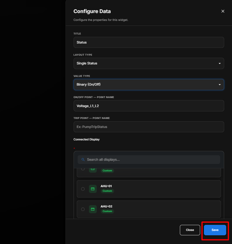
Binary (On/Off) Status Behavior
The Binary (On/Off) value type represents the mapped point using two status states:
- On – The mapped point indicates an active or running condition.
- Off – The mapped point indicates an inactive or stopped condition.
- Trip – If a Trip Point is configured and its value indicates a fault condition, the widget can represent the equipment as being in a tripped or abnormal state.
The Connected Display allows users to associate the Status Widget with a specific display page for further monitoring or navigation.
Value Type: Multistate Input
Select Multistate Input when the mapped point can have multiple defined status values.
Configure Multistate Input
- Under Value Type, select Multistate Input.
- Under the point selection field, click Browse Hierarchy.
- Navigate through Network → Device → Point.
- Select the required multistate point.
- Configure Value 1, Value 2, and Value 3 according to the required status values.
- Select the required Display Page.
- Select the required Widget Color.
- Configure Transparent Background, Show Labels, and Italic Labels as required.
- Set the required Widget Scale.
- Configure Show Background and Hide Header as required.
- Review the configuration.
- Click Save.
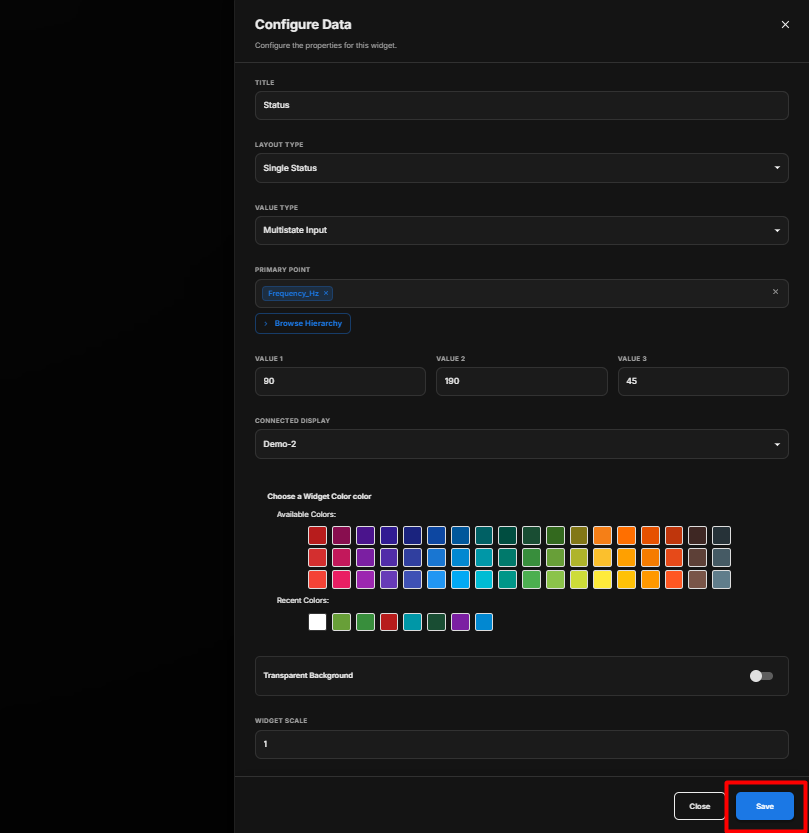
Multistate Status Behavior
The Multistate Input value type allows the widget to represent multiple states based on the values configured for the Primary Point.
For example:
- Value 1 → State 1
- Value 2 → State 2
- Value 3 → State 3
The widget changes its displayed status according to the current value received from the mapped point.
RYB Phase
The RYB Phase layout is used to display the status of three electrical phases:
- R – Red Phase
- Y – Yellow Phase
- B – Blue Phase
Each phase can be connected to a separate point and display.
RYB Phase Settings
| Option | Description |
|---|---|
| Title | Enter an optional label to be displayed above the Status Widget. |
| Layout Type | Select RYB Phase to configure three-phase status information. |
| Point 1 (R) | Select the point associated with the R (Red) phase. |
| Point 2 (Y) | Select the point associated with the Y (Yellow) phase. |
| Point 3 (B) | Select the point associated with the B (Blue) phase. |
| Display (R) | Select the display associated with the R phase. |
| Display (Y) | Select the display associated with the Y phase. |
| Display (B) | Select the display associated with the B phase. |
| Widget Color | Select the color used for the Status Widget. |
| Transparent Background | Enable the toggle to make the widget background transparent. |
| Widget Scale | Set the scale of the Status Widget. |
| Show Background | Use the toggle button to show or hide the widget background. |
| Hide Header | Use the toggle button to show or hide the widget header. |
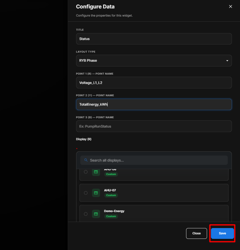
Configure RYB Phase
- Enter the required Title.
- Under Layout Type, select RYB Phase.
- Under Point 1 (R), click Browse Hierarchy and select the point for the R (Red) phase.
- Under Point 2 (Y), click Browse Hierarchy and select the point for the Y (Yellow) phase.
- Under Point 3 (B), click Browse Hierarchy and select the point for the B (Blue) phase.
- Select the required Display (R) for the R phase.
- Select the required Display (Y) for the Y phase.
- Select the required Display (B) for the B phase.
- Select the required Widget Color.
- Enable Transparent Background if required.
- Set the required Widget Scale.
- Configure Show Background according to your requirement.
- Configure Hide Header according to your requirement.
- Review all the configured settings.
- Click Save.
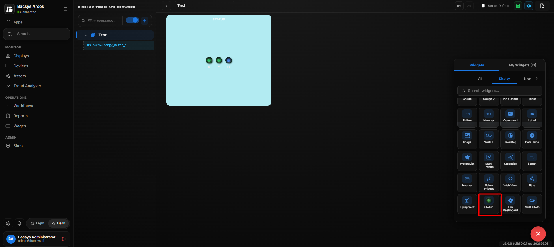
Layout Type Summary
| Layout Type | Purpose | Point Configuration |
|---|---|---|
| Single Status | Displays the status of a single point. | One Primary Point |
| RYB Phase | Displays three-phase status information. | Point 1 (R), Point 2 (Y), and Point 3 (B) |
Value Type Summary
| Value Type | Use |
|---|---|
| Binary (On/Off) | Use when the status has two states, such as On/Off. It uses an On/Off Point and Trip Point. |
| Multistate Input | Use when the status point can have multiple defined states. |
Save the Configuration
After clicking Save, the Status Widget is updated on the display according to the selected Layout Type, Value Type, configured points, display pages, colors, scale, and appearance settings.
Add and Configure the Fan Dashboard Widget
The Fan Dashboard Widget is used to display fan-related operating information within the display.
Add the Fan Dashboard Widget
- Click the + icon.
- Drag and drop the Fan Dashboard Widget onto the display.
- Select the Fan Dashboard Widget to view the available widget actions:
- Zoom In – Enlarges the widget.
- Zoom Out – Reduces the widget size.
- Settings – Opens the widget configuration options.
- Remove Widget – Removes the widget from the display.
- Click Settings to open the Configure Data panel.
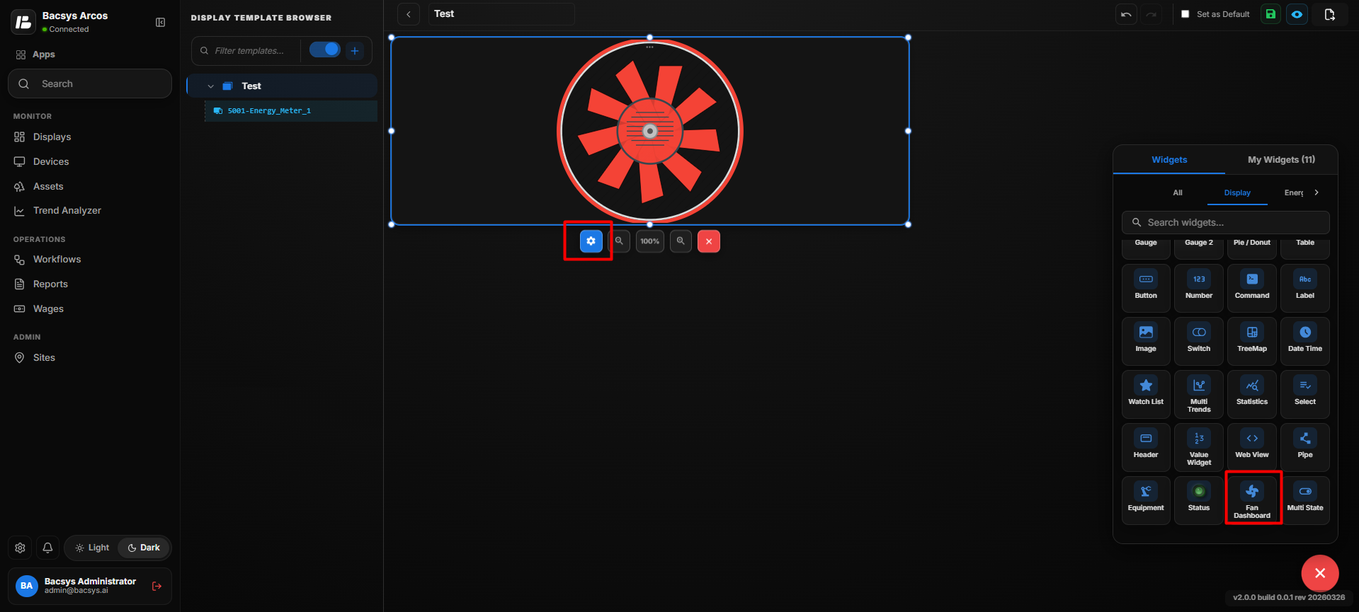
Fan Dashboard Settings
| Option | Description |
|---|---|
| Title | Enter a title for the Fan Dashboard Widget. The title identifies the information displayed by the widget. |
| Point to be Mapped | Enter the point that should be used to display the required fan-related value in the Fan Dashboard Widget. |
| Show Background | Use the toggle button to show or hide the widget background. |
| Hide Header | Use the toggle button to show or hide the widget header, including the title. |
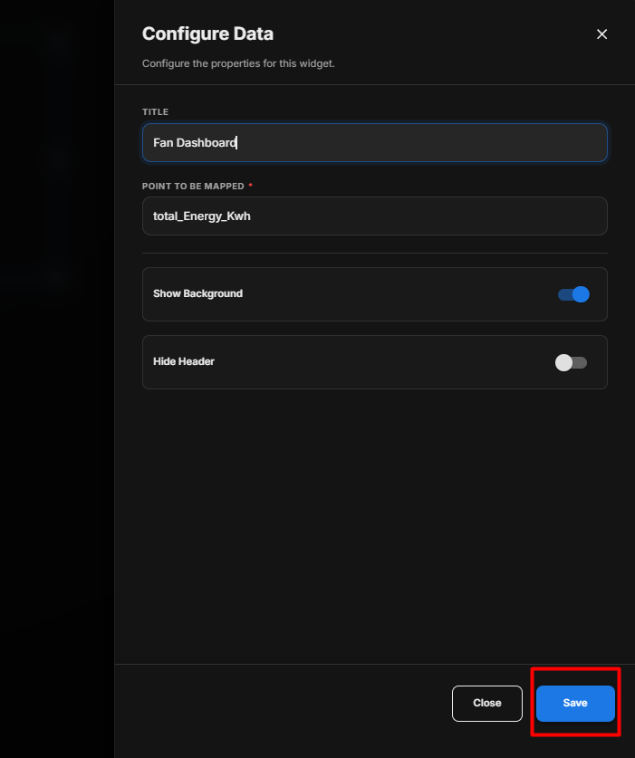
Configure the Fan Dashboard Widget
- Enter the required Title.
- Under Point to be Mapped, enter or select the required point.
- Configure Show Background according to your requirement.
- Configure Hide Header according to your requirement.
- Review the configured settings.
- Click Save.
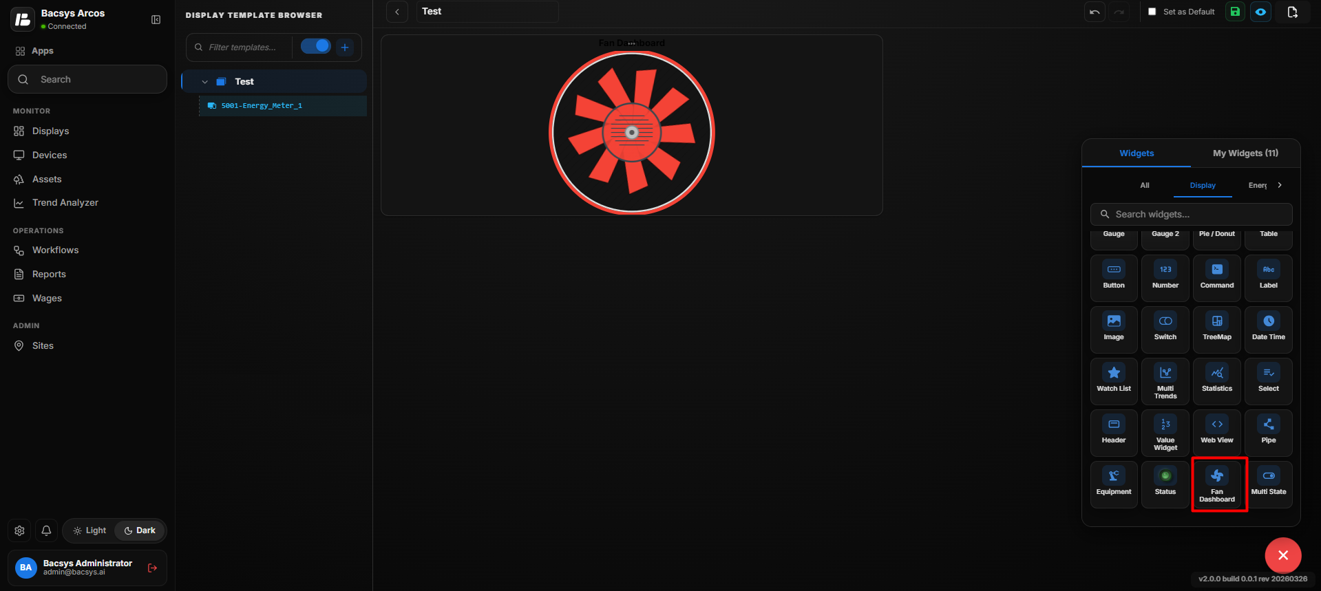
Save the Configuration
After clicking Save, the Fan Dashboard Widget is updated on the display according to the configured point and appearance settings.
Note: The Fan Dashboard displays information based on the Point to be Mapped configured in the widget settings.
Add and Configure the Multi State Widget
The Multi State Widget is used to display the current state of a point based on multiple configured values. Each state can have its own value, label, active color, and inactive color.
Add the Multi State Widget
- Click the + icon.
- Drag and drop the Multi State Widget onto the display.
- Select the Multi State Widget to view the available widget actions:
- Zoom In – Enlarges the widget.
- Zoom Out – Reduces the widget size.
- Settings – Opens the widget configuration options.
- Remove Widget – Removes the widget from the display.
- Click Settings to open the Configure Data panel.
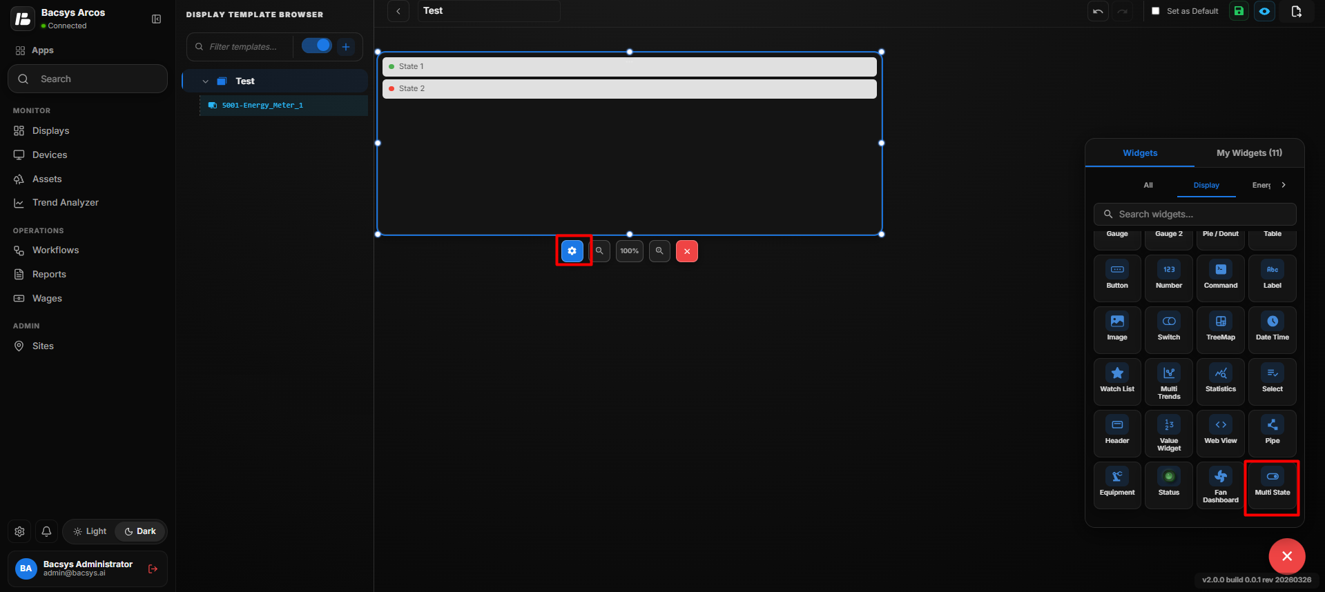
Multi State Widget Settings
| Option | Description |
|---|---|
| Title | Enter a title for the Multi State Widget. |
| Point Name | Enter or select the point whose value determines the current state of the widget. |
| Number of States | Displays the number of states configured for the widget. |
| Add | Click Add to create an additional state. |
| Remove | Click Remove to remove the last configured state. |
| Value | Enter the value associated with the state. When the mapped point matches this value, the corresponding state becomes active. |
| Label | Enter the label that should be displayed for the state. |
| Active Color | Select the color displayed when the corresponding state is active. |
| Inactive Color | Select the color displayed when the corresponding state is inactive. |
| Show Background | Use the toggle button to show or hide the widget background. |
| Hide Header | Use the toggle button to show or hide the widget header, including the title. |
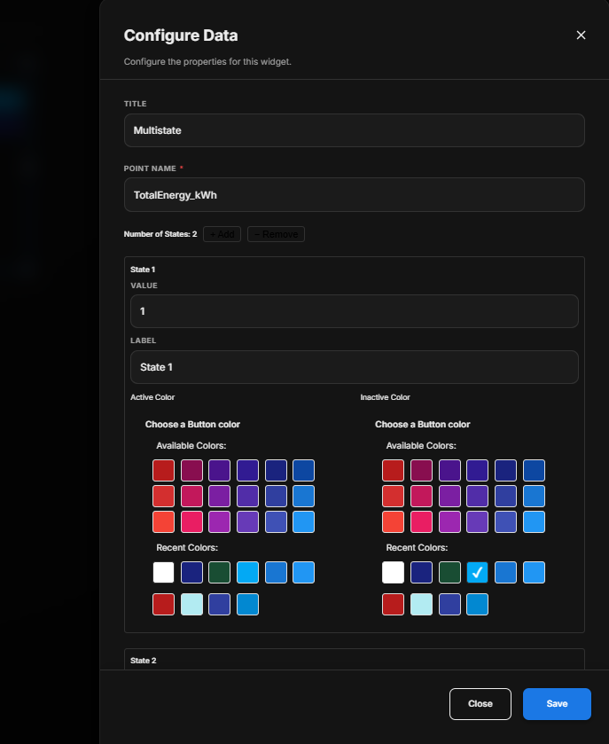
Configure the Multi State Widget
- Enter the required Title.
- Under Point Name, enter or select the required point.
- Set the required Number of States using the Add and Remove options.
- Configure each state individually.
- For each state, enter the required Value.
- Enter the required Label for each state.
- Select an Active Color for each state.
- Select an Inactive Color for each state.
- Configure Show Background according to your requirement.
- Configure Hide Header according to your requirement.
- Review all the configured states.
- Click Save.
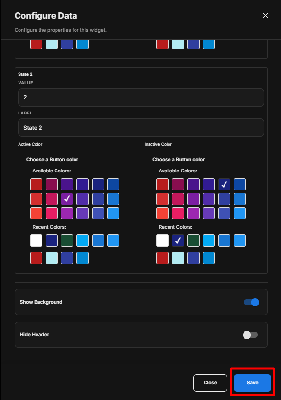
Configure Individual States
Each state has its own configuration.
For example:
| State | Value | Label | Active Color | Inactive Color |
|---|---|---|---|---|
| State 1 | 1 | State 1 | Selected color | Selected color |
| State 2 | 2 | State 2 | Selected color | Selected color |
You can add additional states using the + Add option.
State Behavior
The Multi State Widget compares the current value of the configured Point Name with the values assigned to the states.
For example:
- If the point value is 1, State 1 becomes active.
- If the point value is 2, State 2 becomes active.
- If additional states are configured, the corresponding state becomes active when the point value matches its configured value.
The Active Color is displayed for the matching state, while the configured Inactive Color is used when the state is not active.
Save the Configuration
After clicking Save, the Multi State Widget is updated on the display according to the configured point, states, labels, colors, and appearance settings.
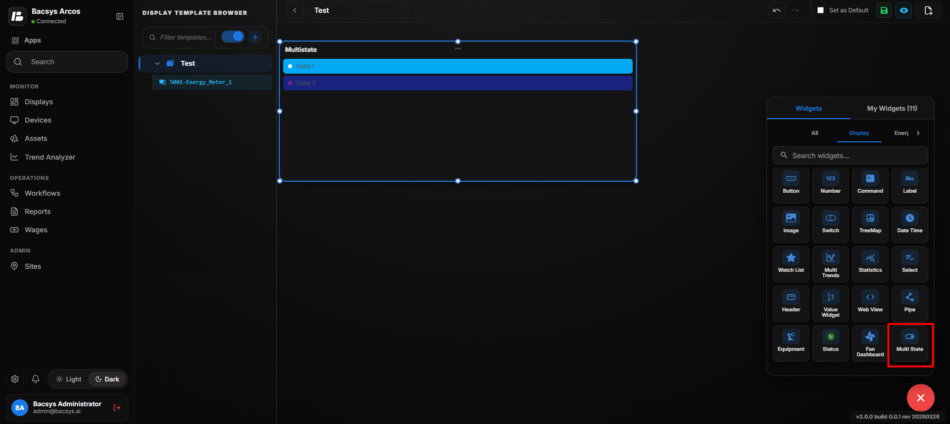
Note: The number of states displayed in the widget depends on the states configured using Add and Remove. Each state must have a corresponding Value and Label.
Energy Widgets
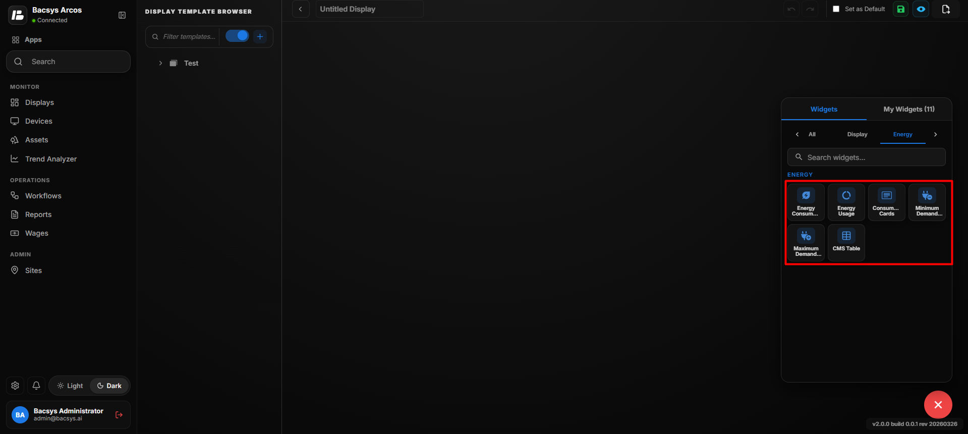
| Widget | Description |
|---|---|
| Energy Consumption | Displays energy consumption over the selected period. |
| Energy Usage | Displays accumulated energy usage. |
| Consumption Cards | Displays energy metrics using cards. |
| Minimum Demand | Displays the minimum recorded demand. |
| Maximum Demand | Displays the maximum recorded demand. |
| CMS Table | Displays energy parameters in a tabular format. |
Add the Meter Table Widget
- Click the + icon.
- Drag and drop the Meter Table Widget onto the display.
- Select the Meter Table Widget to view the available widget actions:
- Zoom In
- Zoom Out
- Settings
- Remove Widget
- Use Zoom In and Zoom Out to adjust the widget view as required.
- Click Settings to open the Configure Data panel.
- Configure the required meter table settings.
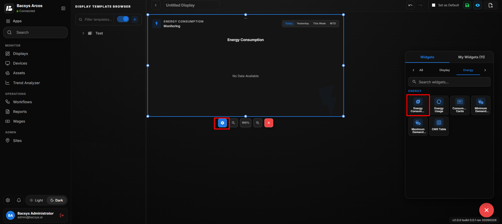
Meter Table Widget Settings
Energy Consumption Widget Settings
| Option | Description |
|---|---|
| Title | Enter a title for the Energy Consumption Widget. The title identifies the energy consumption information displayed by the widget. |
| Point to be Mapped | Enter or select the point whose energy consumption value should be displayed. |
| Poll Frequency (Seconds) | Specify how frequently the widget retrieves or refreshes the value of the selected point. |
| Show Background | Use the toggle button to show or hide the widget background. |
| Hide Header | Use the toggle button to show or hide the widget header, including the title. |
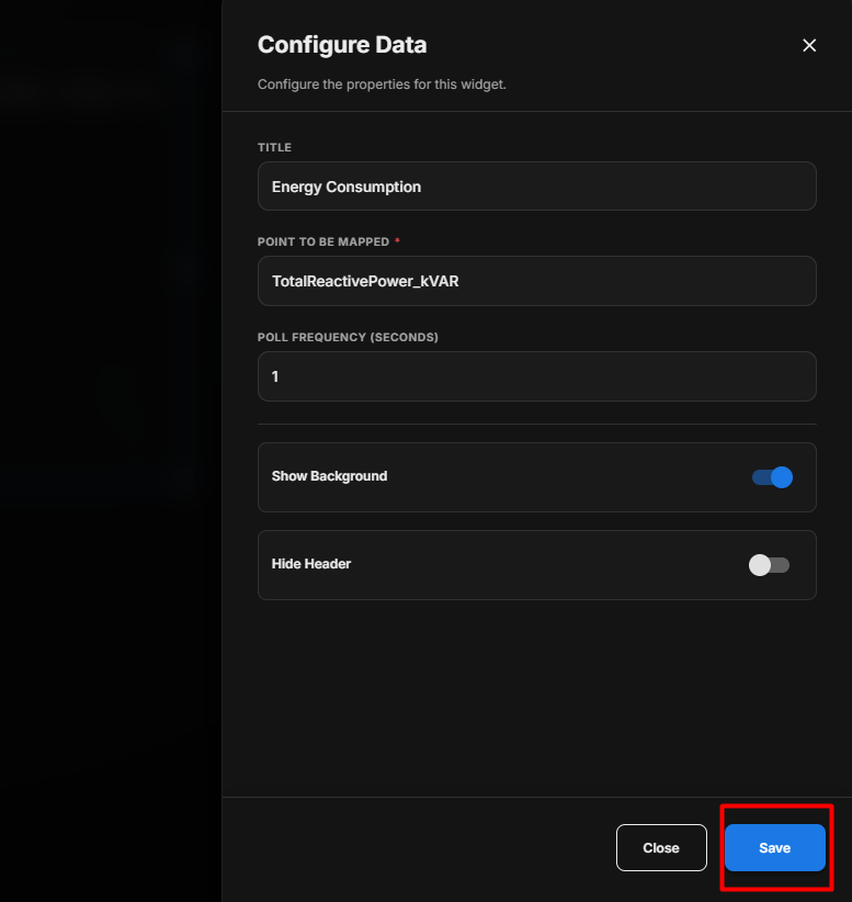
Configure the Energy Consumption Widget
- Enter the required Title.
- Under Point to be Mapped, enter or select the required energy consumption point.
- Enter the required Poll Frequency (Seconds).
- Configure Show Background according to your requirement.
- Configure Hide Header according to your requirement.
- Review the configured settings.
- Click Save.
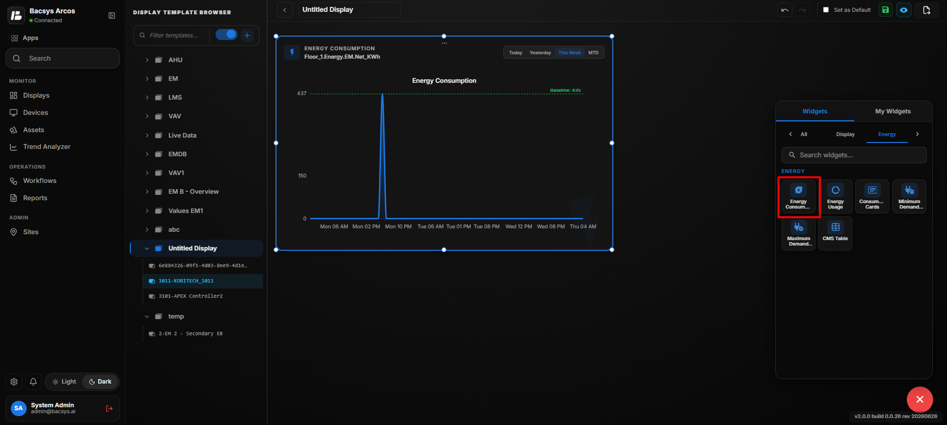
Energy Consumption Display
After saving the configuration, the selected devices and their configured meter parameters are displayed in a table.
Save the Configuration
After clicking Save, the Energy Consumption Widget is updated on the display according to the configured point and appearance settings.
Note: The energy consumption value displayed by the widget depends on the Point to be Mapped configuration. The displayed value is refreshed according to the configured Poll Frequency (Seconds).
Add and Configure the Energy Usage Widget
The Energy Usage Widget is used to display energy usage information based on a configured point. The widget retrieves the value from the mapped point and displays it within the display.
Add the Energy Usage Widget
- Click the + icon.
- Drag and drop the Energy Usage Widget onto the display.
- Select the Energy Usage Widget to view the available widget actions:
- Zoom In – Enlarges the widget.
- Zoom Out – Reduces the widget size.
- Settings – Opens the widget configuration options.
- Remove Widget – Removes the widget from the display.
- Click Settings to open the Configure Data panel.
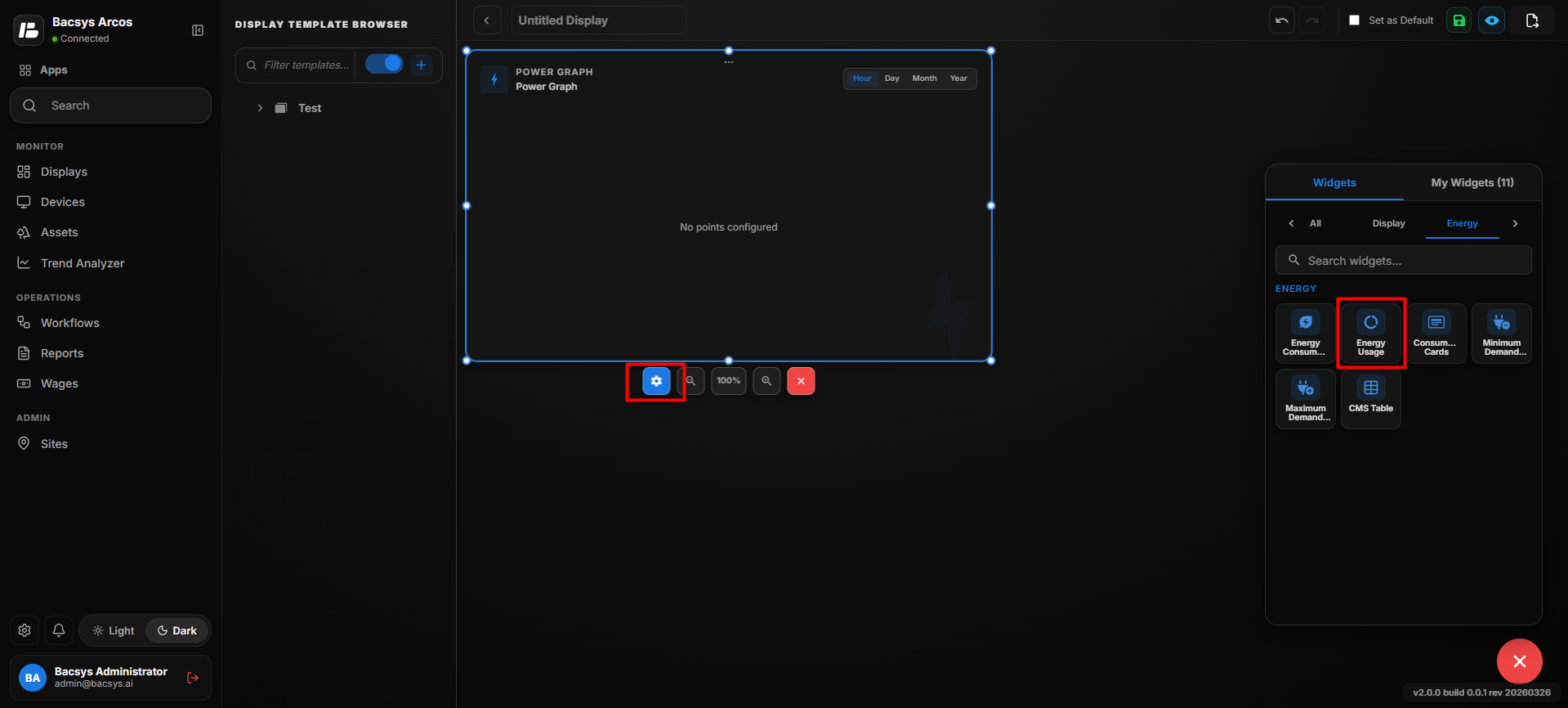
Energy Usage Widget Settings
| Option | Description |
|---|---|
| Title | Enter a title for the Energy Usage Widget. The title identifies the energy usage information displayed by the widget. |
| Point to be Mapped | Enter or select the point whose energy usage value should be displayed in the widget. |
| Show Background | Use the toggle button to show or hide the widget background. |
| Hide Header | Use the toggle button to show or hide the widget header, including the title. |
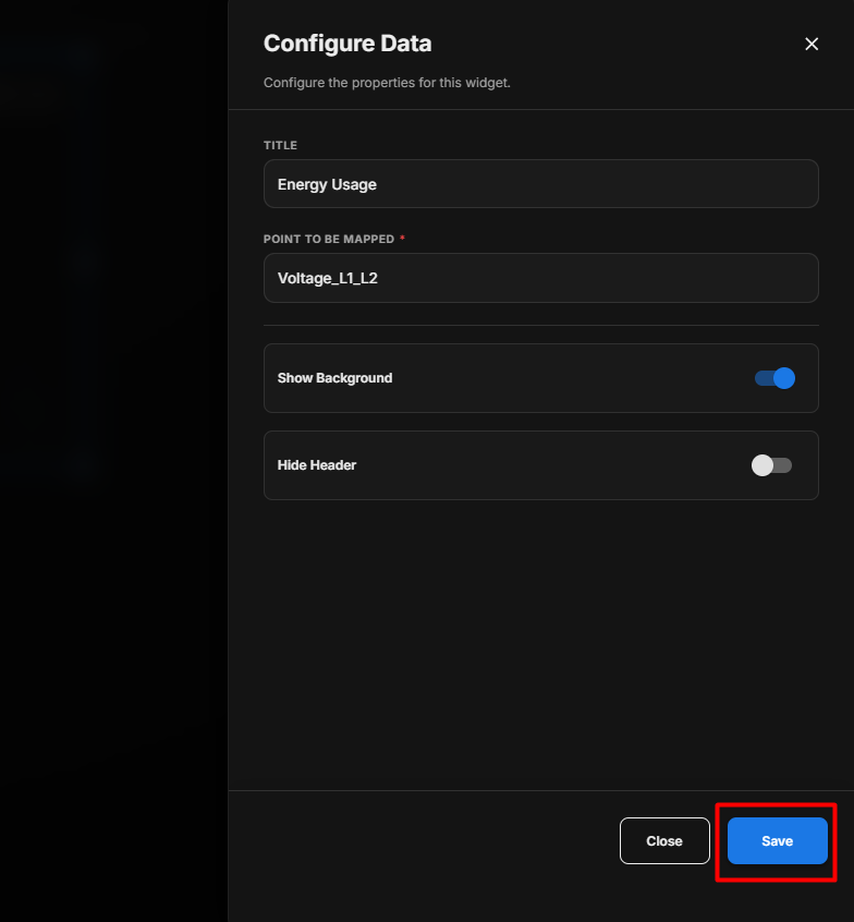
Configure the Energy Usage Widget
- Enter the required Title.
- Under Point to be Mapped, enter or select the required energy usage point.
- Configure Show Background according to your requirement.
- Configure Hide Header according to your requirement.
- Review the configured settings.
- Click Save.
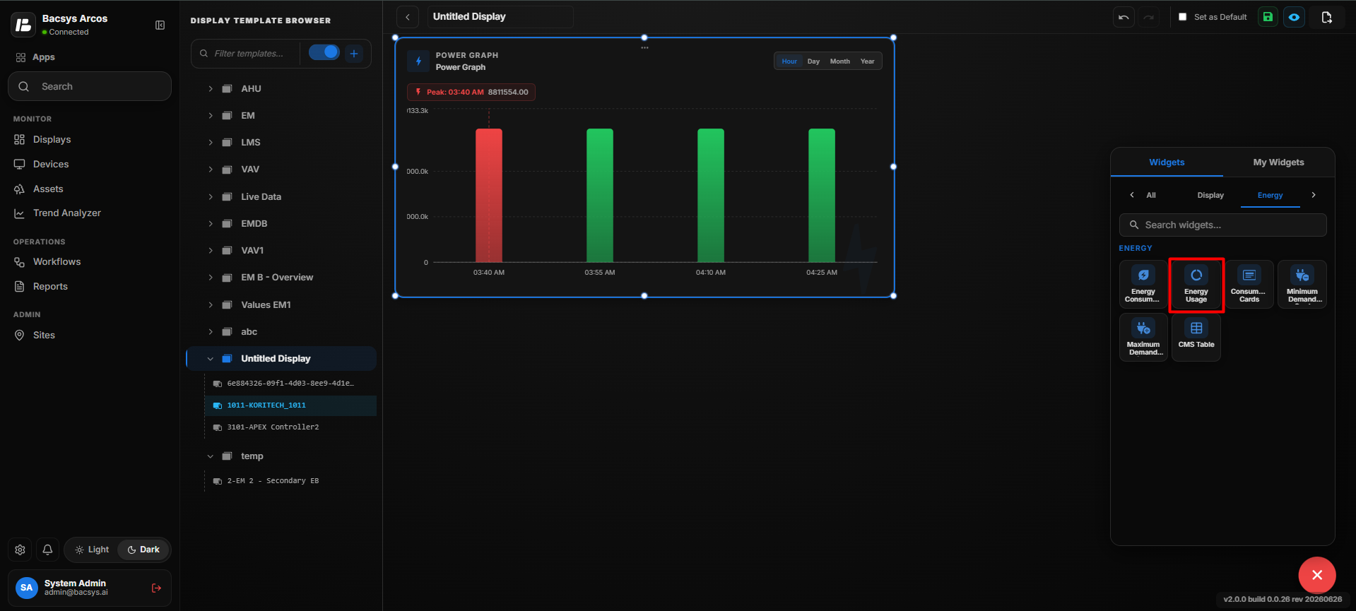 s
Save the Configuration
After clicking Save, the Energy Usage Widget is updated on the display according to the configured point and appearance settings.
Note: The energy usage information displayed by the widget depends on the Point to be Mapped configured in the widget settings.
Add and Configure the Consumption Cards Widget
The Consumption Cards Widget displays energy consumption values for different time periods in separate cards. The widget provides a quick comparison of consumption for periods such as Today, Yesterday, This Week, Last Week, MTD, Last Month, YTD, and Last Year.
Add the Consumption Cards Widget
- Click the + icon.
- Drag and drop the Consumption Cards Widget onto the display.
- Select the Consumption Cards Widget to view the available widget actions:
- Zoom In – Enlarges the widget.
- Zoom Out – Reduces the widget size.
- Settings – Opens the widget configuration options.
- Remove Widget – Removes the widget from the display.
- Click Settings to open the Configure Data panel.
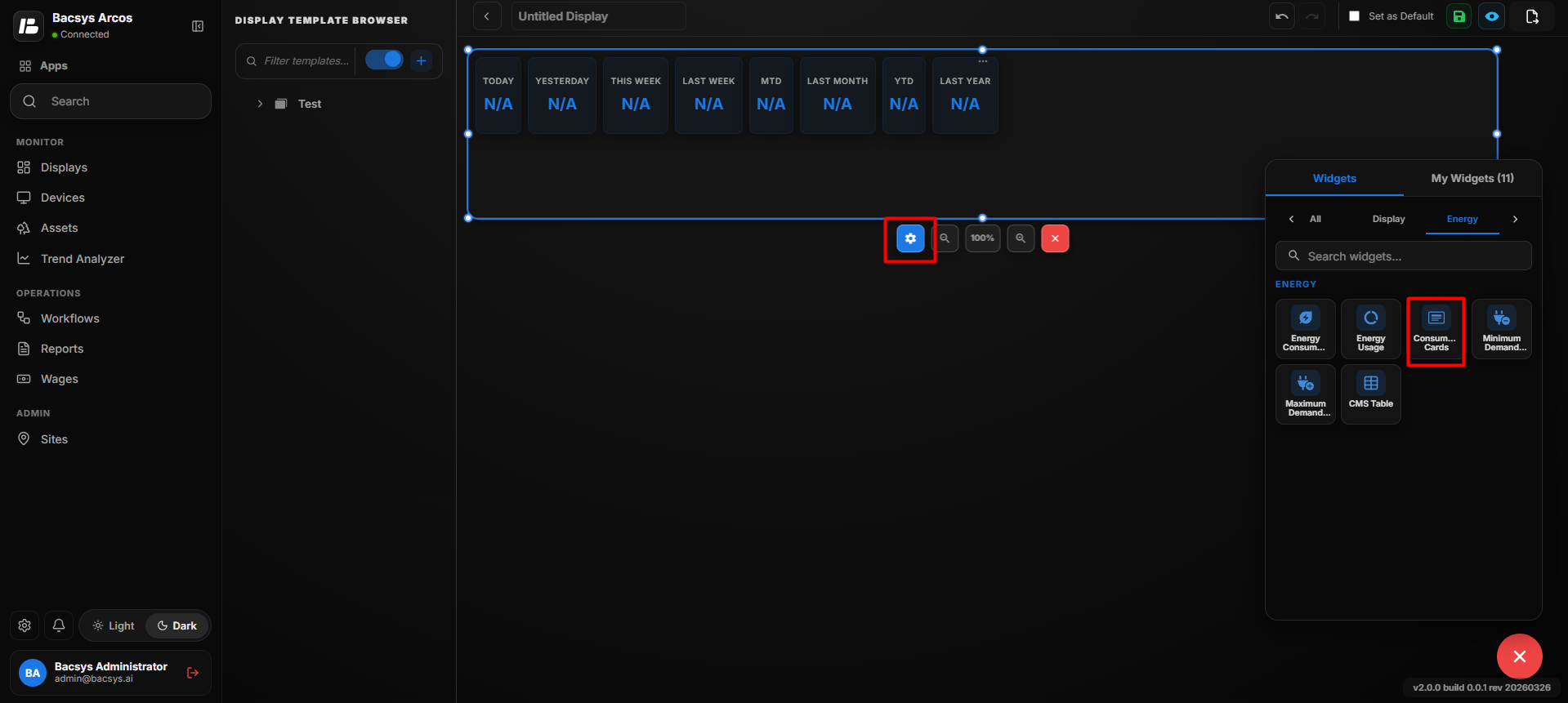
Consumption Cards Widget Settings
| Option | Description |
|---|---|
| Title | Enter a title for the Consumption Cards Widget. |
| Point to be Mapped | Enter or select the point used to retrieve the energy consumption data. |
| Poll Frequency (Seconds) | Specify how frequently the widget retrieves or refreshes the consumption data. |
| Show Background | Use the toggle button to show or hide the widget background. |
| Hide Header | Use the toggle button to show or hide the widget header, including the title. |
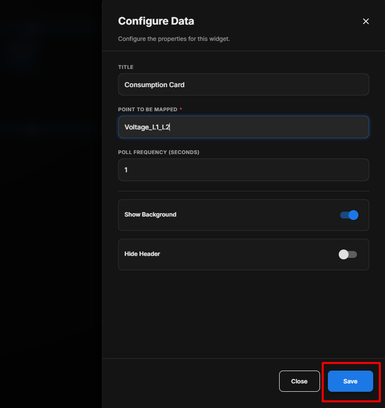
Configure the Consumption Cards Widget
- Enter the required Title.
- Under Point to be Mapped, enter or select the required consumption point.
- Enter the required Poll Frequency (Seconds).
- Configure Show Background according to your requirement.
- Configure Hide Header according to your requirement.
- Review the configured settings.
- Click Save.
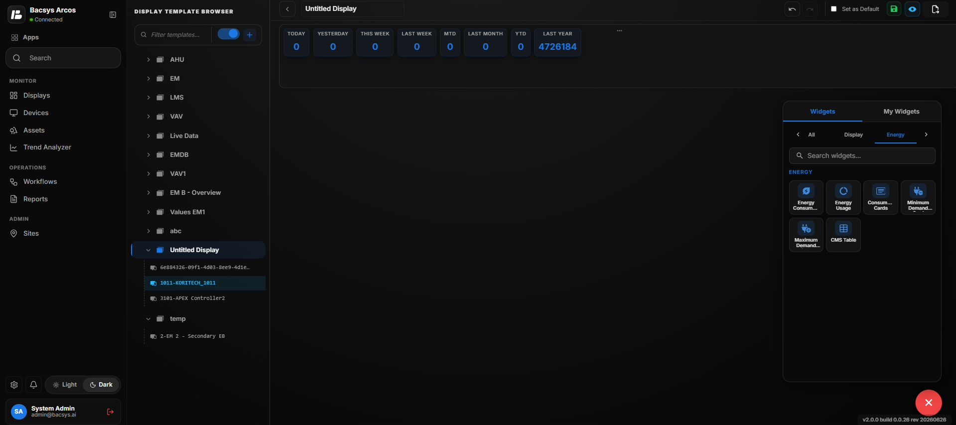
Save the Configuration
After clicking Save, the Consumption Cards Widget is updated on the display and retrieves consumption data from the configured point.
Consumption Periods
The widget displays consumption values for the following periods:
| Card | Description |
|---|---|
| Today | Displays the consumption value for the current day. |
| Yesterday | Displays the consumption value for the previous day. |
| This Week | Displays the consumption value for the current week. |
| Last Week | Displays the consumption value for the previous week. |
| MTD | Displays the consumption value for the current month up to the present date (Month to Date). |
| Last Month | Displays the consumption value for the previous month. |
| YTD | Displays the consumption value for the current year up to the present date (Year to Date). |
| Last Year | Displays the consumption value for the previous year. |
Note: The consumption values displayed in each card depend on the Point to be Mapped and the availability of consumption data for the respective period.
Add and Configure the Min Demand Widget
The Min Demand Widget is used to display the minimum demand value for a selected power point. The widget is configured to display the demand value in kW.
Add the Min Demand Widget
- Click the + icon.
- Drag and drop the Min Demand Widget onto the display.
- Select the Min Demand Widget to view the available widget actions:
- Zoom In
- Zoom Out
- Settings
- Remove Widget
- Use Zoom In and Zoom Out to adjust the widget view as required.
- Click Settings to open the Configure Data panel.
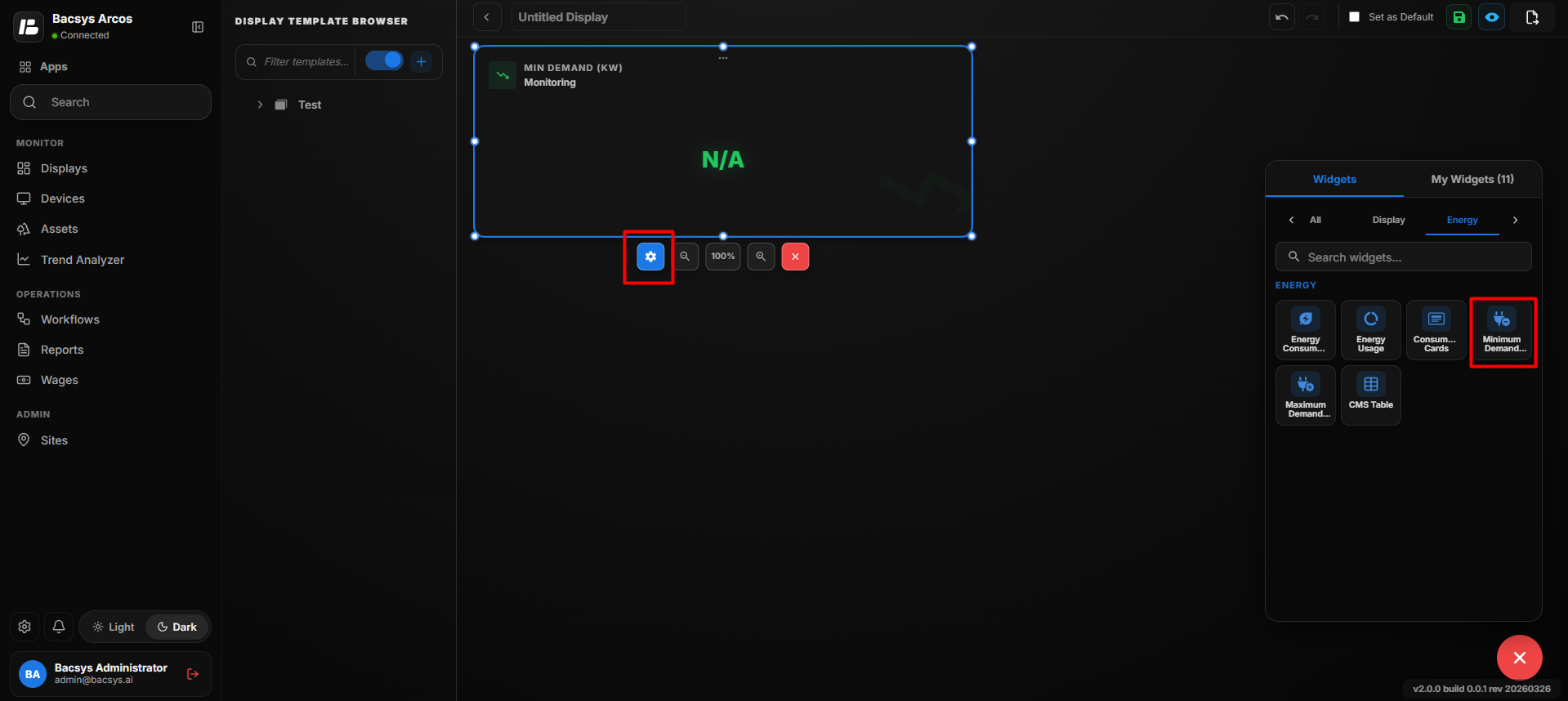
Min Demand Widget Settings
| Option | Description |
|---|---|
| Title | Enter the title to be displayed for the Min Demand Widget. |
| Point to be Mapped | Enter or select the power point used to determine the minimum demand value. Click Browse Hierarchy to select the required point. |
| Poll Frequency (Seconds) | Specify how frequently the widget retrieves or refreshes the selected point value. |
| Show Background | Use the toggle button to show or hide the widget background. |
| Hide Header | Use the toggle button to show or hide the widget header, including the title. |
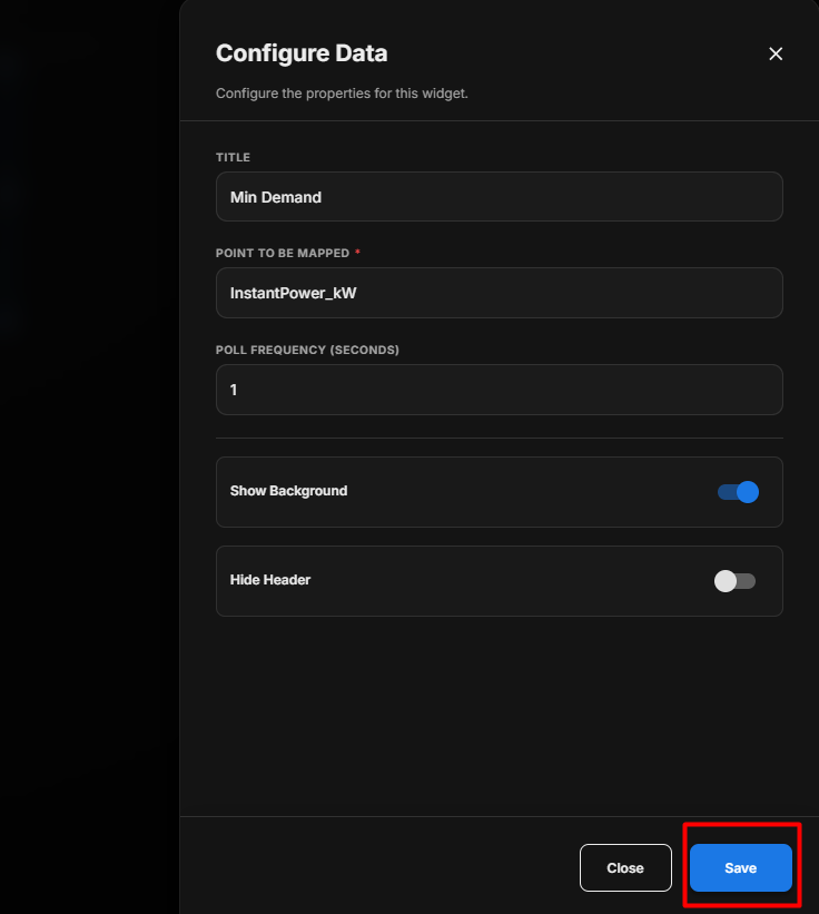
Configure the Min Demand Widget
- Enter the required Title.
- Under Point to be Mapped, enter or select the required power demand point.
- Set the required Poll Frequency (Seconds).
- Configure Show Background according to your requirement.
- Configure Hide Header according to your requirement.
- Review the configured settings.
- Click Save.
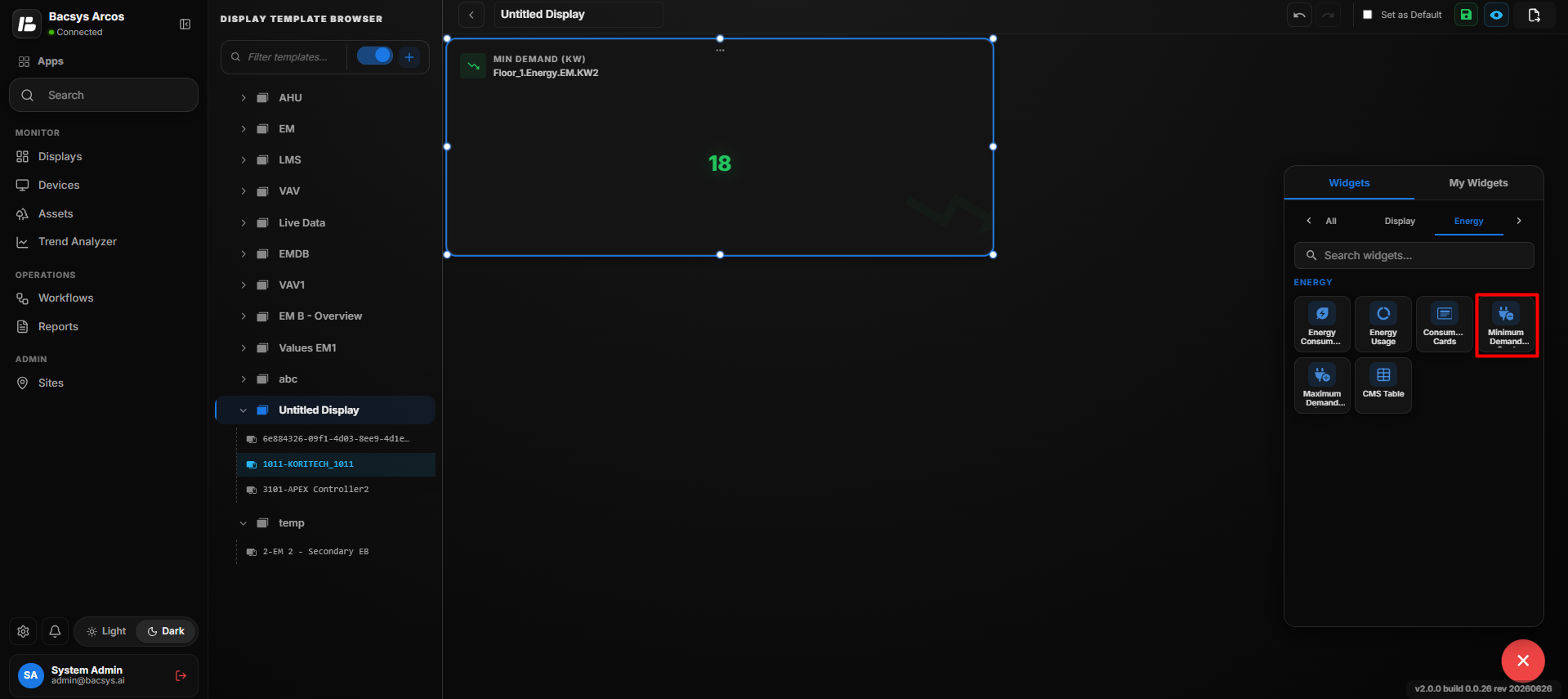
Min Demand Value
After saving, the widget displays the minimum demand value in kW for the selected power point.
Save the Configuration
After clicking Save, the Min Demand Widget is updated on the display and uses the configured point to display the minimum demand value.
Note: The minimum demand value depends on the configured Point to be Mapped and the availability of data from that point.
Add and Configure the Max Demand Widget
The Max Demand Widget is used to display the maximum demand value for a selected power point. The widget displays the demand value in kW.
Add the Max Demand Widget
- Click the + icon.
- Drag and drop the Max Demand Widget onto the display.
- Select the Max Demand Widget to view the available widget actions:
- Zoom In
- Zoom Out
- Settings
- Remove Widget
- Use Zoom In and Zoom Out to adjust the widget view as required.
- Click Settings to open the Configure Data panel.
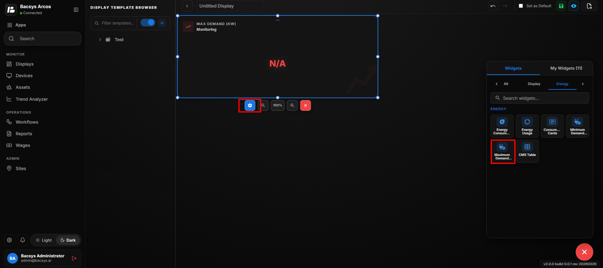
Max Demand Widget Settings
| Option | Description |
|---|---|
| Title | Enter the title to be displayed for the Max Demand Widget. |
| Point to be Mapped | Enter or select the power point used to determine the maximum demand value. Click Browse Hierarchy to select the required point. |
| Poll Frequency (Seconds) | Specify how frequently the widget retrieves or refreshes the selected point value. |
| Show Background | Use the toggle button to show or hide the widget background. |
| Hide Header | Use the toggle button to show or hide the widget header, including the title. |
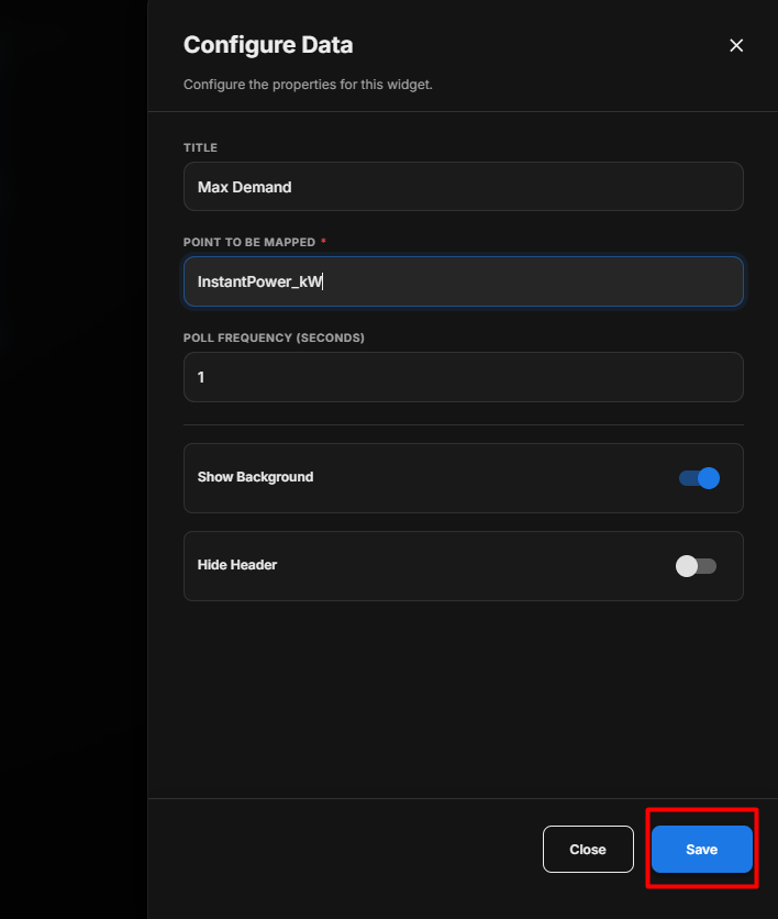
Configure the Max Demand Widget
- Enter the required Title.
- Under Point to be Mapped, enter or select the required power demand point.
- Set the required Poll Frequency (Seconds).
- Configure Show Background according to your requirement.
- Configure Hide Header according to your requirement.
- Review the configured settings.
- Click Save.
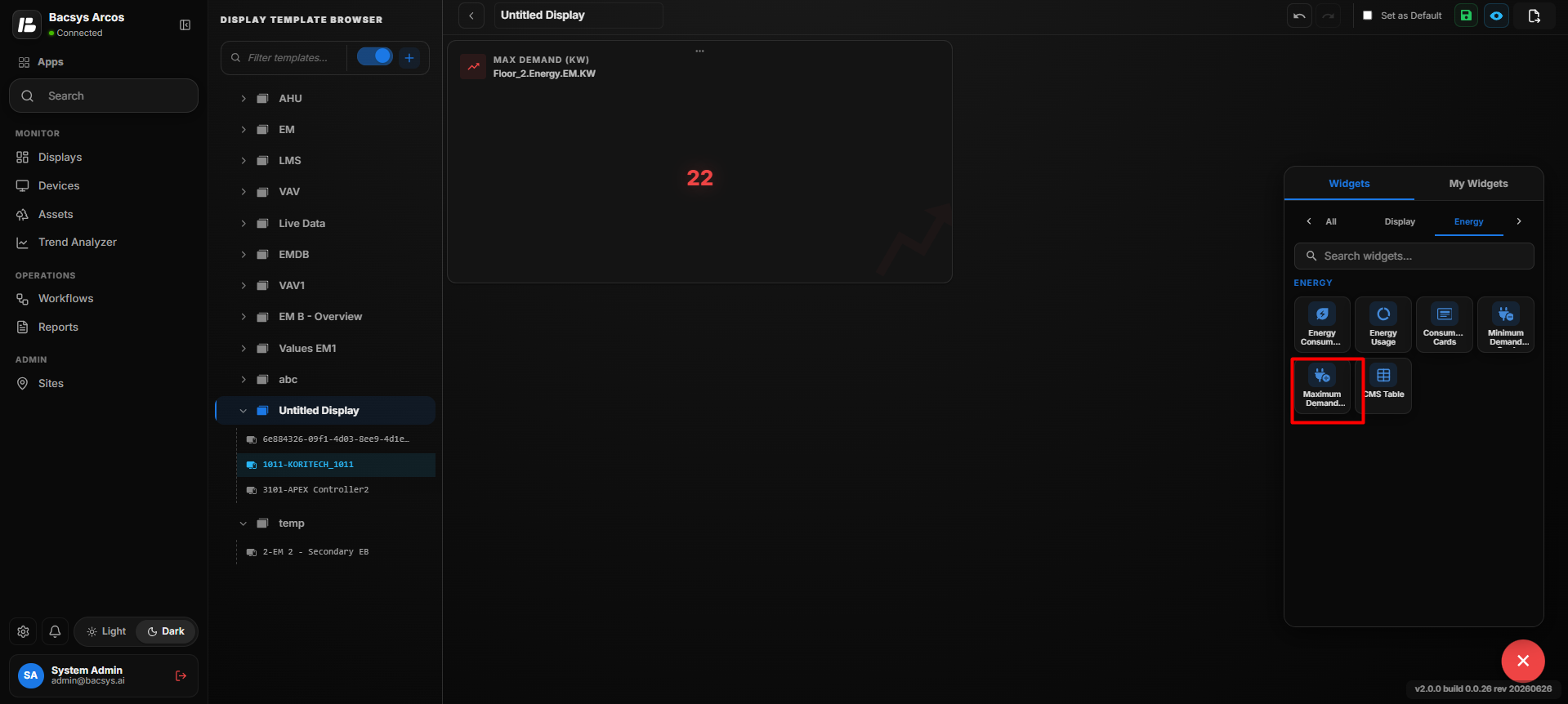
Max Demand Value
After saving, the widget displays the maximum demand value in kW for the selected power point.
Save the Configuration
After clicking Save, the Max Demand Widget is updated on the display and uses the configured point to display the maximum demand value.
Note: The maximum demand value depends on the configured Point to be Mapped and the availability of data from that point.
CMMS Table Widget
The CMMS Table Widget displays device-related maintenance and parameter information in a structured table. It allows users to select a device, configure constant points and parameters, customize the table appearance, and map the device to a dashboard.
Add the CMMS Table Widget
- Click the + icon.
- Drag and drop the CMMS Table Widget onto the display.
- Select the CMMS Table Widget to view the available widget actions:
- Zoom In
- Zoom Out
- Settings
- Remove Widget
- Use Zoom In and Zoom Out to adjust the widget size and view.
- Click Settings to open the Configure Data panel.
- Configure the required CMMS table settings.
- Review the configured settings.
- Click Save.
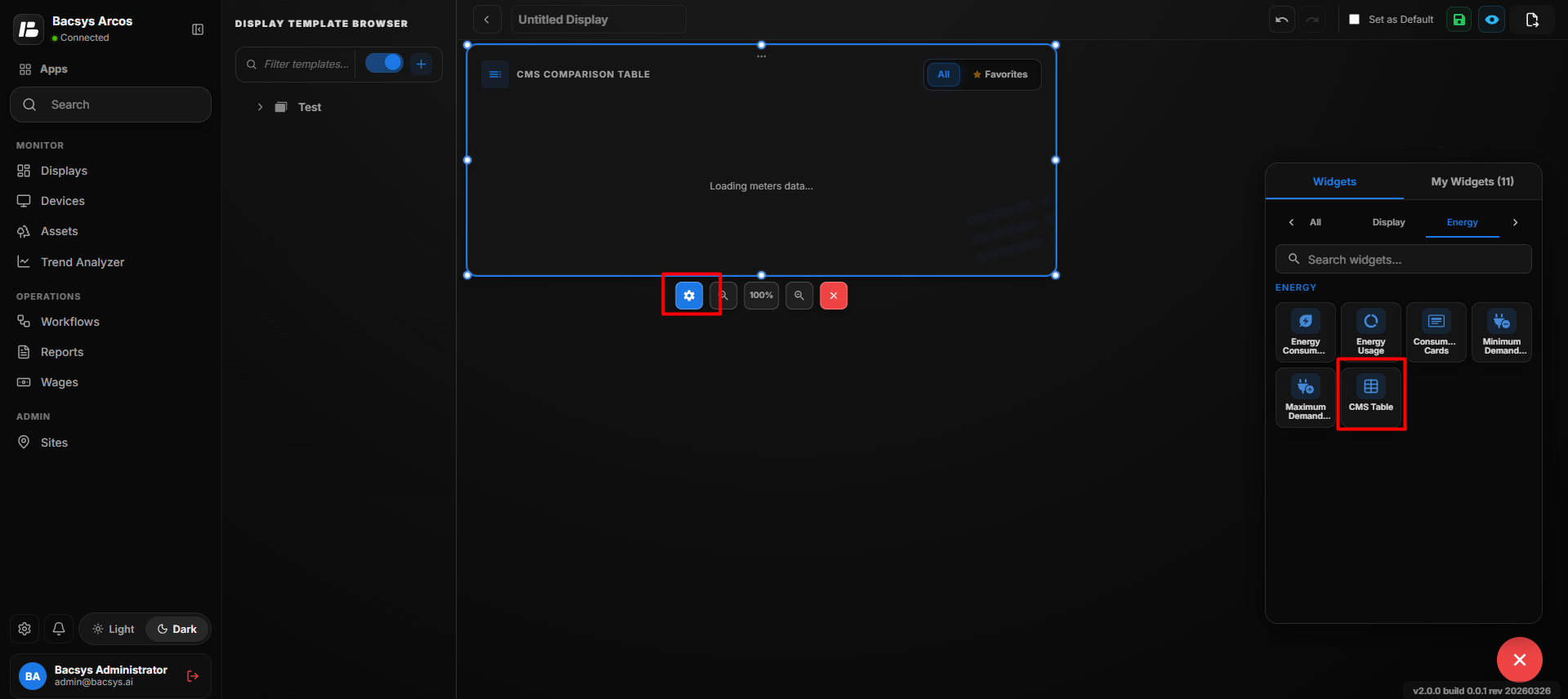
CMMS Table Settings
| Option | Description |
|---|---|
| Title | Enter a title for the CMMS Table Widget. The title identifies the information displayed in the table. |
| Select Device | Select the device whose CMMS information should be displayed in the table. |
| Add Constant Points | Add constant points that should always be displayed in the CMMS table. |
| No. of Constant Points | Specify the number of constant points to be displayed. The corresponding constant point fields are generated based on the entered number. |
| Constant Points | Enter the names of the constant points to be displayed for the selected device, such as Voltage, Power Factor, or Voltage THD. |
| No. of Parameters | Specify the number of additional parameters to be displayed for the selected device. |
| Bold Text | Enable the toggle to display the table text in bold. |
| Font Size | Specify the font size used for the table content. |
| Enable Write Value | Enable the toggle to allow supported point values to be written or modified directly from the table. |
| Show FROM Column | Enable the toggle to display the FROM column in the table. |
| Show TO Column | Enable the toggle to display the TO column in the table. |
| Device Dashboards Mapping | Select the display page that should be associated with the selected device. Use the search field to find and select the required display. |
| Show Background | Use the toggle button to show or hide the widget background. |
| Hide Header | Use the toggle button to show or hide the widget header, including the title. |
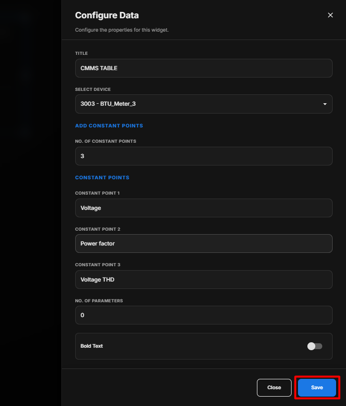
Configure the CMMS Table Widget
- Enter the required Title.
- Under Select Device, select the device whose information should be displayed.
- Under No. of Constant Points, enter the required number of constant points.
- Configure the generated Constant Points fields.
- Enter the required constant point names.
- Under No. of Parameters, specify the number of parameters to be displayed.
- Configure Bold Text according to your requirement.
- Enter the required Font Size.
- Enable Enable Write Value if values need to be modified directly from the table.
- Enable Show FROM Column if the FROM column is required.
- Enable Show TO Column if the TO column is required.
- Under Device Dashboards Mapping, search for and select the required display page.
- Configure Show Background according to your requirement.
- Configure Hide Header according to your requirement.
- Review all configured settings.
- Click Save.
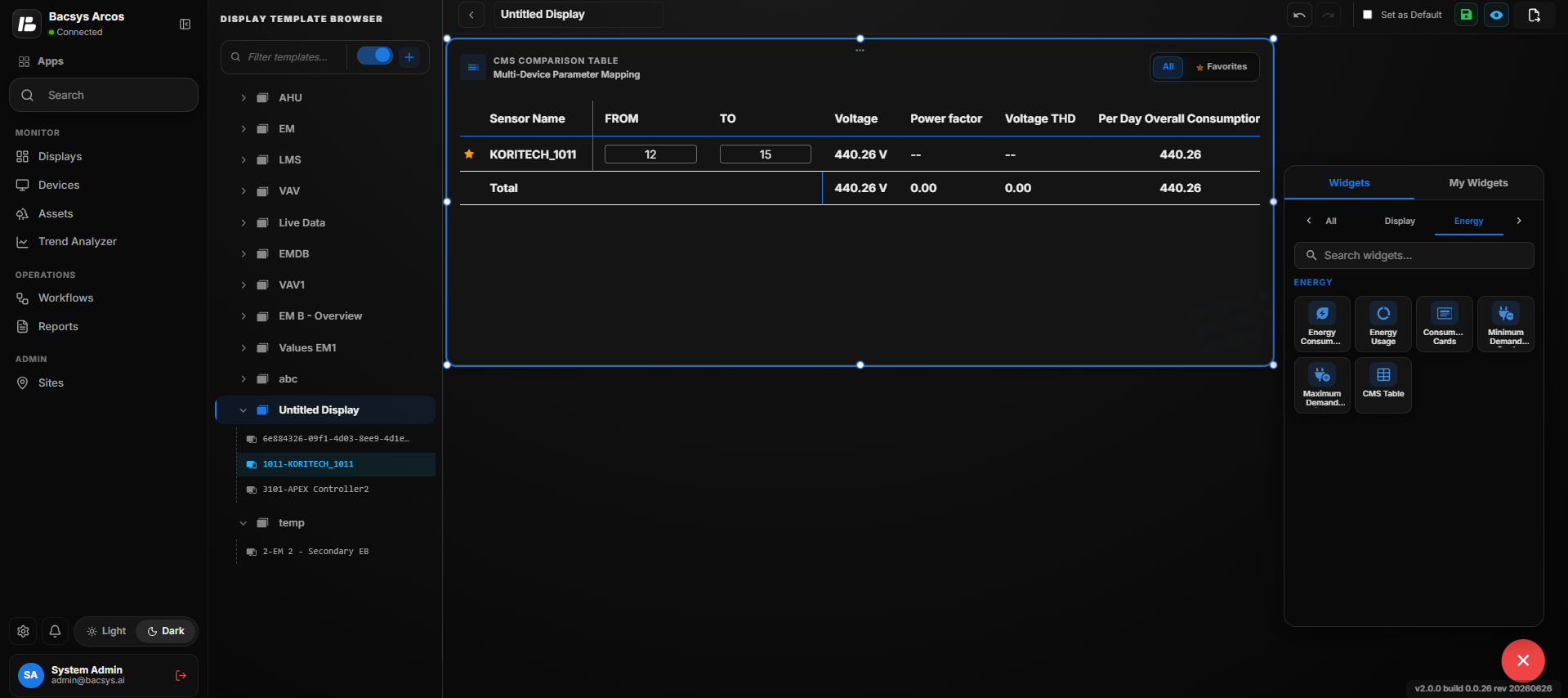
Select a Device
Under Select Device, select the device for which the CMMS information needs to be displayed.
The selected device determines the device information that is displayed in the CMMS Table Widget.
Configure Constant Points
Constant points are points that are always displayed in the CMMS table for the selected device.
- Under No. of Constant Points, enter the required number of constant points.
- The corresponding Constant Point fields are displayed.
- Enter the required point name in each field.
- Review the configured constant points.
Examples of constant points include:
- Voltage
- Power Factor
- Voltage THD
Configure Parameters
- Under No. of Parameters, enter the required number of parameters.
- Configure the required parameters for the selected device.
- Review the configured parameters.
Configure Table Appearance
The CMMS Table Widget provides options to customize how information is displayed.
- Enable Bold Text to display the table content in bold.
- Enter the required Font Size.
- Enable Enable Write Value to allow supported values to be modified from the table.
- Enable Show FROM Column to display the FROM column.
- Enable Show TO Column to display the TO column.
Configure Device Dashboards Mapping
The Device Dashboards Mapping section allows the selected device to be associated with a display page.
- Locate the selected device under Device Dashboards Mapping.
- Use the search field to find the required display page.
- Select the required display page.
- Review the selected dashboard mapping.
Configure Display Options
- Enable Show Background to display the widget background.
- Disable Show Background to hide the widget background.
- Enable Hide Header to hide the widget header.
- Disable Hide Header to display the widget header.
Save the Configuration
After configuring the device, constant points, parameters, table appearance, dashboard mapping, and display options:
- Review all configured settings.
- Click Save.
- The CMMS Table Widget is updated on the display with the configured device information and settings.
Note: The available device information, constant points, parameters, and dashboard mappings depend on the selected device and its configured data.
Analytics Widgets
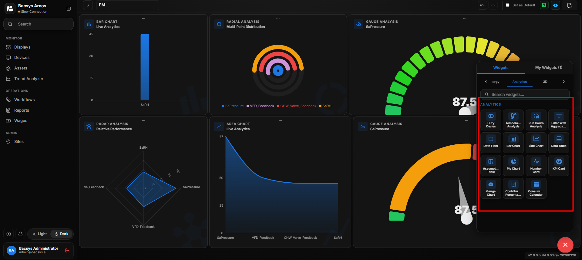
| Widget | Description |
|---|---|
| Duty Cycle | Displays equipment operating cycles. |
| Temperature Analysis | Displays temperature trends. |
| Run Hours Analysis | Displays equipment operating hours. |
| Filter with Aggregation | Filters trend data using aggregation intervals. |
| Date Filter | Filters data using a selected date range. |
| Bar Chart | Displays analytics using bars. |
| Line Chart | Displays analytics using lines. |
| Data Table | Displays analytical data in tabular format. |
| Assumption Table | Displays calculated analytical values. |
| Pie Chart | Displays proportional analytical data. |
| Number Card | Displays a key analytical value. |
| KPI Card | Displays key performance indicators. |
| Gauge Chart | Displays analytical values using a gauge. |
| Contribution Percentage | Displays the percentage contribution of selected points. |
| Consumption Calendar | Displays energy consumption in a calendar view. |
Duty Cycles
The Duty Cycles widget analyzes the operational cycle of equipment by displaying its ON/OFF patterns and runtime distribution over a selected period.
Add the Duty Cycles Widget
- Click the + icon.
- Drag and drop the Duty Cycles Widget onto the display.
- Select the Duty Cycles Widget.
- Use Zoom In and Zoom Out to adjust the widget view.
- Click Settings to open the Configure Data panel.
- Configure the required Duty Cycles settings.
- Review the configured settings.
- Click Save.
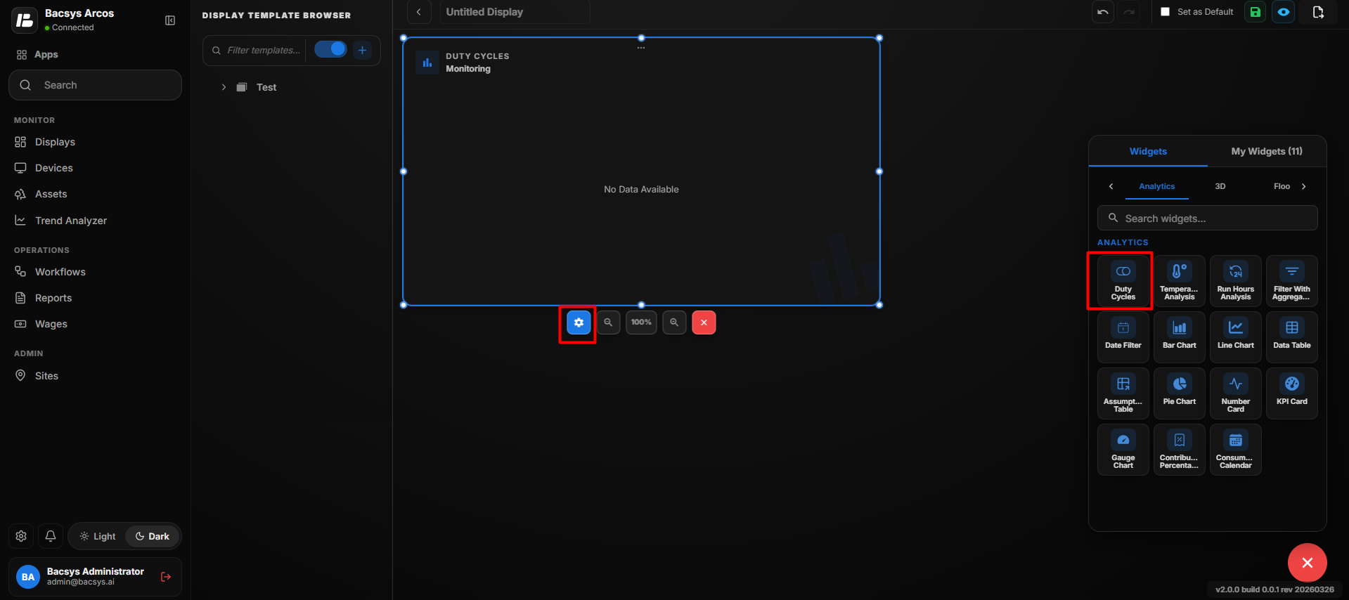 Duty Cycles
 Settings
| Option | Description |
|---|---|
| Title | Enter an optional title for the Duty Cycles Widget. |
| Point to be Mapped | Enter or select the point used to analyze the equipment's duty cycle. |
| Select Interval | Select the time interval for the duty cycle analysis. The available interval shown is Day Wise. |
| Date | Select the date for which the duty cycle data should be analyzed. Enter the date using the DD-MM-YYYY format or use the calendar picker. |
| Show Background | Use the toggle button to show or hide the widget background. |
| Hide Header | Use the toggle button to show or hide the widget header, including the title. |
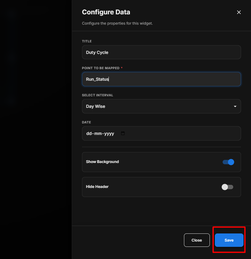 Duty Cycles Settings
Configure the Duty Cycles Widget
- Enter the required Title.
- Under Point to be Mapped, enter or select the required point.
- Under Select Interval, select the required interval.
- Under Date, select the date for which the duty cycle data needs to be analyzed.
- Configure Show Background according to your requirement.
- Configure Hide Header according to your requirement.
- Review the configured settings.
- Click Save.
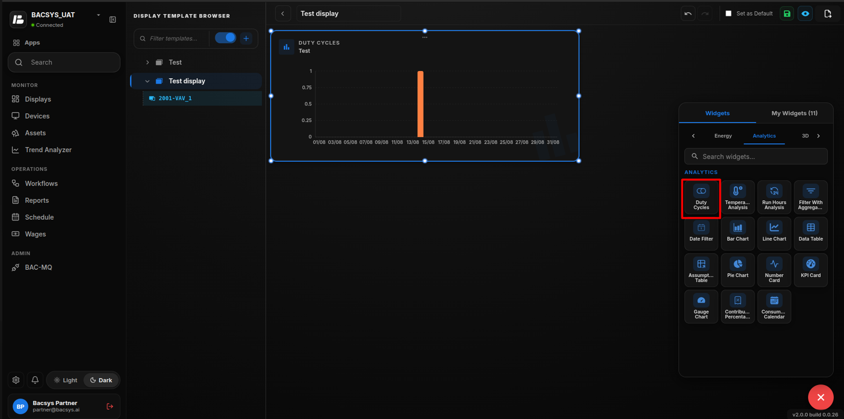 Configure Duty Cycles
Duty Cycle Analysis
After saving the configuration, the widget analyzes the selected point for the configured date and interval. It provides information about the equipment's operating cycle, including its ON/OFF behavior and runtime distribution.
Temperature Analysis Widget
The Temperature Analysis Widget displays temperature-related analysis data based on a configured point, time interval, date, and aggregation period.
Add the Temperature Analysis Widget
- Click the + icon.
- Drag and drop the Temperature Analysis Widget onto the display.
- Select the Temperature Analysis Widget to view the available widget actions:
- Zoom In
- Zoom Out
- Settings
- Remove Widget
- Use Zoom In and Zoom Out to adjust the widget size and view.
- Click Settings to open the Configure Data panel.
- Configure the required Temperature Analysis settings.
- Review the configured settings.
- Click Save.
Add Temperature Analysis
Temperature Analysis Settings
| Option | Description |
|---|---|
| Title | Enter the title to be displayed for the Temperature Analysis Widget. |
| Point to be Mapped | Enter or select the temperature point used for the analysis. |
| Select Interval | Select the time interval for which the temperature data should be analyzed. The available interval shown is Day Wise. |
| Date | Select the date for which the temperature analysis should be performed. Enter the date in DD-MM-YYYY format or use the calendar picker. |
| Select Aggregation | Select the aggregation period used to group the temperature data. The available option shown is 5 Minutes. |
| Show Background | Use the toggle button to show or hide the widget background. |
| Hide Header | Use the toggle button to show or hide the widget header, including the title. |
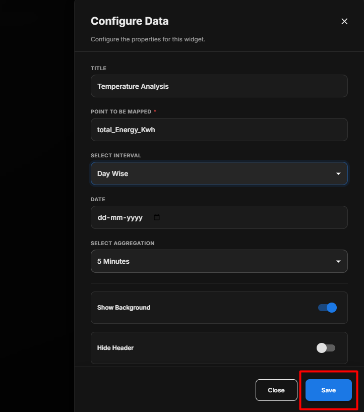 Temperature Analysis Settings
Configure the Temperature Analysis Widget
- Enter the required Title.
- Under Point to be Mapped, enter or select the required temperature point.
- Under Select Interval, select the required interval.
- Under Date, select the date for which the analysis needs to be performed.
- Under Select Aggregation, select the required aggregation period.
- Configure Show Background according to your requirement.
- Configure Hide Header according to your requirement.
- Review all configured settings.
- Click Save.
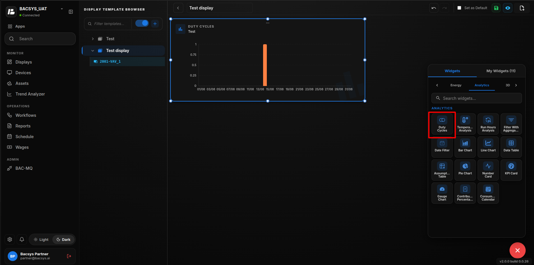 Configure Temperature Analysis
Save the Configuration
After clicking Save, the Temperature Analysis Widget is updated on the display and uses the configured point, interval, date, and aggregation settings to display the temperature analysis.
Note: The Temperature Analysis Widget displays No Data Available when the configured point does not have data for the selected date, interval, or aggregation period.
Run Hours Analysis
The Run Hours Analysis widget displays the total operating hours of selected equipment based on its configured status point and a selected time interval.
Add the Run Hours Analysis Widget
- Click the + icon.
- Drag and drop the Run Hours Analysis Widget onto the display.
- Select the Run Hours Analysis Widget.
- Use Zoom In and Zoom Out to adjust the widget view.
- Click Settings to open the Configure Data panel.
- Configure the required Run Hours Analysis settings.
- Review the configured settings.
- Click Save.
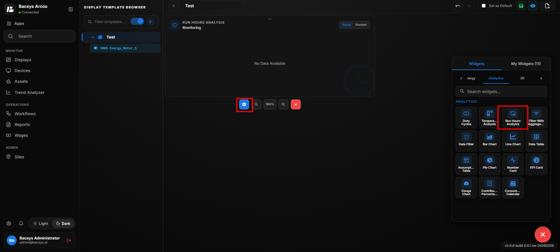 Add Run Hours Analysis
Run Hours Analysis Settings
| Option | Description |
|---|---|
| Title | Enter an optional title for the Run Hours Analysis Widget. |
| Point to be Mapped | Enter or select the point used to determine the equipment operating status. |
| Select Interval | Select the time interval for calculating the equipment run hours. The available interval shown is Day Wise. |
| Date | Select the date for which the equipment run hours should be calculated. Enter the date in DD-MM-YYYY format or use the calendar picker. |
| Show Background | Use the toggle button to show or hide the widget background. |
| Hide Header | Use the toggle button to show or hide the widget header, including the title. |
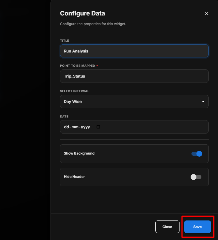 Run Hours Analysis Settings
Configure the Run Hours Analysis Widget
- Enter an optional Title.
- Under Select Point, click Browse Hierarchy.
- Navigate through Network → Device → Point.
- Select the required equipment status point.
- Under Select Interval, select the required interval.
- Select the required Date.
- Configure Show Background according to your requirement.
- Configure Hide Header according to your requirement.
- Review the configured settings.
- Click Save.
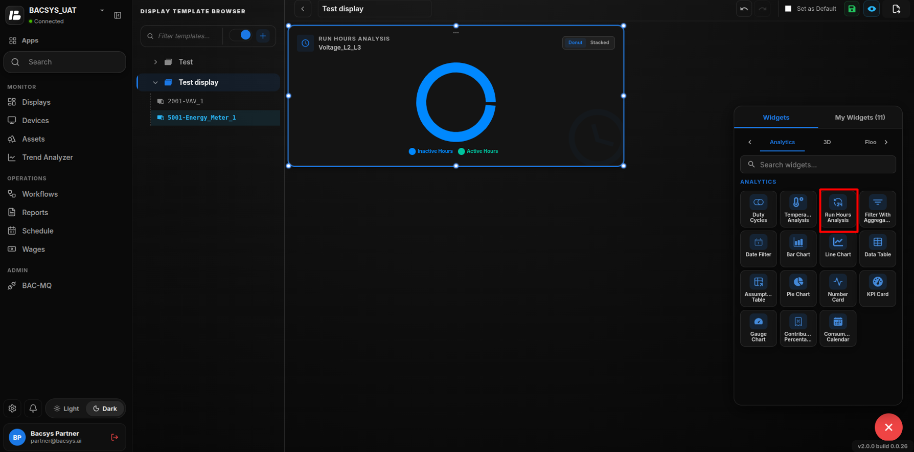 Configure Run Hours Analysis
Run Hours Calculation
After saving the configuration, the widget uses the selected point to determine the equipment's operating periods and calculates the total run hours for the selected date and interval.
Filter with Aggregation
The Filter with Aggregation widget allows users to filter data for a selected point based on a specific time interval and apply different aggregation methods to analyze the data.
Add the Filter with Aggregation Widget
- Click the + icon.
- Drag and drop the Filter with Aggregation Widget onto the display.
- Select the Filter with Aggregation Widget.
- Use Zoom In and Zoom Out to adjust the widget view.
- Click Settings to open the Configure Data panel.
- Configure the required Filter with Aggregation settings.
- Review the configured settings.
- Click Save.
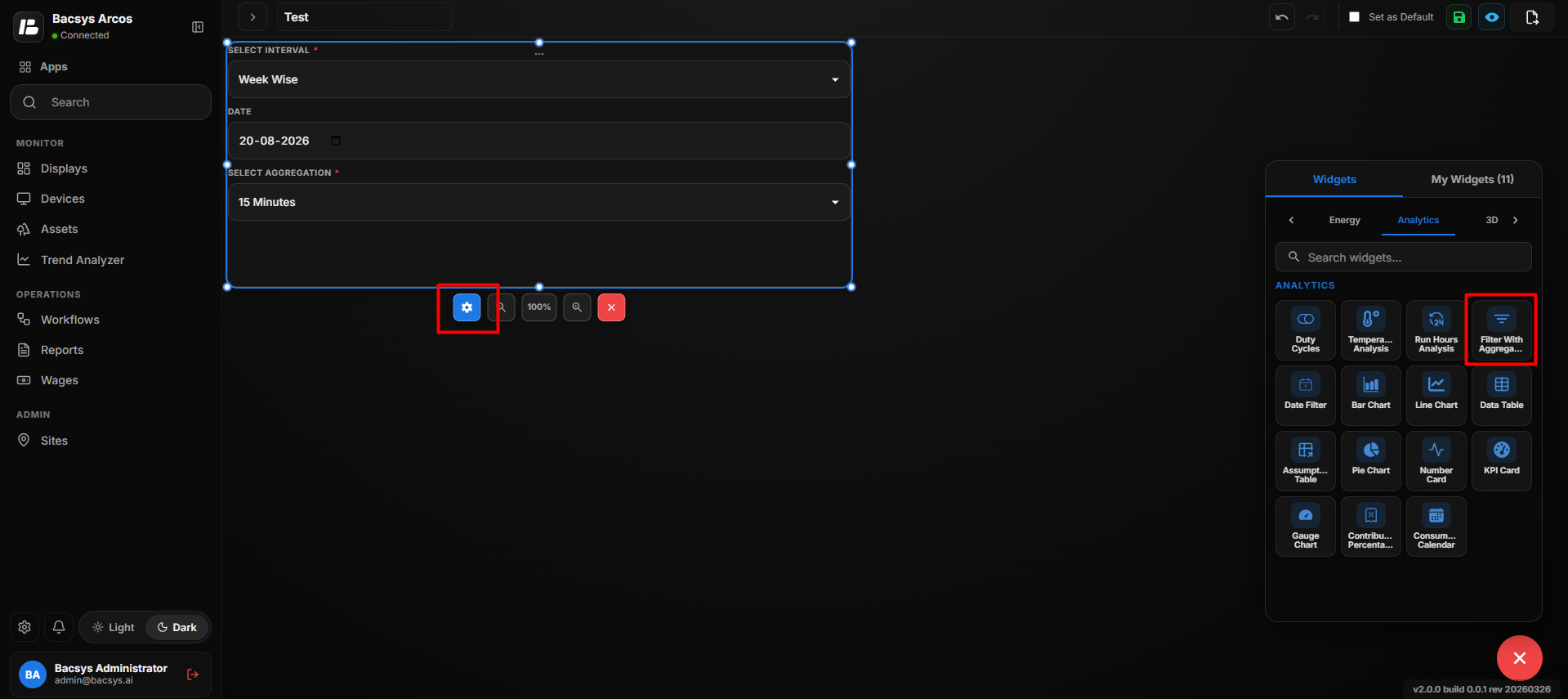 Add Filter with Aggregation
Filter with Aggregation Settings
| Option | Description |
|---|---|
| Title | Enter an optional title for the Filter with Aggregation Widget. |
| Point to be Mapped | Enter or select the point for which the data should be filtered and aggregated. |
| Show Background | Use the toggle button to show or hide the widget background. |
| Hide Header | Use the toggle button to show or hide the widget header, including the title. |
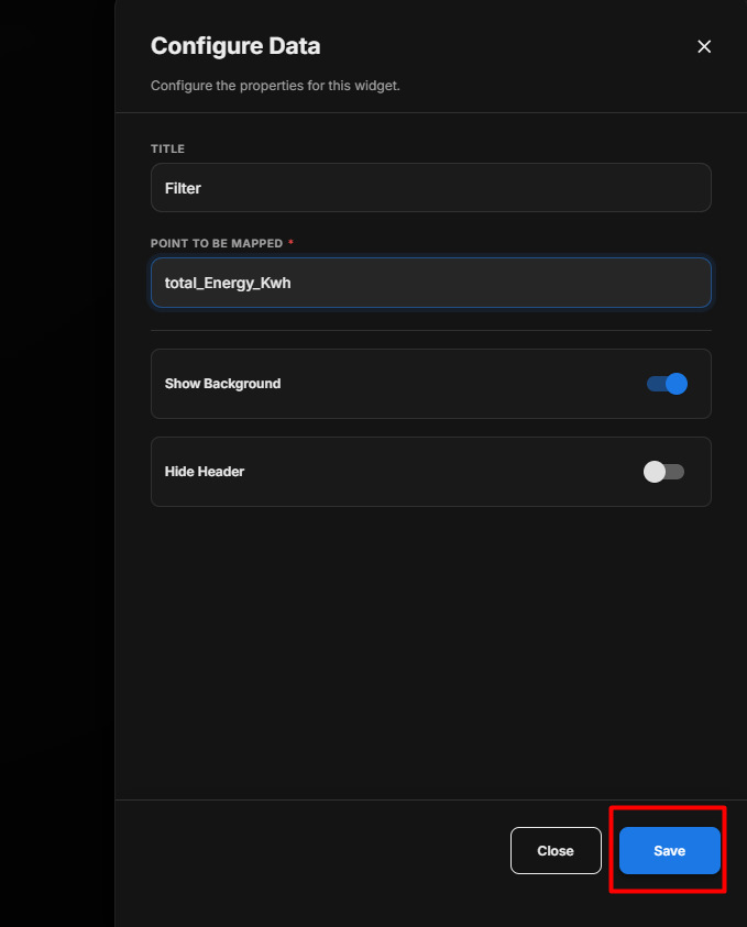 Filter with Aggregation Settings
Configure the Filter with Aggregation Widget
- Enter an optional Title.
- Enter an optional Subtitle.
- Under Select Point, click Browse Hierarchy.
- Navigate through Network → Device → Point.
- Select the required point.
- Under Select Interval, select the required interval:
- Week Wise
- Date Wise
- Month Wise
- Select the required Date or date range.
- Under Select Aggregation, select the required aggregation period:
- 5 Min
- 15 Min
- 1 Hour
- 1 Day
- 1 Week
- 1 Month
- Configure Poll Frequency (Seconds) if available.
- Configure Show Background according to your requirement.
- Configure Hide Header according to your requirement.
- Review the configured settings.
- Click Save.
Data Aggregation
The selected aggregation period determines how the filtered data is grouped for analysis.
| Aggregation | Description |
|---|---|
| 5 Min | Groups data into 5-minute intervals. |
| 15 Min | Groups data into 15-minute intervals. |
| 1 Hour | Groups data into hourly intervals. |
| 1 Day | Groups data into daily intervals. |
| 1 Week | Groups data into weekly intervals. |
| 1 Month | Groups data into monthly intervals. |
Widget Display
After saving the configuration, the widget displays the filtered and aggregated data according to the selected point, interval, date, and aggregation period.
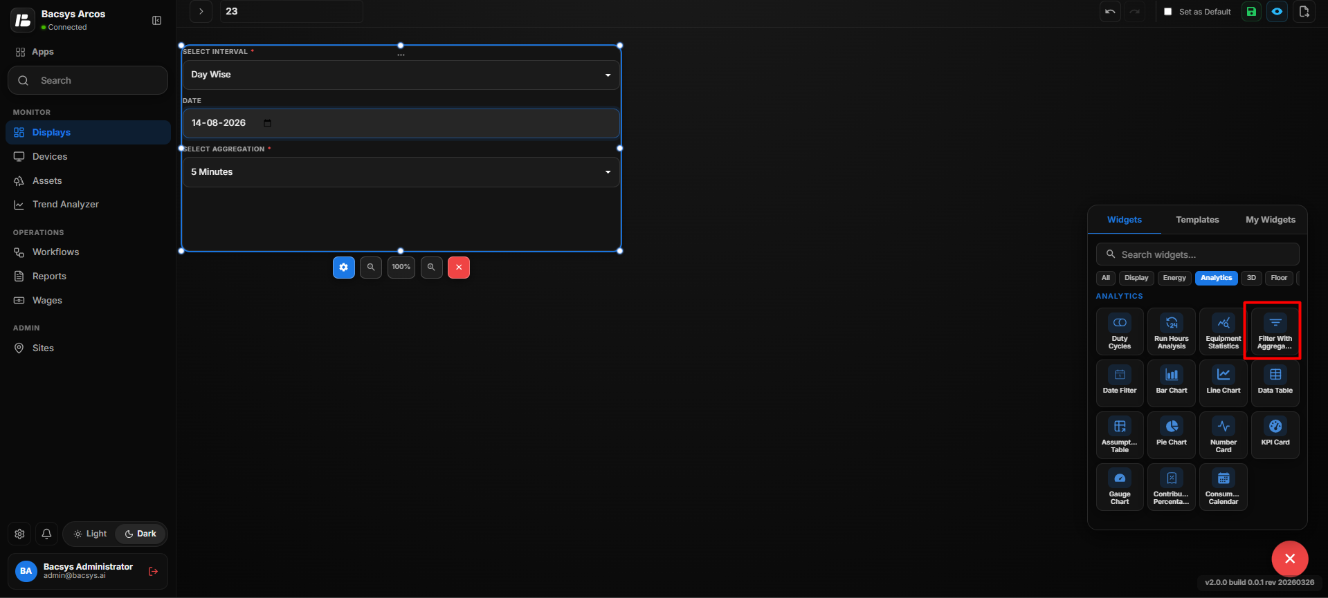 Filter with Aggregation Settings
Note: If the widget is arranged or resized to occupy the full available display area, the widget can expand to fill the display.
Date Filter
The Date Filter widget allows users to select a time interval and date range that can be applied to the display. When the filter is applied, the selected date range updates the data displayed across the widgets on the display.
Add the Date Filter Widget
- Click the + icon.
- Drag and drop the Date Filter Widget onto the display.
- Select the Date Filter Widget.
- Use Zoom In and Zoom Out to adjust the widget view.
- Configure the required date filter settings.
- Select the required interval and dates.
- Click Apply to apply the selected date range.
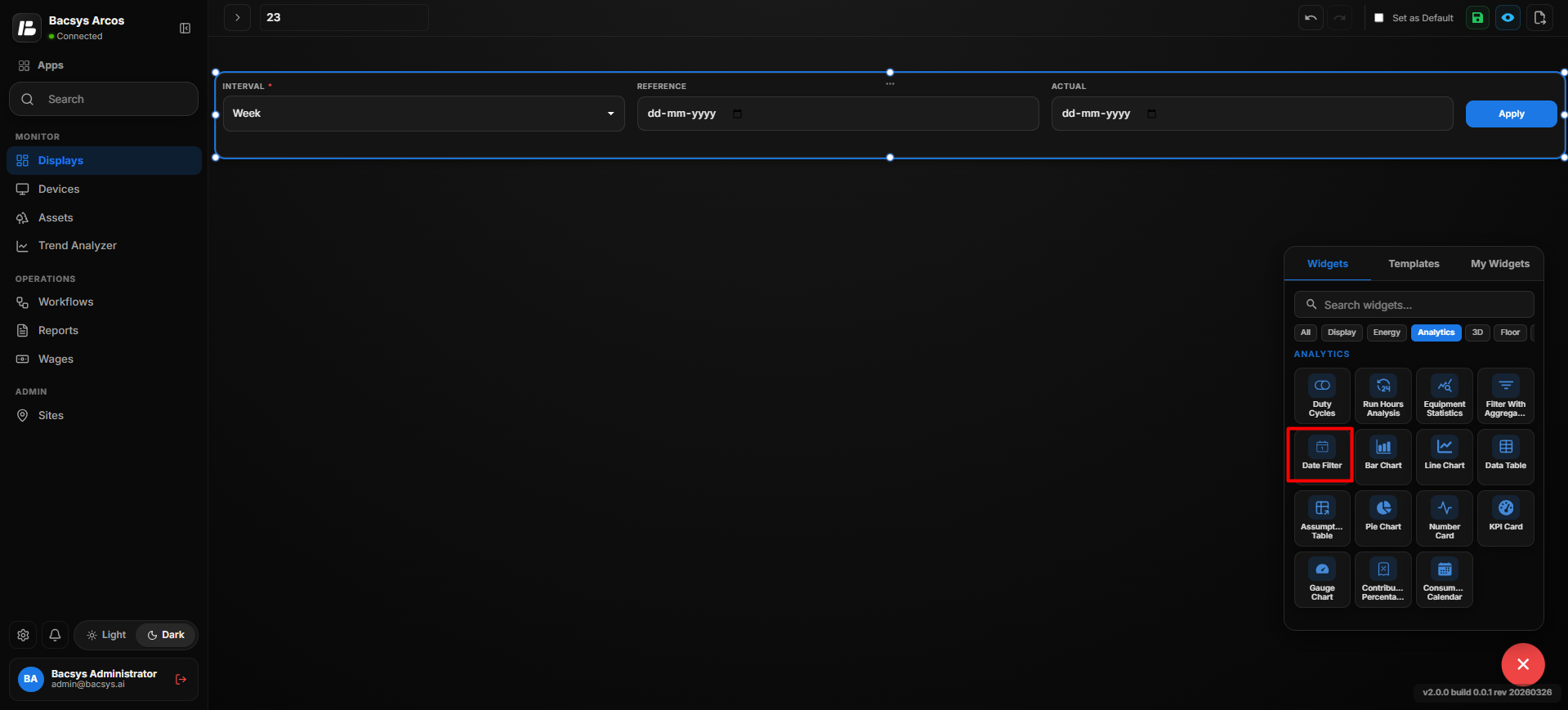 Add Date Filter
Date Filter Options
| Option | Description |
|---|---|
| Interval | Select the time period for filtering the display data. |
| Reference | Select the reference date used for the selected interval. |
| Actual | Select the actual date used for the selected interval. |
| Apply | Applies the selected interval and dates to the display. |
Configure the Date Filter
- Under Interval, select the required interval, such as Week.
- Select the required Reference date.
- Select the required Actual date.
- Review the selected date range.
- Click Apply.
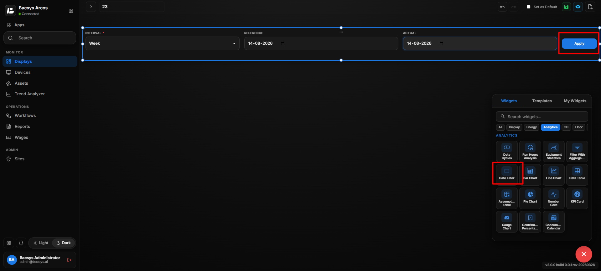 Date Filter Settings
Apply the Date Filter
After clicking Apply, the selected date range is applied to the entire display.
The widgets that use date-based or historical data will refresh their displayed data according to the selected filter.
Note: The Date Filter acts as a common display-level filter. Changing the interval or dates and clicking Apply updates the applicable widgets across the display.
Bar Chart
The Bar Chart widget visualizes and compares data from selected points using bars. It allows users to compare point consumption or other values based on a selected comparison period.
Add the Bar Chart Widget
- Click the + icon.
- Drag and drop the Bar Chart Widget onto the display.
- Select the Bar Chart Widget.
- Use Zoom In and Zoom Out to adjust the widget view.
- Click Settings to open the Configure Data panel.
- Configure the required Bar Chart settings.
- Review the configured settings.
- Click Save.
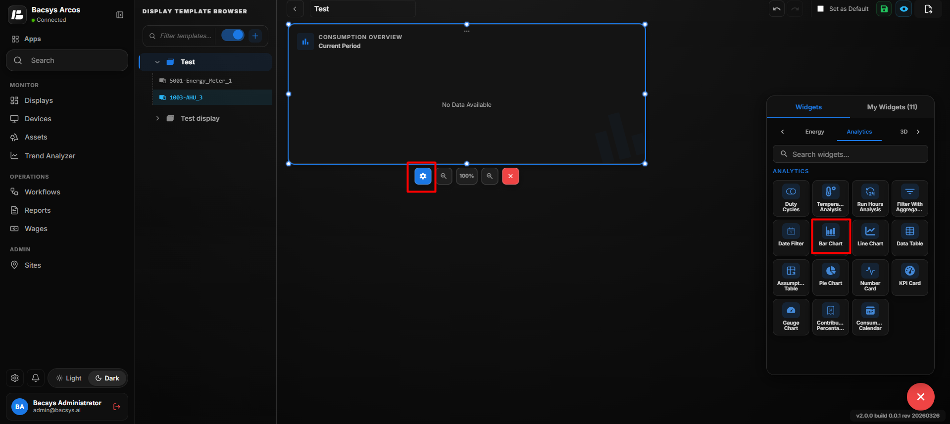 Add Bar Chart
Bar Chart Settings
| Option | Description |
|---|---|
| Title | Enter an optional title for the Bar Chart widget. |
| Select Point | Select one or more points to be displayed in the bar chart. Click Browse Hierarchy to navigate through Network → Device → Point and select the required points. |
| Compare As | Select how the selected point data should be compared. The available option shown is Day. |
| Reference | Select the reference date used for comparison. |
| Actual | Select the actual date used for comparison. |
| Overall Point Consumption | Enable this option to display the overall consumption of the selected points. |
| Represent As | Select the required calculation or representation method for the selected data. |
| Show Background | Use the toggle button to show or hide the widget background. |
| Hide Header | Use the toggle button to show or hide the widget header. |
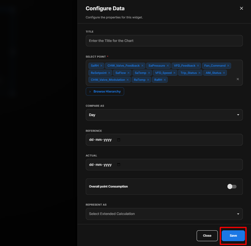 Bar Chart Settings
Configure the Bar Chart
- Enter an optional Title.
- Under Select Point, click Browse Hierarchy.
- Navigate through Network → Device → Point.
- Select the required points.
- Under Compare As, select the required comparison period.
- Select the Reference date.
- Select the Actual date.
- Enable Overall Point Consumption if required.
- Under Represent As, select the required calculation or representation.
- Configure Show Background according to your requirement.
- Configure Hide Header according to your requirement.
- Review the configured settings.
- Click Save.
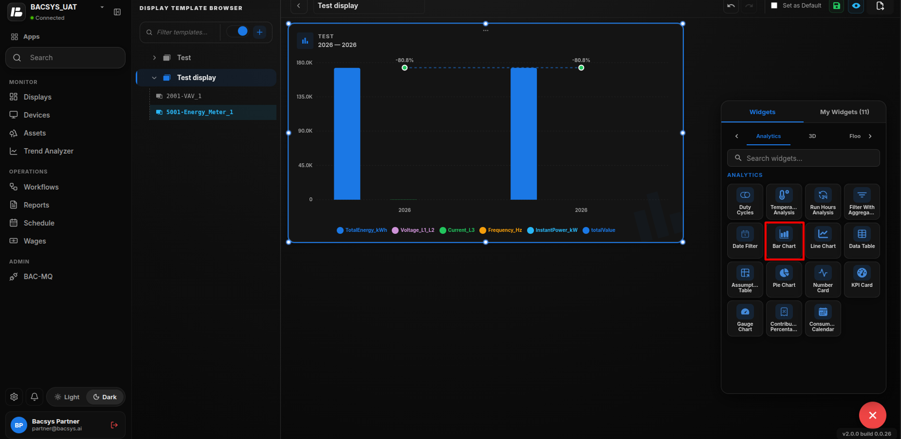 Configure Bar Chart
Bar Chart Comparison
After saving the configuration, the widget displays the selected points as bars and compares the data according to the configured comparison period, reference date, actual date, and representation method.
The Bar Chart can be used to visually compare consumption or other selected point values across the configured periods.
Line Chart Widget
The Line Chart Widget displays point data as a line chart and allows users to compare consumption or trend data between a reference period and an actual period.
Add the Line Chart Widget
- Click the + icon.
- Drag and drop the Line Chart Widget onto the display.
- Select the Line Chart Widget.
- Use Zoom In and Zoom Out to adjust the widget size and view.
- Click Settings to open the Configure Data panel.
- Configure the required Line Chart settings.
- Review the configured settings.
- Click Save.
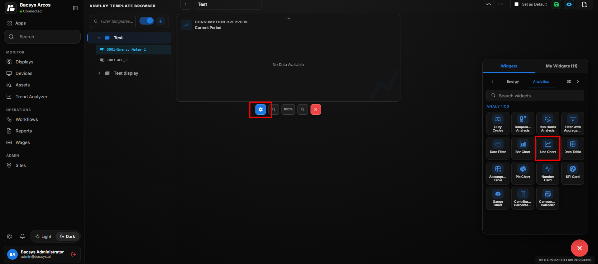
Line Chart Settings
| Option | Description |
|---|---|
| Title | Enter a title for the Line Chart Widget. |
| Number of Rows | Specify the number of points to be displayed in the chart. The corresponding point-mapping fields are generated based on the entered number. |
| Point to be Mapped for Row | Enter or select the point whose data should be displayed in the corresponding row of the Line Chart. |
| Compare As | Select the period by which the point data should be compared. The available option shown is Day. |
| Compare Till Current | Enable this option to compare the selected reference period with the current period up to the present time. |
| Reference | Select the reference date used as the comparison period. |
| Actual | Select the actual date to be compared against the reference period. |
| Overall Point Consumption | Enable this option to display the overall consumption of the selected point for the configured comparison. |
| Represent As | Select the required extended calculation or representation method for displaying the comparison data. |
| Show Background | Use the toggle button to show or hide the widget background. |
| Hide Header | Use the toggle button to show or hide the widget header, including the title. |
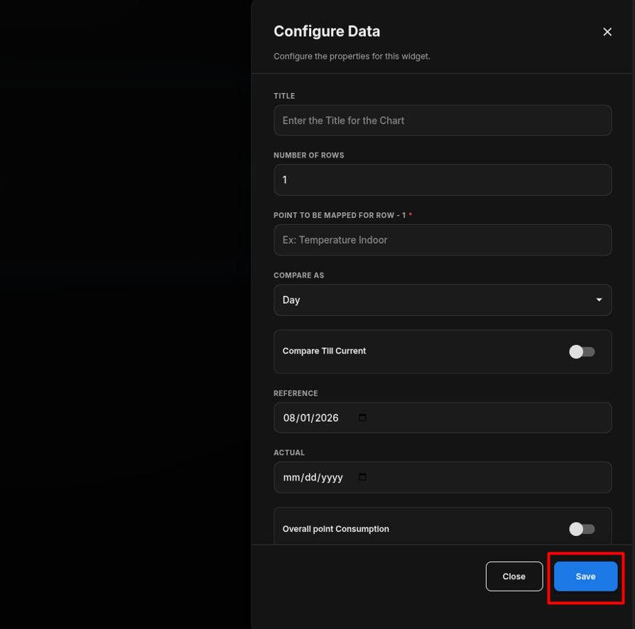
Configure the Line Chart
- Enter the required Title.
- Under Number of Rows, enter the number of points required for the chart.
- Under Point to be Mapped for Row, enter or select the required point for each row.
- Under Compare As, select the required comparison period.
- Enable Compare Till Current if the comparison should continue up to the current time.
- Under Reference, select the date to be used as the reference period.
- Under Actual, select the date to be used as the actual period.
- Enable Overall Point Consumption if the overall consumption needs to be displayed.
- Under Represent As, select the required extended calculation.
- Configure Show Background according to your requirement.
- Configure Hide Header according to your requirement.
- Review all configured settings.
- Click Save.
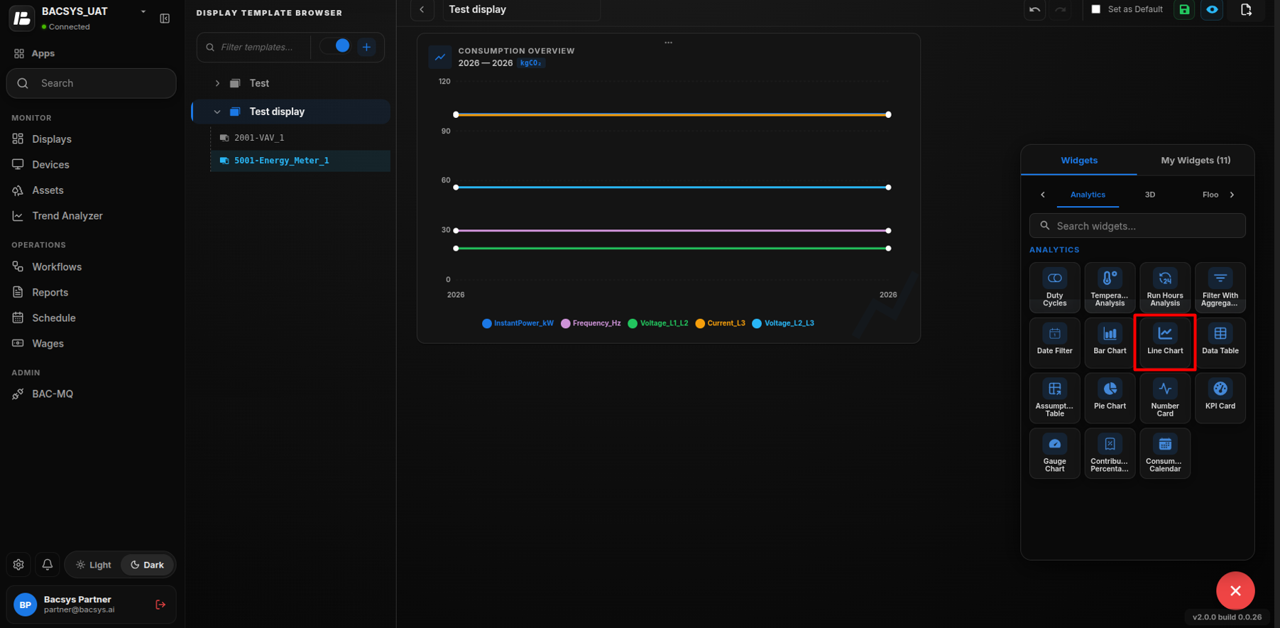
Save the Configuration
After configuring the required points and comparison settings, click Save.
The Line Chart Widget is updated on the display with the selected point data and configured comparison settings.
Line Chart Behavior
The Line Chart displays the configured point data based on the selected Compare As, Reference, and Actual values.
For example, when Compare As is set to Day, the widget can compare the selected point's data between the configured Reference date and Actual date.
If Compare Till Current is enabled, the comparison continues against the current time instead of using the complete actual period.
If Overall Point Consumption is enabled, the widget displays the overall consumption for the selected point as part of the comparison.
The Represent As option determines how the calculated comparison data is represented in the chart.
Data Table
The Data Table widget displays selected point data in a structured table format. It allows users to compare data based on selected dates and comparison periods and provides additional fields for displaying points and delta information.
Add the Data Table Widget
- Click the + icon.
- Drag and drop the Data Table Widget onto the display.
- Select the Data Table Widget.
- Use Zoom In and Zoom Out to adjust the widget view.
- Click Settings to open the Configure Data panel.
- Configure the required Data Table settings.
- Review the configured settings.
- Click Save.
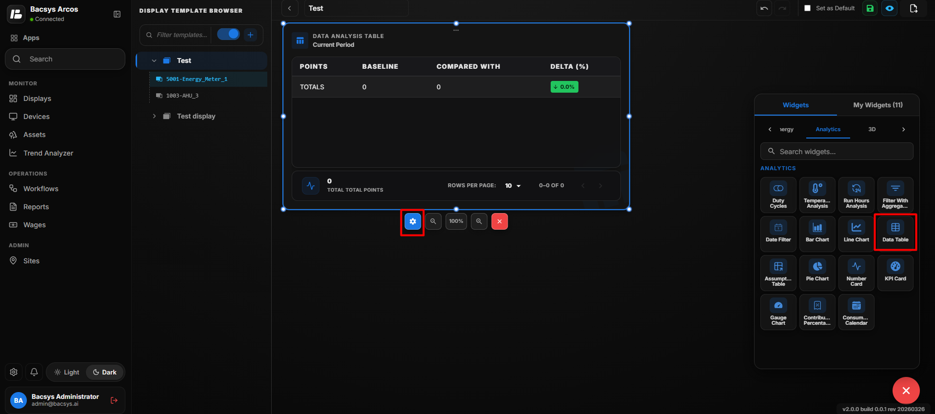 Add Data Table
Data Table Settings
| Option | Description |
|---|---|
| Title | Enter an optional title for the Data Table widget. |
| Select Point | Select the point whose data should be displayed in the table. Click Browse Hierarchy to navigate through Network → Device → Point and select the required point. |
| Compare As | Select the period used to compare the selected point data. The available option shown is Day. |
| Reference | Select the reference date used for comparison. |
| Actual | Select the actual date used for comparison. |
| Represent As | Select the required calculation or representation method for the selected data. |
| Placeholder for Points | Enter placeholder text for displaying or representing points in the table. |
| Placeholder for Delta | Enter placeholder text for displaying the difference or delta between the compared values. |
| Show Background | Use the toggle button to show or hide the widget background. |
| Hide Header | Use the toggle button to show or hide the widget header. |
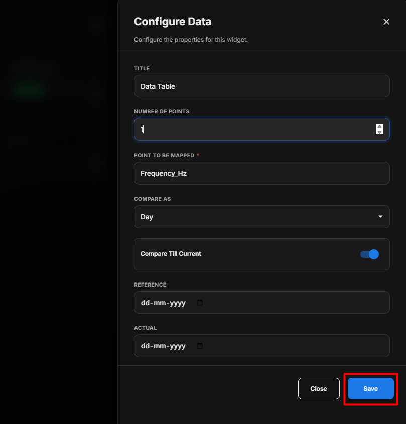 Data Table Settings
Configure the Data Table
- Enter an optional Title.
- Under Select Point, click Browse Hierarchy.
- Navigate through Network → Device → Point.
- Select the required point.
- Under Compare As, select the required comparison period.
- Select the Reference date.
- Select the Actual date.
- Under Represent As, select the required calculation or representation.
- Enter the required Placeholder for Points text.
- Enter the required Placeholder for Delta text.
- Configure Show Background according to your requirement.
- Configure Hide Header according to your requirement.
- Review the configured settings.
- Click Save.
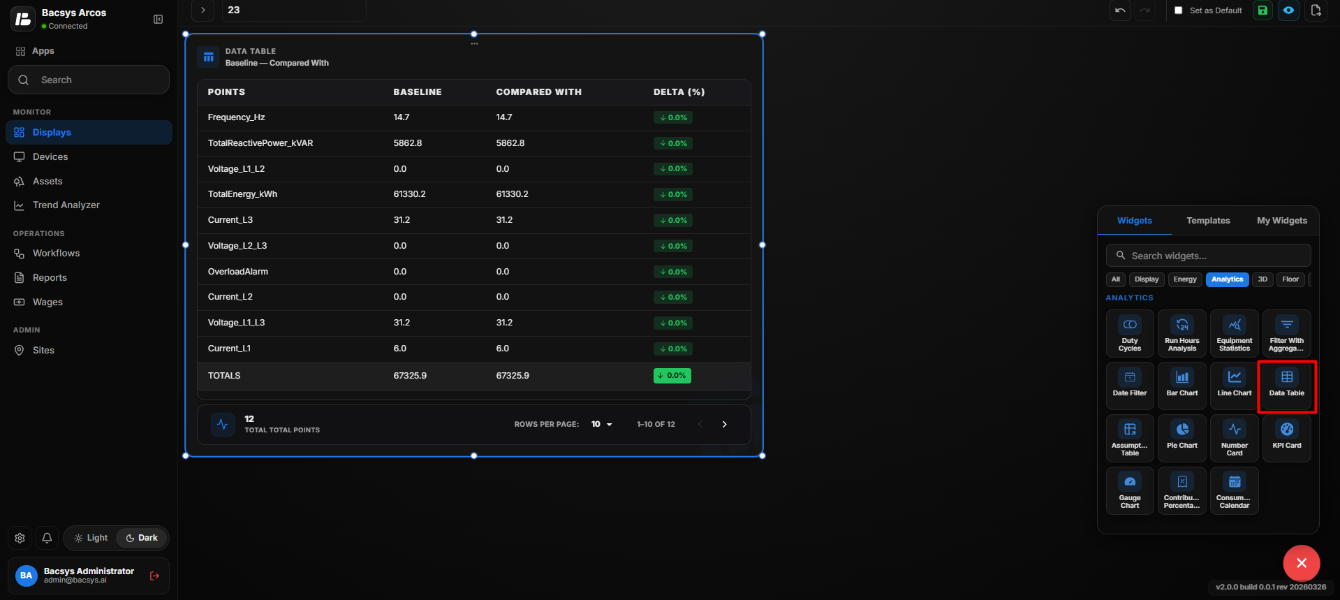 Configure Data Table
Data Table Comparison
After saving the configuration, the widget displays the selected point data in a table format based on the configured comparison period, reference date, actual date, and representation method.
The Placeholder for Points and Placeholder for Delta fields can be used to define how point values and their differences are represented in the table.
Pie Chart
The Pie Chart widget displays the distribution of selected data as proportional segments of a circular chart. It can be used to compare the contribution of different values or categories.
Add the Pie Chart Widget
- Click the + icon.
- Drag and drop the Pie Chart Widget onto the display.
- Select the Pie Chart Widget.
- Use Zoom In and Zoom Out to adjust the widget view.
- Click Settings to open the Configure Data panel.
- Configure the required Pie Chart settings.
- Click Save.
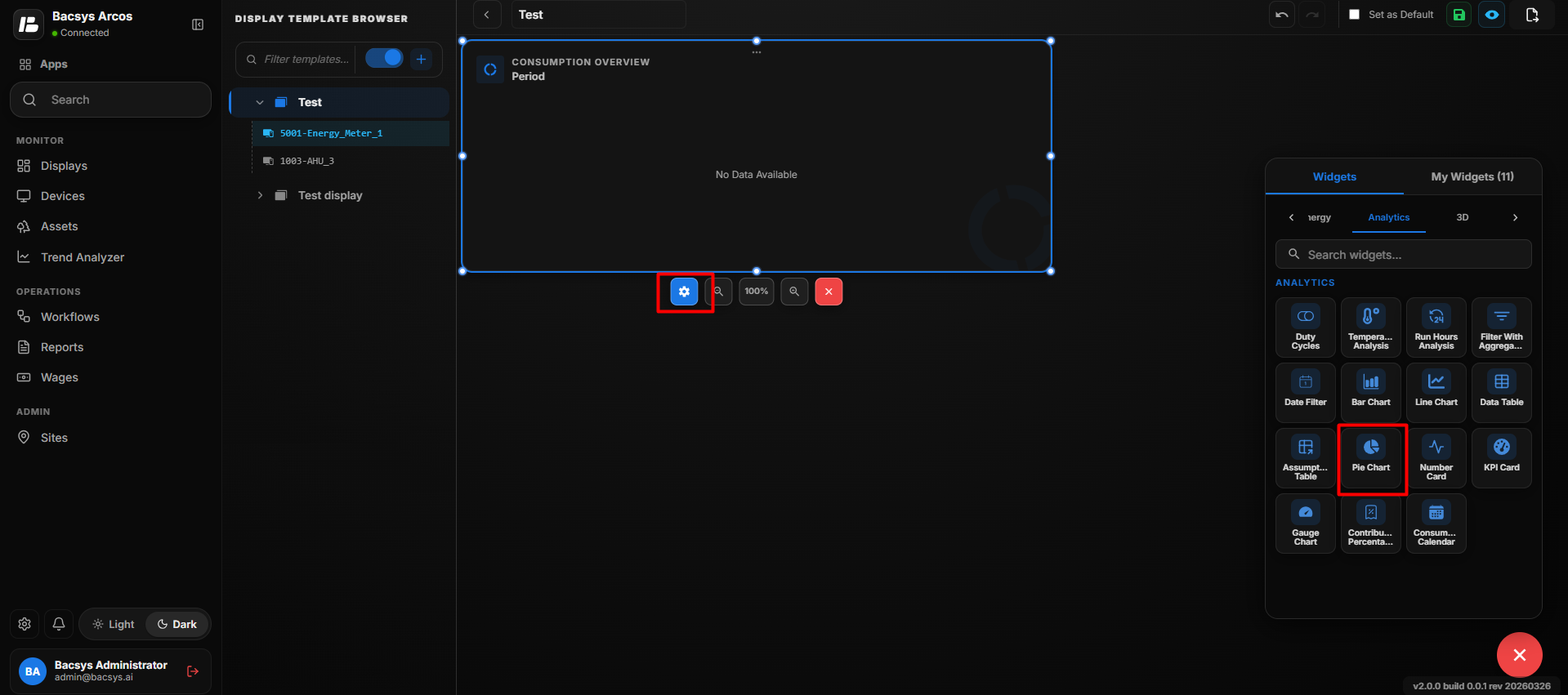 Add Pie Chart
Pie Chart Settings
| Option | Description |
|---|---|
| Title | Enter the title to be displayed for the Pie Chart. |
| Number of Rows | Specify the number of rows or points to be displayed in the Pie Chart. |
| Point to be Mapped for Row | Enter or select the point to be mapped to the corresponding row. |
| Compare As | Select the comparison period used to calculate the displayed data. The available option shown is Day. |
| Date | Select the date for which the data should be displayed. |
| Show Cell Percentage | Enable the toggle to display the percentage value for each section of the Pie Chart. |
| Represent As | Select the required extended calculation method. Available options include KgCO2, Tariff, Area, and Cost. |
| Show Background | Use the toggle button to show or hide the widget background. |
| Hide Header | Use the toggle button to show or hide the widget header, including the title. |
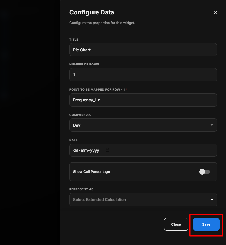 Pie Chart Settings
Configure the Pie Chart
- Enter the required Title.
- Specify the required Number of Rows.
- Under Point to be Mapped for Row, enter or select the required point.
- Under Compare As, select the required comparison period.
- Select the required Date.
- Enable Show Cell Percentage if percentage values should be displayed.
- Under Represent As, select the required calculation:
- KgCO2
- Tariff
- Area
- Cost
- Configure Show Background according to your requirement.
- Configure Hide Header according to your requirement.
- Review the configured settings.
- Click Save.
Configure Pie Chart
After saving, the Pie Chart displays the selected data as proportional segments. When Show Cell Percentage is enabled, the percentage contribution of each segment is also displayed.
Save the Configuration
After clicking Save, the Pie Chart Widget is updated on the display using the configured point, comparison period, date, and extended calculation settings.
Number Card
The Number Card widget displays a selected point value as a prominent numerical value. It can be used to quickly monitor important real-time or historical metrics.
Add the Number Card Widget
- Click the + icon.
- Drag and drop the Number Card Widget onto the display.
- Select the Number Card Widget.
- Use Zoom In and Zoom Out to adjust the widget view.
- Click Settings to open the Configure Data panel.
- Configure the required Number Card settings.
- Click Save.
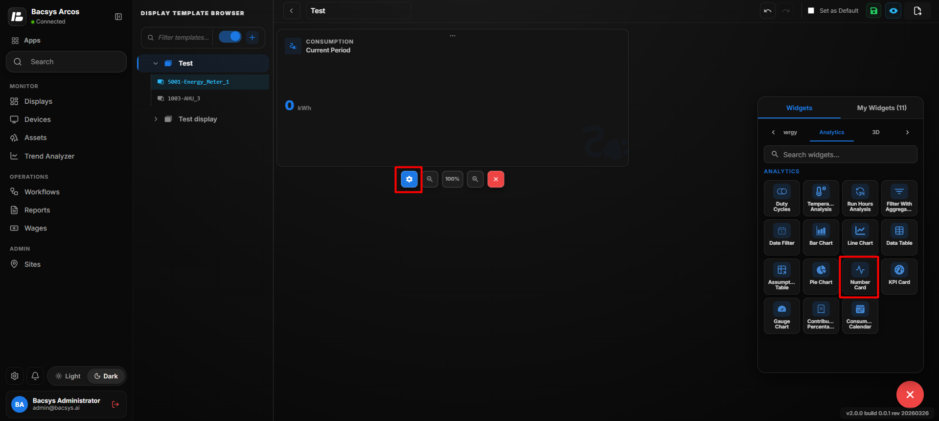 Add Number Card
Number Card Settings
| Option | Description |
|---|---|
| Title | Enter the title to be displayed for the Number Card. |
| Point to be Mapped | Select the point whose value should be displayed. |
| Font Size | Specify the font size of the displayed value. |
| Font Color | Select the color of the numerical value from the available color palette. Recently used colors are also available for quick selection. |
| Background Color | Select the background color of the Number Card from the available color palette. Recently used colors are also available for quick selection. |
| Hide Label | Enable the toggle to hide the point label displayed on the Number Card. |
| Compare As | Select the comparison period used to calculate the displayed value. The available option shown is Day. |
| Date | Select the date for which the value should be displayed. |
| Represent As | Select the required extended calculation or representation method for the selected point. |
| Show Background | Use the toggle button to show or hide the widget background. |
| Hide Header | Use the toggle button to show or hide the widget header, including the title. |
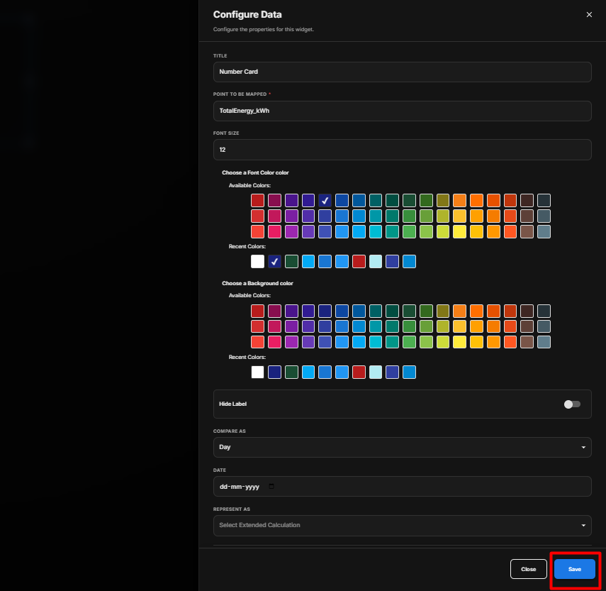 Number Card Settings
Configure the Number Card
- Enter the required Title.
- Under Point to be Mapped, select the required point.
- Enter the required Font Size.
- Select the required Font Color.
- Select the required Background Color.
- Configure Hide Label according to your requirement.
- Under Compare As, select the required comparison period.
- Select the required Date.
- Under Represent As, select the required extended calculation.
- Configure Show Background according to your requirement.
- Configure Hide Header according to your requirement.
- Review the configured settings.
- Click Save.
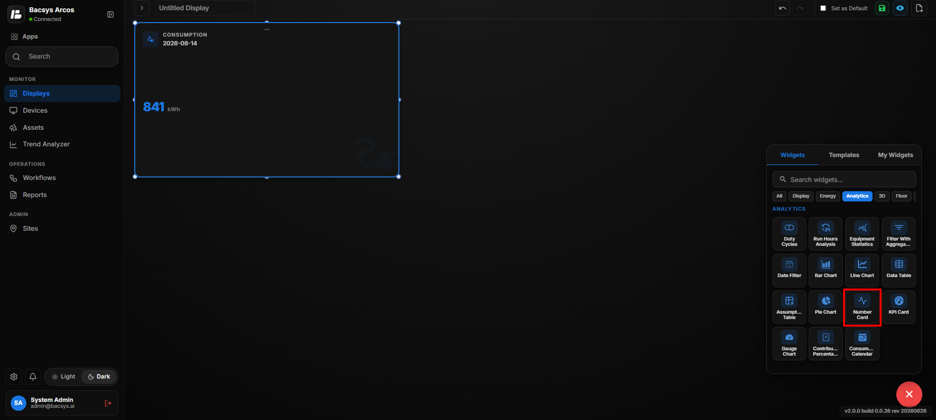 Configure Number Card
Save the Configuration
After saving, the Number Card displays the selected point value as a large numerical value using the configured font, background, label, and calculation settings.
KPI Card
The KPI Card widget displays a key performance indicator for a selected point and allows users to compare the value between a reference date and an actual date.
Add the KPI Card Widget
- Click the + icon.
- Drag and drop the KPI Card Widget onto the display.
- Select the KPI Card Widget.
- Use Zoom In and Zoom Out to adjust the widget view.
- Click Settings to open the Configure Data panel.
- Configure the required KPI Card settings.
- Click Save.
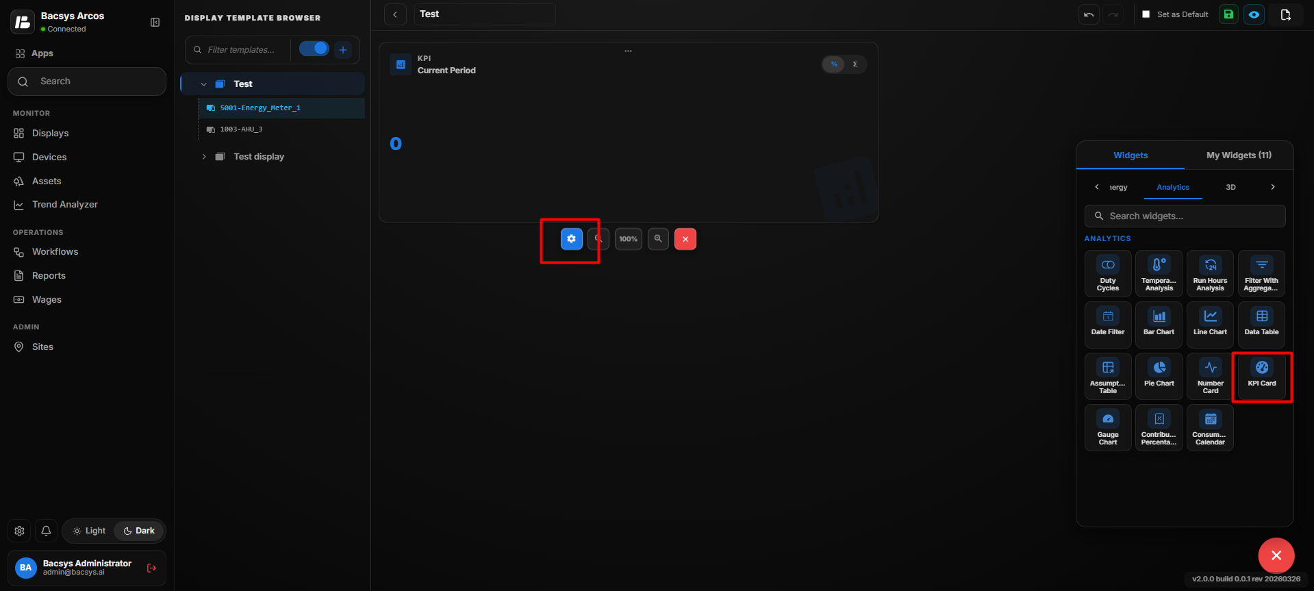 Add KPI Card
KPI Card Settings
| Option | Description |
|---|---|
| Title | Enter the title to be displayed for the KPI Card. |
| Point to be Mapped | Select the trend point used for the KPI calculation. |
| Compare As | Select the comparison period used to compare KPI values. |
| Reference | Select the reference date used as the baseline for comparison. |
| Actual | Select the actual date whose value is compared against the reference value. |
| Represent As | Select the required extended calculation or representation method for the selected point. |
| Show Background | Use the toggle button to show or hide the widget background. |
| Hide Header | Use the toggle button to show or hide the widget header, including the title. |
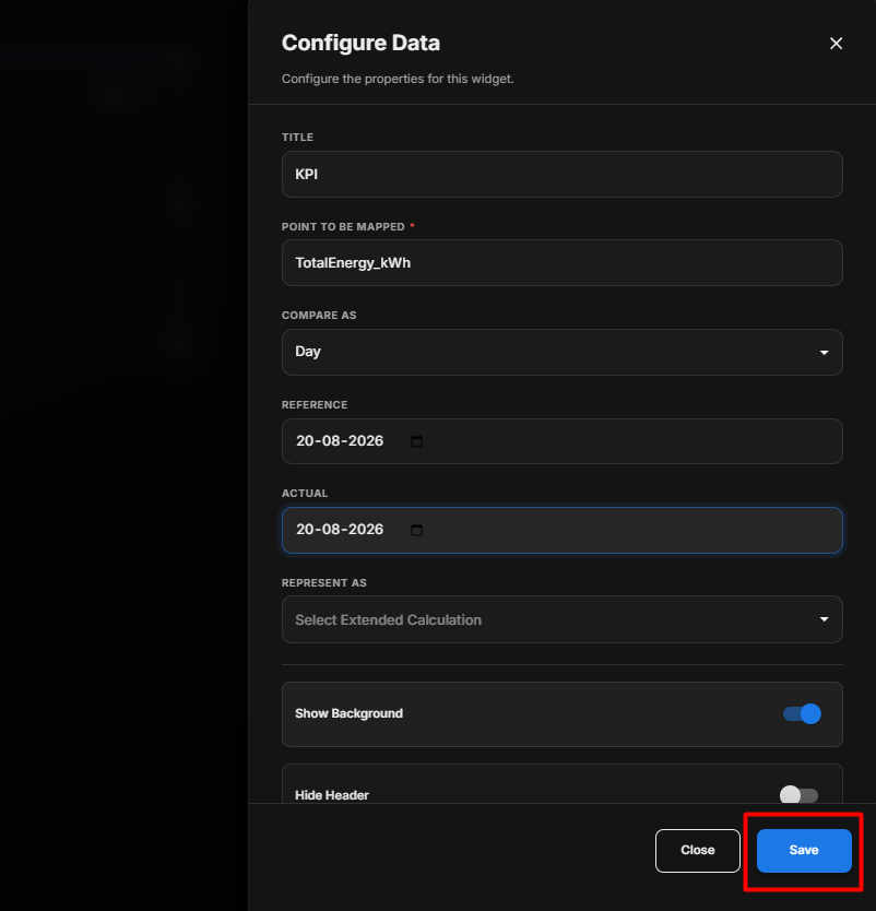 KPI Card Settings
- Enter the required Title.
- Under Point to be Mapped, select the required point.
- Under Compare As, select the required comparison period.
- Select the Reference date.
- Select the Actual date.
- Under Represent As, select the required extended calculation.
- Configure Show Background according to your requirement.
- Configure Hide Header according to your requirement.
- Review the configured settings.
- Click Save.
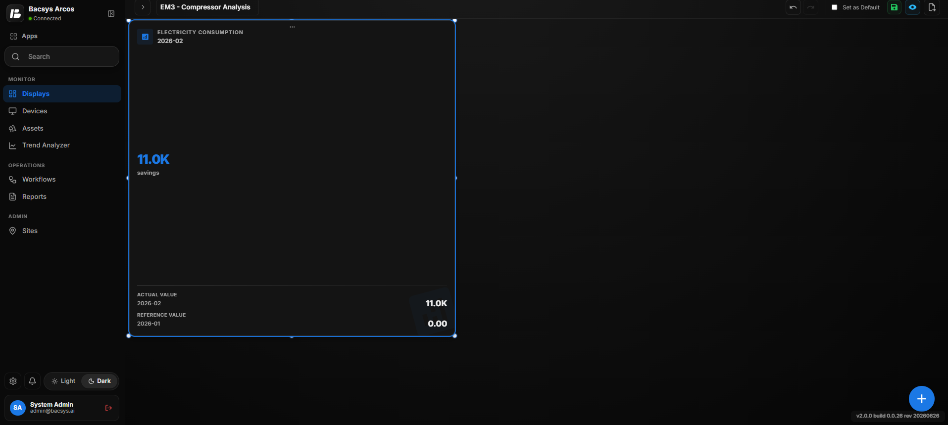 Configure KPI Card
After saving, the KPI Card displays the calculated KPI value based on the selected trend point, comparison period, reference date, actual date, and extended calculation settings.
Gauge Consumption Chart
The Gauge Consumption Chart widget displays consumption performance using a gauge with configurable threshold levels. It allows users to compare consumption values against defined success, warning, and error limits.
Add the Gauge Consumption Chart Widget
- Click the + icon.
- Drag and drop the Gauge Consumption Chart Widget onto the display.
- Select the Gauge Consumption Chart Widget.
- Use Zoom In and Zoom Out to adjust the widget view.
- Click Settings to open the Configure Data panel.
- Configure the required Gauge Consumption Chart settings.
- Click Save.
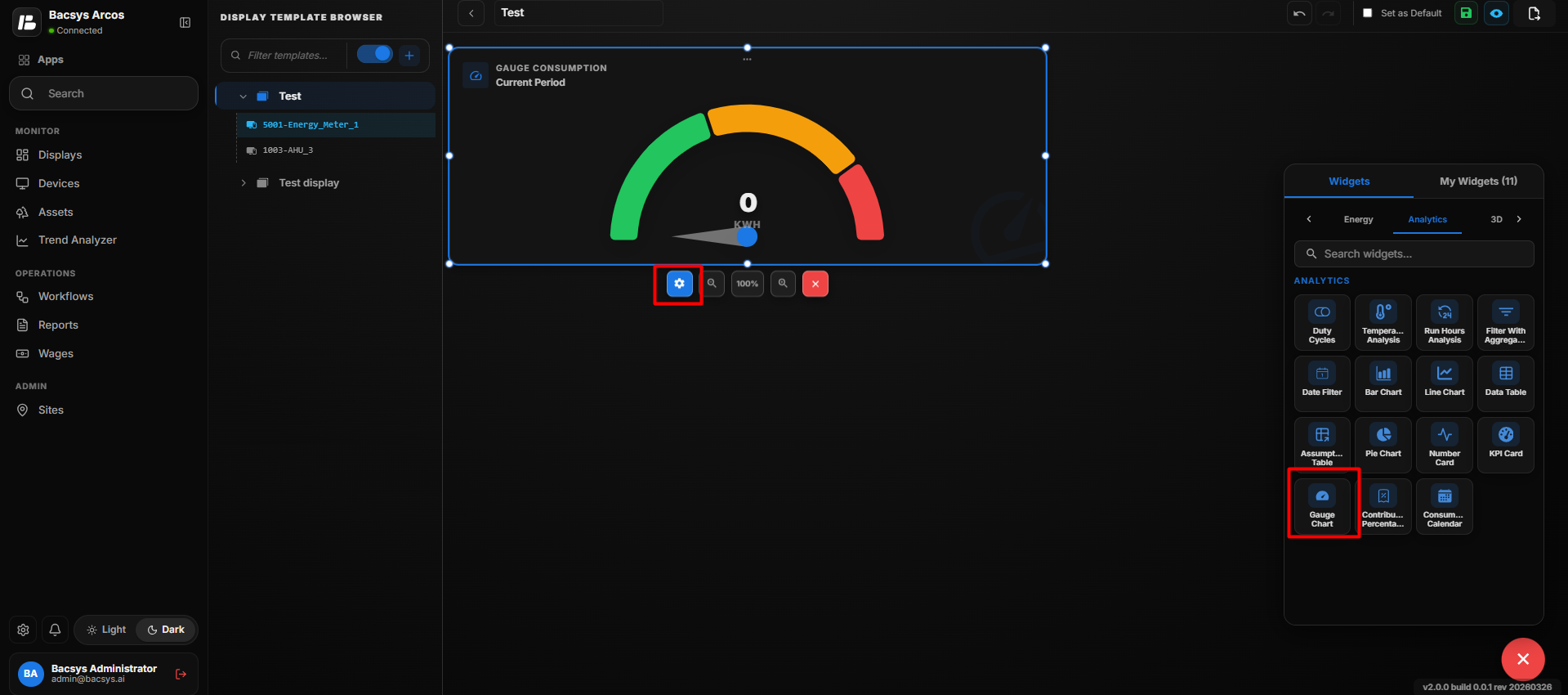 Add Gauge Consumption Chart
Gauge Consumption Chart Settings
| Option | Description |
|---|---|
| Title | Enter the title to be displayed for the Gauge Consumption Chart. |
| Point to be Mapped | Select the trend point used for the consumption calculation. |
| Compare As | Select the comparison period used to calculate the consumption value. The available option shown is Day. |
| Use as Actual | Enable this option to use the selected point value as the actual value for the gauge calculation. |
| Reference | Select the reference date used as the baseline for comparison. |
| Actual | Select the actual date whose consumption value is evaluated. |
| Represent As | Select the required extended calculation or representation method for the selected point. |
| Level 1 (Success) – Threshold Value | Enter the threshold value for the Success level. |
| Level 1 Color | Select the color used to represent the Success level. |
| Level 2 (Warning) – Threshold Value | Enter the threshold value for the Warning level. |
| Level 2 Color | Select the color used to represent the Warning level. |
| Level 3 (Error) – Threshold Value | Enter the threshold value for the Error level. |
| Level 3 Color | Select the color used to represent the Error level. |
| Show Background | Use the toggle button to show or hide the widget background. |
| Hide Header | Use the toggle button to show or hide the widget header, including the title. |
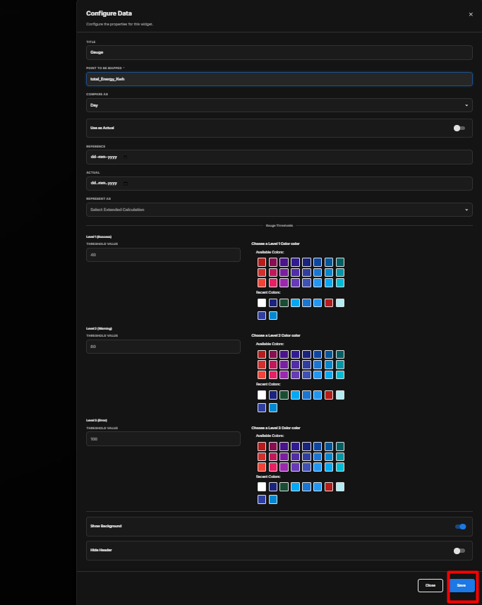 Add Gauge Consumption Chart
Configure the Gauge Consumption Chart
- Enter the required Title.
- Under Point to be Mapped, select the required trend point.
- Under Compare As, select the required comparison period.
- Enable Use as Actual if the selected point should be treated as the actual value.
- Select the required Reference date.
- Select the required Actual date.
- Under Represent As, select the required extended calculation.
- Enter the Level 1 (Success) Threshold Value.
- Select the Level 1 Color.
- Enter the Level 2 (Warning) Threshold Value.
- Select the Level 2 Color.
- Enter the Level 3 (Error) Threshold Value.
- Select the Level 3 Color.
- Configure Show Background according to your requirement.
- Configure Hide Header according to your requirement.
- Review the configured settings.
- Click Save.
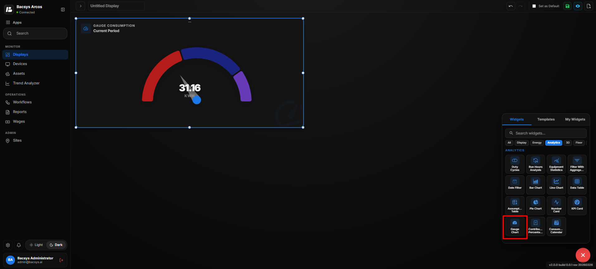 Add Gauge Consumption Chart
Save the Configuration
After saving, the Gauge Consumption Chart displays the calculated consumption value on a gauge. The configured Success, Warning, and Error thresholds determine the gauge status and corresponding visual indication.
Contribution Percentage
The Contribution Percentage widget displays the percentage contribution of selected trend points, allowing users to compare how much each selected point contributes to the overall value.
Add the Contribution Percentage Widget
- Click the + icon.
- Drag and drop the Contribution Percentage Widget onto the display.
- Select the Contribution Percentage Widget.
- Use Zoom In and Zoom Out to adjust the widget view.
- Click Settings to open the Configure Data panel.
- Configure the required Contribution Percentage settings.
- Click Save.
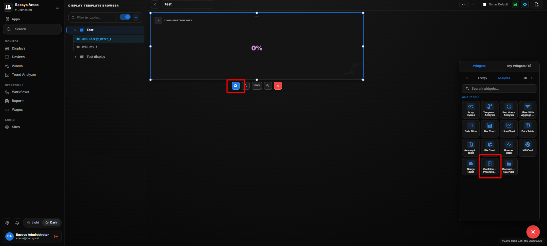 Add Contribution Percentage
Contribution Percentage Settings
| Option | Description |
|---|---|
| Title | Enter the title to be displayed for the Contribution Percentage Widget. |
| Number of Points (Max 2) | Specify the number of points to be used for the contribution percentage calculation. A maximum of 2 points can be selected. |
| Point to be Mapped | Enter or select the point to be used for the contribution percentage calculation. |
| Font Size | Specify the font size of the displayed contribution percentage. |
| Font Color | Select the color of the displayed value from the available color palette. Recently used colors are also available. |
| Background Color | Select the background color of the widget from the available color palette. |
| Hide Label | Enable the toggle to hide the labels associated with the selected points. |
| Compare As | Select the comparison period used to calculate the contribution percentage. The available option shown is Day. |
| Date | Select the date for which the contribution percentage should be calculated. |
| Represent As | Select the required extended calculation or representation method for the selected point. |
| Show Background | Use the toggle button to show or hide the widget background. |
| Hide Header | Use the toggle button to show or hide the widget header, including the title. |
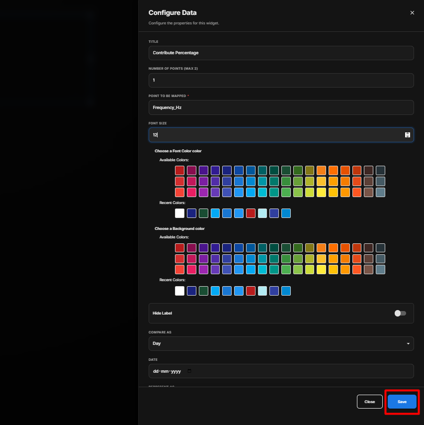 Add Contribution Percentage
Configure the Contribution Percentage
- Enter the required Title.
- Specify the Number of Points to be used. The maximum allowed is 2.
- Under Point to be Mapped, select the required point.
- Enter the required Font Size.
- Select the required Font Color.
- Select the required Background Color.
- Configure Hide Label according to your requirement.
- Under Compare As, select the required comparison period.
- Select the required Date.
- Under Represent As, select the required extended calculation.
- Configure Show Background according to your requirement.
- Configure Hide Header according to your requirement.
- Review the configured settings.
- Click Save.
 Add Contribution Percentage
Save the Configuration
After saving, the widget calculates and displays the percentage contribution of the selected trend points based on the configured comparison period, date, and calculation method.
Consumption Calendar
The Consumption Calendar widget displays meter consumption data in a calendar-based view, allowing users to monitor daily consumption patterns and identify variations over time.
Add the Consumption Calendar Widget
- Click the + icon.
- Drag and drop the Consumption Calendar Widget onto the display.
- Select the Consumption Calendar Widget.
- Use Zoom In and Zoom Out to adjust the widget view.
- Click Settings to open the Configure Data panel.
- Configure the required Consumption Calendar settings.
- Click Save.
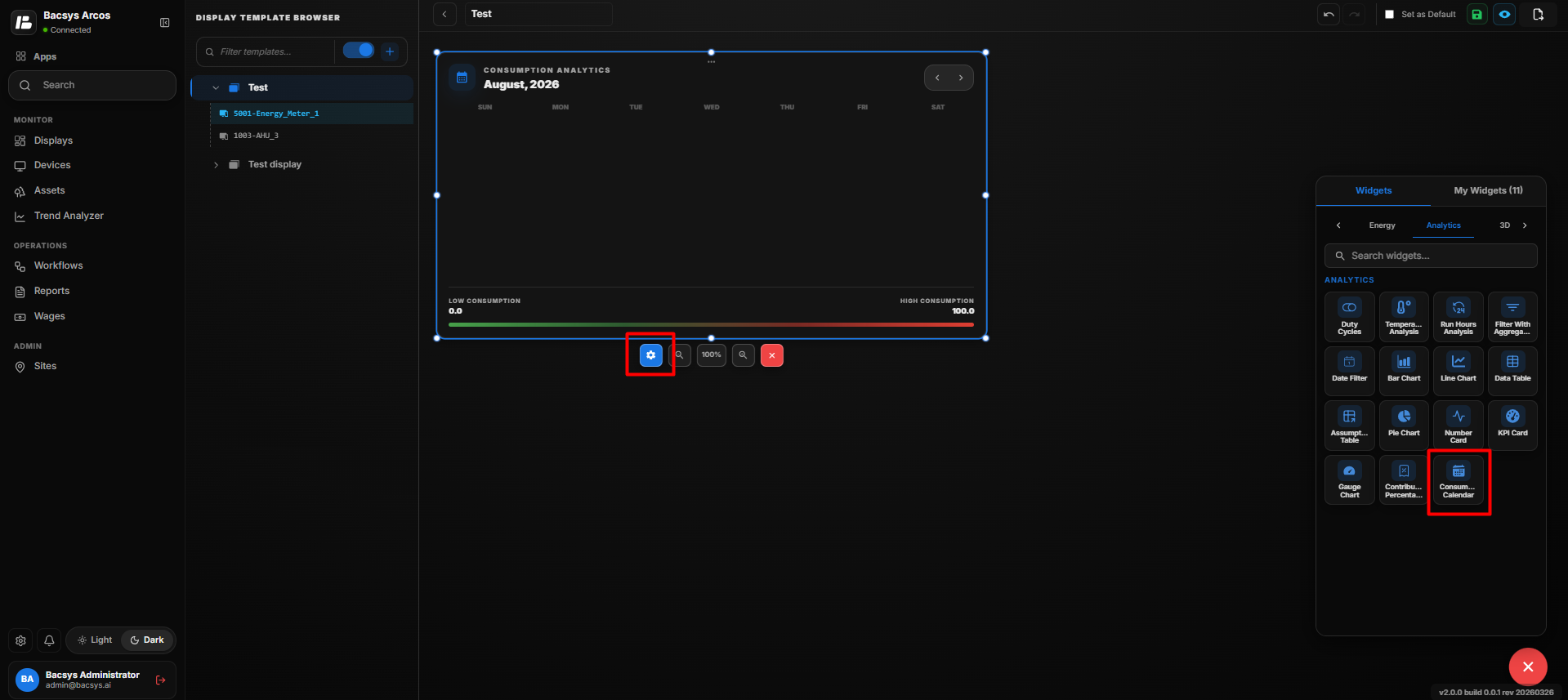 Add Consumption Calendar
Consumption Calendar Settings
| Option | Description |
|---|---|
| Title | Enter the title to be displayed for the Consumption Calendar. |
| Point to be Mapped | Select the point used to retrieve the consumption data for the calendar. |
| Poll Frequency (Seconds) | Specify how frequently the Consumption Calendar refreshes the consumption data. |
| Range Start Color | Select the starting color for the consumption range from the available color palette. |
| Range End Color | Select the ending color for the consumption range from the available color palette. |
| Default Date | Select the default date that is displayed when the Consumption Calendar is loaded. |
| Show Background | Use the toggle button to show or hide the widget background. |
| Hide Header | Use the toggle button to show or hide the widget header, including the title. |
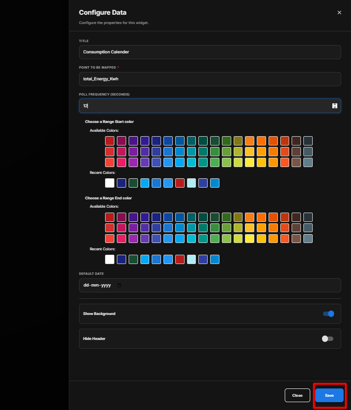 Add Consumption Calendar
Configure the Consumption Calendar
- Enter the required Title.
- Under Point to be Mapped, select the required consumption point.
- Enter the required Poll Frequency (Seconds).
- Select the required Range Start Color.
- Select the required Range End Color.
- Select the required Default Date.
- Configure Show Background according to your requirement.
- Configure Hide Header according to your requirement.
- Review the configured settings.
- Click Save.
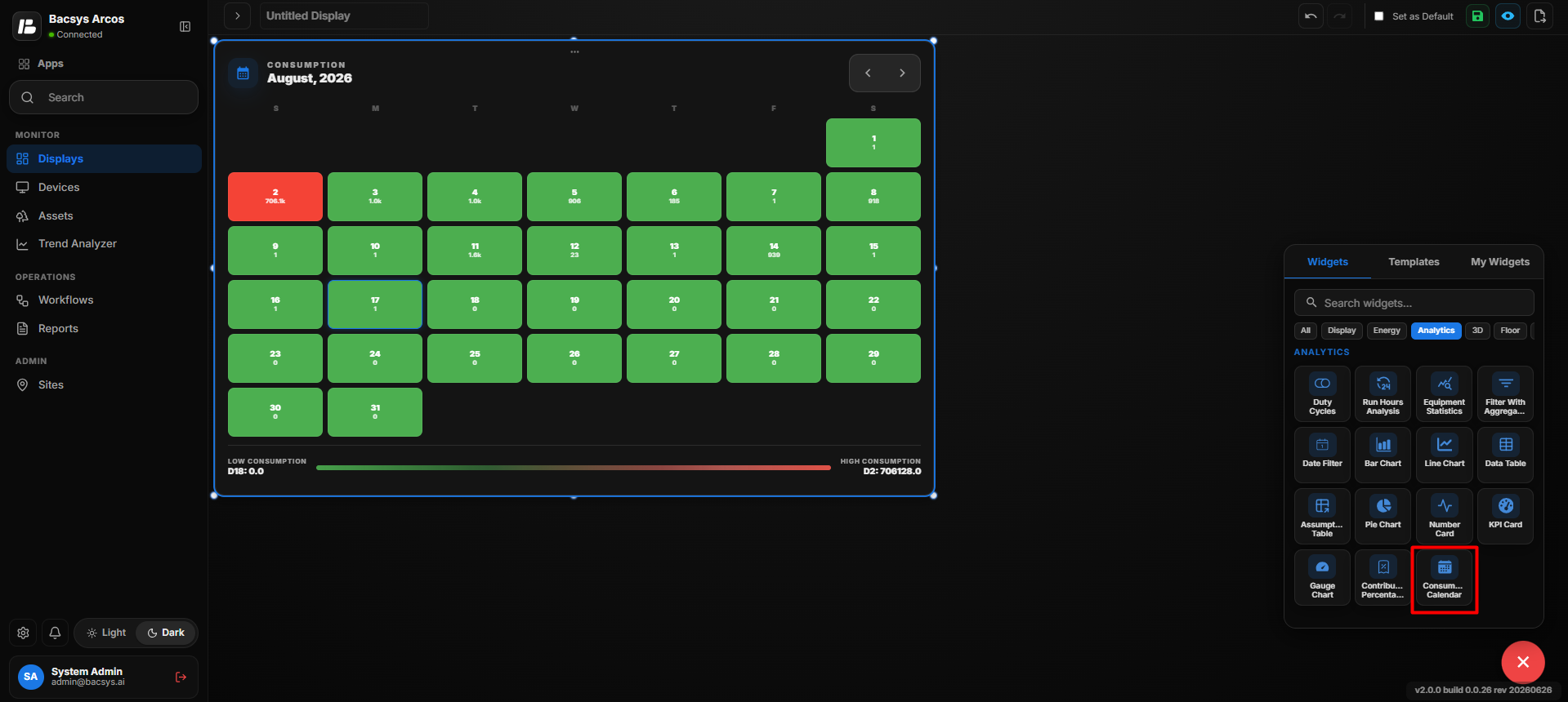 Add Consumption Calendar
Save the Configuration
After clicking Save, the Consumption Calendar Widget is updated on the display using the configured point, refresh frequency, date, and consumption range colors.
Floor Widgets
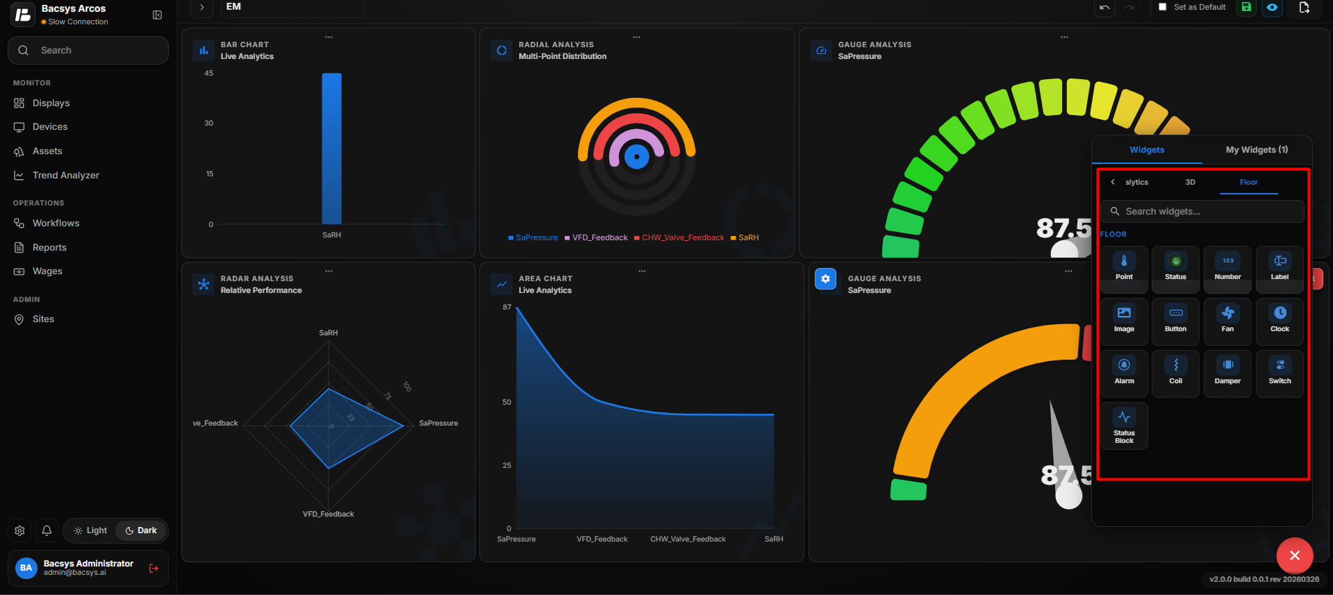
Prebuilt Display Widgets
| Widget | Description |
|---|---|
| Point | Displays the current value of a selected point. |
| Status | Displays the operating status of a selected point. |
| Number | Displays numeric values of a selected point. |
| Label | Displays static text or labels. |
| Image | Displays uploaded images. |
| Button | Performs navigation or other configured actions. |
| Fan | Displays an animated fan based on the configured point status. |
| Clock | Displays the current date and time based on the system time. |
| Alarm | Displays the alarm status of the configured point or equipment. |
| Coil | Displays the operating status of a heating or cooling coil. |
| Damper | Displays the damper position graphically based on the configured point. |
| Switch | Provides ON/OFF control for writable points. |
| Status Block | Displays multiple equipment statuses within a single widget. |
Add and Configure the Floor Point Widget
The Floor Point Widget allows users to display real-time values from a selected data point directly on a floor layout.
Add the Floor Image
- Open the Floor layout.
- From the Display widget list, drag and drop the Image Widget onto the floor layout.
- Configure the image to represent the required floor or area.
- Position and resize the image according to the floor layout.
- Save the image configuration.
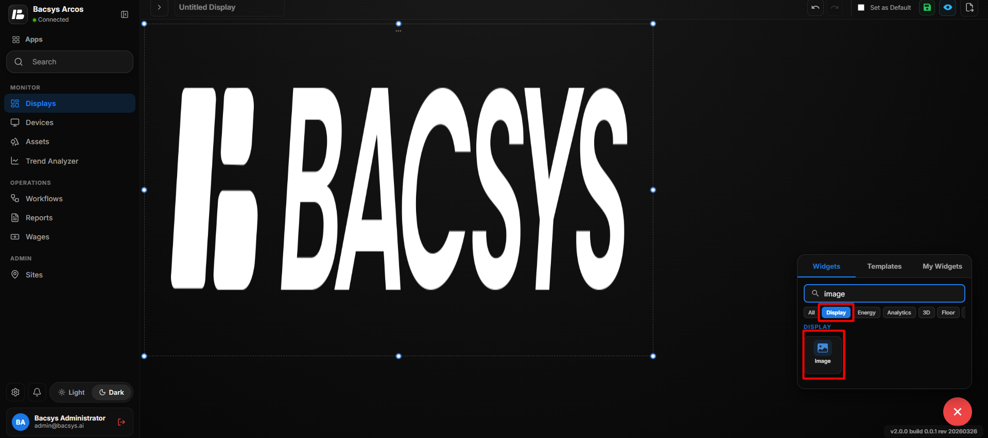 Add the Floor Image
Add the Point Widget
- Drag and drop the Point Widget onto the floor image.
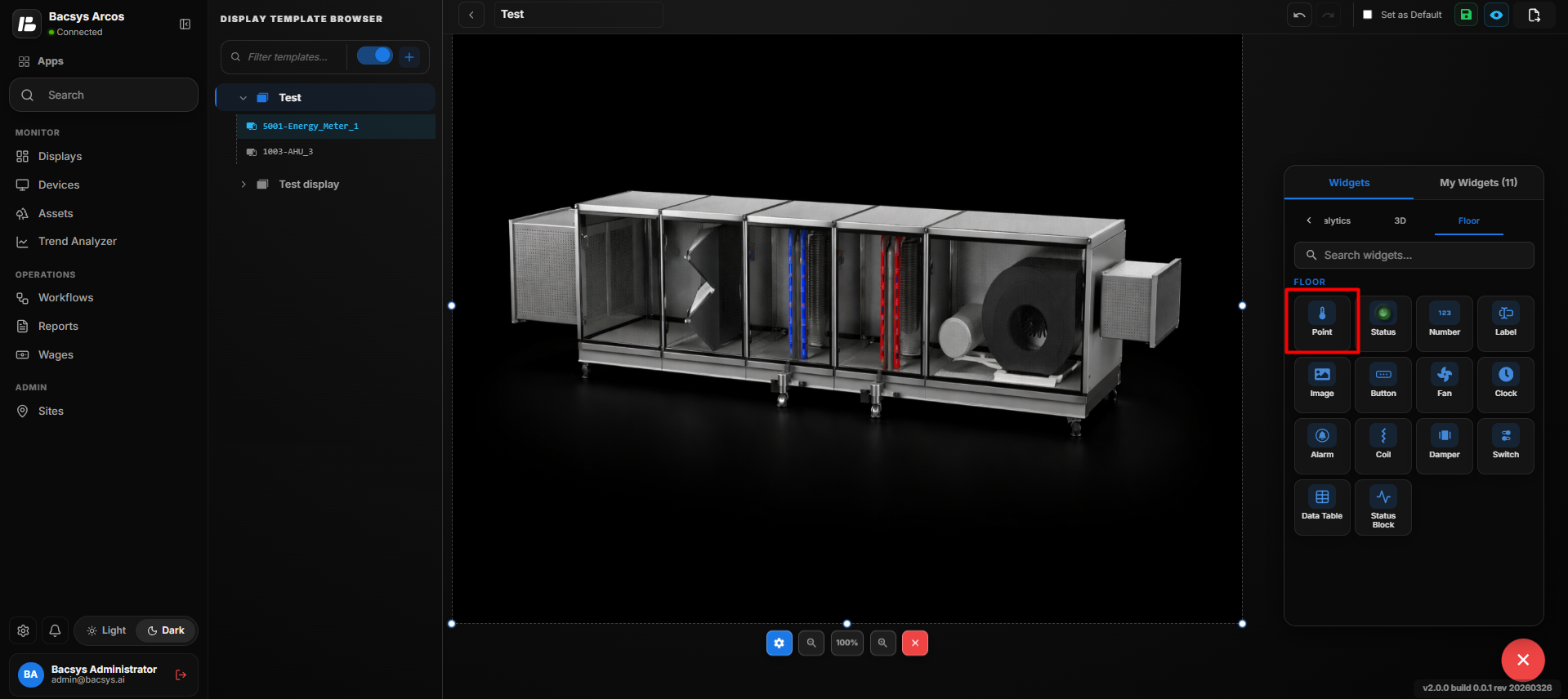 Add the Point Widget
- Position the Point Widget at the required location on the floor layout.
- Select the Point Widget to display its widget toolbar.
- Click Edit to open the Point Config panel.
- Configure the required Point Widget properties.
- Click Save Changes to save the configuration.
Point Configuration
The Point Config panel allows users to configure the appearance, connected point, and display properties of the Point Widget.
General Properties
Point Widget Settings
| Setting | Description |
|---|---|
| Display Label | Defines the label displayed for the point on the floor layout. |
| Widget Scale | Controls the size of the Point Widget on the floor layout. |
| Connected Point | Specifies the data point connected to and displayed by the widget. |
| Font Size | Sets the font size of the displayed point value. |
| Bold | Enables or disables bold formatting for the displayed point value. |
| Italic | Enables or disables italic formatting for the displayed point value. |
| Show Name | Shows or hides the name of the connected point. |
| Transparent BG | Makes the widget background transparent when enabled. |
| Text Color | Sets the color of the displayed point text. |
| Widget Color | Sets the color of the Point Widget. |
| Label Color (Value = 0) | Sets the label color when the connected point value is 0. |
| Label Color (Value = 1) | Sets the label color when the connected point value is 1. |
| Available Colors | Provides a predefined set of colors that can be selected for text, widget, and label colors. |
| Recent Colors | Provides quick access to previously selected colors. |
| Cancel | Discards the changes made to the Point Widget settings. |
| Save Changes | Saves the configured Point Widget settings and applies them to the floor layout. |
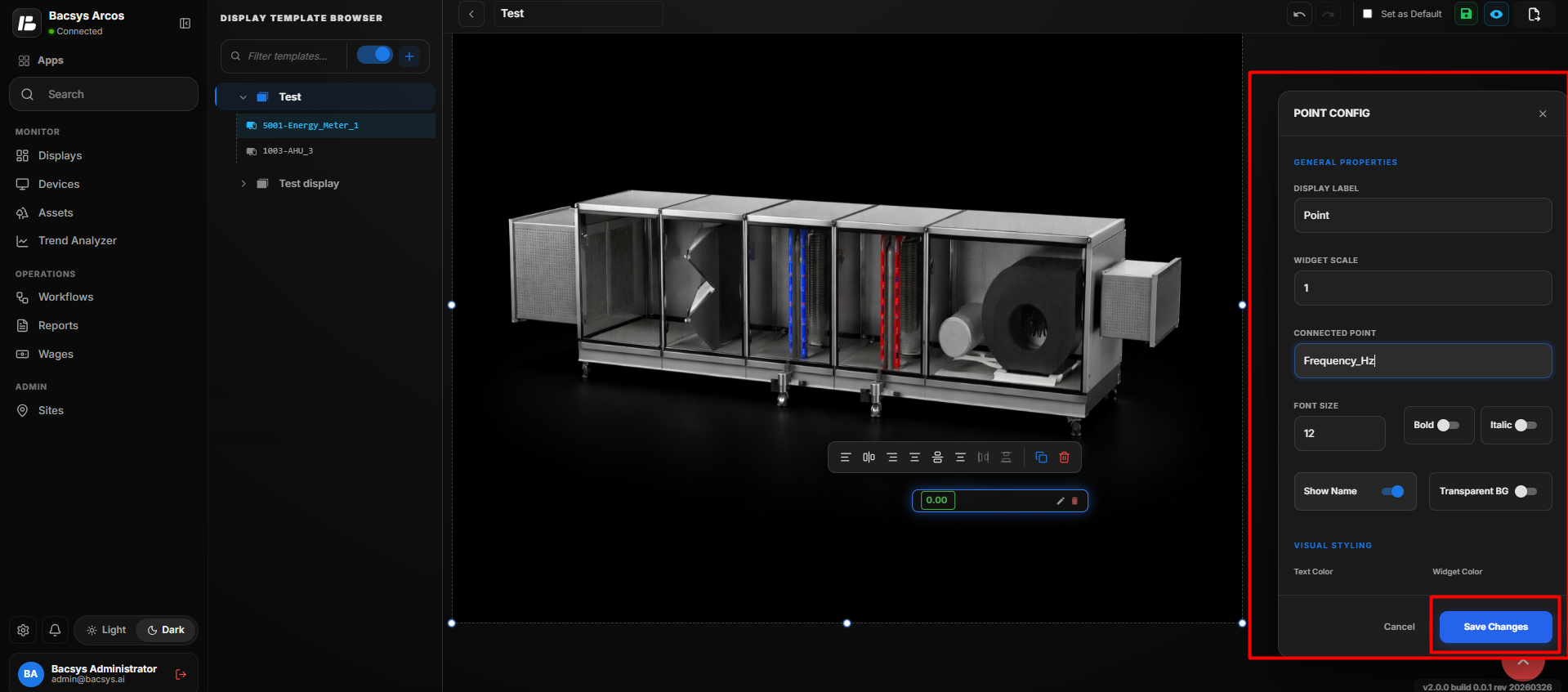 General Properties
Configure the Connected Point
- Click Browse Hierarchy under Connected Point.
- Navigate through Network → Device → Point.
- Select the required data point.
- Verify that the selected point appears in the Connected Point field.
- Configure the Display Label, Widget Scale, Font Size, and other required properties.
- Configure Bold, Italic, Show Name, and Transparent BG according to your requirements.
- Select the required Text Color and Widget Color.
- Configure the Label Color (Value = 0) and Label Color (Value = 1) to define the label colors for the corresponding point values.
- Review all configured settings.
- Click Save Changes.
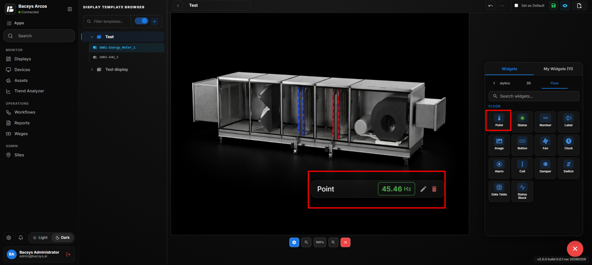 Configure the Connected Point
Update the Floor Point
After saving the configuration:
- The selected data point is connected to the Point Widget.
- The Point Widget displays the configured point value on the floor layout.
- The configured label and styling are applied to the widget.
- The Point Widget remains positioned at the selected location on the floor image.
The same process can be repeated to add and configure multiple Point Widgets at different locations on the floor layout.
Add and Configure the Status Widget
The Status Widget allows users to display the operational status of equipment or systems on the floor layout.
- Drag and drop the Status Widget onto the floor layout.
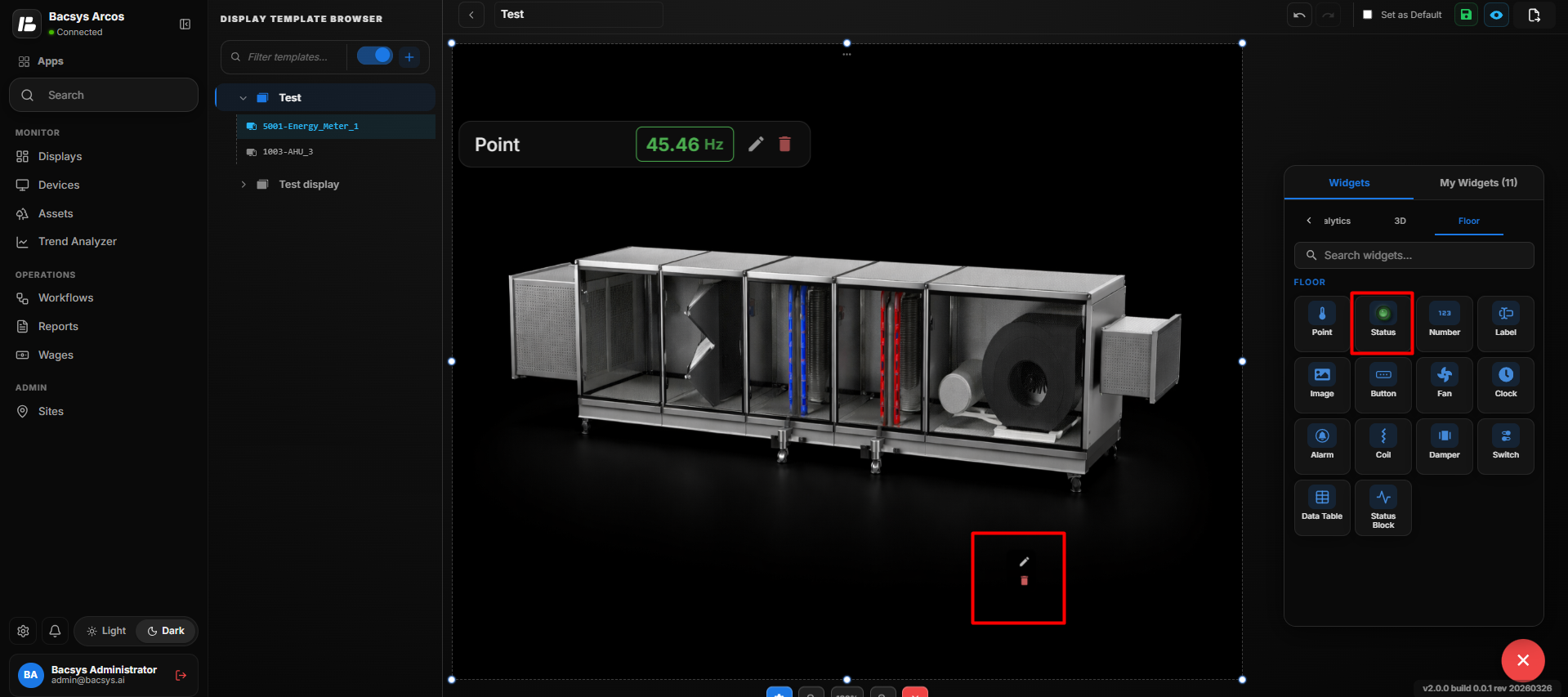 Add the Status Widget
- Select the Status Widget and click Edit to open the configuration panel.
- Under Layout Type, select the required status layout:
- Single Status
- RYB Phase
- Select Single Status to configure a single equipment status.
- Under Value Type, select the required value type:
- Multistate Input
- Binary ON/OFF
- Select Multistate Input when the status point contains multiple predefined states.
| Setting | Description |
|---|---|
| Layout Type | Defines the status display layout. Available options include Single Status and RYB Phase. |
| Value Type | Defines the type of status value. Available options include Multistate Input and Binary ON/OFF. |
| Primary Point | Selects the main data point used to determine the equipment status. |
| Browse Hierarchy | Allows users to browse the Network → Device → Point hierarchy and select the required point. |
| Multistate Values | Defines the values or states associated with a multistate input. |
| Connected Display | Selects a display that can be opened when the status widget is used for navigation. |
| Display Label | Defines the label displayed for the status widget on the floor layout. |
| Widget Scale | Controls the size of the Status Widget on the floor layout. |
| Show Name | Displays the name of the connected point when enabled. |
| Transparent BG | Makes the widget background transparent when enabled. |
| Text Color | Sets the color of the status text. |
| Widget Color | Sets the color of the Status Widget. |
| Recent Colors | Provides quick access to previously selected colors. |
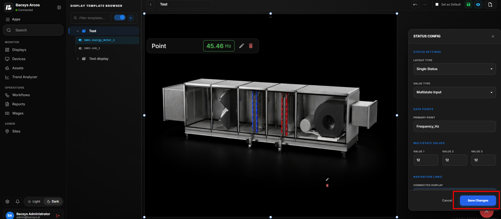 Status Widget Configuration
- Click Save Changes to save the Status Widget configuration.
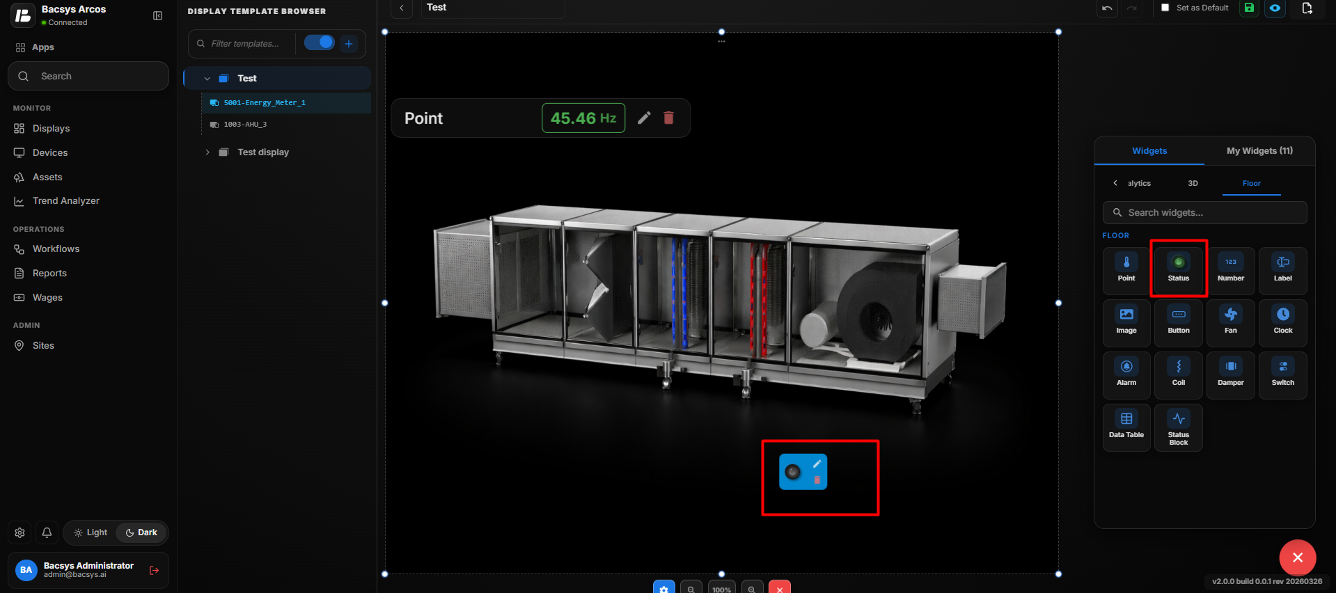 Display the Status Widget
- The configured status is displayed on the floor layout.
Configure Binary (ON/OFF) Status
- Select the Status Widget configured with Single Status.
- Click Edit to open the Status Config panel.
- Under Value Type, select Binary (ON/OFF).
- Configure the required ON/OFF Point.
- Select the required Trip Point, if applicable.
- Configure the Connected Display for navigation, if required.
| Setting | Description |
|---|---|
| Layout Type | Defines the status display layout. |
| Value Type | Selects Binary (ON/OFF) to display the equipment status as ON or OFF. |
| ON/OFF Point | Selects the data point used to determine whether the equipment is ON or OFF. |
| Browse Hierarchy | Allows users to browse the Network → Device → Point hierarchy and select the required ON/OFF point. |
| Trip Point | Selects the data point used to indicate a trip or fault condition. |
| Browse Hierarchy | Allows users to browse the Network → Device → Point hierarchy and select the required Trip Point. |
| Connected Display | Selects the display to open when navigation is configured for the Status Widget. |
| Display Label | Defines the label displayed for the status widget on the floor layout. |
| Widget Scale | Controls the size of the Status Widget on the floor layout. |
| Show Name | Displays the name of the connected point when enabled. |
| Transparent BG | Makes the widget background transparent when enabled. |
| Text Color | Sets the color of the status text. |
| Widget Color | Sets the color of the Status Widget. |
| Recent Colors | Provides quick access to previously selected colors. |
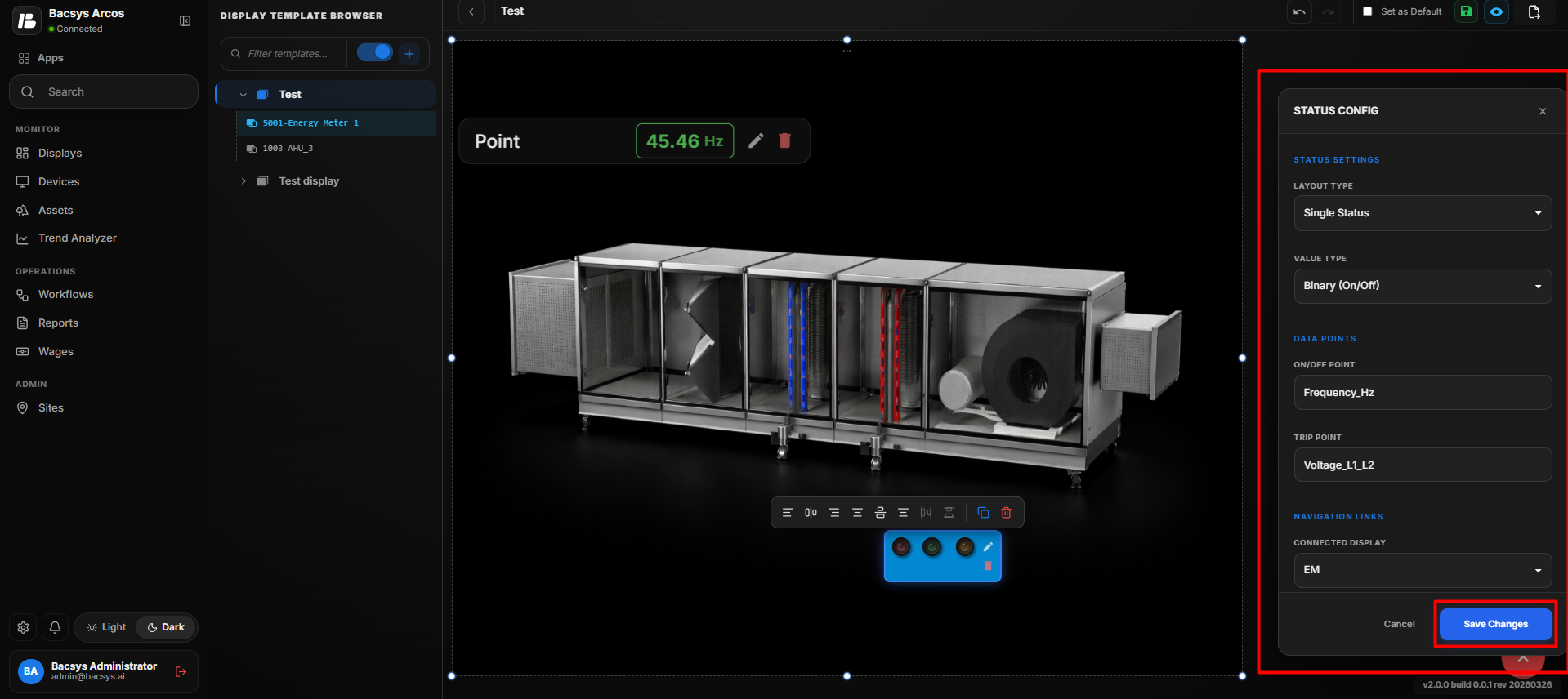 Binary (ON/OFF) Status
- Click Save Changes.
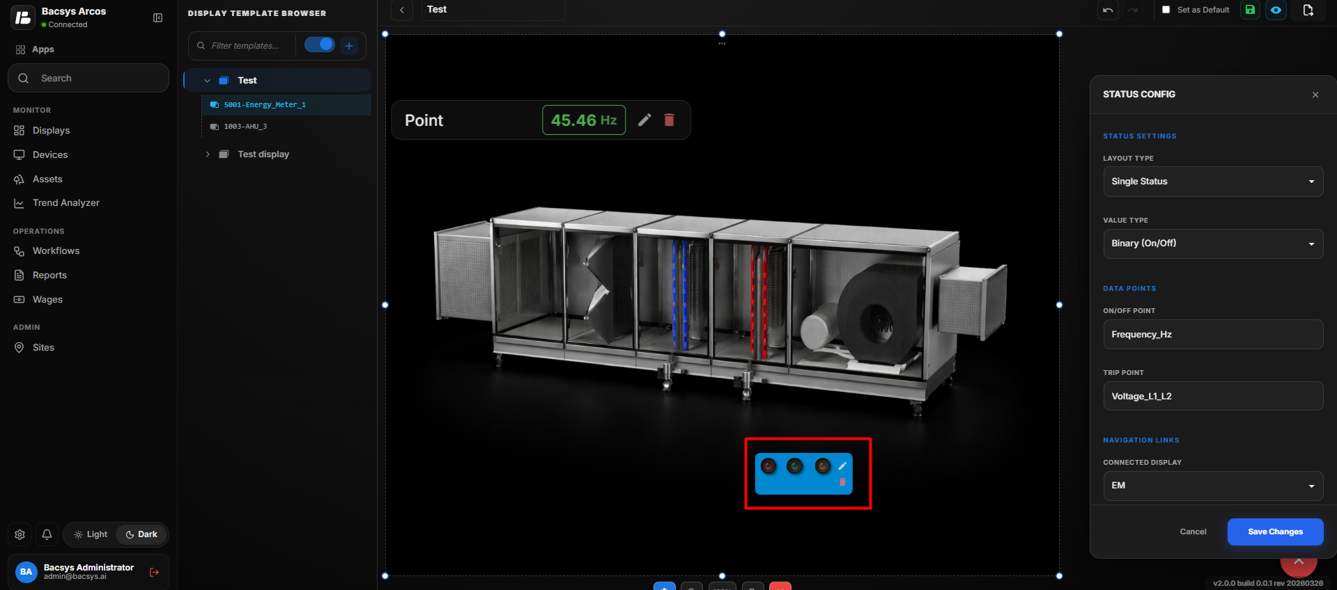 Display the Binary (ON/OFF) Status
- The Status Widget is updated to display the configured ON/OFF status on the floor layout.
Configure RYB Phase Status
- Select RYB Phase under Layout Type.
- Configure the required points for:
- Point 1 (R) – Red phase
- Point 2 (Y) – Yellow phase
- Point 3 (B) – Blue phase
- Use Browse Hierarchy to select the required point for each phase.
- Configure the corresponding Display (R), Display (Y), and Display (B) navigation links if required.
- Configure the Display Label, Widget Scale, Show Name, and Transparent BG settings.
| Setting | Description |
|---|---|
| Layout Type | Selects RYB Phase to display the status for three electrical phases: Red, Yellow, and Blue. |
| Point 1 (R) | Selects the data point associated with the Red (R) phase. |
| Browse Hierarchy | Allows users to browse the Network → Device → Point hierarchy and select the required Red phase point. |
| Point 2 (Y) | Selects the data point associated with the Yellow (Y) phase. |
| Browse Hierarchy | Allows users to browse the Network → Device → Point hierarchy and select the required Yellow phase point. |
| Point 3 (B) | Selects the data point associated with the Blue (B) phase. |
| Browse Hierarchy | Allows users to browse the Network → Device → Point hierarchy and select the required Blue phase point. |
| Display (R) | Selects the display to open when navigating from the Red phase. |
| Display (Y) | Selects the display to open when navigating from the Yellow phase. |
| Display (B) | Selects the display to open when navigating from the Blue phase. |
| Display Label | Defines the label displayed for the RYB Phase Status Widget on the floor layout. |
| Widget Scale | Controls the size of the RYB Phase Status Widget on the floor layout. |
| Show Name | Displays the name of the connected point when enabled. |
| Transparent BG | Makes the widget background transparent when enabled. |
| Text Color | Sets the color of the status text. |
| Widget Color | Sets the color of the Status Widget. |
| Recent Colors | Provides quick access to previously selected colors. |
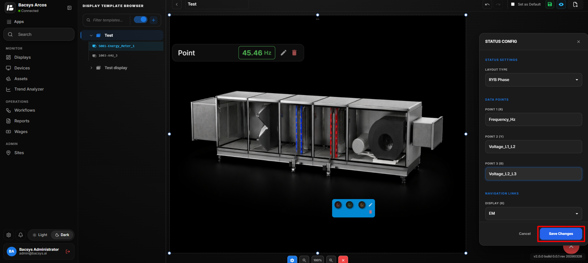 Status Widget Configuration
- Click Save Changes to save the RYB Phase configuration.
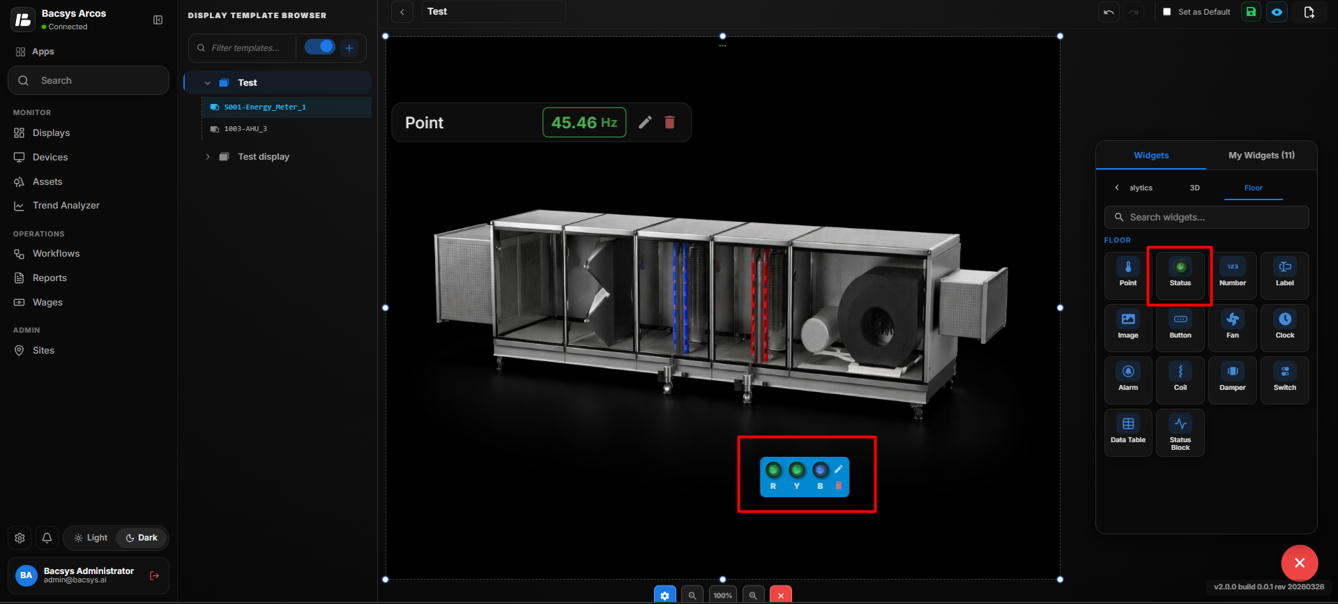 Save Changes
- The Status Widget is updated to display the configured R, Y, and B phase status on the floor layout.
Add and Configure the Number Widget
- Drag and drop the Number Widget onto the floor layout.
- Position the Number Widget at the required location.
- Select the Number Widget and click Edit to open the Number Config panel.
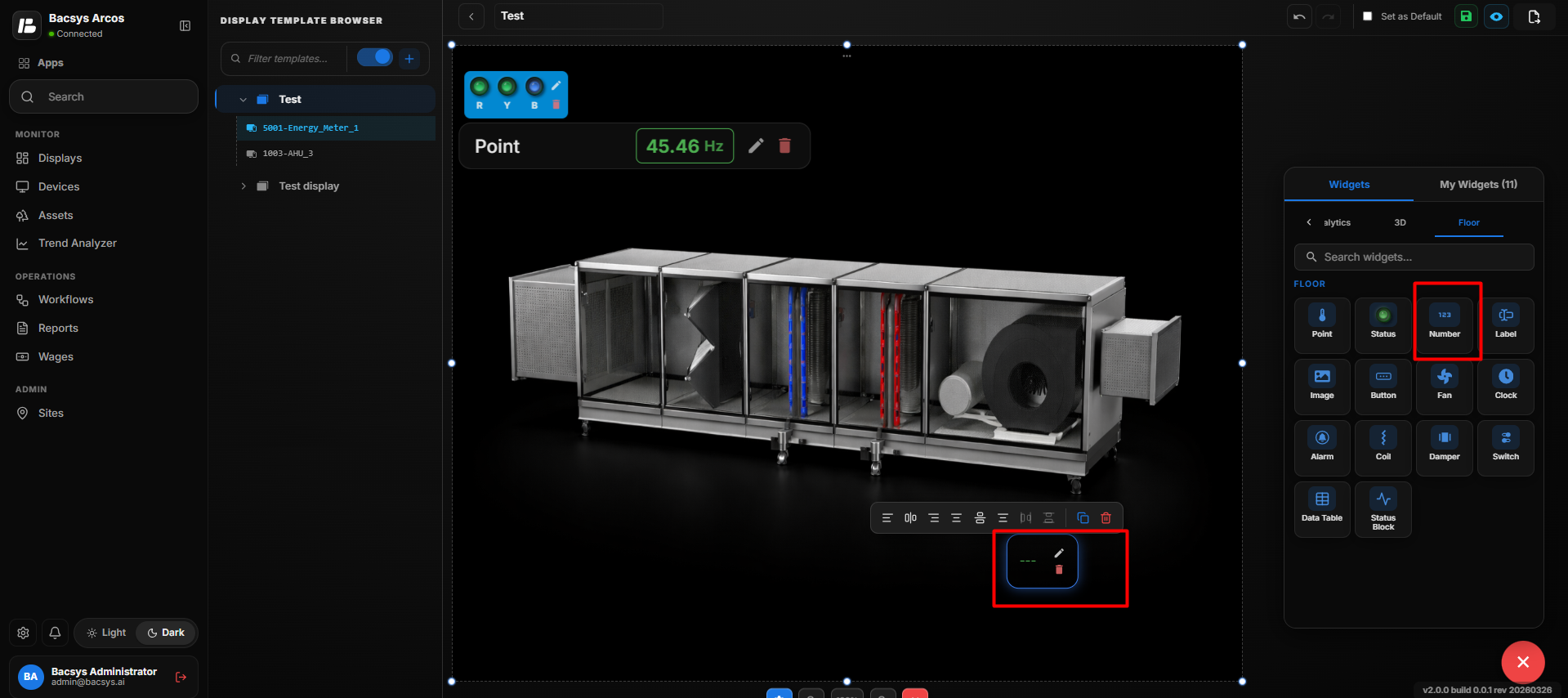 Number Widget
- Configure the required Number Widget properties.
- Select the required Connected Point using Browse Hierarchy.
Number Widget Settings
| Setting | Description |
|---|---|
| Display Label | Defines the label displayed for the Number Widget on the floor layout. |
| Widget Scale | Controls the size of the Number Widget on the floor layout. |
| Connected Point | Selects the data point whose numeric value is displayed by the widget. |
| Browse Hierarchy | Allows users to browse the Network → Device → Point hierarchy and select the required point. |
| Font Size | Sets the font size of the displayed numeric value. |
| Bold | Displays the numeric value in bold text when enabled. |
| Italic | Displays the numeric value in italic text when enabled. |
| Show Name | Displays the name of the connected point when enabled. |
| Transparent BG | Makes the widget background transparent when enabled. |
| Text Color | Sets the color of the displayed numeric value. |
| Widget Color | Sets the color of the Number Widget. |
| Recent Colors | Provides quick access to previously selected colors. |
| Label Color (Value = 0) | Sets the label color when the connected point value is 0. |
| Label Color (Value = 1) | Sets the label color when the connected point value is 1. |
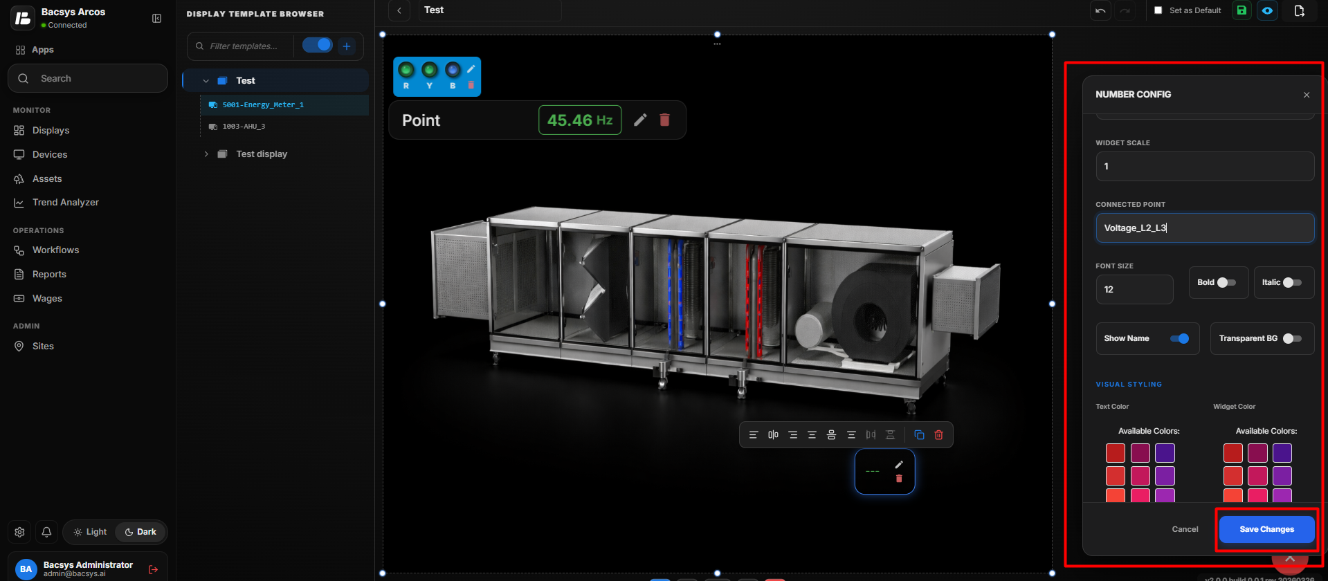 Number Widget Configuration
- Click Save Changes.
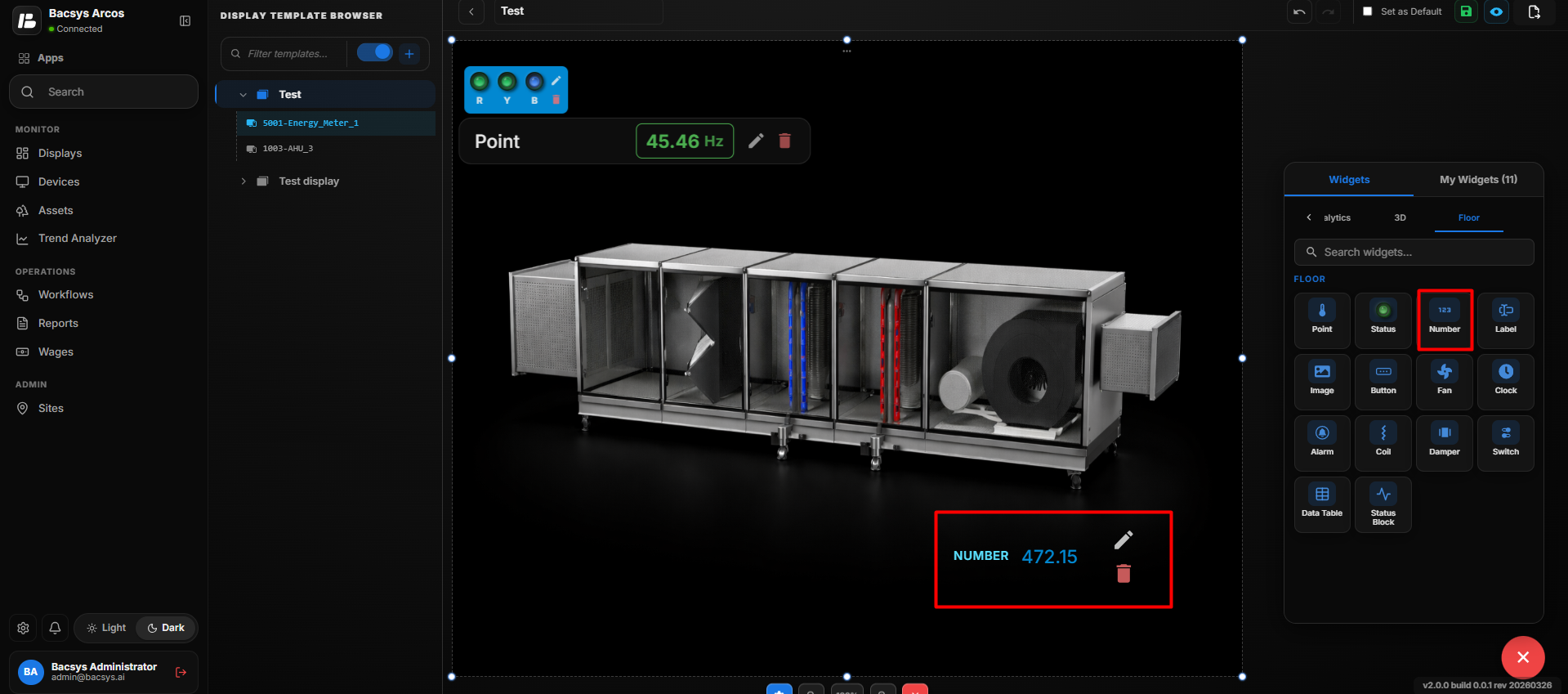 Save Changes
- The configured number value is displayed on the floor layout.
Configure the Number Widget
- Enter the required Display Label.
- Set the required Widget Scale.
- Under Connected Point, click Browse Hierarchy.
- Navigate through Network → Device → Point.
- Select the required point.
- Configure the Font Size.
- Enable Bold or Italic according to your requirement.
- Configure Show Name to display or hide the connected point name.
- Enable Transparent BG if a transparent widget background is required.
- Select the required Text Color.
- Select the required Widget Color.
- Configure Label Color (Value = 0).
- Configure Label Color (Value = 1).
- Review all configured settings.
- Click Save Changes.
Update the Number Widget
After saving the configuration:
- The selected point is connected to the Number Widget.
- The widget displays the current numeric value of the connected point.
- The configured Display Label and Font Size are applied.
- The configured Text Color and Widget Color are applied.
- The connected point name is displayed when Show Name is enabled.
- The widget background becomes transparent when Transparent BG is enabled.
- The appropriate label color is applied based on the point value.
- The Number Widget remains positioned at the selected location on the floor layout.
The same process can be repeated to add and configure multiple Number Widgets at different locations on the floor layout.
Add and Configure the Label Widget
- Drag and drop the Label Widget onto the floor layout.
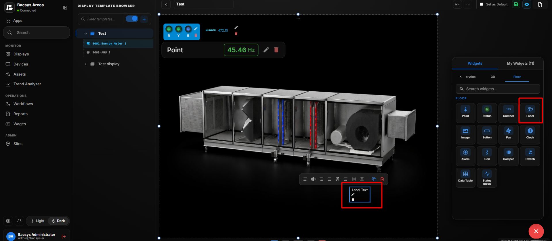 Label Widget
- Position the Label Widget at the required location.
- Select the Label Widget and click Edit to open the Label Config panel.
- Enter the required text in the Display Label field.
- Set the Widget Scale to adjust the size of the label.
| Setting | Description |
|---|---|
| Display Label | Defines the label displayed for the Label Widget on the floor layout. |
| Widget Scale | Controls the size of the Label Widget on the floor layout. |
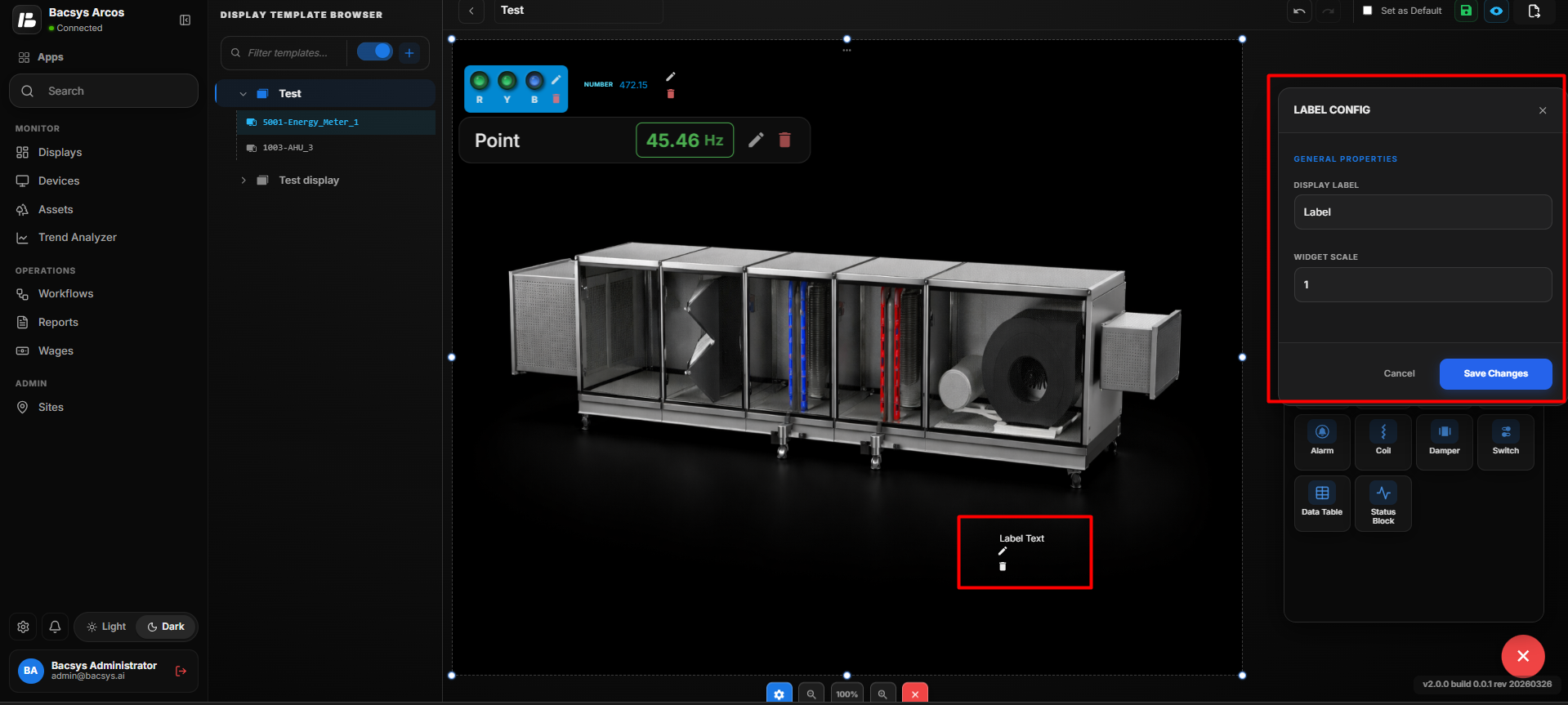 Label Widget Configuration
- Review the label configuration.
- Click Save Changes.
- The configured label is displayed on the floor layout.
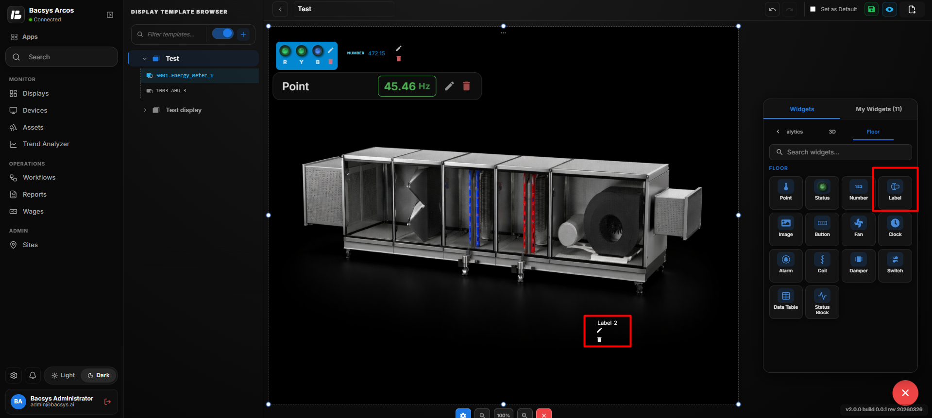 Label Widget Configuration
Add the Image Widget
- Drag and drop the Image Widget onto the floor layout.
- Position the Image Widget at the required location.
- Select the Image Widget and click Edit to open the Image Config panel.
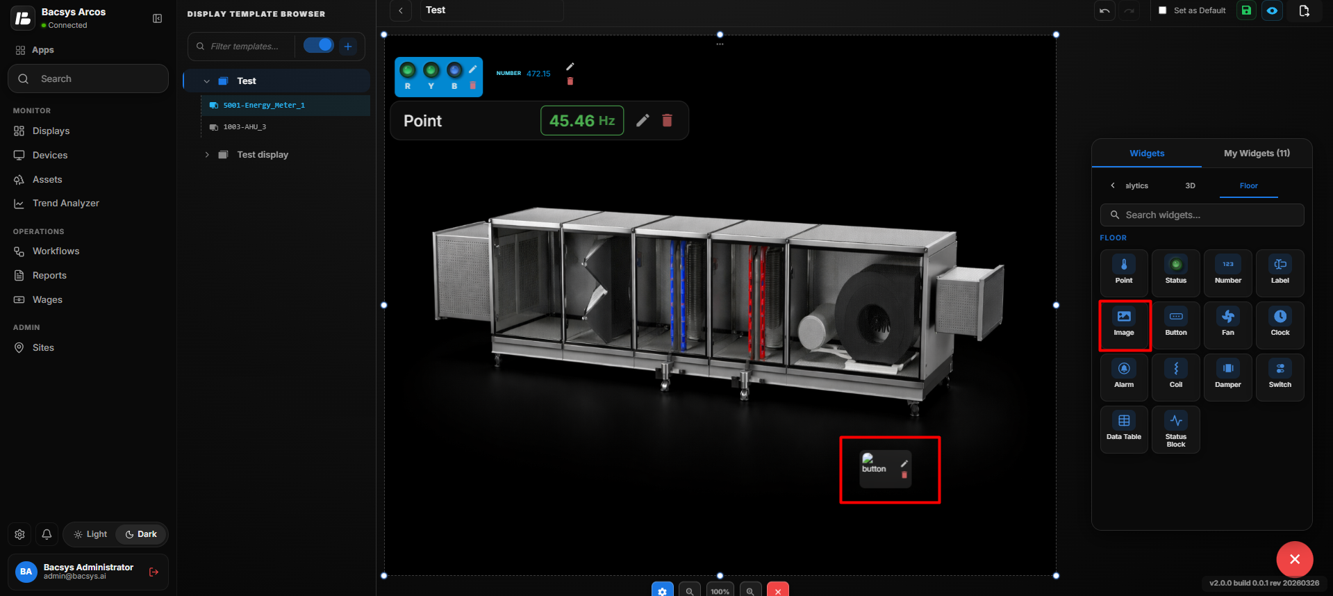 Image Widget
 Configuration
Image Widget Settings
| Setting | Description |
|---|---|
| Display Label | Defines the label displayed for the Image Widget on the floor layout. |
| Widget Scale | Controls the size of the Image Widget on the floor layout. |
| Show Name | Displays the name of the image when enabled. |
| Transparent BG | Makes the widget background transparent when enabled. |
| Text Color | Sets the color of the text displayed by the Image Widget. |
| Widget Color | Sets the color associated with the Image Widget. |
| Recent Colors | Provides quick access to previously selected colors. |
| Image URL | Specifies the URL of the image to be displayed in the widget. |
| Choose File | Allows users to select and upload an image file from their system. |
| Save Changes | Saves the configured Image Widget settings. |
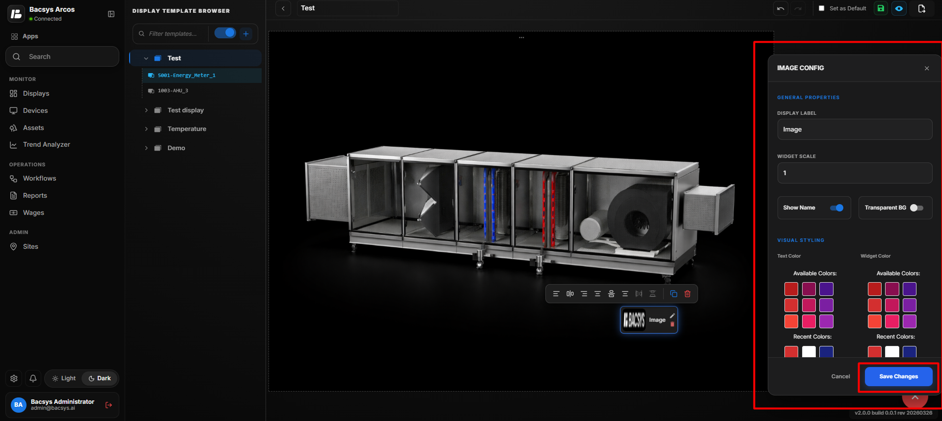 Image Widget
- Configure the required Image Widget settings.
- Click Save Changes.
- The configured image is displayed on the floor layout.
Configure the Image Widget
- Enter the required Display Label.
- Set the required Widget Scale.
- Configure Show Name according to your requirement.
- Enable Transparent BG if a transparent background is required.
- Select the required Text Color.
- Select the required Widget Color.
- Under Source, enter the Image URL if the image is hosted at a URL.
- Alternatively, click Choose File and select the required image from your system.
- Review all configured settings.
- Click Save Changes.
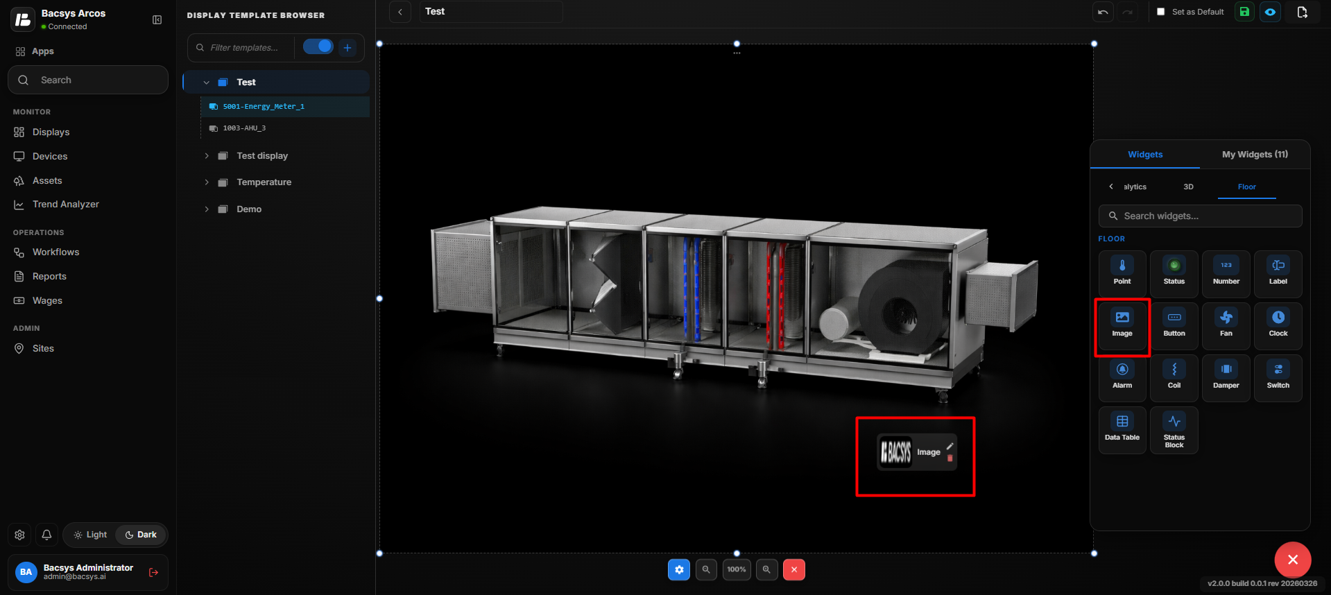 Image Widget Configuration
Update the Image Widget
After saving the configuration:
- The selected image is displayed on the floor layout.
- The configured Display Label is applied to the Image Widget.
- The configured Widget Scale determines the size of the image widget.
- The image name is displayed when Show Name is enabled.
- The widget background becomes transparent when Transparent BG is enabled.
- The configured Text Color and Widget Color are applied to the widget.
- The Image Widget remains positioned at the selected location on the floor layout.
The same process can be repeated to add and configure multiple Image Widgets at different locations on the floor layout.
Add and Configure the Button Widget
- Drag and drop the Button Widget onto the floor layout.
- Position the Button Widget at the required location.
- Select the Button Widget and click Edit to open the Button Config panel.
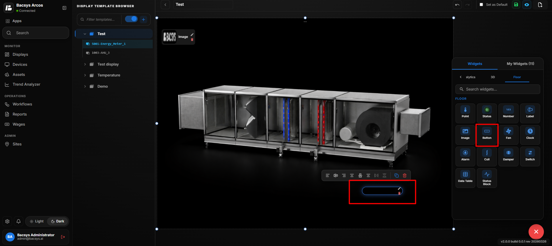 Button Widget
 Configuration
| Setting | Description |
|---|---|
| Widget Scale | Controls the size of the Button Widget on the floor layout. |
| Show Name | Displays the button name when enabled. |
| Transparent BG | Makes the widget background transparent when enabled. |
| Display Navigation | Allows the button to navigate to a selected display when clicked. |
| Custom URL | Specifies an external URL for button navigation. |
| Open in New Tab | Opens the configured Custom URL in a new browser tab when enabled. |
| Button Label | Defines the text displayed on the button. |
| Width (px) | Sets the button width in pixels. |
| Height (px) | Sets the button height in pixels. |
| Font Size | Sets the font size of the button label. |
| Bold | Displays the button label in bold text when enabled. |
| Italic | Displays the button label in italic text when enabled. |
| Text Color | Sets the color of the button label. |
| Button Color | Sets the background color of the button. |
| Recent Colors | Provides quick access to previously selected colors. |
| Save Changes | Saves the configured Button Widget settings. |
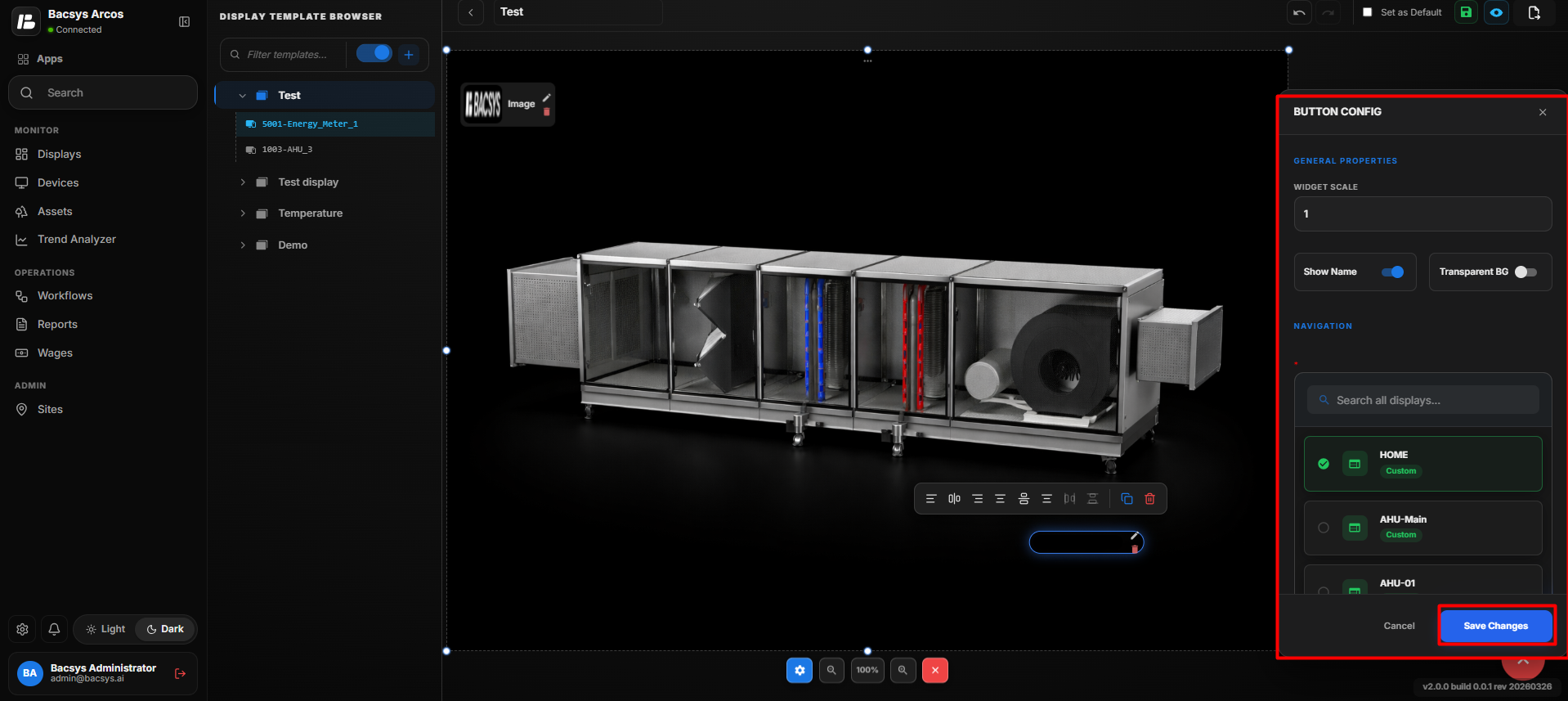 Button Widget
Configure the Button Widget
- Set the required Widget Scale.
- Configure Show Name according to your requirement.
- Enable Transparent BG if a transparent background is required.
- Under Navigation, select the required display from the available display list.
- Enter a Custom URL if external URL navigation is required.
- Enable Open in New Tab if the URL should open in a new browser tab.
- Enter the required Button Label.
- Set the required Width (px) and Height (px).
- Configure the Font Size.
- Enable Bold or Italic according to your requirement.
- Select the required Text Color.
- Select the required Button Color.
- Review all configured settings.
- Click Save Changes.
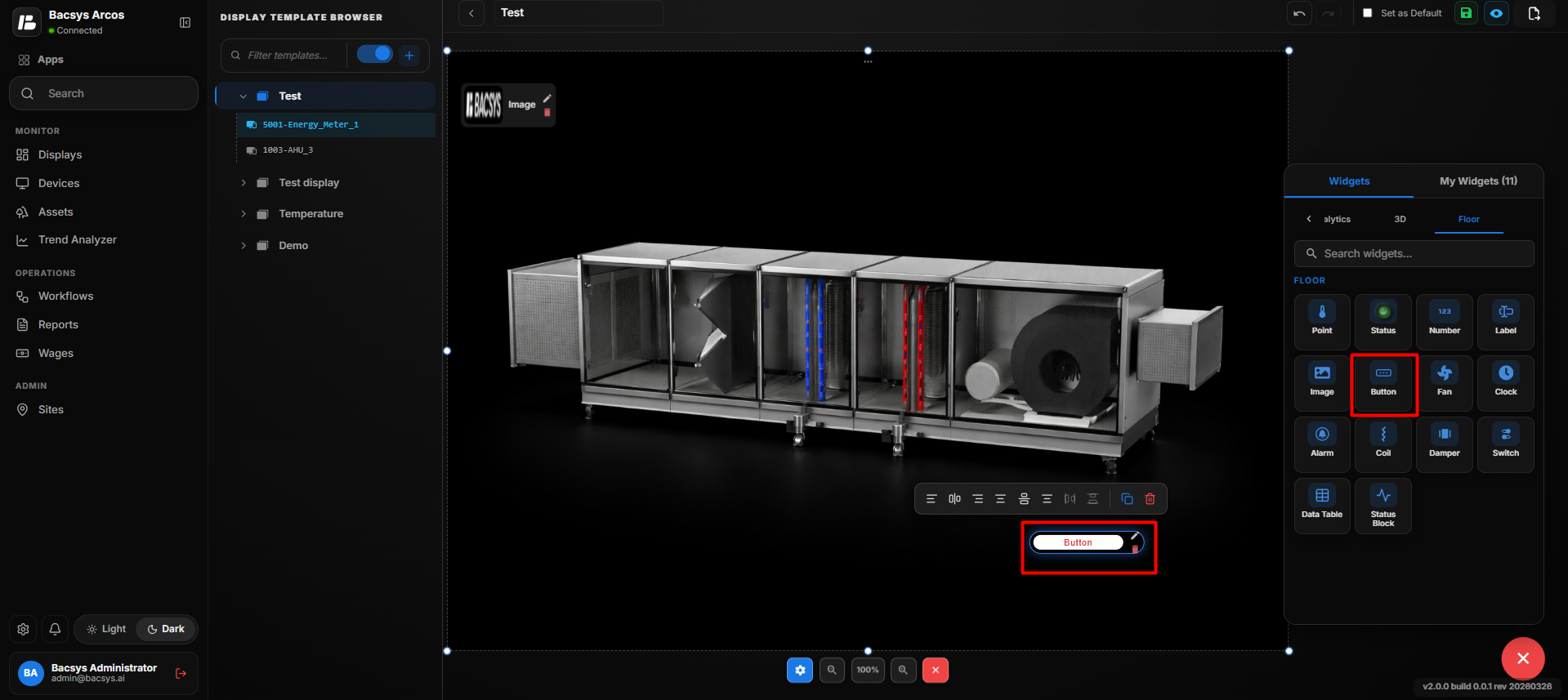 Button Widget
Update the Button Widget
After saving the configuration:
- The configured button is displayed on the floor layout.
- The configured Button Label is displayed on the button.
- The selected Text Color and Button Color are applied.
- The configured Width, Height, and Widget Scale are applied.
- The button navigates to the selected display when Display Navigation is configured.
- The button opens the configured external URL when Custom URL is provided.
- The URL opens in a new browser tab when Open in New Tab is enabled.
- The Button Widget remains positioned at the selected location on the floor layout.
The same process can be repeated to add and configure multiple Button Widgets at different locations on the floor layout.
Add and Configure the Fan Widget
- Drag and drop the Fan Widget onto the floor layout or 3D image.
- Position the Fan Widget at the required location.
- Select the Fan Widget and click Edit to open the Fan Config panel.
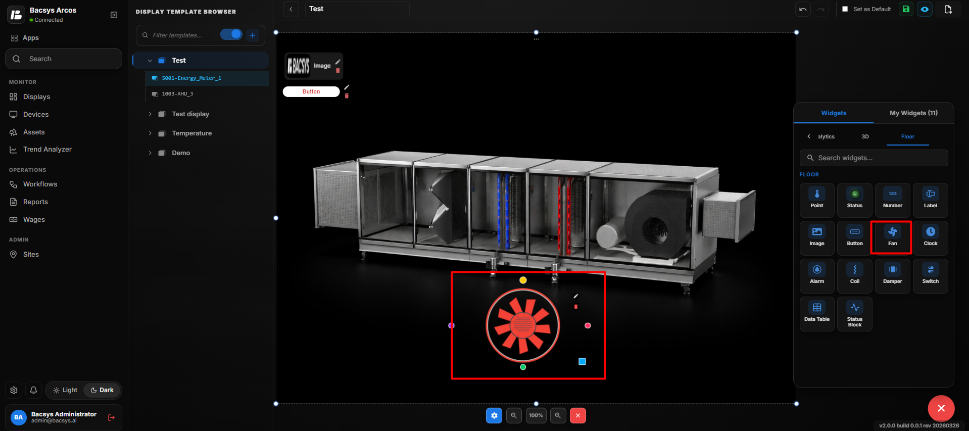 Fan Widget
| Setting | Description |
|---|---|
| Display Label | Defines the label displayed for the Fan Widget. |
| Widget Scale | Controls the size of the Fan Widget on the floor layout. |
| Connected Point | Selects the data point associated with the Fan Widget. |
| Browse Hierarchy | Allows users to browse the Network → Device → Point hierarchy and select the required point. |
| Font Size | Sets the font size of the displayed fan label or value. |
| Bold | Displays the label or value in bold text when enabled. |
| Italic | Displays the label or value in italic text when enabled. |
| Show Name | Displays the name of the connected point when enabled. |
| Transparent BG | Makes the widget background transparent when enabled. |
| Text Color | Sets the color of the displayed fan text. |
| Widget Color | Sets the color of the Fan Widget. |
| Label Color (Value = 0) | Sets the label color when the connected point value is 0. |
| Label Color (Value = 1) | Sets the label color when the connected point value is 1. |
| Write Enabled | Enables writing or controlling the connected point from the Fan Widget. |
| True Value | Defines the value interpreted as the True/ON state when writing is enabled. |
| False Value | Defines the value interpreted as the False/OFF state when writing is enabled. |
| Min Limit | Defines the minimum value allowed when writing to the connected point. |
| Max Limit | Defines the maximum value allowed when writing to the connected point. |
| Recent Colors | Provides quick access to previously selected colors. |
| Save Changes | Saves the configured Fan Widget settings. |
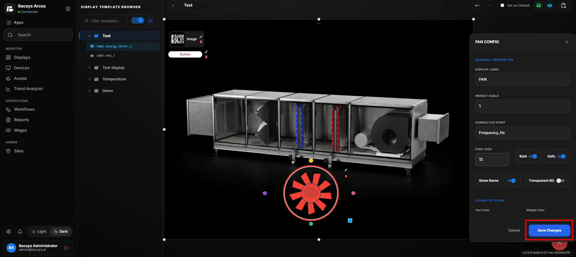 Fan Widget
Configure the Fan Widget
- Enter the required Display Label.
- Set the required Widget Scale.
- Under Connected Point, click Browse Hierarchy.
- Navigate through Network → Device → Point.
- Select the required point.
- Configure the Font Size.
- Enable Bold or Italic according to your requirement.
- Configure Show Name to display or hide the connected point name.
- Enable Transparent BG if a transparent background is required.
- Select the required Text Color.
- Select the required Widget Color.
- Configure Label Color (Value = 0).
- Configure Label Color (Value = 1).
- Enable Write Enabled if the connected point needs to be controlled from the Fan Widget.
- Enter the required True Value and False Value.
- Configure the Min Limit and Max Limit for the writable value, where applicable.
- Review all configured settings.
- Click Save Changes.
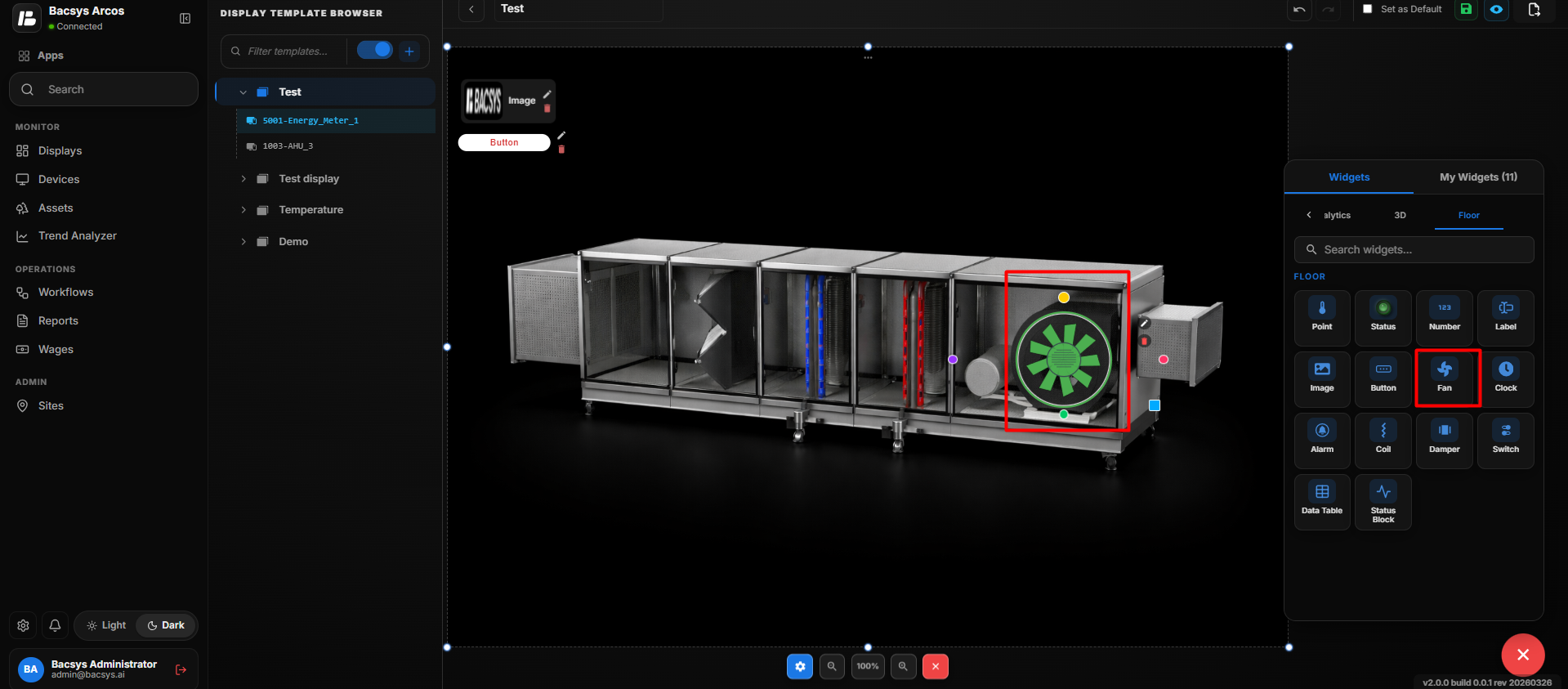 Fan Widget
Update the Fan Widget
After saving the configuration:
- The selected point is connected to the Fan Widget.
- The Fan Widget displays the configured fan and connected point information.
- The configured Display Label, Font Size, and text styling are applied.
- The configured Text Color and Widget Color are applied.
- The appropriate label color is displayed based on the connected point value.
- The connected point name is displayed when Show Name is enabled.
- The widget background becomes transparent when Transparent BG is enabled.
- When Write Enabled is enabled, the Fan Widget allows the connected point to be controlled using the configured True Value, False Value, Min Limit, and Max Limit.
- The Fan Widget remains positioned at the selected location on the floor layout.
The same process can be repeated to add and configure multiple Fan Widgets at different locations on the floor layout.
Note: The Fan Widget is mainly used with 3D images/3D visualization to represent fan components and display or control their associated data points.
Add and Configure the Clock Widget
- Drag and drop the Clock Widget onto the floor layout.
- Position the Clock Widget at the required location.
- Select the Clock Widget and click Edit to open the Clock Config panel.
- Configure the required clock settings.
- Set the clock to display the system date and time.
- Configure the required display format, if available.
- Click Save Changes.
- The Clock Widget displays the current system time on the floor layout.
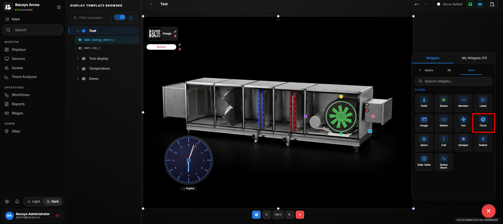 Clock Widget
Add and Configure the Alarm Widget
- Drag and drop the Alarm Widget onto the floor layout.
- Position the Alarm Widget at the required location.
- Select the Alarm Widget and click Edit to open the Alarm Config panel.
- Configure the required alarm properties.
- Select the required Connected Point using Browse Hierarchy.
- Configure the required display and visual styling options.
- Click Save Changes.
- The configured Alarm Widget is displayed on the floor layout.
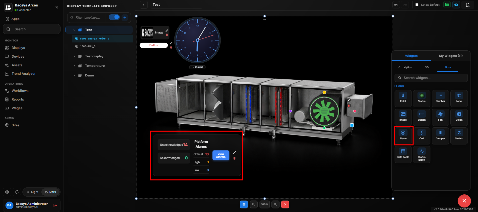 Alarm Widget
 Configuration
| Setting | Description |
|---|---|
| Display Label | Defines the label displayed for the Alarm Widget on the floor layout. |
| Widget Scale | Controls the size of the Alarm Widget on the floor layout. |
| Connected Point | Selects the data point associated with the alarm. |
| Browse Hierarchy | Allows users to browse the Network → Device → Point hierarchy and select the required point. |
| Font Size | Sets the font size of the displayed alarm label or value. |
| Bold | Displays the alarm label or value in bold text when enabled. |
| Italic | Displays the alarm label or value in italic text when enabled. |
| Show Name | Displays the name of the connected point when enabled. |
| Transparent BG | Makes the widget background transparent when enabled. |
| Text Color | Sets the color of the displayed alarm text. |
| Widget Color | Sets the color of the Alarm Widget. |
| Label Color (Value = 0) | Sets the label color when the connected point value is 0. |
| Label Color (Value = 1) | Sets the label color when the connected point value is 1. |
| Recent Colors | Provides quick access to previously selected colors. |
| Save Changes | Saves the configured Alarm Widget settings. |
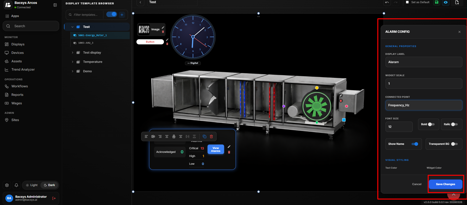 Alarm Widget
Configure the Alarm Widget
- Enter the required Display Label.
- Set the required Widget Scale.
- Under Connected Point, click Browse Hierarchy.
- Navigate through Network → Device → Point.
- Select the required point.
- Configure the Font Size.
- Enable Bold or Italic according to your requirement.
- Configure Show Name to display or hide the connected point name.
- Enable Transparent BG if a transparent background is required.
- Select the required Text Color.
- Select the required Widget Color.
- Configure Label Color (Value = 0).
- Configure Label Color (Value = 1).
- Review all configured settings.
- Click Save Changes.
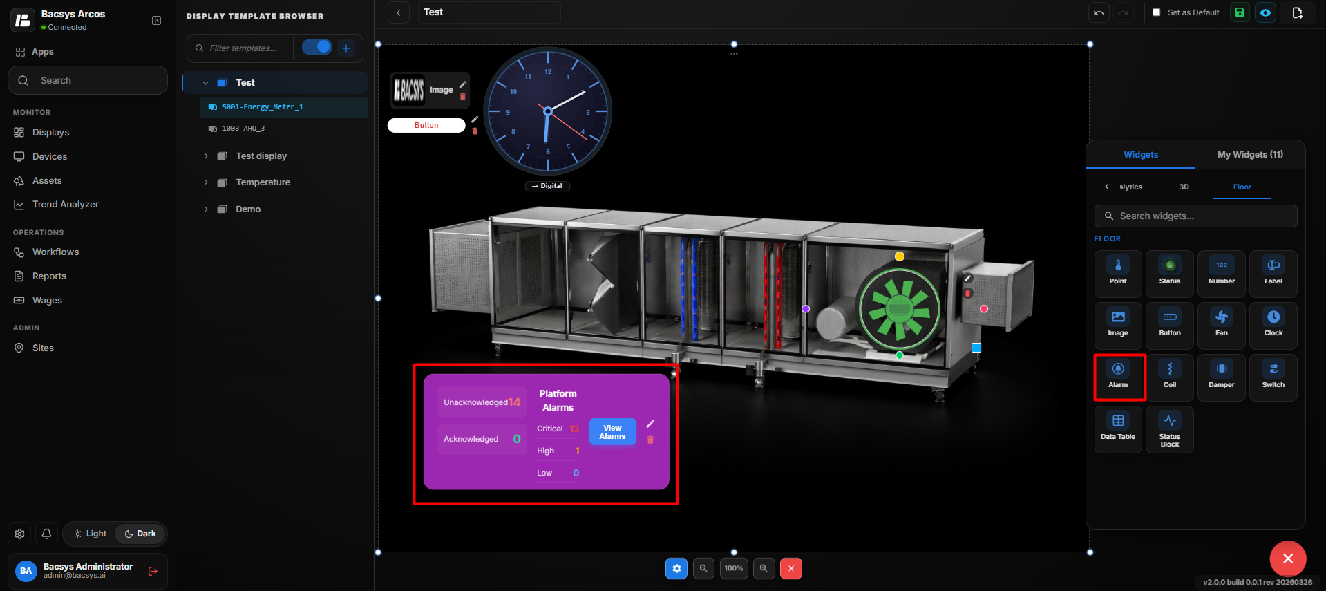 Alarm Widget
Update the Alarm Widget
After saving the configuration:
- The selected point is connected to the Alarm Widget.
- The Alarm Widget displays the configured alarm information.
- The configured Display Label, Font Size, and text styling are applied.
- The configured Text Color and Widget Color are applied.
- The appropriate label color is displayed based on the connected point value.
- The connected point name is displayed when Show Name is enabled.
- The widget background becomes transparent when Transparent BG is enabled.
- The Alarm Widget remains positioned at the selected location on the floor layout.
The same process can be repeated to add and configure multiple Alarm Widgets at different locations on the floor layout.
Add and Configure the Coil Widget
- Drag and drop the Coil Widget onto the floor layout or 3D image.
- Position the Coil Widget at the required location.
- Select the Coil Widget and click Edit to open the Coil Config panel.
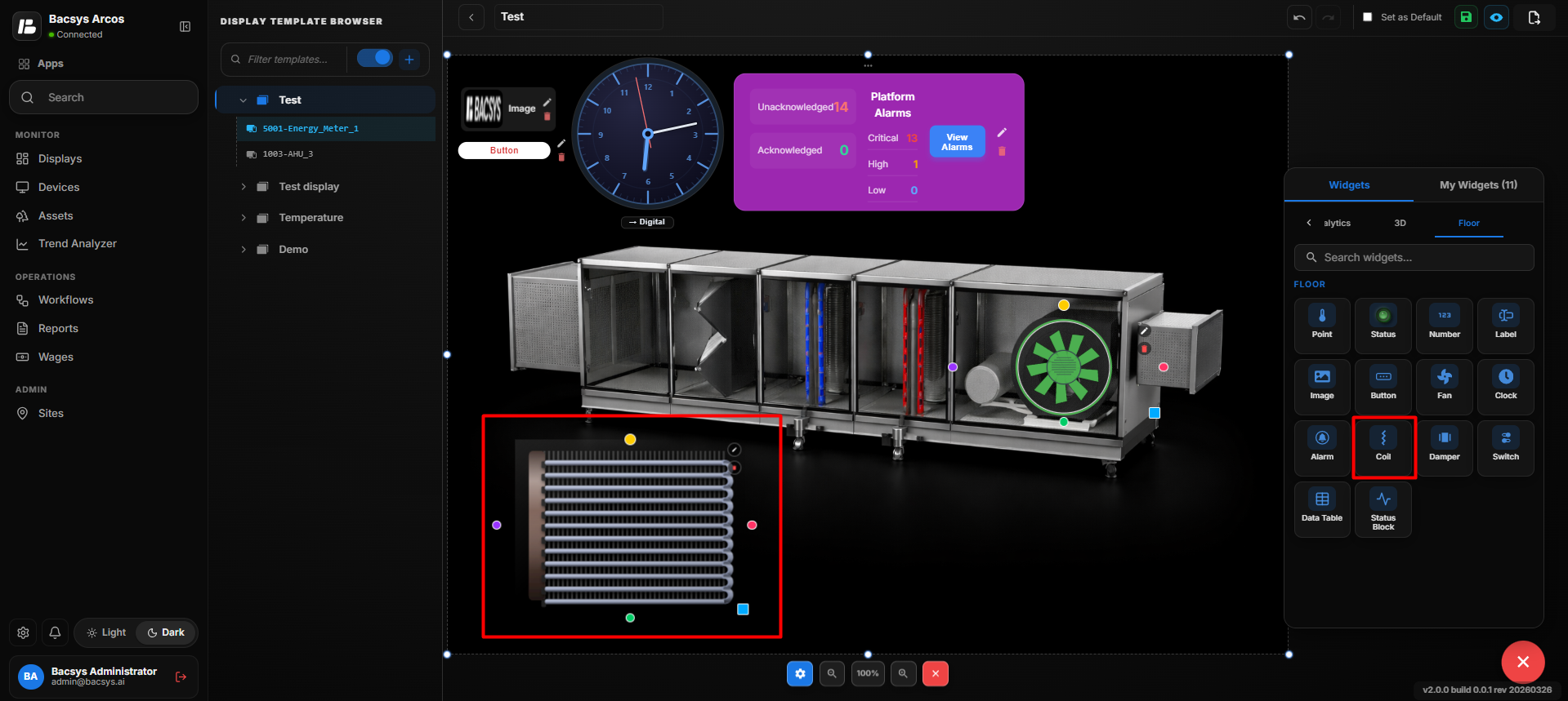 Coil Widget
 Configuration
| Setting | Description |
|---|---|
| Display Label | Defines the label displayed for the Coil Widget on the floor layout. |
| Widget Scale | Controls the size of the Coil Widget on the floor layout. |
| Connected Point | Selects the data point associated with the coil. |
| Browse Hierarchy | Allows users to browse the Network → Device → Point hierarchy and select the required point. |
| Write Enabled | Enables writing or controlling the connected point from the Coil Widget. |
| Coil Type | Defines the type of coil, such as Heating or Cooling. |
| Min Limit | Defines the minimum value allowed when writing a value. |
| Max Limit | Defines the maximum value allowed when writing a value. |
| Save Changes | Saves the configured Coil Widget settings. |
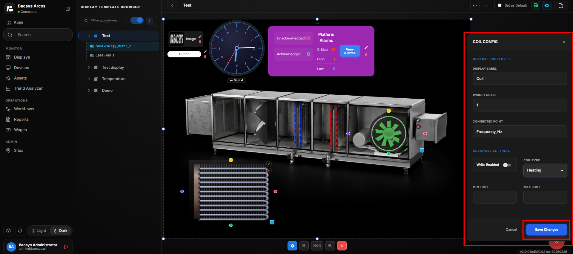 Coil Widget
Configure the Coil Widget
- Enter the required Display Label.
- Set the required Widget Scale.
- Under Connected Point, select the required point.
- Navigate through Network → Device → Point when selecting the connected point.
- Enable Write Enabled if the connected point needs to be controlled from the Coil Widget.
- Select the required Coil Type, such as Heating or Cooling.
- Enter the required Min Limit and Max Limit for the writable value.
- Review all configured settings.
- Click Save Changes.
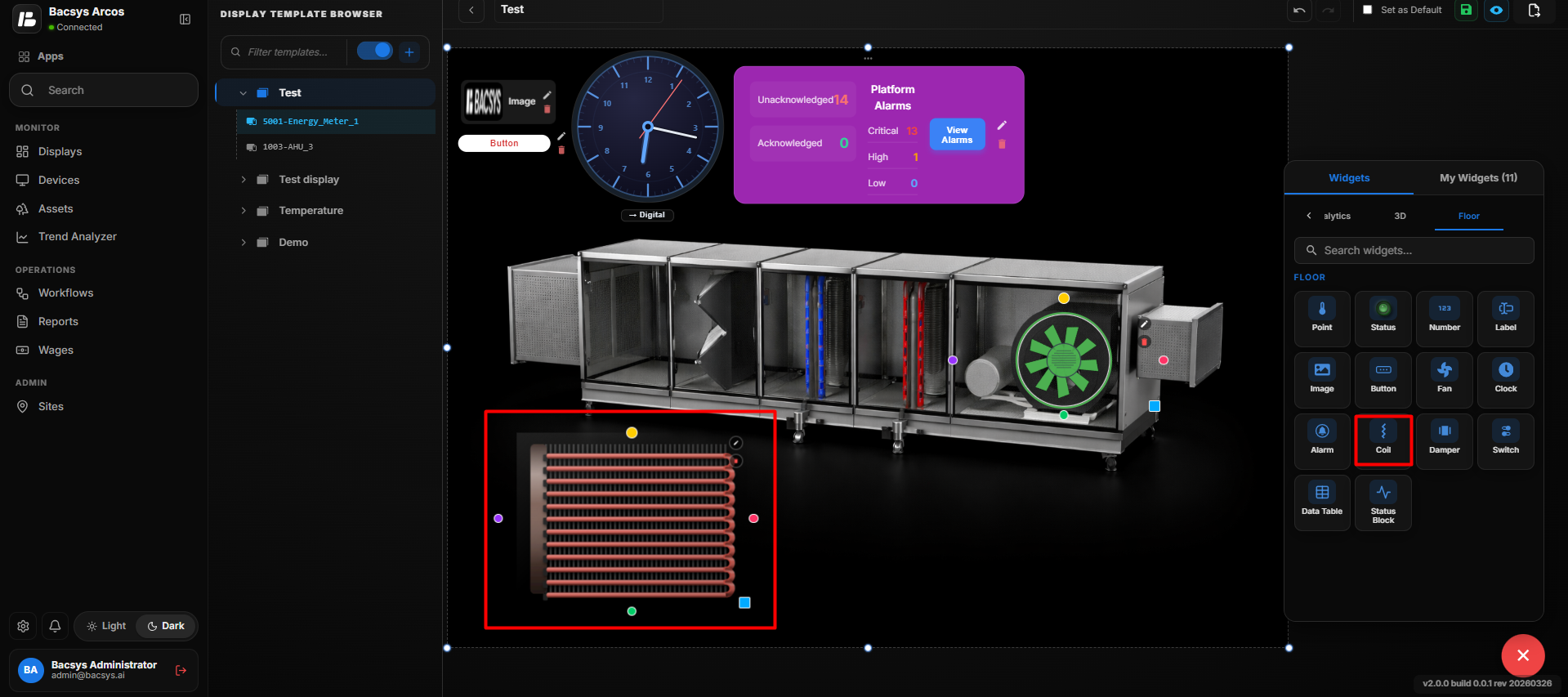 Coil Widget
Update the Coil Widget
After saving the configuration:
- The selected point is connected to the Coil Widget.
- The configured Display Label and Widget Scale are applied.
- The selected Coil Type is applied to the widget.
- When Write Enabled is enabled, the connected point can be controlled within the configured Min Limit and Max Limit.
- The configured Coil Widget is updated on the floor layout or 3D image.
The same process can be repeated to add and configure multiple Coil Widgets at different locations on the floor layout or 3D image.
Add and Configure the Damper Widget
- Drag and drop the Damper Widget onto the floor layout or 3D image.
- Position the Damper Widget at the required location.
- Select the Damper Widget and click Edit to open the Damper Config panel.
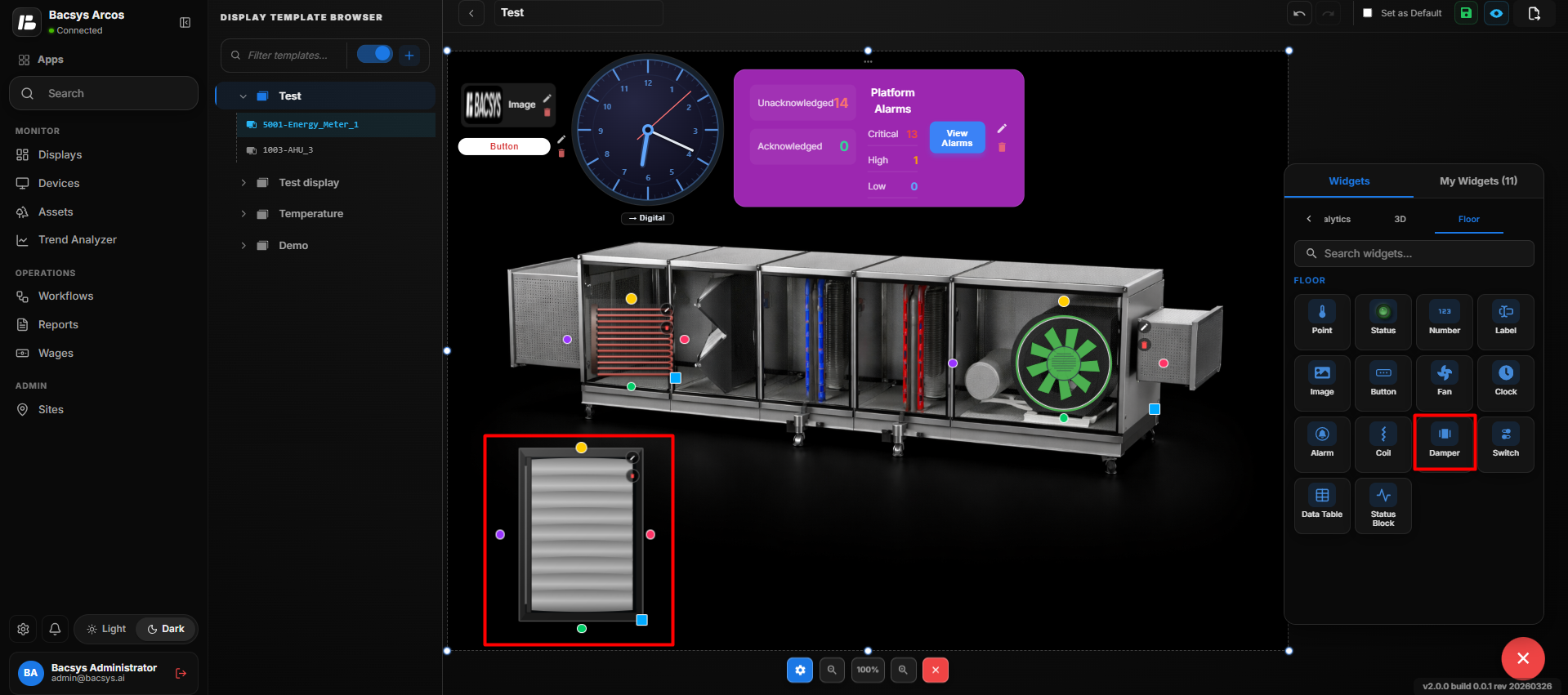 Damper Widget
 Configuration
| Setting | Description |
|---|---|
| Display Label | Defines the label displayed for the Damper Widget on the floor layout. |
| Widget Scale | Controls the size of the Damper Widget on the floor layout. |
| Connected Point | Selects the data point associated with the damper. |
| Browse Hierarchy | Allows users to browse the Network → Device → Point hierarchy and select the required point. |
| Write Enabled | Enables writing or controlling the connected damper point. |
| Min Limit | Defines the minimum value allowed for the damper control. |
| Max Limit | Defines the maximum value allowed for the damper control. |
| Save Changes | Saves the configured Damper Widget settings. |
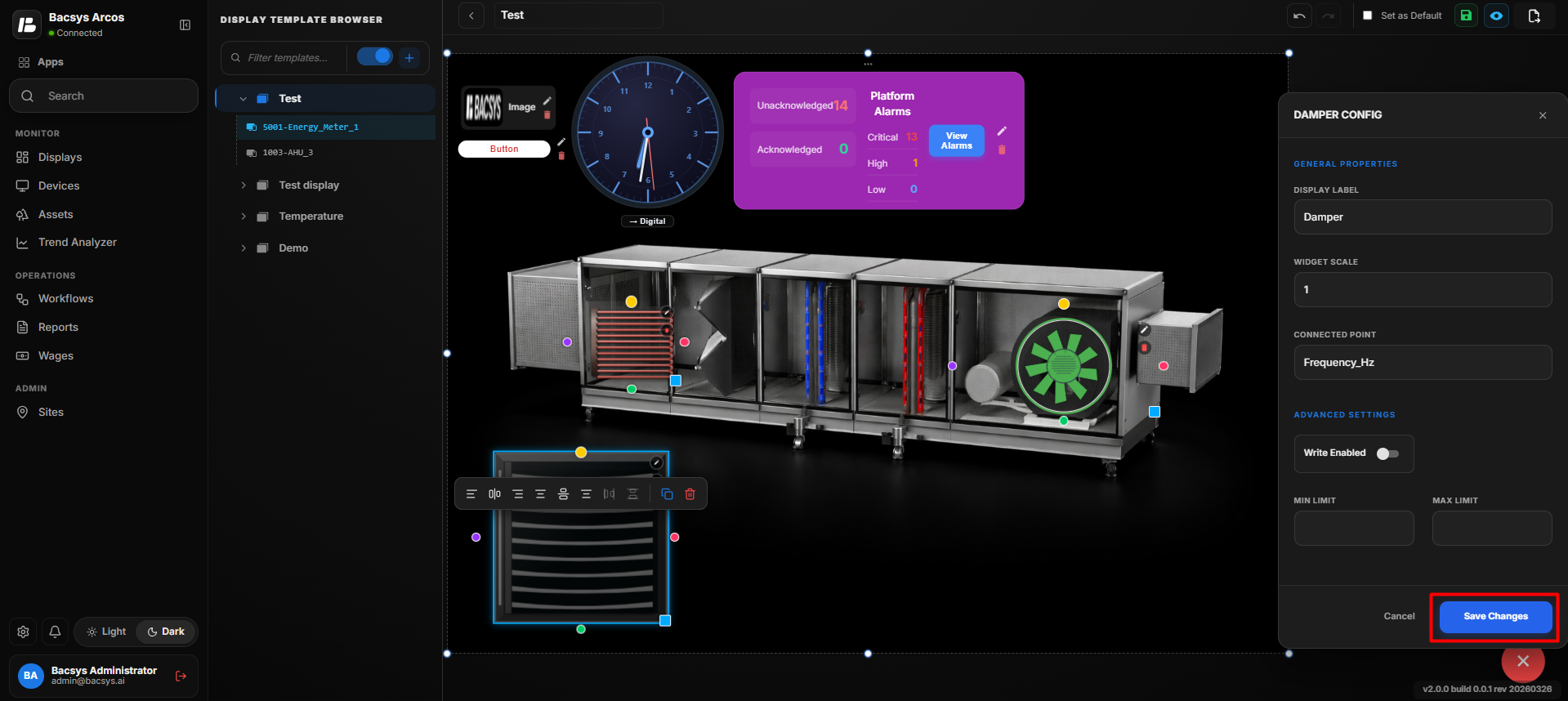 Damper Widget
Configure the Damper Widget
- Enter the required Display Label.
- Set the required Widget Scale.
- Under Connected Point, select the required point.
- Navigate through Network → Device → Point when selecting the connected point.
- Enable Write Enabled if the damper point needs to be controlled from the widget.
- Enter the required Min Limit and Max Limit for the damper control.
- Review all configured settings.
- Click Save Changes.
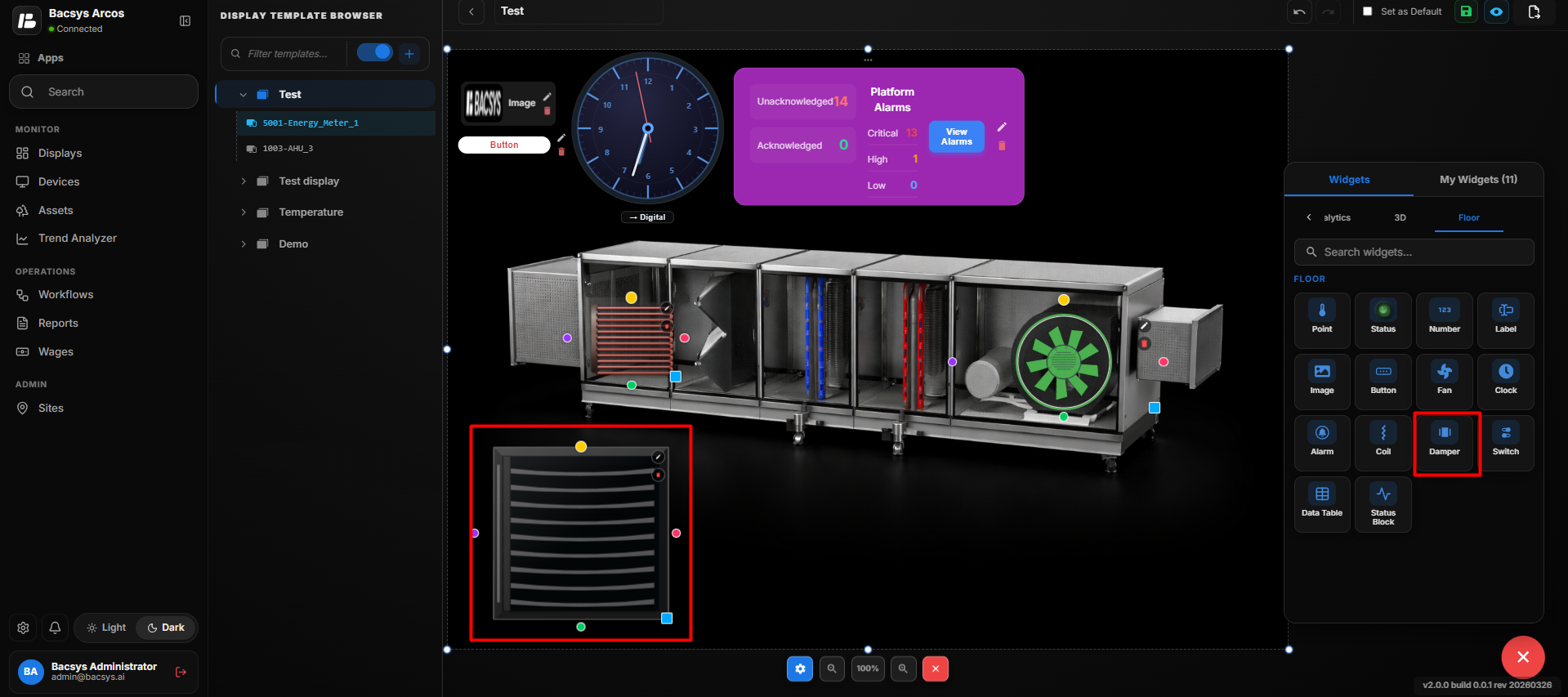 Damper Widget
Update the Damper Widget
After saving the configuration:
- The selected point is connected to the Damper Widget.
- The configured Display Label and Widget Scale are applied.
- The Damper Widget displays the configured damper information on the floor layout.
- When Write Enabled is enabled, the connected damper point can be controlled within the configured Min Limit and Max Limit.
- The configured Damper Widget remains positioned at the selected location on the floor layout.
The same process can be repeated to add and configure multiple Damper Widgets at different locations on the floor layout.
Add and Configure the Switch Widget
- Drag and drop the Switch Widget onto the floor layout or 3D image.
- Position the Switch Widget at the required location.
- Select the Switch Widget and click Edit to open the Switch Config panel.
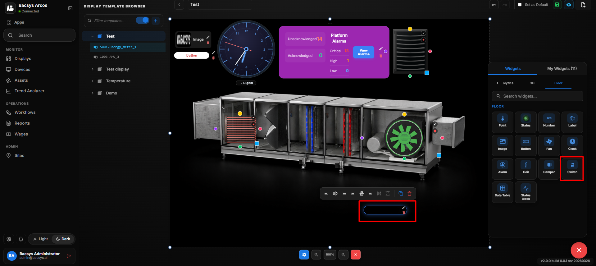 Switch Widget
 Configuration
| Setting | Description |
|---|---|
| Display Label | Defines the label displayed for the Switch Widget. |
| Widget Scale | Controls the size of the Switch Widget on the floor layout. |
| Connected Point | Selects the data point associated with the switch. |
| Browse Hierarchy | Allows users to browse the Network → Device → Point hierarchy and select the required point. |
| Font Size | Sets the font size of the displayed switch label or value. |
| Bold | Displays the switch label or value in bold text when enabled. |
| Italic | Displays the switch label or value in italic text when enabled. |
| Show Name | Displays the name of the connected point when enabled. |
| Transparent BG | Makes the widget background transparent when enabled. |
| Text Color | Sets the color of the switch text. |
| Widget Color | Sets the color of the Switch Widget. |
| Label Color (Value = 0) | Sets the label color when the connected point value is 0. |
| Label Color (Value = 1) | Sets the label color when the connected point value is 1. |
| Recent Colors | Provides quick access to previously selected colors. |
| Write Enabled | Enables writing or controlling the connected point through the Switch Widget. |
| Min Limit | Defines the minimum value allowed when writing a value. |
| Max Limit | Defines the maximum value allowed when writing a value. |
| Save Changes | Saves the configured Switch Widget settings. |
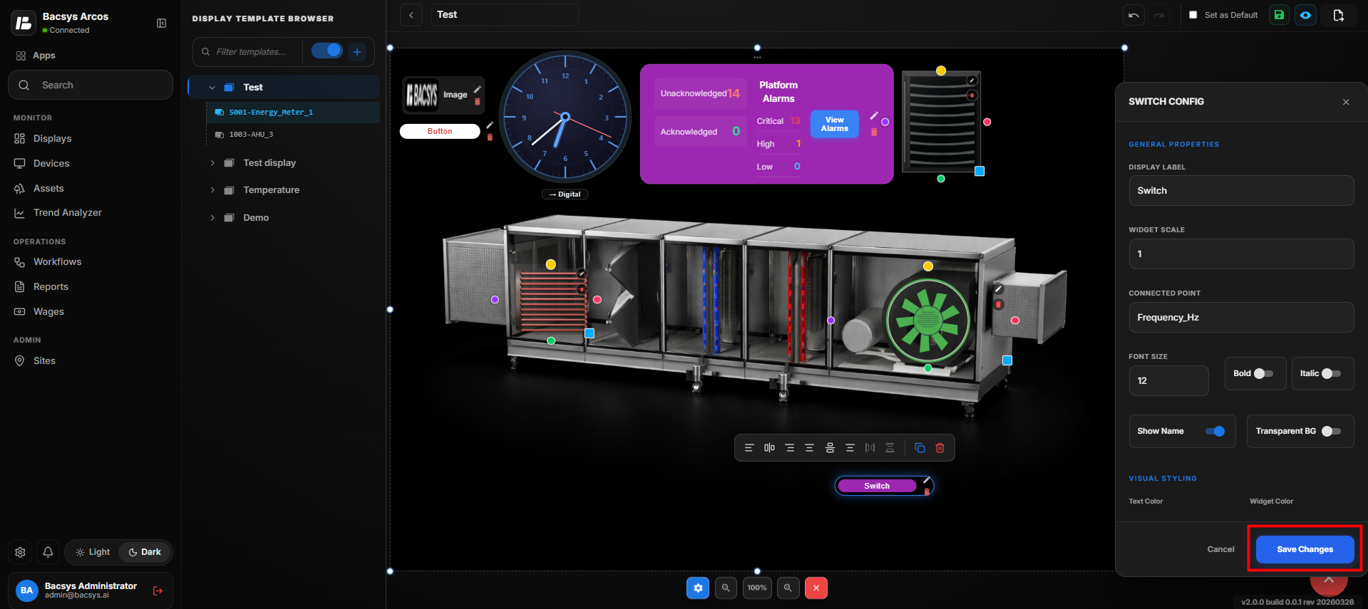 Switch Widget
Configure the Switch Widget
- Enter the required Display Label.
- Set the required Widget Scale.
- Under Connected Point, select the required point.
- Use Browse Hierarchy to navigate through Network → Device → Point and select the required point.
- Configure the Font Size.
- Enable Bold or Italic if required.
- Enable or disable Show Name according to your requirement.
- Enable Transparent BG if a transparent widget background is required.
- Select the required Text Color and Widget Color.
- Configure Label Color (Value = 0) for the OFF/0 state.
- Configure Label Color (Value = 1) for the ON/1 state.
- Enable Write Enabled if the connected point needs to be controlled from the Switch Widget.
- Enter the required Min Limit and Max Limit when write control is enabled.
- Review all configured settings.
- Click Save Changes.
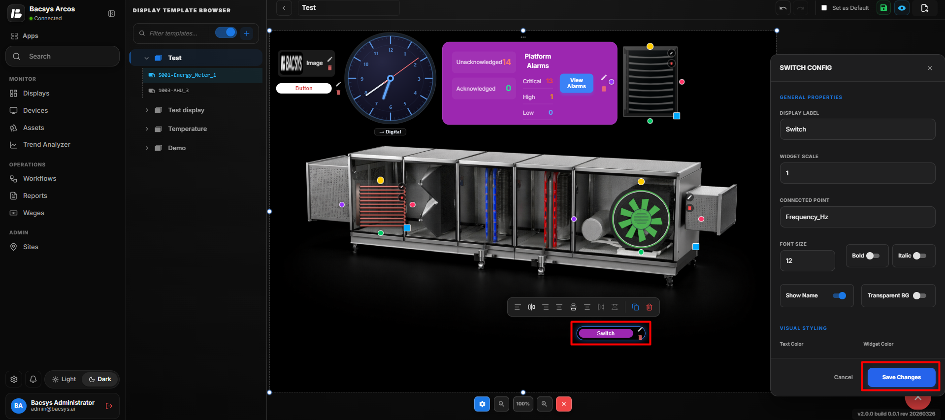 Switch Widget
Update the Switch Widget
After saving the configuration:
- The selected point is connected to the Switch Widget.
- The configured label, scale, font, and colors are applied.
- The Switch Widget reflects the connected point's current state.
- The Value = 0 and Value = 1 label colors are applied according to the point state.
- When Write Enabled is enabled, the connected point can be controlled within the configured limits.
- The configured Switch Widget remains positioned at the selected location on the floor layout.
The same process can be repeated to add and configure multiple Switch Widgets at different locations on the floor layout.
Template Display Actions
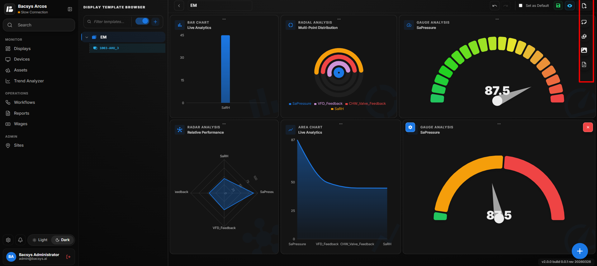
The following actions are available in the Template Display Browser to manage and export template displays.
| Action | Description |
|---|---|
| Consolidated Layout | Displays all configured widgets in a consolidated layout, providing a unified view of the template display. |
| Save As | Creates a copy of the current template display with a new name, allowing users to reuse and modify the copied template without affecting the original. |
| Export as Image | Exports the current template display as an image file for documentation, presentations, or sharing. |
| Export as PDF | Exports the current template display as a PDF document, preserving the layout for printing or distribution. |